
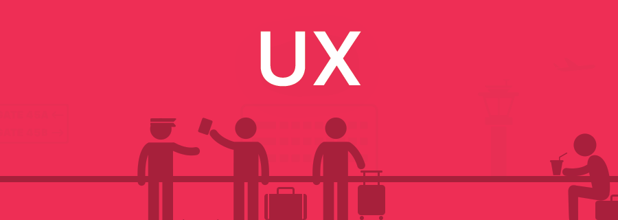
In the final instalment of our three-part miniseries where we’ve been discussing some of the worst UX flaws in our day-to-day lives, we’ll be talking about airports, bus stations and train stations. As a digital nomad I can certainly relate to these, and as you’ll soon realise, I’ve had a lot of time to think about the solutions to these well-known UX horrors. Prepare yourself — these UX flaws are the absolute worst.
Where am I Supposed to Go?
Perhaps the most obvious UX horror in transport hubs like airports and train/bus stations (although undoubtably the absolute worst) is the complete disregard for clear directions, making it seemingly impossible for travellers to navigate from A to B (baggage claim to coach transfers, for example).
Sadly, these flaws exist in user interfaces too, and when the user feels like you’ve abandoned them, or worse, never offered them any visual aids to begin with, they will quickly become frustrated, never to return. Another mistake is to bestow the user with too many primary options — instead, focus on one call-to-action and have secondary options (“About us”, “Contact us”, “FAQ”) waiting helpfully in the background.
What’s Beyond the Security Gate?
Don’t you hate it when you pass through the security measures at the airport, only to find that the Burger King from the check-in area doesn’t exist on the other side? Or worse, it’s twice as expensive. Forcing the user on your signup screen without explaining the benefits of doing so is a terrific way to increase exit rates. Instead, offer them a reward (a downloadable for example) before signing up as a show of faith, and then offer more rewards the instant they sign up. Explain the rewards, then deliver them immediately and with integrity (i.e. no crafty strings attached).
Why Can’t I Find Somewhere to Sit?
Airports and other transport hubs are notoriously evil for purposely inducing stress so that you upgrade your seats, buy extras, or binge on treats at a massively inflated price to make yourself feel better. When designing for screens, it’s the eyes and mouse that need to rest - let the user sit back and absorb the information at their own pace.
When your design has too many fancy transitions, parallax scrolling "features" and ultra-vibrant videos/images, it’s overwhelming to the user. A burst of colour, animation and movement creates sensory overload and which distracts the user from their goal. Instead, wow the user by making their life easier. If you do, you’ll convert them into a returning user. Don’t worry, animations can still help the user without distracting them.
Conclusion
Did you find the UX tips in this article helpful? If you didn’t catch the other two instalments earlier in the week, this is your chance to read the two articles discussing the UX horrors at fast-food chains and supermarkets before the weekend begins!
P.S. One flaw that we weren’t able to touch on is the fact that travellers approach queuing like an olympic sport, but that’s the beauty of the world wide web — shopping, content and information is available for consumption 24/7 in the digital world. If you make it accessible and UX-friendly, users will indulge, return, and indulge some more.