
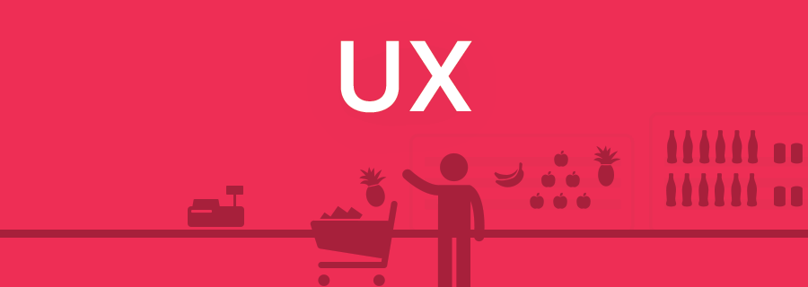
In the 2nd instalment of our three-part miniseries on day-to-day, real-world UX horrors, we’ll be moaning discussing supermarkets and what a terrible ordeal shopping really is, as well as the ways that the solutions to these user experience flaws can also be applied to web and mobile interface design. Since I don’t drive, grocery shopping is something that I have to deal with everyday; here are the issues most of us encounter:
When Items Aren’t Priced
Most shoppers won’t approach a member of staff if they find an item without a displayed price, either because they’re shy, or because they simply don’t have the time. It’s really annoying and this happens far too often on the web too; most users will agree that if you have to enquire about the price, it’s probably too high. We’ll never find out if that’s statistically true or not because most shoppers/users won’t bother making an enquiry.
Always give the user the information they want.
When Items Are Out of Reach
As somebody who is vertically challenged I can certainly relate to this: items that are out of reach for short shoppers. You should try to cater for all of your demographics, not only the most popular ones — some disabilities/impairments for example are more common than you might think (around 5% of us are colourblind!). Whenever I can’t reach an item on the top shelf, it makes me think of app screens that have their menu icon in the top-left corner (the furthest corner away from my thumb!).
Don’t compromise on UX for the sake of more content.
When the Layout Changes Every Week
Supermarkets frequently change their layouts to force the shopper to walk around the entire store and discover items that they weren’t originally intending to buy; that’s right, they purposely offer a bad UX so that you spend more money. Now think how many times you’ve changed the design of your website or app (even if your intentions weren’t bad, for example you were A/B testing different layouts to see which works best).
Even though trying to improve the user experience of your design is a terrific thing to do, too many changes, too frequently, can frustrate the user because every time they “learn” how your design works, it changes again. Design in small sprints and roll out changes gradually to ease the user into a new UI and experience.
When Self-Service Checkouts Don’t Work
When you finally reach an online checkout and something goes wrong, it really is heartbreaking. Either it doesn’t accept your credit card information, or the submit button doesn’t work, or a special offer that you were trying to take advantage of doesn’t seem to have applied at the checkout — those things are hell. When you shop online you’re essentially serving yourself, much like the self-serving machines at the store. When something goes wrong, it’s pretty difficult to find a somebody who can help.
While maybe not directly a designer-fault, it is still a UX issue. You can use Sympli to handoff designs at regular intervals so that developers can weigh-in on the practicality and overall user experience of your design.
Conclusion
Did you find the UX tips in this article helpful? If so, come back on Friday for the finale to our week-long miniseries on real-world UX horrors, where we’ll talk about the ultimate bad-UX experience…airports, buses and train stations! Oh dear.