

If you’ve carried out research on your customers, and created personas or user journeys, you’ve probably noticed that different users want or need different features, functionality and customisation options. A settings page can help your users customise your product to better meet their needs.
Setting Up Your Settings
Be selective
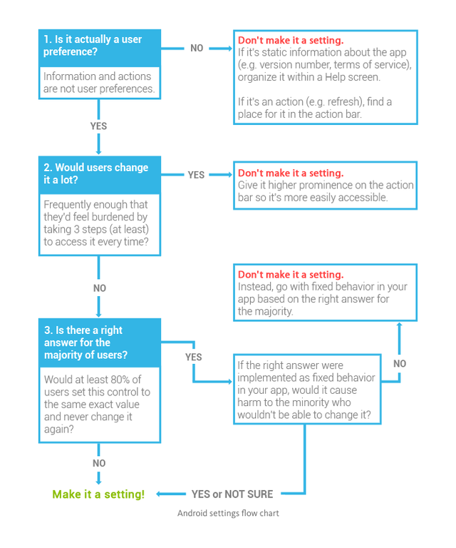
When creating settings for your users to customise it can become overwhelming knowing what to add and what not to add. This can lead to instances where there are so many options and toggles that your users simply don’t know where to start and give up before they’ve changed a single thing. Your settings should be something your user sets once then doesn’t change again for a long time e.g. whether they want to receive email notifications. Not whether they want to view a specific page as a list or table - that is a layout preference and should be kept inline on the page it affects. The android settings flow chart is a great way to help you make decisions on what and what not to add.
Group related settings
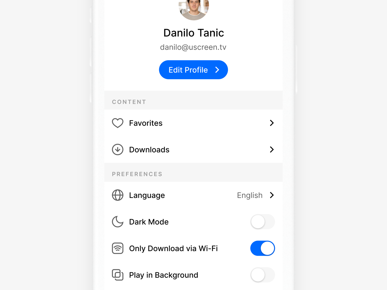
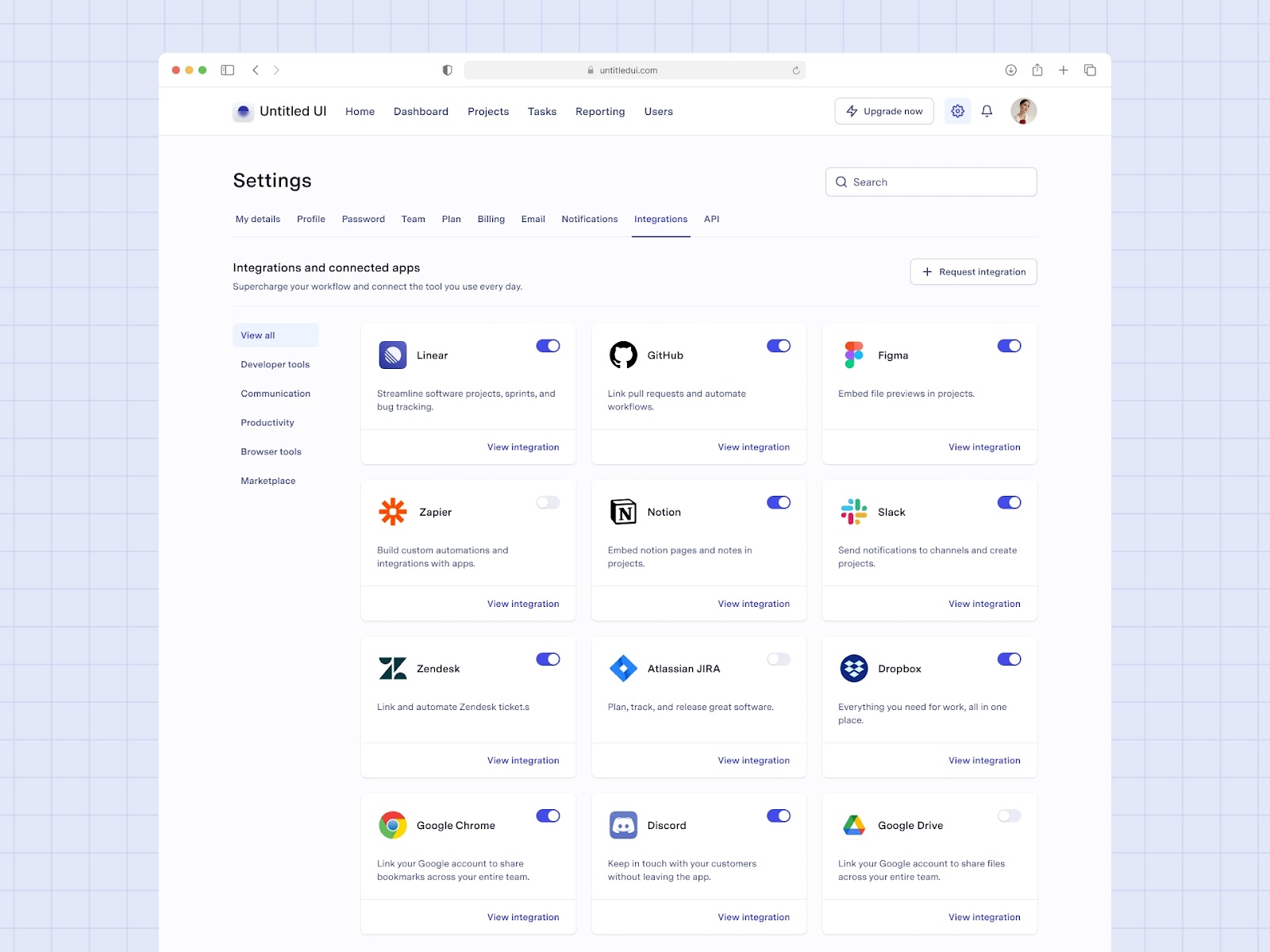
When you are creating your settings page you might notice that some settings are kind of similar in what they do. Maybe you have one setting that sets in-app notifications and another that sets email notifications. These could (and should) be grouped together into a notifications section so your users don’t have to hunt down the settings for the notification type they are looking for. Grouping related items together can improve the find-ability of settings and can help users discover other related settings that they might not have known about until that point.
Prioritise your categories
After you have grouped your settings you can start to order and prioritise them on screen. Settings you think users are more likely to change should go near the top. And settings that are destructive should go near the bottom. You can also use colour or icons to indicate destructive settings.
Avoid technical terms
When writing out the guide around your settings, try to avoid using technical terminology. It can be easy to do if you use them day to day or work in a particularly technical field. But erring on the simple side can greatly help new and novice users on your system find their way around without getting frustrated or confused.
Provide a description
You shouldn’t rely on one sentence or a word to convey what will happen when a setting is changed. Especially for more technical settings. Where possible try to add a description for the setting outlining what will happen if changed.
Include a search
If you have a lot of settings or help guides it may be a good idea to add search functionality to those pages. This will help users get to the setting they are looking for faster and reduce the time on task allowing them to continue using your main features. Search is also a great tool for power users (more on this in a second) to find things, that may be buried, quickly.
Show a confirmation
If a user changes a setting you should provide feedback that something has changed. If the user has to save their changes you can use a toast notification as a visual indicator that it has worked. If changes are saved automatically you can use colour to indicate a change e.g. changing the background of a toggle from green to red or grey.
Setting Considerations
Cater to power users
Some of your users may be more tech-savvy or have more knowledge of your platform than other users and so will want to be able to customise it to their needs a little more, these are your power users. For some settings, you can have a basic setting that everyone can understand and use, but that also has deeper functionality for your users that want a little more control. You can often see these kinds of things with appearance customisation where you are given our of the box themes to choose from as a basic setting or you can enter your own colour hex codes as the power user option. Catering to these user types will help them feel in control and give them please from being able to make things just right.
Admin settings
There may be some settings that not everyone should be able to access. A good example of this is integration settings for products that allow you to connect with other applications. Usually, this type of setting is only made accessible to certain user types as changing them can have unintended consequences or may increase the bill at the end of the month. These are your admin user settings.
Test your settings
When creating a settings page or adding new settings you can put them in from of your users or customer support team to gather feedback and tweak them where necessary. You may find customers ask for additional settings or functionality after seeing your first iteration. This can ensure your settings are useful and usable for everyone.
Mobile app settings
Mobile applications will have additional and different settings to desktop applications. Mobiles can make use of a device’s camera or microphone. It can send push notifications and access contacts. If your app has functionality that utilises these features, you users will be able to influence this out of your application via separate settings you can only suggest they change. What a person can change and influence using their mobile settings should be considered when creating a mobile interface. What happens if they have increased the font size or browse in black and white?
Ad space
Some sites and apps utilise their settings pages as a place to self-promote. If your product has a tier system or different plans available at different price points, you can use the space around these settings to promote a higher plan or related applications if you are part of an ecosystem that works together.
You can create settings for almost anything in an application, but you have to find the right balance of being useful versus not allowing users to change so much that it affects how you planned on certain functionality working. Whatever you decide to add to your settings, be sure to make it descriptive, findable, and appropriately categorised.
Sympli is a Saas company that creates tools for design collaboration, handoff, and version control. With more than 5 years on the market, we had helped thousands of designers and developers work together by providing a single source of truth and reducing back-and-forth communications, resulting in faster delivery.