
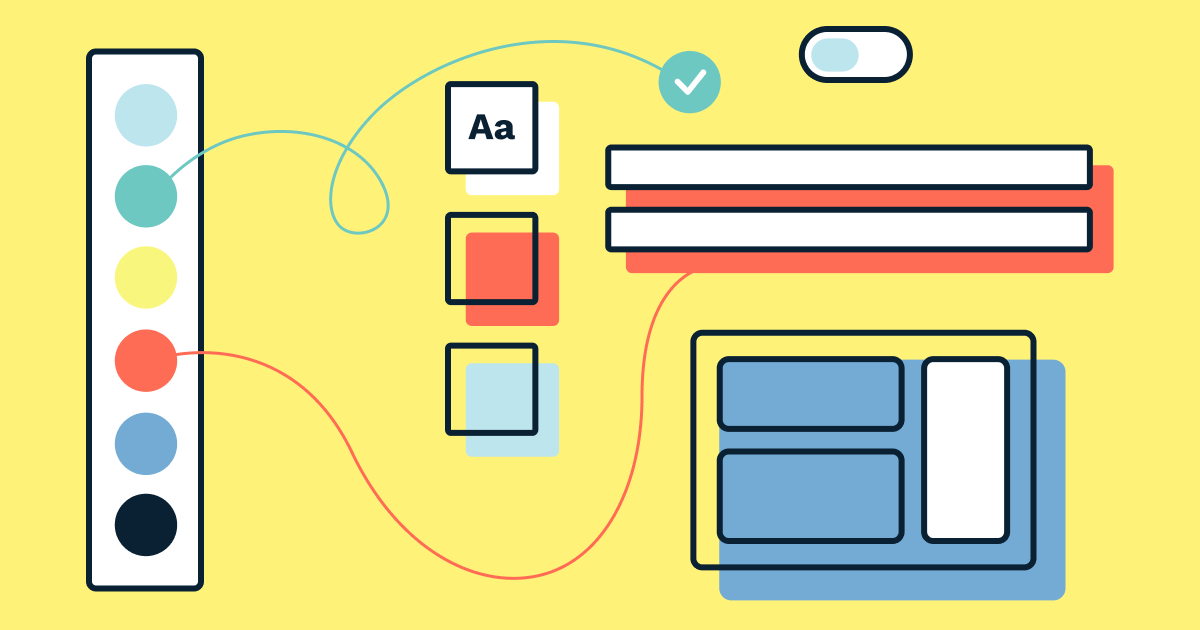
Color plays an important role in how interfaces communicate with users. In a design system, you’ll need to include many different colors to convey different meanings, so in order for colors to be used effectively, it’s important that they’re organized carefully.
In this tutorial, you’ll learn how to create and organize colors in UI design tools such as Figma and then make those color tokens available to stakeholders (including designers and developers) using Sympli Design Systems.
Ordinarily, you’ll be using libraries or the equivalent of libraries in your UI design tool of choice. However, Sympli can import styles from any document, even if it’s not a library. For this tutorial we’ll assume that you’re using a Figma Library, although it doesn’t really matter since the workflow is the same regardless of the tool and method used.
Saving Color Styles
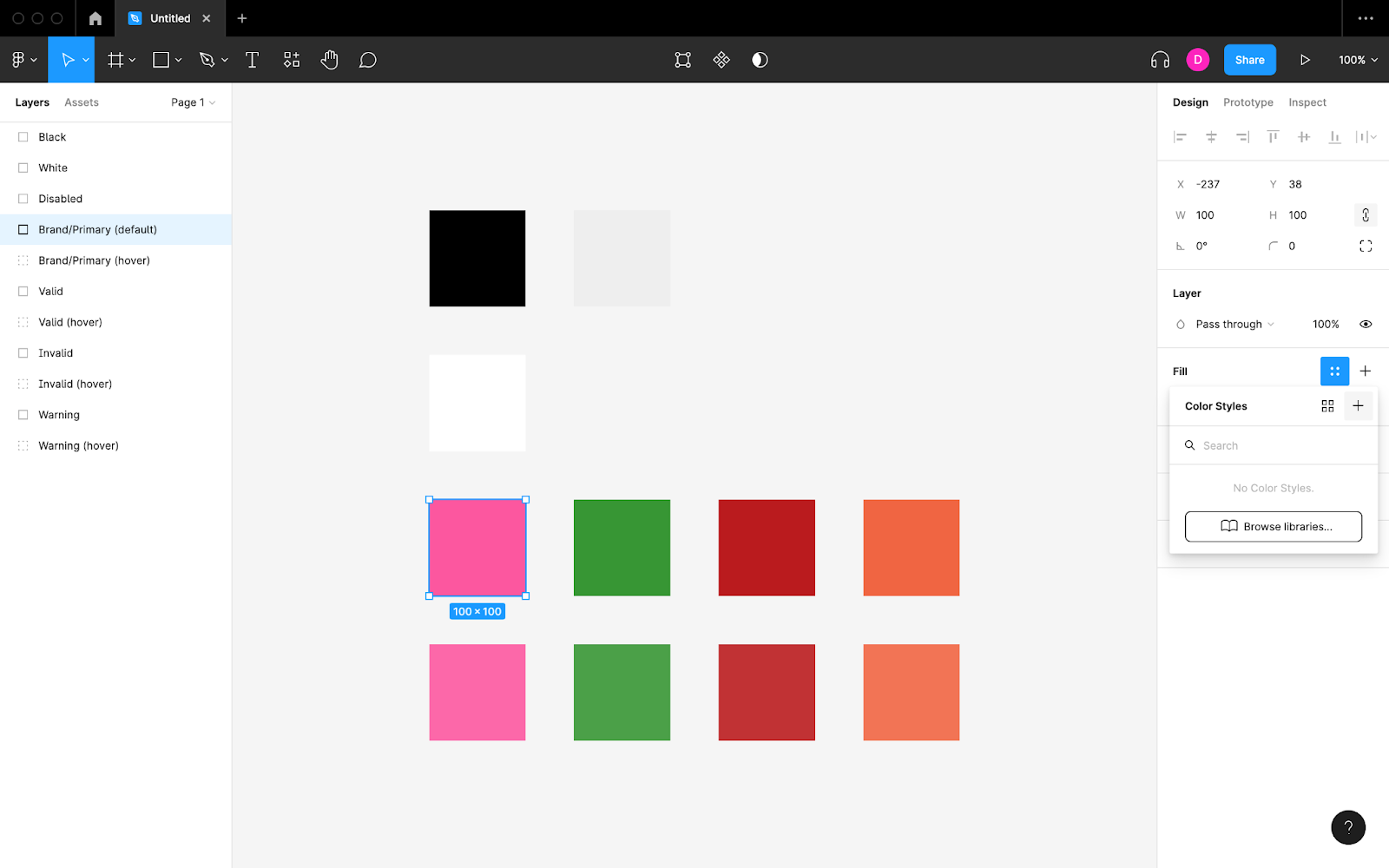
To save (and later reuse) a Color Style in Figma, click on the “Style” icon under the “Fill” heading in the “Design” panel, and then click on the “Create style” icon.
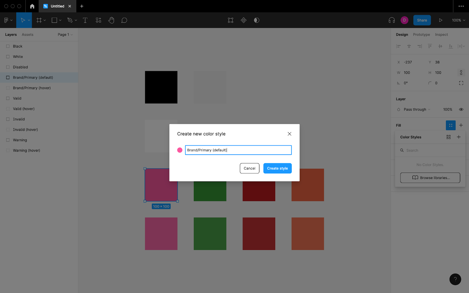
Naming Color Styles
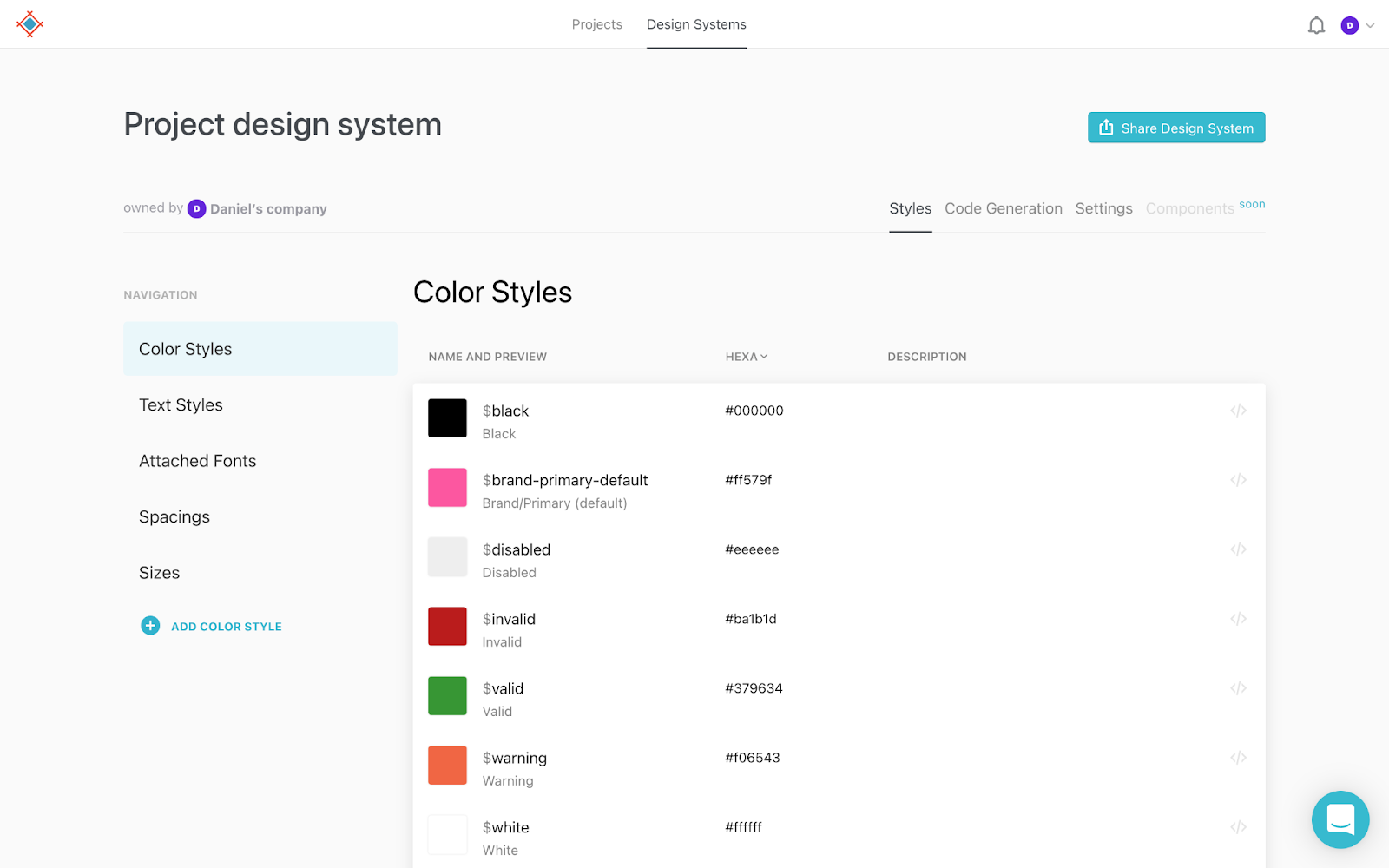
Give the Color Style a name when asked to do so, keeping in mind that you can categorize Styles in Figma by prefixing their names with a category name followed by a forward slash. For example, “Brand/Primary (default)” would add a Color Style called “Primary (default)” to a category called “Brand.”
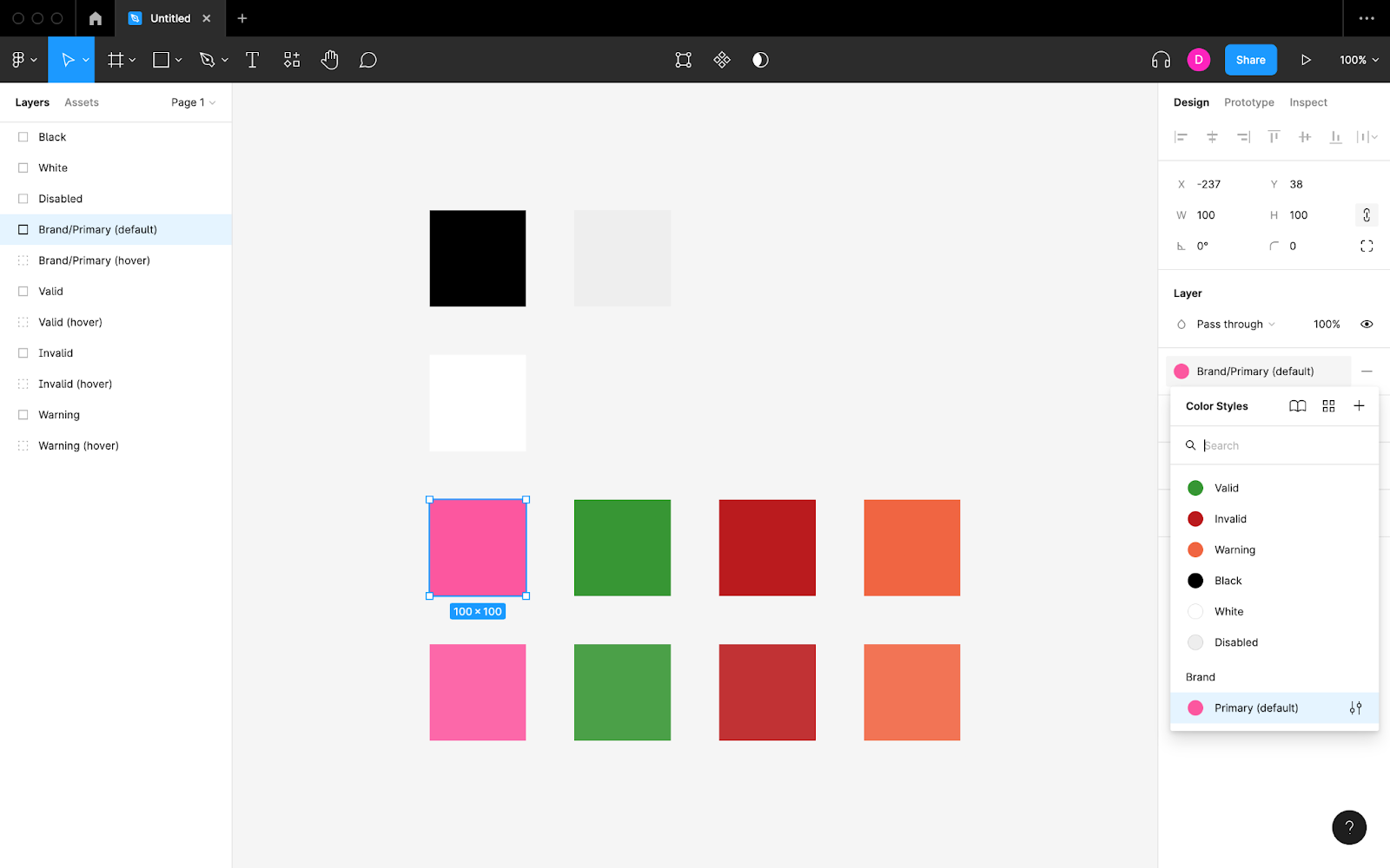
Here’s what that would look like in Figma while browsing through Color Styles to apply to a Layer:
Which Colors Should Be Included?
The colors that you should include in your design system depends on its complexity and the types of designs that it needs to cater for. However, there are a few colors that almost all design systems require.
First of all, you’ll need to specify the default background color and text color (twice if the design system will have a dark mode).
Secondly, most design systems will need a green color to let users know when their input is valid or to encourage users to select a specific choice. Similarly, they’ll need a red color to let users know when they’ve made a mistake or a specific interaction may cause them to make one, plus an orange color for less severe warnings.
Design systems should also include the brand’s colors, which are often used for CTAs.
All tap targets (i.e., links and buttons) should have hover states. Usually, tinting the colors slightly is enough to make them discernible, but you can come up with completely new colors if you prefer.
Lastly, when a tap target is disabled it’s best to show a faded version of its color, or you can opt for a completely unsaturated gray color.
Handing Off Color Tokens With Sympli
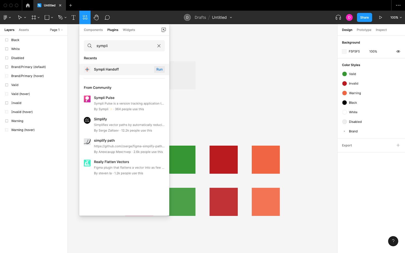
To hand off color tokens or design systems from Figma to Sympli, click on the “Resources” icon (⇧ + I) in the horizontal toolbar, switch to the “Plugins” tab, search for “Sympli,” and then click on the “Run” button.
After logging in (if needed) and switching to the “Design System” tab, choose which styles you’d like to sync. When you’re ready, click on the “Continue” button.
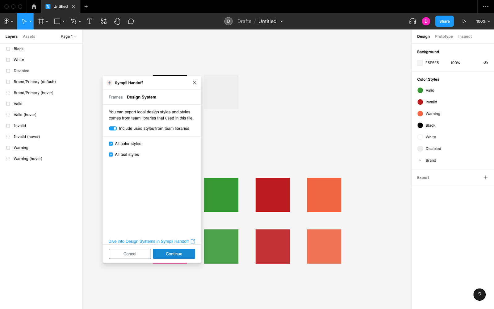
Next, choose a Sympli Design System to sync to, or create a new one from scratch.
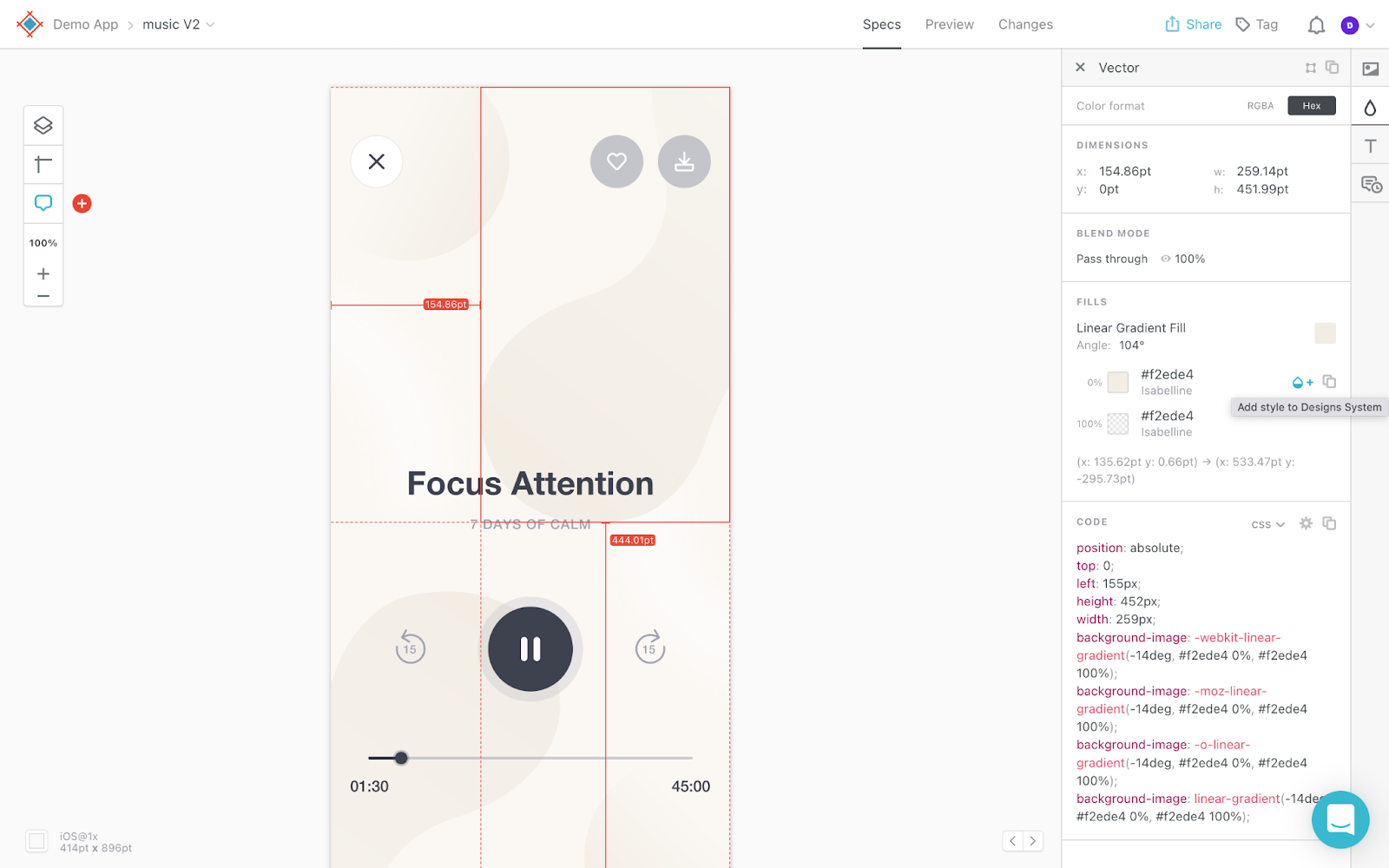
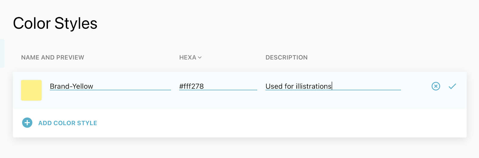
If you’d like to add color tokens to your design system from a design that’s already been handed off to Sympli, select a layer that uses that color and then click on the “Add style to Design System” icon in the Sympli Handoff Inspector. Next you can go to the project’s design system and add descriptions to the color tokens, to give them more context.
Setting up Design Systems in Sympli
There are some Styles that Sympli Design Systems aren’t able to sync yet, but you can still add them manually very easily.
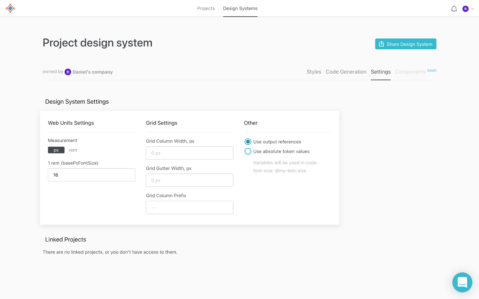
In Sympli Handoff, navigate to the “Design Systems” tab. From this tab, you’ll be able to add fonts, spacings and sizes manually.
To specify a base font size (px or rem units) or grid column settings, click on the “Settings” tab. Soon, you’ll be able to add entire components to your Sympli Design Systems too.
You can also share the Sympli Design System with developers, and they can copy the pre-generated code snippets for the color tokens for the platform they want and use them in their code right away.
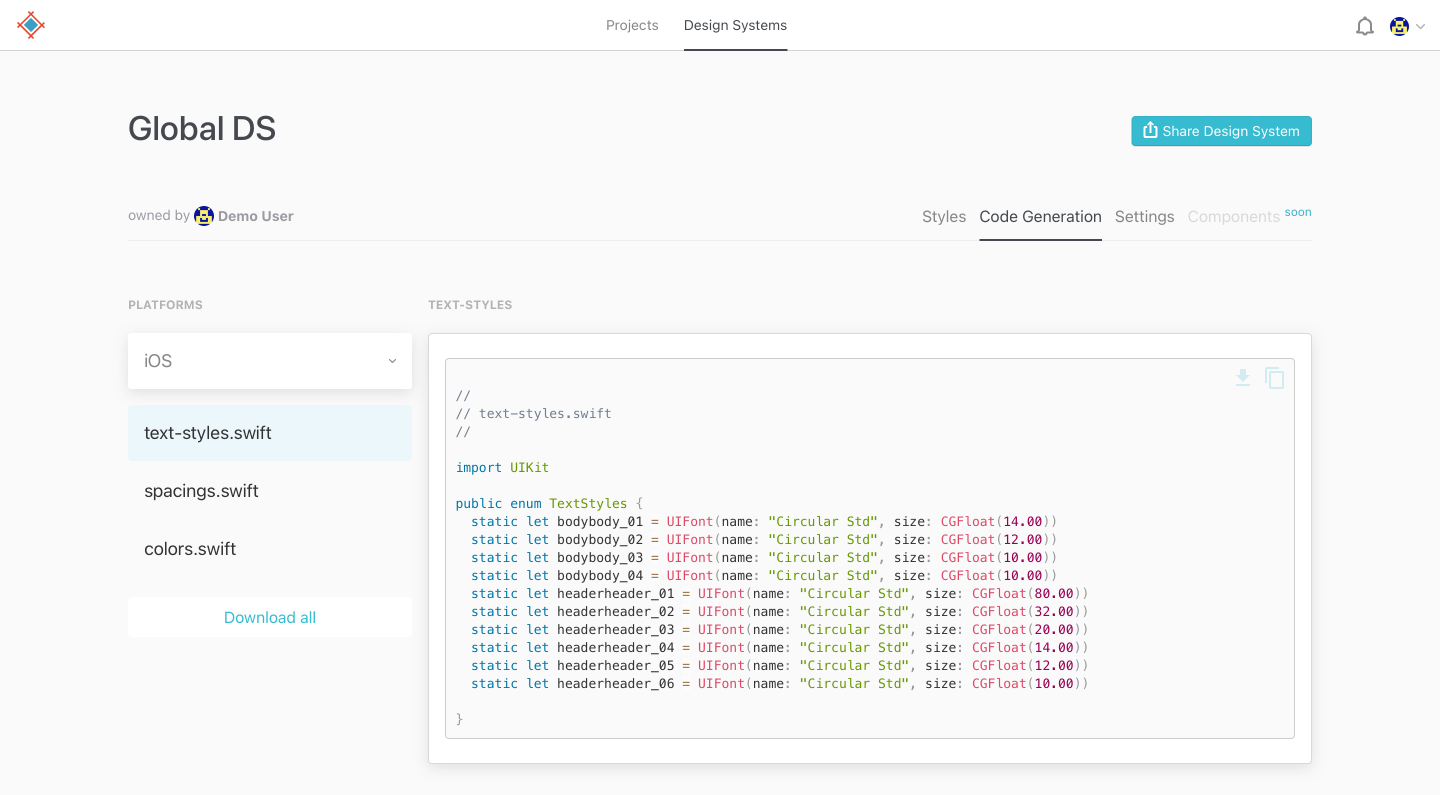
Tokens can be used throughout multiple code projects (e.g., CSS, Swift and Android). Using Sympli Design Systems to establish a single-source-of-truth, it’s easy to keep your tokens in one place and up to date so that developers and other stakeholders can use them anywhere.
Tokens are a useful bit of design decisions made in a project, which make them a valuable information to for a single-source-of-truth that anyone on the project can consult, and with Sympli Handoff it’s easy to keep this knowledge in one place and up to date.