
Unless you’ve been out of the business of design for a few years, you’ve probably heard of the term ‘design system’ and maybe even started working on your own with the help of our Quick Start Guide. But one thing you may not have heard of is the term ‘design tokens’.
Design tokens, as a concept, were only conceived of a few years ago. But it only took a short while before people were discussing it throughout dev Twitter circles, and writing articles about how it was the next great thing. But unless you are a front-end developer, you might not have been in these Twitter circles. So what exactly are ‘design tokens’ and why do designers need to know about them?
What are design tokens?
According to Adobe; “Design tokens are design decisions, represented as data, that ensure systematically unified and cohesive product experiences.” This quote has a bit too many words over 6 letters for my liking. I prefer Jinas’ a much more human way of explaining them: “Design Tokens are the visual atoms of the design system – specifically, they are named entities that store visual design attributes. We use them in place of hard-coded values in order to maintain a scalable and consistent visual system.” And she would know as she worked on the team that created the concept of design tokens while working on the Salesforce Lightning Design System.
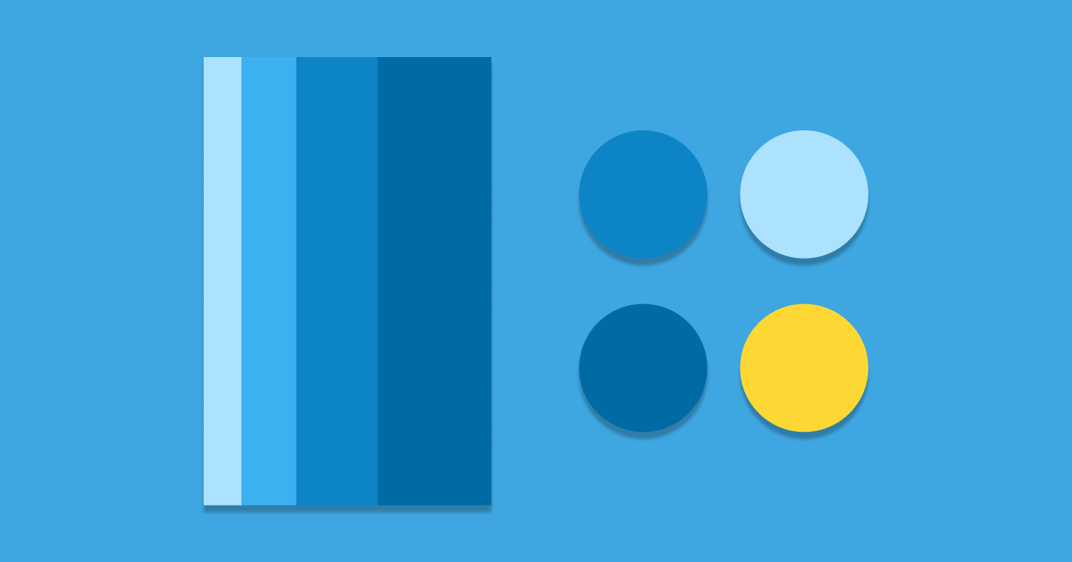
When creating a design system you outline things like the typography, the colour pallet and the grid size you use. Each of these elements is individual but often used throughout your designs in different areas. It could be that your button background colour is also the same as your navigation background colour. Or that the margin between your inputs is the same as the padding in your modals. Each of these reusable styles are a ‘variable’ within your design that can, and will likely, change over time, these changes can make it difficult to keep consistency between your design and what is created by the front end developers you work with.
Design tokens take these ‘variables’ and abstract them away from the design and even from the actual values they represent. They are given a name and that name is then assigned a value. For example, rather than #FF0000, it would be:
name: primary-red
value: #FF0000
This means that wherever you would normally say colour: #FF0000 you would now say colour: primary-red and pass in the variable. This means that in future you can change the value assigned to that variable and it will change everywhere it’s used throughout the entire application. This is super handy if your branding gets changed in future.
There is any number of styles in design that tokens can be used to abstract out, but some examples of these are:
1. Typographic styles such as font, weight, size, decoration, colour and line-height.
2. Interfaces styles like border-radius, gradients and background colours.
3. Interaction styles such as button hover animations or page transitions.
Why are they good?
So now you understand what design tokens are, you might be wondering what makes them any better than the existing solutions like CSS variables that have been used in tandem with design systems for years?
What makes a design token different from a variable is they are codebase agnostic. Kept in a completely separate file, usually as JSON or YAML. These types of file can then be read into any codebase. Meaning that you can use them in your website and your android app and your iOS app, all of which are written in different languages. This means that you only have to update the variable in one place rather than however many different sites or applications you have for your product. This makes design tokens good for three main reasons:
Consistency
Similar to CSS variables, when you can define certain properties such as sizing or colour using one name, you just have to remember what the name is and not the more complex hex code or pt size. This ensures consistency across everywhere that style is used and means you don’t end up accidentally changing one letter of the hex code, resulting in 40 slightly different shades of green being used throughout your platforms.
Maintainable
As all your tokens are kept together in a file (or files) agnostic to the code base your devs work in day-to-day, it means they are easy to maintain and update. When your typography is inevitably updated, rather than the developers having to search their codebase for everywhere a specific font-weight is used, they simply go to the tokens relating to the typography and make the updates in one place.
Scalable
The main benefit of design tokens is one we’ve touched on already. They allow your design decisions to be applied across multiple applications, products and platforms all at once and are codebase agnostic. This means that if you have a large brand update that affects things like typography, colour, iconography and much more, these style changes can be pushed to your marketing site, your web platform and your iOS app, all at the same time.
Examples of design token being used in the wild
The most famous example of design tokens being used is of course in the Salesforce Lightning Design System. This is where design tokens originated and a lot can be learned from the documentation of their tokens.
Adobe’s Spectrum Design System is another great example of how design tokens can be used for the very basic building blocks of design.
And finally, the US Government also uses design tokens in its US Web Design System, stating; “USWDS seeks to maximize design efficiency and improve communication with design tokens: the discrete palettes of values from which we base all our visual design.”
Though design tokens have only been around for a few years, they are already being picked up by some of the largest names in tech. They make collaboration between designers and developers easier and help ensure consistency across platforms. Design tokens will undoubtedly become ever more mainstream as time goes on, and this can only be a good thing for designers.
Sympli is a Saas company that creates tools for design collaboration, handoff, and version control. With more than 5 years on the market, we had helped thousands of designers and developers work together by providing a single source of truth and reducing back-and-forth communications, resulting in faster delivery.