

It’s always been the case that developers and designers operate in different languages: Developers work in points and DPs (density-independent pixels) and designers work in pixels. But until recently, it wasn’t much of a problem.
Prior to 2010, one point always equaled one pixel. So despite the language disparity, it was easy to translate designs into code. However, this changed when Apple introduced Retina display with high PPI (pixels per inch) screens. Apple’s release effectively doubled the number of pixels contained in a single point.
As Apple and other companies continue to create more screens of varying sizes and densities, it became increasingly difficult to translate from points to pixels.
So how do we resolve this issue?
There are a lot of valuable, in-depth resources out there to help designers understand resolutions for products, such as Sebastien Gabriel’s Designer's Guide to DPI, and Google's Device Metrics webpage. But too much information can confuse just as easily as not enough, so we’ve tried to “Sympli-fy” it a bit for you.
Achieve Resolution Independence
It is basically impossible to account for every screen type when you design. Since it’s impractical to create multiple versions of each design to account for different screens, you need to strive for designs that achieve resolution independence.
There are two methods to create resolution-independent designs:
-
Use a baseline resolution of 1x (for iOS and Web) or MDPI (for Android) and export at 2x or 3x.
-
Use vector graphics as much as possible
Benefits of 1x Design
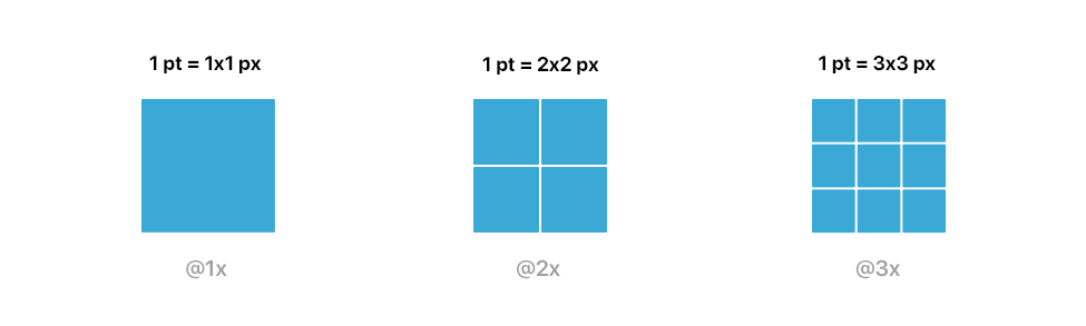
Designing in 1x (1 pt is equal to 1px) enables you to work faster (using fewer pixels = less RAM) and create “pixel perfect” designs, even when scaled up to support different displays.
Although there are some valid reasons to design in 2x, we recommend sticking with 1x to improve scalability and ensure that you create “future proof” designs that will work in any resolution. (See designer Kurt Varner’s “7 reasons to design at 1x” for more information.)
This tactic allows you to streamline your design workflow by simplifying the calculation to scale up your images while, again, maintaining “pixel perfection” throughout the adjustment of the image.
Designing in 1x and scaling up.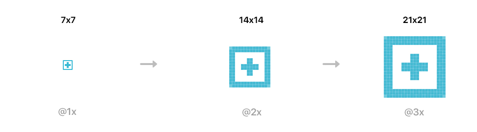
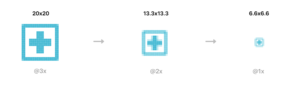
If you design at 2x or 3x instead, you’re more likely to run into problems when scaling your design up and down to support multiple screens. For example, when you design in 3x (or xxhdpi since 300% = xxhdpi = @3x as the Designers Guide to DPI image further below shows us), you would have to divide by three to get 1x resolution and 1.5 to get 2x resolution; such scaling can break the pixel grid and result in non-integer pixels, which will blur your designs. Designing in 3x and then scaling down.
Designing at the baseline resolution effectively restores the 1 point = 1 pixel paradigm that existed prior to 2010. By using 1x, you can easily convert from pixels to pts/dps. For example, 16 pixels in design-speak translate to 16 pts/dps in dev-speak. So 1x (or MDPI), 1 px = 1 pt (iOS) = 1 dp (Android).
Image inspiration source: Designer’s Guide to DPI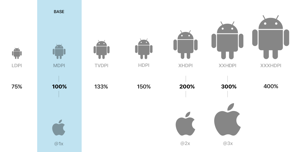
Benefits of Vector Graphics
Similar to the perks of designing in 1x, vector images are resolution independent. Even though vector images like SVGs (Scalable Vector Graphics) are not as good as pixel-based (bitmap) ones for complex images (e.g., images that contain color gradients, shading, and textures), they are infinitely scalable and will not become blurry at any size. So despite their shortcomings, they’re especially useful today, especially as minimalist design such as the flat design trend, become increasingly popular.
Tips and Tricks to Design with Your Resolution in Mind
“When you are designing for various display types, you should think in points, but design in pixels.” — Ivo Mynttinen, designer and developer.
As mentioned previously, a point for iOS or web is a resolution-independent form of measurement—one point can contain one or more pixels. As a result, the more pixels contained in a single point, the crisper the image becomes. (Note: the same concept applies to the Android equivalent, DPs.)
Photoshop
Standard artboard templates in Photoshop are 2x since the default dimensions for iPhone 6 are 750x1334 px when you first create an artboard-based PSD. To switch to 1x artboards, simply change the width to 375 pixels and the height to 667 pixels. Then, you can save this preset as “iPhone 6” for future reference (instead of using Photoshop’s default iPhone 6 template which is 2x). Even though the units are pixels, keep in mind that because you are designing in 1x, it is also 375x667 pts.
Sketch
In contrast, when you insert an artboard in Sketch and select iPhone 6, the dimensions are 375x667 px. This is because Sketch is naturally a vector-based design tool with a default resolution setting of 1x. In fact, Sketch recently came out with awesome new features to make designing for multiple devices even easier, namely the ability to build flexible layouts with the new Sketch 39 resizing tool. Peter Nowell, creator of Sketch Master, has a cheat sheet on how to make the most of this new feature.
Conclusion: A Scalable Solution
The bottom line is this: The key to achieve a scalable solution that will easily accommodate the increasing variety of display types is to aim for resolution independence. By designing in the baseline resolution and using vector graphics whenever possible, you are “future-proofing” your designs against any new display that may be released. In the words of Kurt Varner, designer @Dropbox: “1x is timeless.”