Iconfont libraries like FontAwesome and IcoMoon make icon delivery so much easier. With nothing more than a little bit of HTML code, we can insert scalable vector icons into our designs with ease, but there’s one issue that arises from this: we tend to overuse icons without realising their elusive negative impacts.
Lets discuss the negative effect on user experience as a result of overusing icons, or using them unnecessarily. This is when you should (and shouldn’t) use an icon.
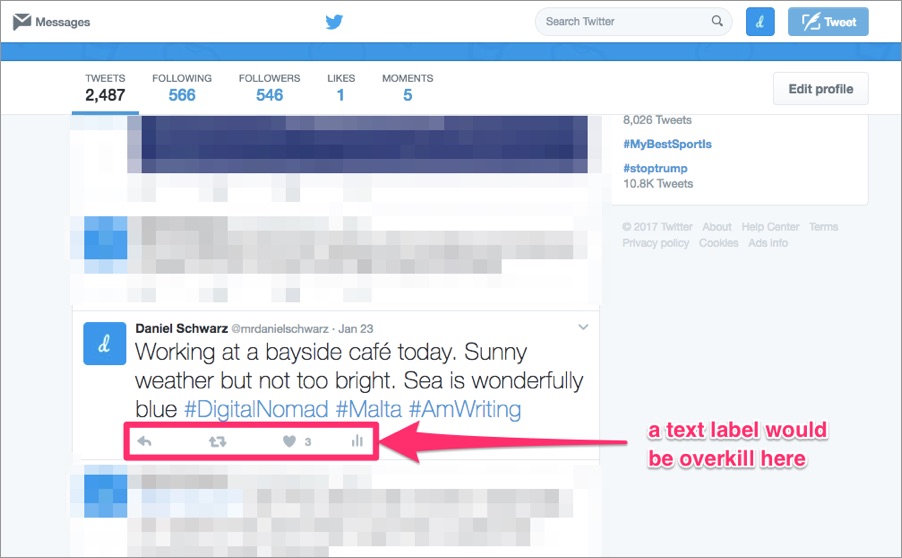
You Should: When Text Labels Are Overkill
Naturally, you should use an icon when you don’t have enough space for a text label, but this isn’t always the best reason to use an icon. First you should consider creating space in other ways; this might include simplifying the layout or removing unnecessary distractions (I covered some very useful tips on minimalism a couple of weeks ago).

You Shouldn’t: Simply "Because"
Finding vacant spaces in your design and looking for things to fill them with, is terrible design practise (although hugely tempting I must admit) — this applies to icons too. By using icons unnecessarily you’re creating more visual distractions…unnecessarily, and too many visual distractions make it harder for the user to scan through content for useful information.
You Should: to Establish Importance
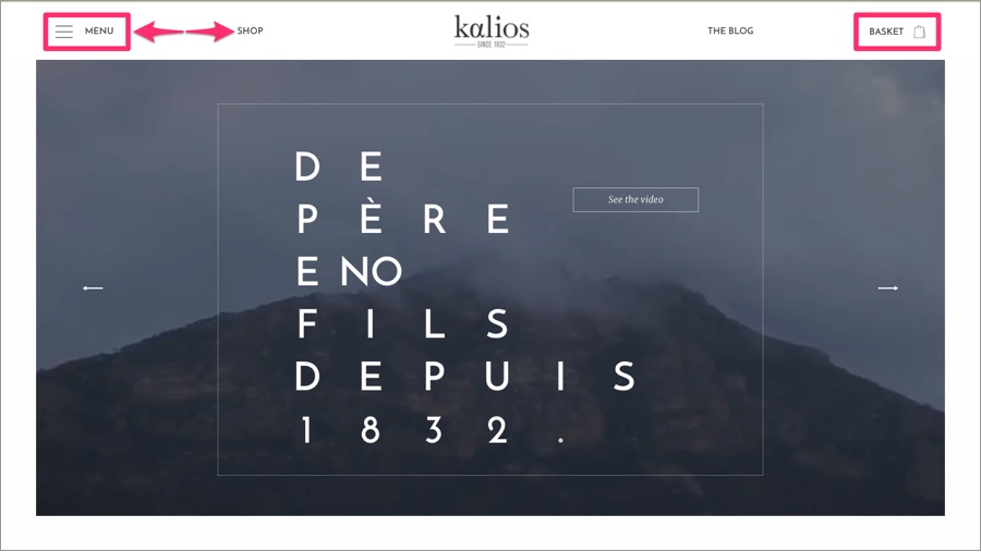
When you have a collection of links (like in a navbar or menubar), some of them will naturally be more important than others. We can establish importance by creating contrast; by floating links to the left or right, styling some of them as buttons, or, lastly, using an icon alongside the text label.
When you have multiple links in close quarters, the important links can be like a needle in a haystack. Lets take a “Login” link for example — for returning visitors this is likely to be the most important link (it would take priority over things like “Pricing”, “Tour”, “FAQ", etc). So then, this link would warrant an icon to make it stand out more, but it wouldn’t stand out if every other link also had an icon.

You Shouldn’t: When the Design is Crowded
People tend to notice imagery (which includes icons) before anything else, because we can eye-scan over them faster than we can text, however images rarely give us the information we need (which might be fine if we were reading an article about the top 10 things to do in Rome). When it comes to navigating an interface, users need clarity, so if your design is already pretty complex, using ambiguous icons can worsen that.
Also, as humans, we communicate via words. We respond to words. What’s clearer: a floppy disk icon or a “Save changes” button? Definitely the text label. Always calculate how busy your design is first before you decide to include icons.
Conclusion
Even though icons can certainly make a design look more visually appealing, visual appeal doesn’t necessarily equal optimal user experience. They can be very distracting, especially when it isn’t clear what an icon represents, so like any other aspect of design, use them with caution and minimise whenever you can.

