
A designers role is to carefully combine select shapes and colours, A/B test different layouts, fine-tune animations, and craft user flows with the intention of offering the visitor a terrific user experience. A marketers role is to tell a story, encourage engagement, and captivate the user emotionally.
What both of these roles have in common, is that both are aiming to make the user convert. This requires a mixture of UI and content, which leads to the conclusion that neither design nor content should come first. In fact, designers and marketers should be working together to design the initial wireframes of the design.
UX Strategy vs. Marketing Strategy
Designers tend to shy away from such collaboration for fear of encountering an awkward and undesirable conversation like this:
Designer: hey, our design is 100% finished!
Client: great, I’ll forward this to the team!
Marketer: oh, this doesn’t fit into our marketing strategy at all. We need a giant background image right above the fold!
Designer: that would require a complete redesign!
Marketer: but we need to sell our product, it’s a must!
Designer: okay, I’ll make some changes.
Marketer: we’ll need a “subscribe to our newsletter” modal that pops up after 7 seconds, as well.
Designer: this offers a very bad user experience — it’ll disrupt the user’s flow. It’ll make them click away.
Marketer: I don’t understand this tech-speak, let’s just make the changes. Oh, and make the CTA bigger.
In actuality, there are two very simple solutions to these two conundrums. Large headers can be compromised with — they don’t have to include heavy images, and they don’t have to be full-screen. Subscribe widgets don’t have to be modals — they can be as much effective in the sidebar or in the content footer.
But that’s beside the point. At this stage, the designer is supremely annoyed that changes are required to be made to what he or she thought was the finished design. At this stage, it’s highly unlikely that the designer will consider a redesign (at what is most likely their own expense), and so they will make the necessary changes (however unrecommended they are) to bring the project to an end.
It’s the customer that suffers, and ultimately, the client too.
Solution: Collaborate with the Marketing Team on Wireframes
A wireframe is a colourless mockup (with zero visual aesthetic) of the design that specifically focuses on layout and content. It’s the perfect time to debate marketing strategy versus user experience. While the marketing team explains their strategy for delivering their "message", building their brand, and directing the user towards a call-to-action (i.e. the customer journey), the designer can weigh-in on how that impacts the user experience. Most importantly, the designer is then able to make changes without wasting too much of their time.
3 Very-Common Conflicts Between Design and Content
-
Marketers love to use plenty of CTA’s, however, designers will tell you that too many CTA’s can come across as spammy, especially when used thoughtlessly.
-
Marketers love to “retain” the visitor by getting them to subscribe, like and follow, however, designers will tell you that constant badgering is a major turnoff, where the actual effect is the complete opposite of the desired effect.
-
Marketers love to use highly-attractive “big headers”, however, designers will tell you that this delays the user’s access to the actual content. Plus, users are very unlikely to convert after seeing only the above-the-fold content.
Designers can demonstrate better solutions to these marketing requirements, whereas marketers can explain to designers that user experience isn’t everything. There must be a balance, and that can only be achieved with via mutual respect for each other's expertise. There must be a balance.
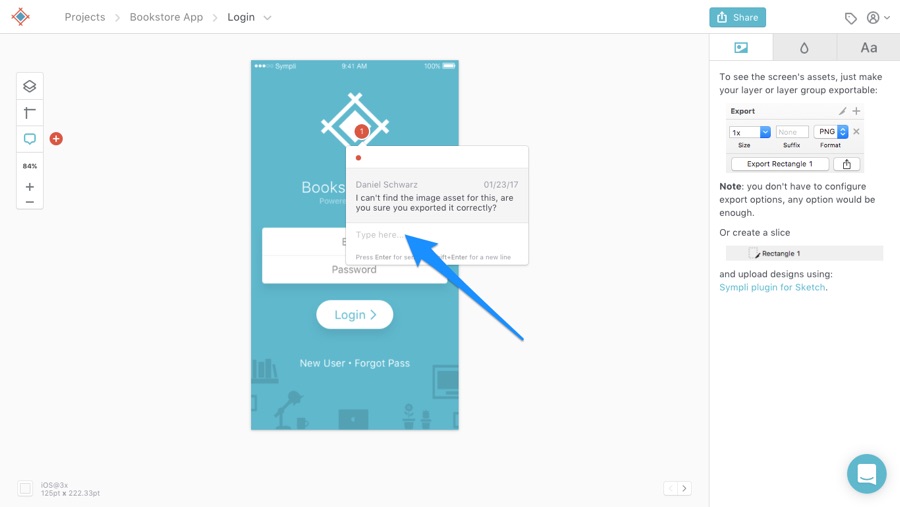
Collaborating Using Sympli Comments
Sympli is a super-easy way for designers to handoff design concepts (whether wireframes or finished mockups). It serves as a collaborative middle-man for virtually anybody to weigh-in with their feedback on a design, may they be from a marketing team or a development team. The trick is to handoff designs at regular intervals, giving all teams numerous chances to offer their expertise and unique perspective, reducing the likelihood of reaching an end result that nobody likes.
How it works:
- Designer shares the design using the Sympli Plugin for Sketch/Photoshop
- Non-designer teammates see the design in Sympli
- Non-designer teammates “pin” comments to artboards
- Designer responds to those comments, makes the required changes, uploads updated versions of the design, then requests feedback once more
- Developer implements the design by extracting the code and image assets that have been imported into Sympli
Conclusion
With careful collaboration, effective communication, and respect for each other’s knowledge, teams can design websites and apps that not only convert well, but offer a user experience that doesn’t “haggle” the visitor too much. There’s a fine sweet-spot when it comes to marketing versus user experience, and effective collaboration is required to find it.
I also firmly believe that the best designers are also writers. Even if the designer isn’t expected to write the actual content, it’s extremely beneficial (to the end result) when the designer understands the true value of content and a carefully articulated customer journey marketing. Educating yourself on the basics of marketing, writing, web development, or really, anything outside of your immediate expertise can be massively beneficial to you and your team.