

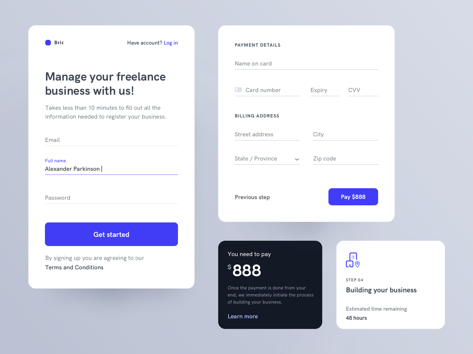
Forms can come in many shapes and sizes, they can be as short as one date picker or as long as a full paragraph input. But generally speaking they should all follow some basic rules.
Labels
Always use a label
Labels are the piece of text shown next to a form input that lets the user know what they are supposed to enter into the field. Though it may seem an obvious point it’s important to remember to always include a label when presenting users with any type of form element.
Don't use placeholders as the label
Simply having a placeholder isn’t enough, it’s also important that you put it in the right place. It may be tempting to show the label inside the input, in what is commonly called the ‘placeholder’ as this can save space and looks neater. However, if you show the input label in the input it will disappear when the user clicks into it removing any reminder they have of what they’re supposed to be entering in there.
Keep labels short
Labels should be short and descriptive. Helping users understand what info they need to input without requiring them to read a full sentence. This will also ensure a minimal, tidy design which is important especially in long forms which can be cluttered and overwhelming.
Show labels close to their input
Labels should be closer to the input they are for than any other input around them. If your label is too far away from your input it can be difficult for users to differentiate which label belongs to which input.
Use sentence case
Sentence case means you only capitalise the first letter of the first word of the sentence. Doing this improves the readability of your label is more than one word long and as forms are usually important you want to ensure there’s no misunderstanding here.
Input Styling
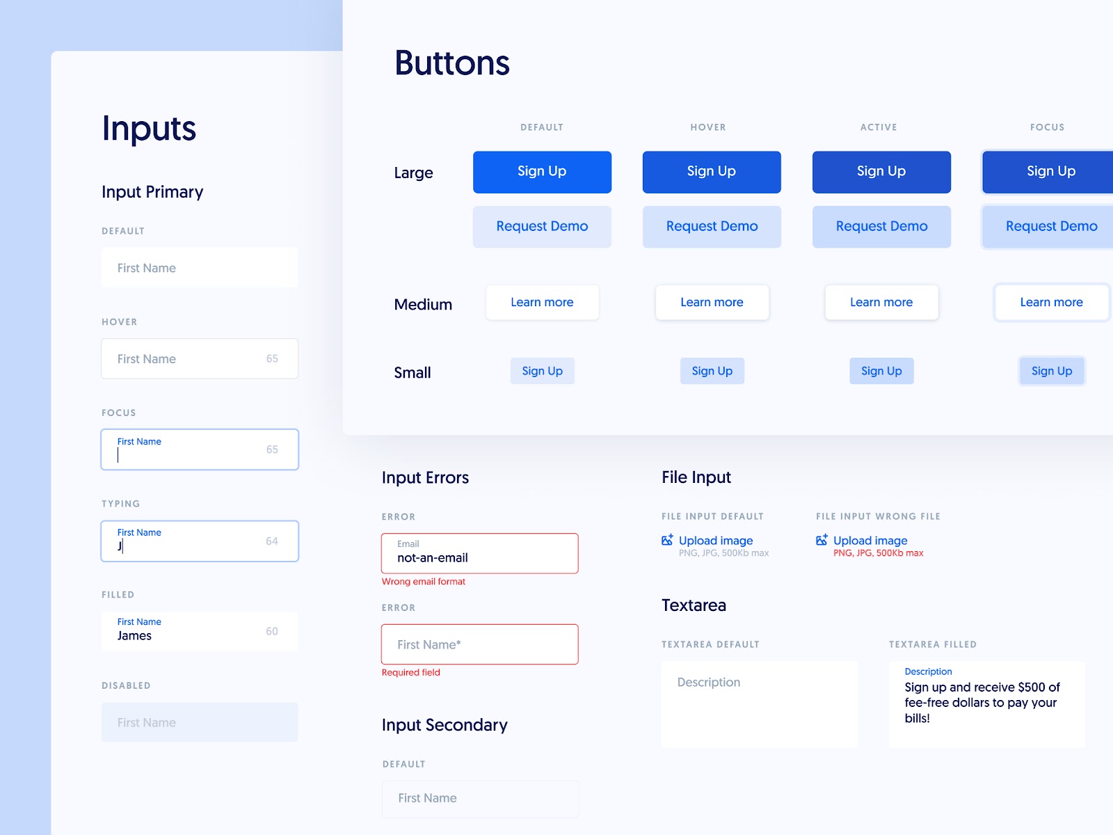
Make sure all states are covered
When creating styles for your form inputs you should think about every possible state they can be in. This includes not only error and confirmation states but also disabled, hover and focused states for screen readers. Each of these states should also go through an accessibility check to ensure they are readable to all users.
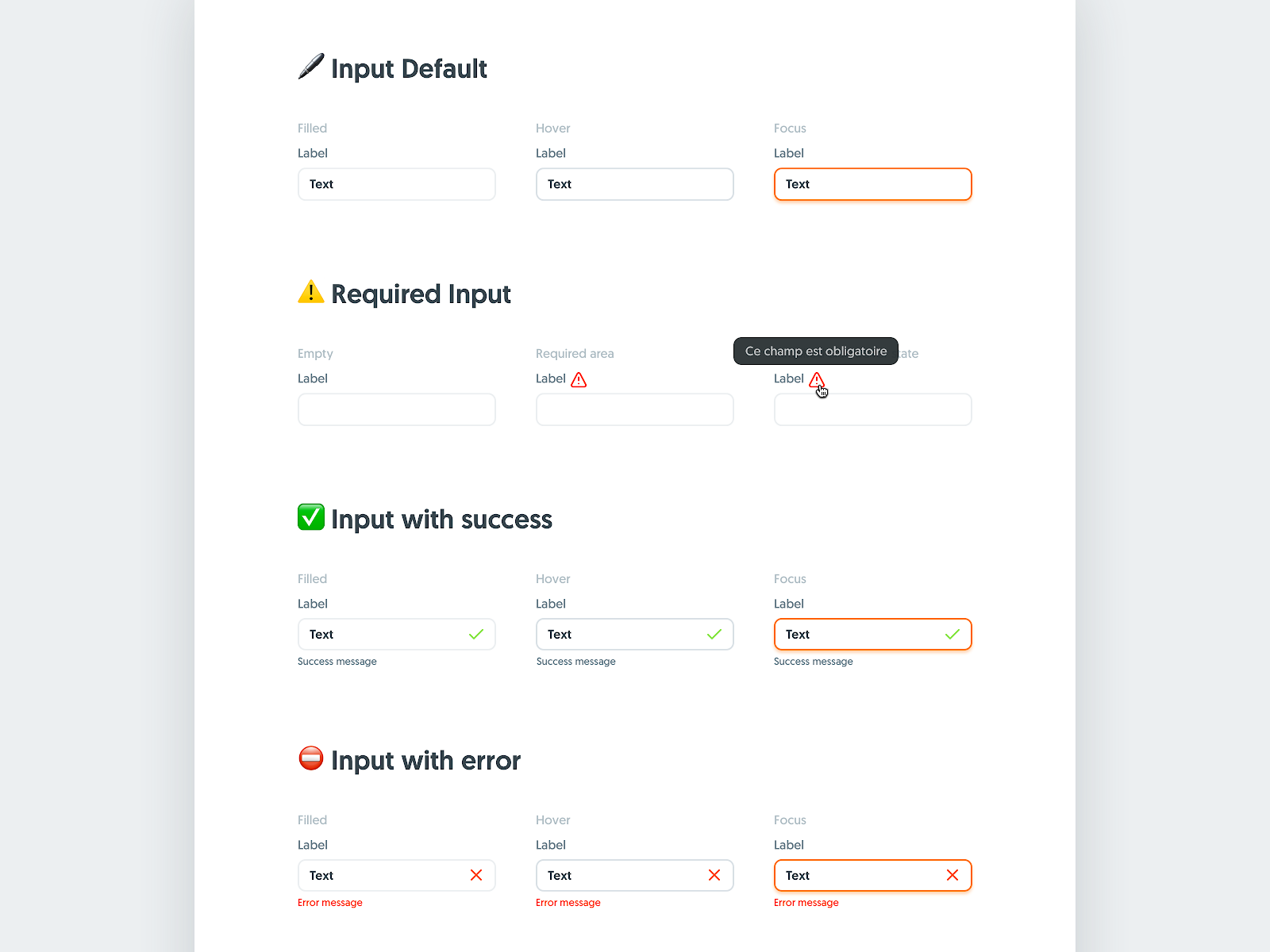
Show errors inline
When working on the styling for your error states you should keep them in line with the rest of the input. Showing a warning icon inside the input can help users quickly locate their mistakes and fix them. As well as this, if you can, provide context in what might have went wrong. For example, if it is a formatting error, let the user know with prompt text located close to the bottom of the input.
Match input size to the content
The length of an input should be matched to the length of the content expected to go into it. For example, an area/postcode is usually shorter than the first line of an address, adapting the size can help users quickly grasp what content should go where. And reduces the cognitive load of attempting to understand what goes into each input.
Show users their options
If you have a dropdown selector which has 6 or fewer items, you should display these to users either as radio buttons or checkboxes depending on if they are multi select or not. This reduces the number of clicks the user must take to complete your form which can be important, especially in long forms. The only exception to this is if you have limited space - such as in a modal.
Layout
Group related items together
This point is generally only important when it comes to longer forms, or forms that have distinctive sections. When you have a lot of inputs one thing you can do to improve the usability of the form is to group items that are related together and space them out from other sections either by using additional white space or dividing lines. For example, in a delivery field, you may group the name inputs together then the delivery address inputs and finally the billing inputs. This can help reduce the cognitive load on users by pre-grouping items into related sections.
Use a single column
Where possible use a single column layout as this has shown to help decrease errors when inputting information. There are some exceptions to this, for example displaying first and last name inputs side by side or day, month and year inputs for a birthday. It is especially important that inputs that are not related be shown in a single column and not double.
Stack radio inputs vertically
This is a second point but relates to using a single column layout. But if you have checkboxes or radio buttons in your form e.g. for terms or subscription inputs, these should be displayed vertically as well. This makes the list scannable and reduces the amount of reading users have to do.
Additional considerations
Buttons
Buttons play a significant role in form design, and although they aren’t part of the form itself they can make or break your design. If a user accidentally clicks cancel instead of saving they may lose their progress and might not come back to do it again. Ensuring you use a primary style for the main action you want users to take and a secondary style for the cancel or discard action can help reduce errors. You may also want to utilise colour theory here and make your cancel action red to convey a warning.
The button placement is also important in forms, generally speaking, users will be scanning down the left-hand side of the form inputs if they are aligned properly. Aligning your primary action to the left-hand side at the bottom of the form means that they won’t need to go looking for the button and can improve the overall UX of your form.
Progress indicators
If your form has more than one stage, you should add a progress indicator. If you know how many stages your form has you can let your user know what stage they are currently on and how many stages they have left to go. This can help reduce uncertainty and stop people from dropping off one stage before the last because they are unsure how many more inputs they have to fill out.
This can seem like a lot to remember but once you have created a few forms the rules will come as second nature.
Sympli is a Saas company that creates tools for design collaboration, handoff, and version control. With more than 5 years on the market, we had helped thousands of designers and developers work together by providing a single source of truth and reducing back-and-forth communications, resulting in faster delivery.