
Tables are one of the most fundamental components of design, almost every digital product has at least one data table in it somewhere and getting them even a little bit wrong can lead to some unpleasant usability problems. So knowing how to design tables well is an invaluable skill to have as a ux designer. Here are some top tips to help you design tables that work to help your users find the information they need.
Column Headers
Let’s start at the top. Literally. Column headers are the ‘title’ area of a column, they help users know what data is contained within that column and can be an area to house actions that can be taken on the column. You can do a few things to make sure this aspect of the table helps your users without getting in the way.
Sticky Column Headers
The first thing to consider is if your table is vertically scrollable. If it is then you should consider making the column headers within your table sticky. This means that when a user scrolls vertically down the page they are still able to reference the column header. This helps a user with context and with finding their way around the data in the table.
Column Header Actions
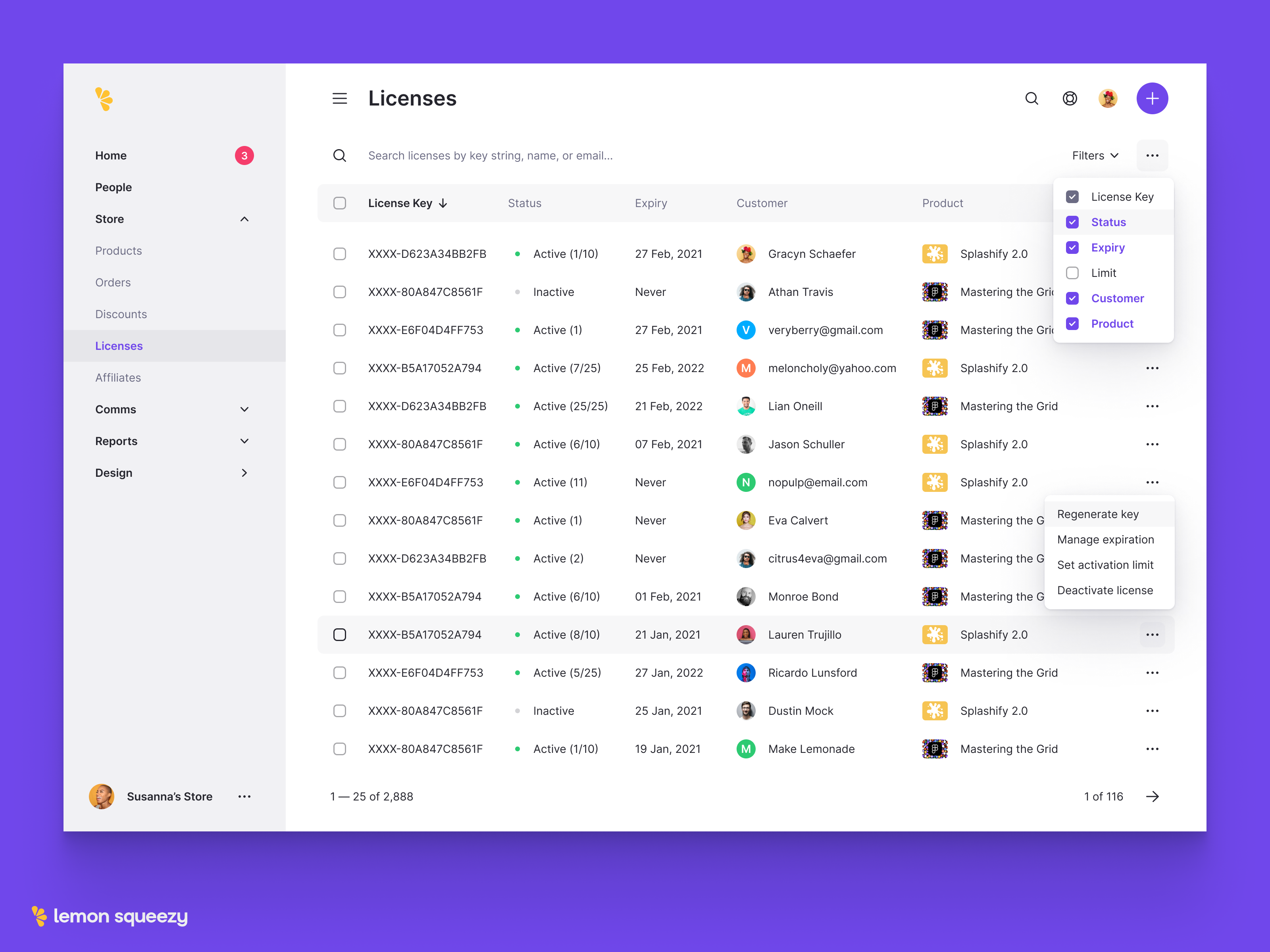
The two most common actions you will find in the column header are sorting and a way to reorder the columns. If a user can sort a column you will need to add a visual indicator, usually, this is an icon of two arrows pointing up and down. When clicked the table will likely need to re-load so you will need to consider a loading state for the table if you haven’t already.
The second most common action for column headers is the ability to grab the column and drag it to the left or right to move it to another area of the table. This action doesn’t always have a visual indicator, instead, you may want to use a change of mouse pointer (from an arrow to a grad hand) to indicate to your users that they can move the columns around. If you would like to add an icon you can add the dot grid icon which is most commonly used to indicate an area that can be ‘grabbed’ in an interface.
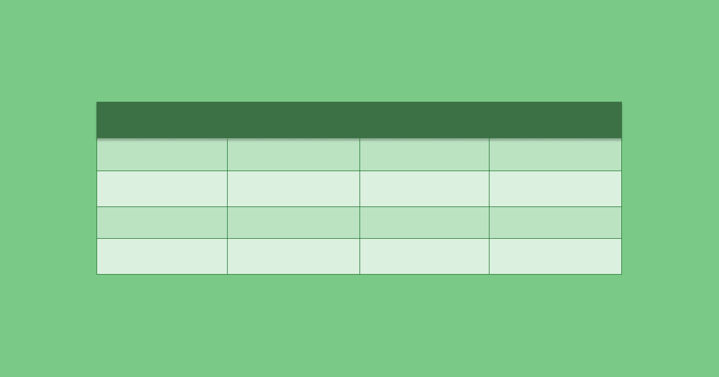
Table Rows
The rows within a table are where your data will be displayed, with each row being a new line item in the table.
Horizontal Scrolling
This can be surprisingly tricky to get right especially if you’re used to using a MacBook and not a Windows laptop. On MacBooks, you can use the trackpad or a Magic Mouse to scroll horizontally however, on a Windows machine (or for anyone that uses a standard mouse) there is no easy way to scroll horizontally without the use of a scrollbar.
This means you will need to factor in scrollbar location when creating your design. Usually, they are shown at the end of a table, but if your table goes off-screen your user will have to scroll to the bottom of the table to access the horizontal scrollbar, then scroll back up to view the data in the columns now visible – not good.
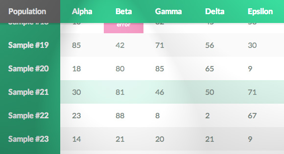
Sticky Columns
Though this interface element is technically about columns, its purpose is to help you browse row data easier. On most tables, the first piece of data is the most important, it could be a persons’ name in a list of users or the project name in a table of upcoming work.
Either way, this data point is usually referenced when checking the other pieces of data in that row. If you have a particularly wide table you might need to scroll horizontally (see above) but this means your users may lose context of what row they are looking at. Similar to a sticky column header, making that important first column sticky can help users orientate themselves within the table. What piece of data this columns holds could be uncovered with some basic user testing.
Table Actions
There are a few actions users can take on a table but there are a few fundamental things you should consider adding to allow your users to carry out their day to day tasks.
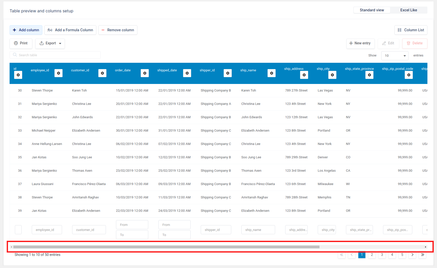
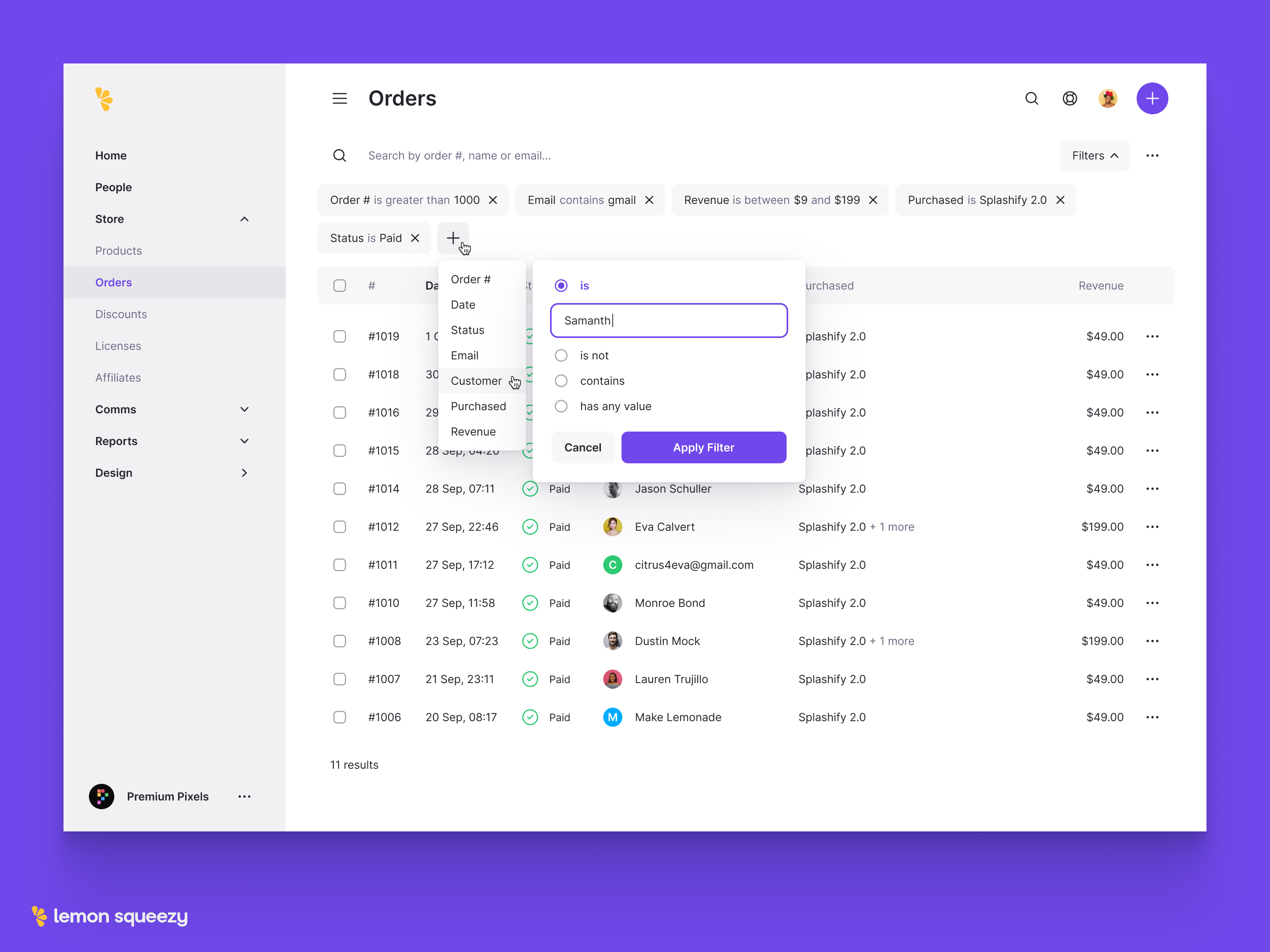
Filtering
Filtering is one of the most basic actions you can add to a table to improve the usability and find-ability of data. Depending on the number of filters you are providing to your users you can show them on top of the table or in a modal or drawer. To take it one step further you could allow users to save their selected filters for easy reapplied. This combined with column customisation (see ‘table customisation’ below) will drastically improve the usability of the design of your table.
Bulk Actions
Bulk actions in a table allow users to select multiple rows of data to update or delete them all at the same time. This action is very useful if you have a specific piece of data that is commonly updated at the same time., for example updating the status of a task or selecting and removing users from an account. Usually, in the form of a checkbox to the left of the first column, you can have the actual action buttons appear just above the table on the selection of one or more checkboxes.
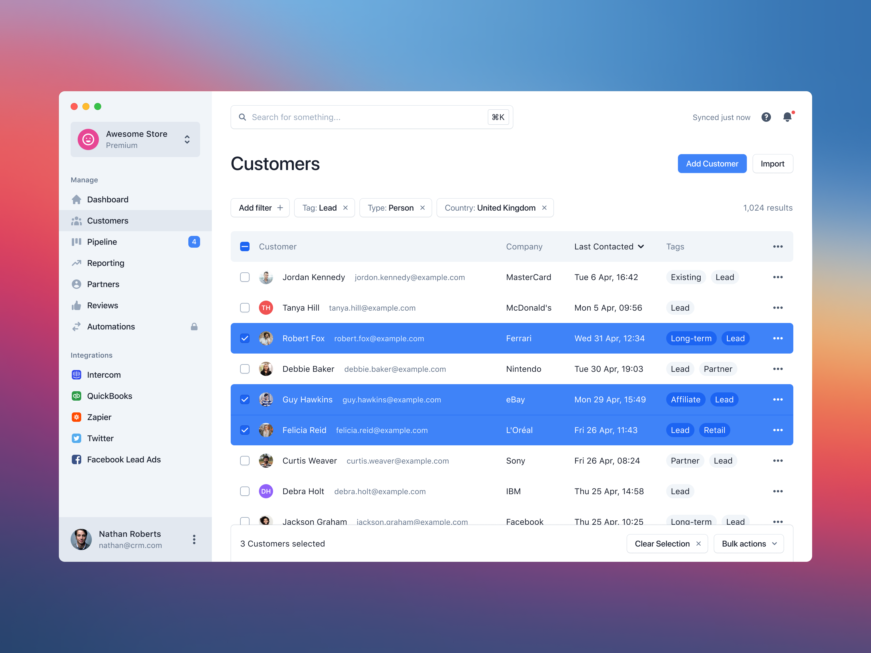
Table Customisation
There are a few different ways you can allow your users to customise the user experience of your table. Customisation can help not only improve the UX design of the table but also the performance.
Customisable Columns
In some cases, different users may only need specific data points from within your table. Instead of creating multiple tables to meet each user types needs, you can add the ability for users to turn on or off specific columns on their own table. By turning off specific columns they will improve their own experience by removing redundant data but it will reduce the time it takes to load the page due to having to fetch fewer data points.
Display Density
The table you are designing may end up with a wide variety of users viewing it. Some of which may be more advanced in their knowledge of the system, these people are sometimes referred to as power users. This user type may want to be able to view more information at once than novice or regular users. Having a way for users to choose a more dense table of information can help these power users find what they are looking for quickly.
Tables may seem easy at first glance however, they can be tricky to get right and involves a lot more components than you might think. Ensuring all your users can navigate around your table and find what they are looking for quickly is the most important aspect of this UI component.
Sympli is a Saas company that creates tools for design collaboration, handoff, and version control. With more than 5 years on the market, we had helped thousands of designers and developers work together by providing a single source of truth and reducing back-and-forth communications, resulting in faster delivery.