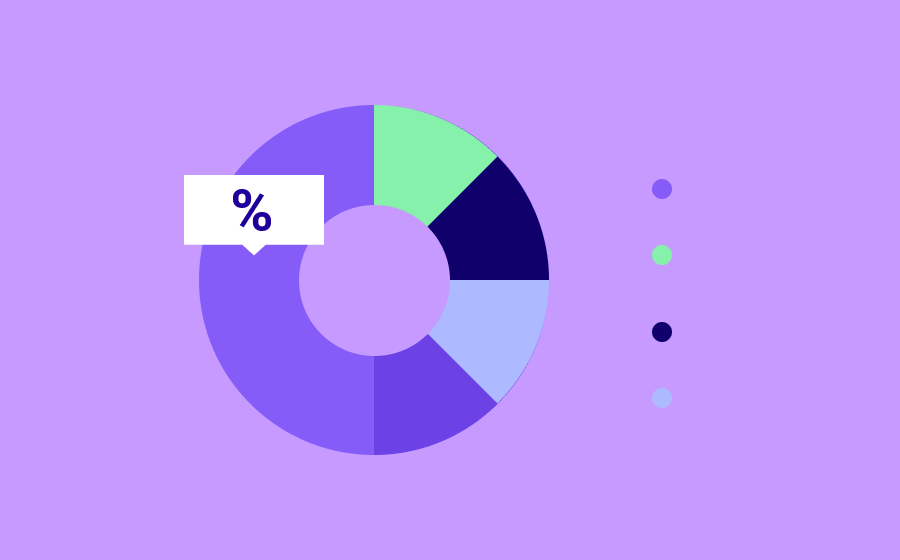
A dashboard or control panel is a tool that is used to quickly understand what is happening in a company, website or any context that involves data. It offers a graphical representation of the information and KPIs, speeding up the detection of possible problems and decision-making by the user.
For a dashboard to be really valuable and allow optimizing a strategy or taking action, we must carry out a preliminary investigation that provides us with information about the product, the context of use and the end-users who will interact with it. In short, everything you need to create a personalized dashboard adjusted to specific users objectives.
In this article we will see some aspects to consider when dealing with dashboard design. Focused on a small mobile user experience and taking into account important concepts of UX / UI design. For this context, I will design the dashboard of a bank that receives data from its customers transactions by debit and credit cards.
Defining the layout

Assuming that we already know the user-persona and the main objectives of the dashboard, the first important choice that a UI designer should face is diagramming or layout. This will help us understand the structure of the dashboard and not get lost along the way when more elements are added. For this case, we have the layout of the mobile version, which will be made up of a main chart followed by two smaller charts. The hierarchy that you see in the image will help the user to have a starting place and not be confused with all the information at the same time, without forgetting other benefits such as dynamism and visual rhythm.
Information and charts
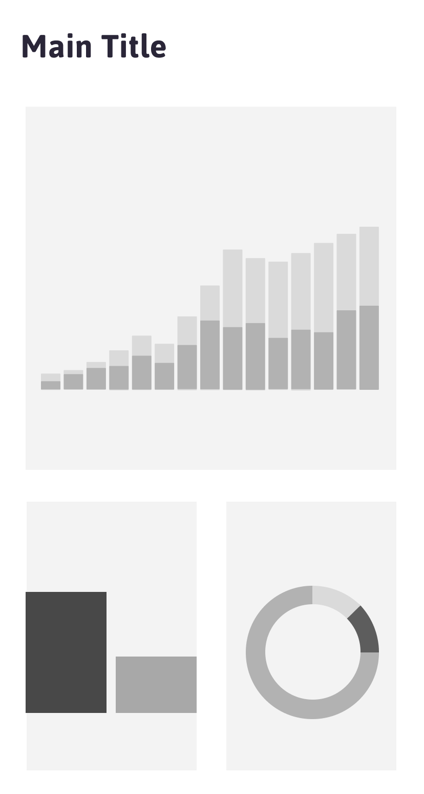
Another major challenge in dashboard design is strictly selecting only what matters. Due to the limited space and the large data that could be included, designers must show only the information that is relevant to the user and that which will help them make decisions or execute business actions. To synthesize this information, you must choose correctly what type of charts to use. The main ones are bars, pie, donut, lines, maps, bubbles, etc. In my case, I will use a comparative bar chart for the main chart, addressing a broad but relevant type of information about the business, such as the number of transactions per week, followed by other more specific bars such as the gender of the clients and their age. The type of chart that we will use will depend on the type of information that we want to include.
Keep the good contrast
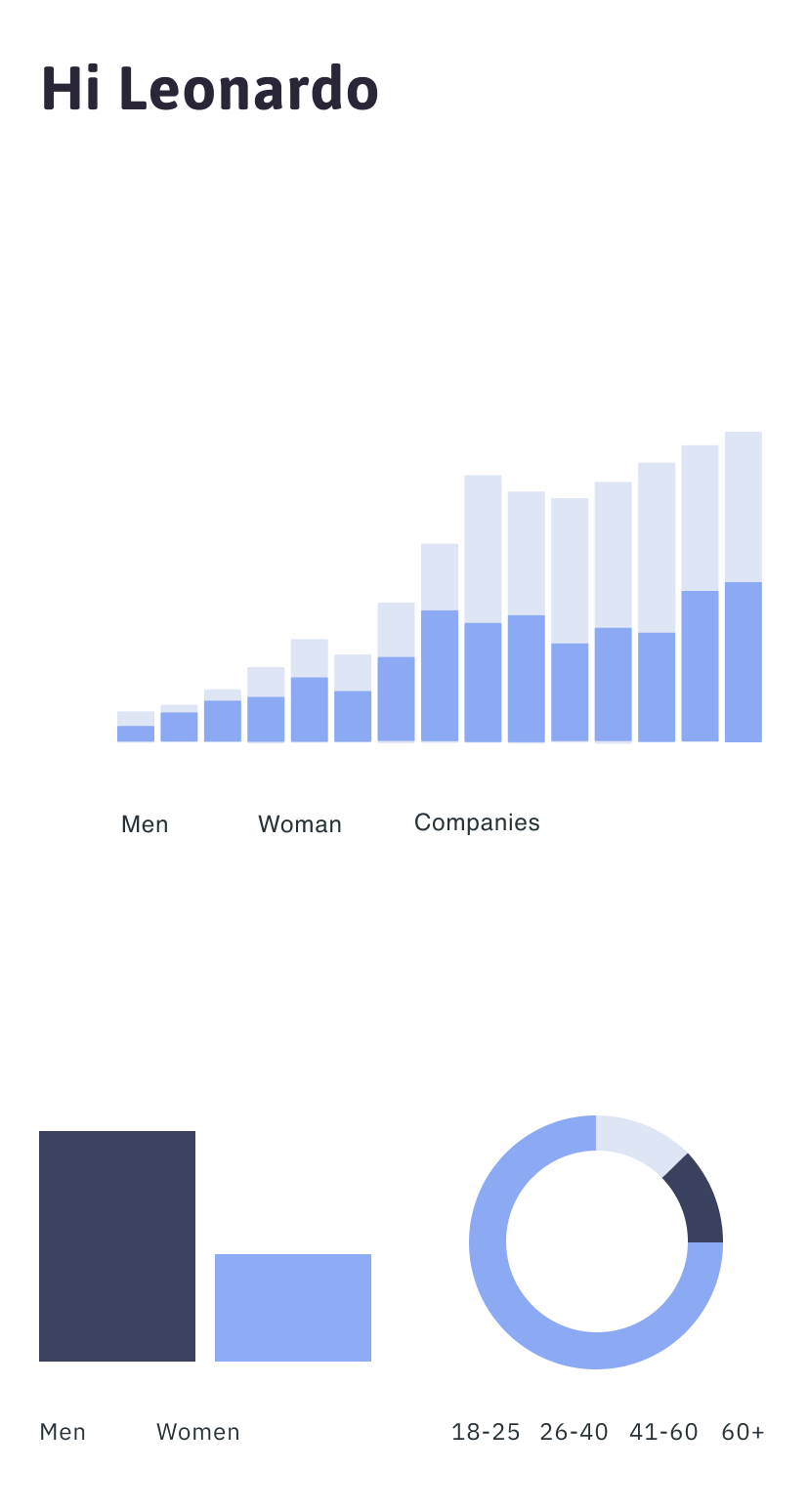
There is an infinite variety of palettes and colors that could be included in a simple dashboard, but in the end the only thing that matters is the readability and contrast of the data. The readability helps the user to easily and comfortably read the information displayed, separating the letters and graphics from the background. The correct contrast of the data implies having a clear separation between the data of the same chart. For example, the donut chart would be uncomfortable to read if the colors that make it up were very similar, forcing the user to spend a lot of time distinguishing them in their mind. Although this separation could be easier if we have several colors of the color wheel, it will also work in a short range of tones. In my case, I will stay in the blue colors, maintaining the minimum necessary contrast.
White space a visual journey
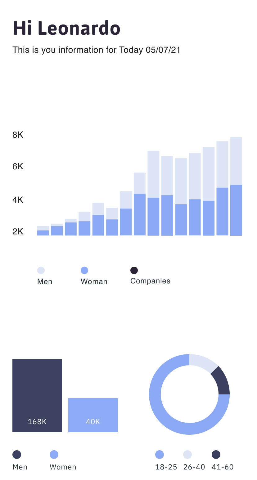
The negative space between the elements of a dashboard helps the view to separate the information into groups and assign degrees of importance to it, that is, the more negative space there is around an element is because it is more important. Correct spacing between the three charts must be respected, as well as the spacing of the elements within each chart, such as legends and bars. A common mistake that I have seen in dashboards of several products, is the fact of constantly crowding the information, making it difficult to read and being inconsistent with other spacing. In this step I included other elements such as the legend colors and the value axis label of the first chart.
Importance of the pixels
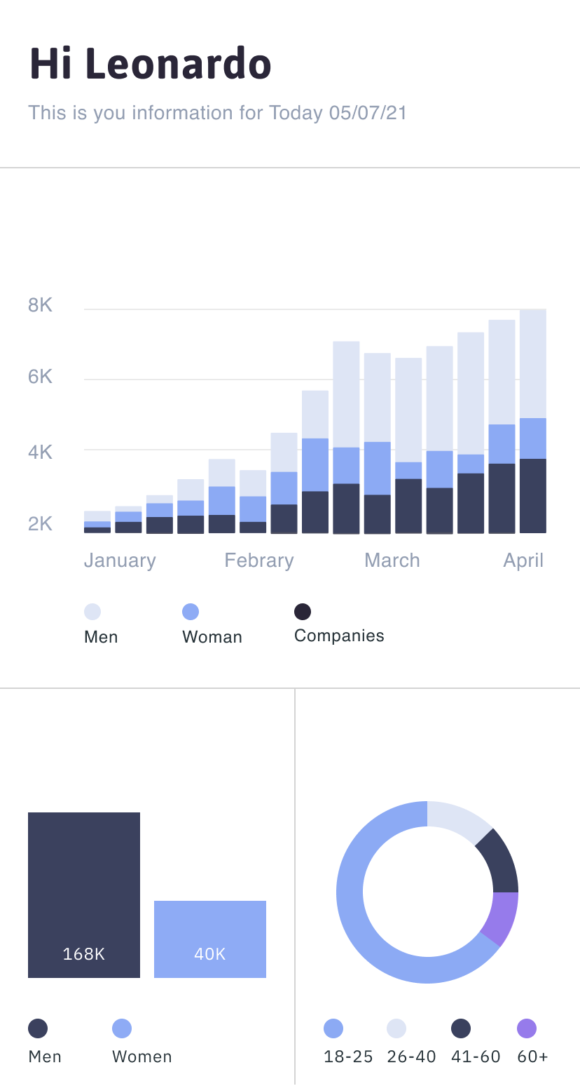
Another reason why spacing is important is to give more importance to the elements that we are including. In a dashboard, each pixel must have a purpose for the user and their objectives, so it is important to be clear about the function of each element and eliminate the unnecessary or decorative. Less is more, and each space in an interface must take care of the amount of pixels with information that it includes. To maintain the distribution of my layout and that the user can easily recognize the height of the bars, I have added separation and reference lines, also included a new color on the donut chart.
Avoid realistic representations
As a trend of the 90s, many dashboards strived to have a similarity with real measurement tools, adding shadows, lights, colors, gradients, textures and volumetry that do not really add anything to the understanding of the metrics. Although this cannot be totally unlinked, we must eliminate any style that does not contribute to the design and on the other hand, use minimalism as a tool to improve the experience and the data visualization criteria.
Left to right importance
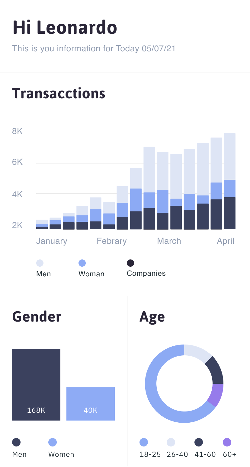
In this screen I placed the titles to each chart, which must be kept in the same style of size, color, etc. to maintain consistency. Consistency between elements is important to make it easier for the user to remember contexts and navigate between different types of information without thinking too much. With the progressive use of the interface, it will be possible to associate that the chart title will always be in the upper left corner. Another important aspect that we must remember is the fact that users (or at least the majority) read from left to right, so the important primary information on the chart must maintain this order, and keeping the second or third hierarchy information in the right.
Use tooltips and micro-interactions
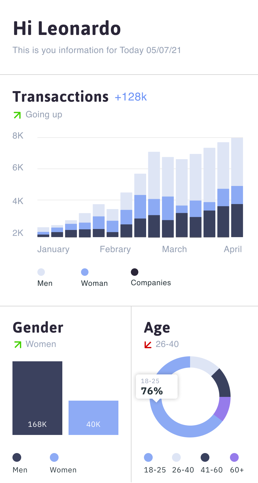
One of the constant problems that dashboard design has is the excess of information, in order to manage these extra data and not overload the screen, tooltips can be used, which are displayed in a hover state or when the user tabs on them. On this screen I added an information tooltip for the donut chart. Usually this involves a micro-interaction and that certain elements move or animate minimally.
Allow customization
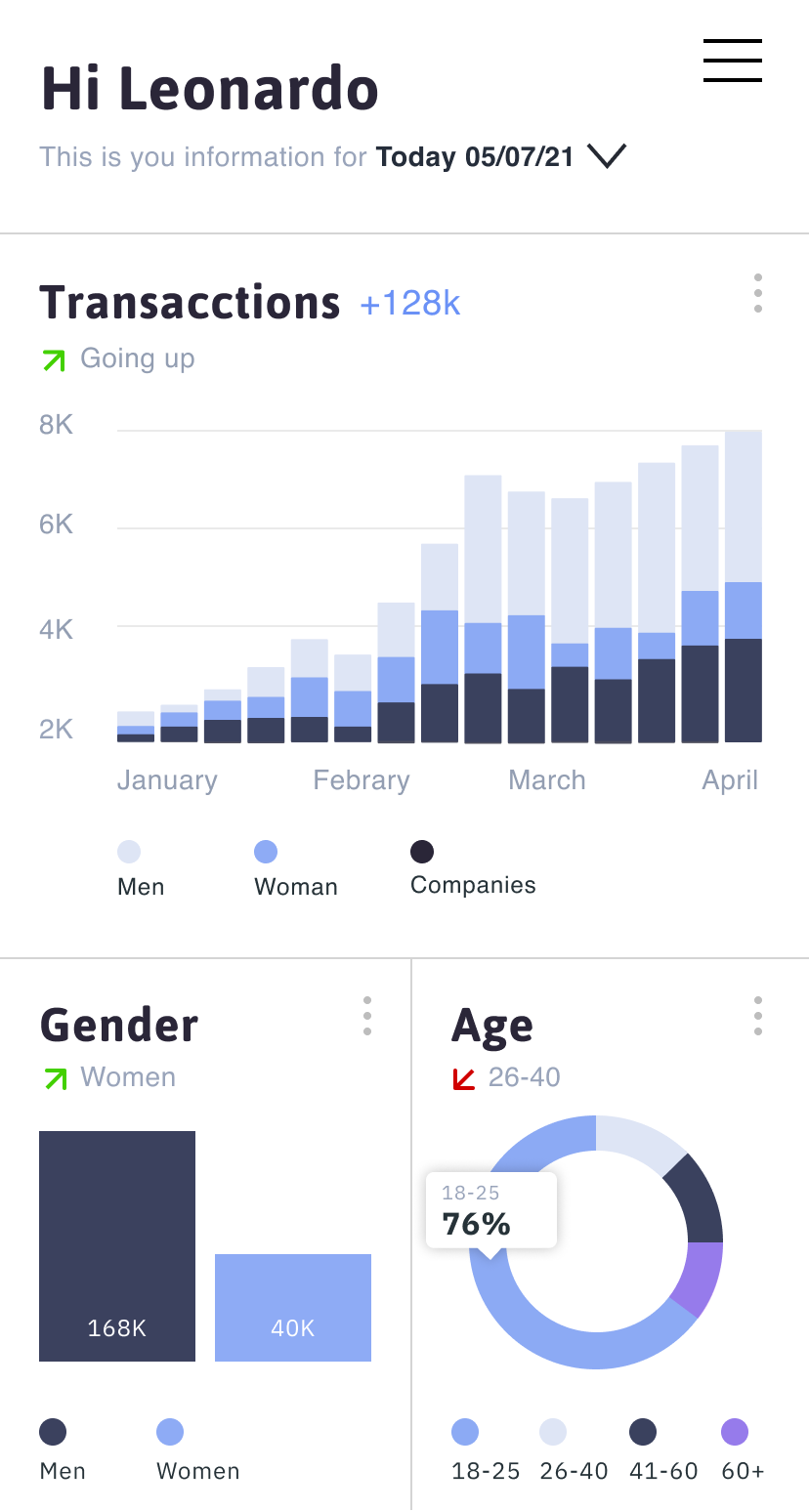
Allowing the user to customize the way the data and the dashboard is presented is another way to create a good experience. In this last screen add the three gray dots in the upper right corner of each chart, to display a floating submenu with customization options, such as going from a line graph to a bar graph, downloading the graph or even rearranging the order from the charts. Last but not least, the option of changing the time range of the dashboard on the header.
Final thoughts
In summary, to design a dashboard that works, attractive and efficient for users, we must prioritize efforts in those aspects that go beyond aesthetics. The success of a dashboard design should be evaluated based on the ability of users to identify and understand the numbers, indicators and patterns linked to the data they represent. So working on the user experience and a quality UI design are two relevant elements in the process of creating a great dashboard.
Thanks for reading!
Sympli is a Saas company that creates tools for design collaboration, handoff, and version control. With more than 5 years on the market, we had helped thousands of designers and developers work together by providing a single source of truth and reducing back-and-forth communications, resulting in faster delivery.

