
In this three-part miniseries we’ll take an objective look at real-world establishments with documented, but constantly overlooked, UX flaws (by documented I mean customers complaining on social media, of course!). We’ll explore ways to combat these UX flaws with epic solutions, all the while seeing how these flaws and solutions can translate to UX design for screens (web and mobile). In this article we’ll start with fast-food chains!
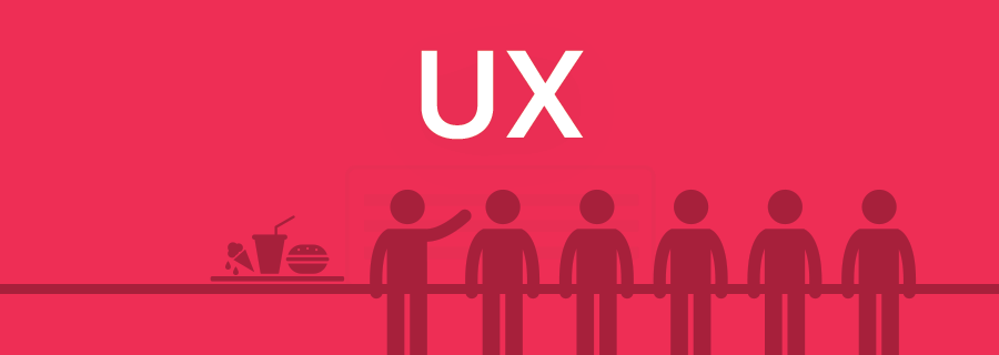
People Refuse to Queue Properly
It’s said that only the British know how to queue properly, but if you believe that then you’ve obviously never been to a fast-food restaurant in the UK. Fast-food chains are notorious for enforcing absolutely no queueing etiquette whatsoever.
Many food-fast restaurant layouts are poorly designed, where even though there are multiple servers, there isn’t room for multiple queues; some customers consolidate into a single line that forms through the more-roomy middle aisle; some dive into the shorter queues if they can, sometimes even leaving the longer queue to do so, even if there were plenty of other customers in front. Is this even allowed? Yes. Is it fair? No.
It happens because restaurants prioritise number of seats over UX.
Obviously websites don’t have queues, but that’s not the lesson here. When you overcrowd your design (lets take the overuse of display ads as an example), you’re putting monetisation first and your customer second. Don’t build content around advertising, and make the user the ultimate priority.
Tip: use Sympli early-on to handoff multiple layout variations. It’s important to gather feedback from a variety of perspectives - development, marketing, branding, and so on. All of these things are important, but as a designer, you might be looking at it only from a design perspective.
Fast-Food Menus Are Disorganised
When a restaurant serves foods both singularly and as combo meals, as well as a range of limited edition and saver items, it’s important to have a menu that makes visual sense. Customers don’t want to spend 5 minutes deciding on a meal only to be told that “[meal] only comes with [item1] or [item2], unless you buy [item3] in which case [item4] is free.” Keep it simple!
Combo meals should be like step forms; that is, longer forms (credit card applications, filing taxes, et cetera) that are broken down into steps. Because of smaller screens, mobile apps sometimes do this to offer a better user experience, however an even better solution is to remove redundant form fields.
Both menus and forms can improve UX using the same tricks:
- Summarise with headings and labels
- Split into steps (choose burger, side, drink, then size)
- Remove unnecessary steps or visual distractions
- Help the user make decisions by offering fewer options
Your Ice-Cream Melts
People don’t like queuing up, let alone queuing twice, but the only other option is to serve customers their ice-cream with their meal, in which case it melts. It’s a seemingly lose-lose situation. A better solution would be to have a dedicated counter for collecting your ice-cream after your meal, so that you receive fresh one in return for your proof of purchase receipt. It’s such a simple solution, but sadly many companies will sacrifice UX if it means they can pay fewer salaries.
Creating personalised experiences makes the user feel special.
- Call the user by their name, if you can
- When recommending content/items for sale, learn what they like
- Don’t use a catch-all support email, connect the user with the right person so that they can receive help quicker
Conclusion
Did you find the UX tips in this article helpful? If so, come back on Wednesday to continue our week-long miniseries on real-world UX horrors, where we’ll talk about…supermarkets!