Growth is literally inevitable in design teams. Your workflow evolves. Your team expands. Each and every individual design becomes more elaborate as your team draws closer to the finish line, and with that comes more feedback, more collaboration, and ultimately, more comments (many, many more comments!).
This is why we’ve improved our commenting feature to include a “Review” tab, which lists all of the comments on an individual screen in a centralised location, to save you from the hassle of having to click and reveal each comment.
Where can I find this comment overview?
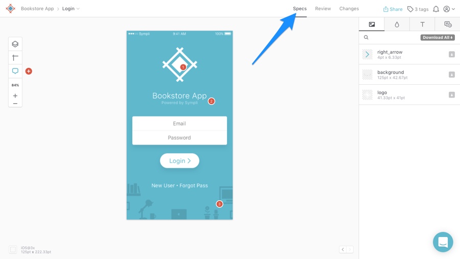
When you click on an individual screen in a project, you’re automatically sent to the spec interface by default. This is the interface that you’ve been familiar with all this time; where developers can inspect the design, generate the code samples, and extract the design assets. This interface is labelled as “Specs” in a new menu that now appears in the top navigation, as shown below.

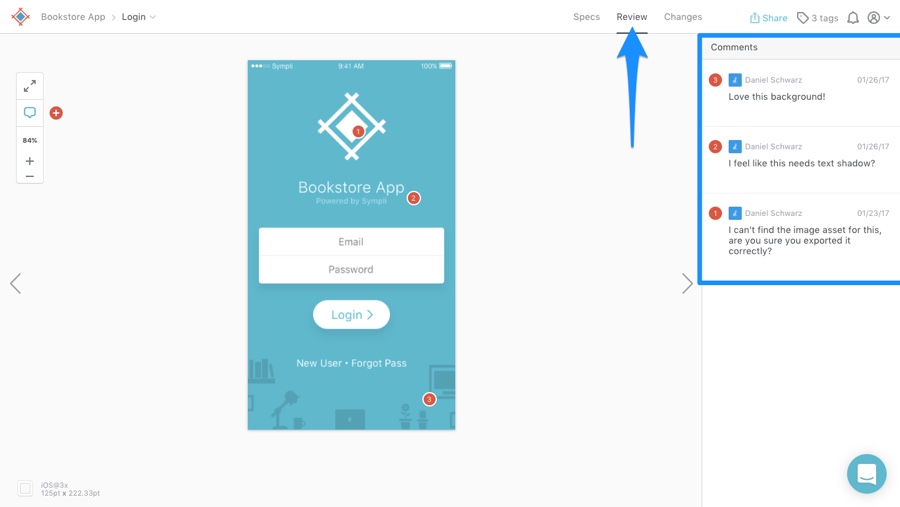
Next to “Specs”, in the menu, you’ll see the “Review” tab. In this tab, all comments related to the currently selected screen will be listed in the sidebar on the right, alongside the screen on the left. This is where you'll find all of the comments that require your attention (questions to answer, design flaws to fix, feedback to take on board, compliments from your teammates to make you smile).

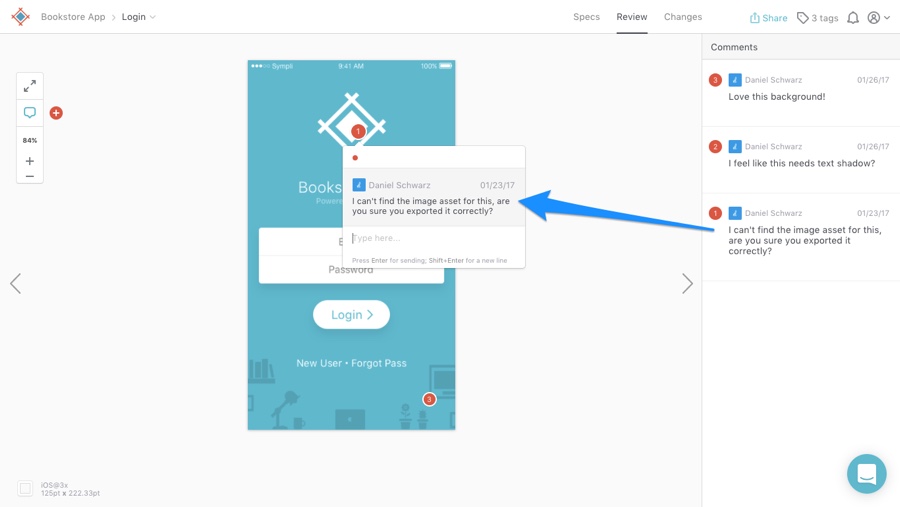
Comments have always been contextual in Sympli. Each comment has a number and is represented by a coloured spot (red by default) on the screen, situated in the region/near the element that the comment relates to. Instead of clicking on each spot to reveal the comment, you can now browse comments in the comment review sidebar. If you need to see which region the comment relates to/refers to, simply click on it in the sidebar and it’ll reveal itself on the app screen!

Where’s the visual diff tool gone?
Don't worry, it hasn’t gone anywhere!
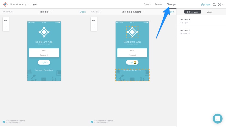
When we replaced the “Browse changes” button with this new menu, we added a "Changes" tab - this takes you to the visual diff tool. If you’re not familiar, you can learn about the visual diff tool here. In short, it helps developers understand what changed in a design by comparing two versions of the same screen side-by-side.

Are you finding that the new review feature speeds up your team's feedback workflow? Give us a shout out on Twitter and let us know what you think, and if you’re not already a Sympli user, sign up here to try it out with a free project!


