

Ah, the hamburger menu ? an icon of three stacked lines (two buns and the meat in the middle) used to represent a menu. Clicking on the icon reveals a navigation of some kind; it can animate in as a modal, slide-in off the canvas, whatever; the rule is that the navigation has to be hidden at first.
An off-canvas navigation combined with the hamburger icon does free up valuable screen real estate, especially on mobile sites and apps, but is it always the best choice? You'd think so, considering its popularity, but no. It's often used without thought, and there's usually a better way to handle navigation.
Here are the alternatives (and when you should use them)!
Old-School Navigation
On desktop websites there's rarely a need for a hamburger icon. You should only use it if your website has excessive content and it needs breaking up, but even then you should still include the most important links in a more accessible menu. Why? Because the main issue with off-canvas navigations is that the hamburger icon raises a wall between where the user is, and where the user wants to go, and you should only do this if really necessary.
Users are lazy, so don't hide valuable content unnecessarily!
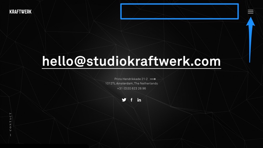
Should You Still Use the Hamburger Icon on Mobile Sites?
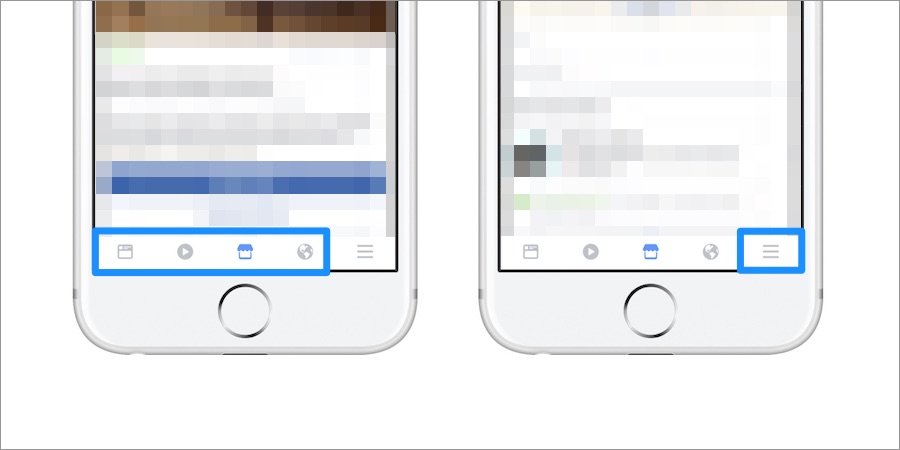
It depends. If you've hidden less-important or not-applicable-to-mobile links and the mobile layout still looks overcrowded, then it's more acceptable to use an off-canvas navigation in these cases. However, a common mistake is to have it replace the logo at the top of the webpage, where in fact, on mobile websites, navigational elements should be located towards the bottom where they're more accessible to users' thumbs.
In short: include common links where the thumb can access them comfortably, and then use the hamburger icon/off-canvas navigation for less important menu items.
Tip: using fixed headers (with hamburger or not) is a terrific way of keeping the navigation always-visible. Just condense the height after the user scrolls so it's less intrusive!
Single-Page Navigation
People love to scroll, because they're lazy and clicking is too much effort. Sounds crazy but it's true! Not every webpage works as a scroll-centric webpage though, but some (like feeds and landings) do. That being said, if the user knows exactly what section they want to read, a clickable nav is still recommended.
Never rely on scrolling as a sole method of navigation!
Does It Have to be a Typical Navigation?
No, it can be contextual to the situation. If you're breaking up content with scroll snapping, you can have a minimalist click-based navigation at the side. Infinite scroll works very well too (some might disagree with this, but when done right it can).
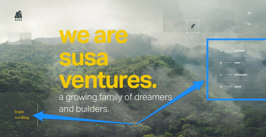
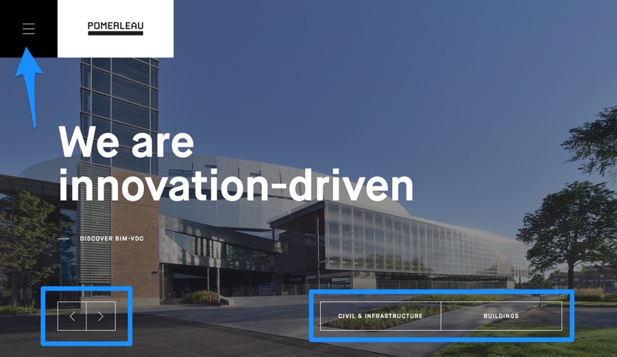
If you're using a slideshow concept you can use left and right buttons, or even your typical horizontal/vertical menu somewhere more central to the webpage, and then once again save your hamburger icon and off-canvas menu for the mobile site, or use a combination of navs/menus if your website does have the space.
It's difficult to say exactly what route to take because that really depends on the type of content your website is offering and how the user needs to interact with it. The best apps (Airbnb and InVision App are brilliant examples) constantly A/B test different variations to see which design converts better.
Conclusion
I wouldn't say that you should never follow trends, because with certain demographics (usually younger demographics), modern concepts can add to the overall appeal, however visual aesthetics never trumps user experience. Following trends is fine if you have real evidence that the trend benefits the user.
And the hamburger menu is no exception!