Solving UX flaws is actually super-easy if you break the design process down into simpler steps. The #1 way to screw up UX is to assume that your first amazing idea is the best idea, and then design it to completion without considering any alternative solutions, or asking your teammates for feedback at certain intervals.
”But won’t that take longer?
Well of course it will, nobody ever said that design was easy! But that being said, it actually requires a lot more time to fix a broken user experience than it does to craft it from scratch. Here’s how you can solve any UX problem in 3 easy steps.
Step 1: Iterate
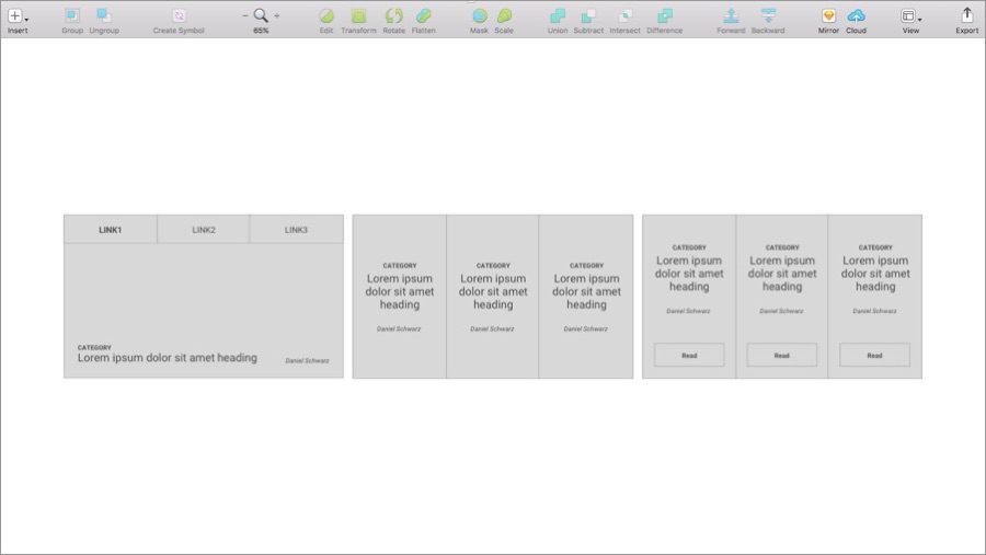
Start by rapidly mocking up 2-3 low-fidelity ideas. In the example below I’ve come up with a few card-based layouts to show how a user could be introduced to the 3 top articles on my blog; these lo-fi mockups took no longer than 10 minutes, and with each iteration I identified a key flaw in the user experience.
With the first variation, the tabbed browsing creates an unnecessary additional step for the user. With the second, I removed that blockage, however it’s not 100% clear how the user moves forward because there’s no call-to-action. In the third and final variation, I’ve added that CTA and I’ve come to the conclusion that this may be the best design to continue with.
Now would be a terrific time to validate this conclusion by asking teammates for feedback. Feedback should never be a step in your workflow, feedback is a continuous effort throughout.

Step 2: Develop
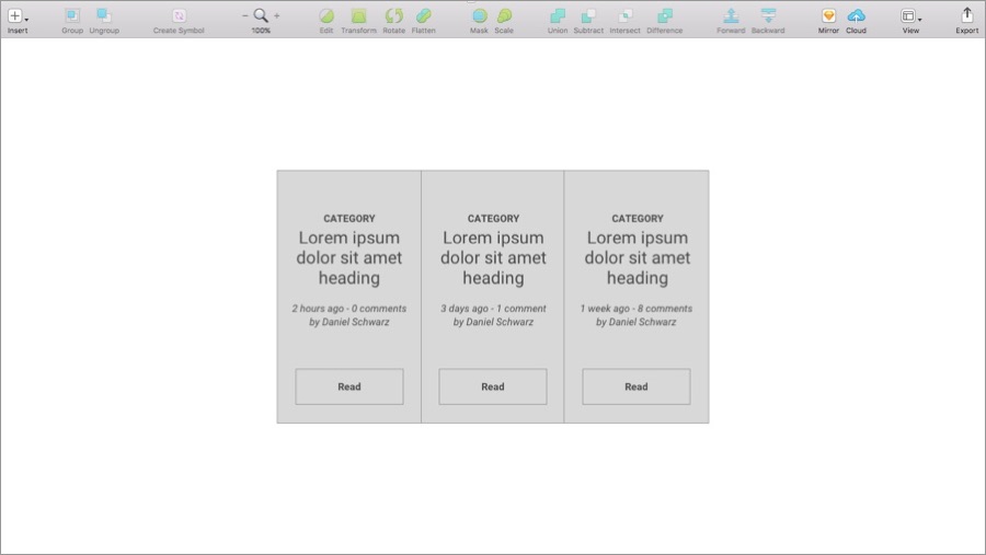
So we’ve chosen our concept — now we need to develop it a little more (and you could even create alternative variations of the chosen concept, depending on the complexity of what you’re designing). What other information could we include? What might be useful to the user? In my case, number of comments? Publish date? Lets expand on the concept and try to add more value.

And when you’re done, request feedback again (it’s so much easier to to receive feedback from your teammates as you go along, than it is to receive feedback on an entire version!).
Step 3: Minimise
Believe it or not, there is such thing as displaying too much information. In this final step you should attempt to minimise your design and summarise your content to contain only the necessary information. When the users’ brain has to process too many things, this is called information overload, and it makes the user grow tired of looking at your interface. We need to offer enough information for the user to move forward, but not so much that it distracts the user from doing so.
Our brains can only digest so much information before we’ve had enough — make sure that it’s the right information.

Conclusion
So there you have it, 3 easy steps for solving UX. First you widen your scope and mockup various ideas (even if they’re terrible ideas; terrible ideas are useful too!), then you narrow your scope and explore your best idea further, and then finally you minimise your best idea and uncomplicated it as much as you can, all the while using feedback to validate your conclusions.
Iterate, develop, minimise.


