We all know how valuable user testing can be for improving UX. It's an important step in any lean workflow, where the aim is to collect feedback at regular intervals in order to drive the next iteration. It also means that our design has a direction, and we're not aimlessly wondering from idea to idea. Our designs will always be better when informed by feedback.
But, that doesn't mean that your users should receive a broken or incomplete MVP (Minimum Viable Product) to look at, whether that's a dynamic prototype or a static mockup. If the user becomes so frustrated that they're unable (or unwilling) to carry on with the user test, then you're not going to receive much feedback. So what can we do?
Well, you can run usability tests on yourself with Sketch Mirror.
What's Sketch Mirror?
Sketch Mirror is an iOS companion for Sketch, which allows you to mirror your design on your iOS device (it works on iPod, iPad and iPhone). It's important to remember that you're not always designing for mice and TrackPads; sometimes (a lot of the time, actually), you're designing for thumbs. Mobile conversions are often a lot lower than desktop conversions, simply because certain actions are harder to accomplish on mobile, which means that this is where the most care has to be taken. Sketch Mirror helps us test UX on those mobile devices.
What Pitfalls Can We Avoid by Testing?
Issues like broken functionality obviously won't show up in a static mockup (that kind of usability testing comes later), but any issues related to visual design, and to an extent, user flows, can be identified with Sketch Mirror. Here's a few examples of issues that you can detect using Sketch Mirror, that you wouldn't ordinarily be able to detect from your desktop:
- Any issues relating to visual design and navigation
- Distance from tap targets to thumbs are too far apart
- Size of tap targets are too small (fat fingers)
- Colors and visual hierarchy are too confusing
- Some elements don't need to appear on mobile
- Some features should take advantage of native functionality
- Content is too hard to read on mobile (legibility/readability)
Et cetera, et cetera…
Downloading Sketch Mirror
First, make sure that you have Sketch Mirror installed on your iOS device (it's 100% free, forever), and that you have the app open. It generally has favourable reviews, where the negative ones mostly relate to color fading on iOS and issues with Wi-FI connectivity.
Activating Sketch Mirror
Like I said, make sure that Sketch Mirror is open when you try to connect. Also ensure that both your desktop and mobile device are on the same Wi-Fi network (this is where a lot of the issues relating to connectivity occur).
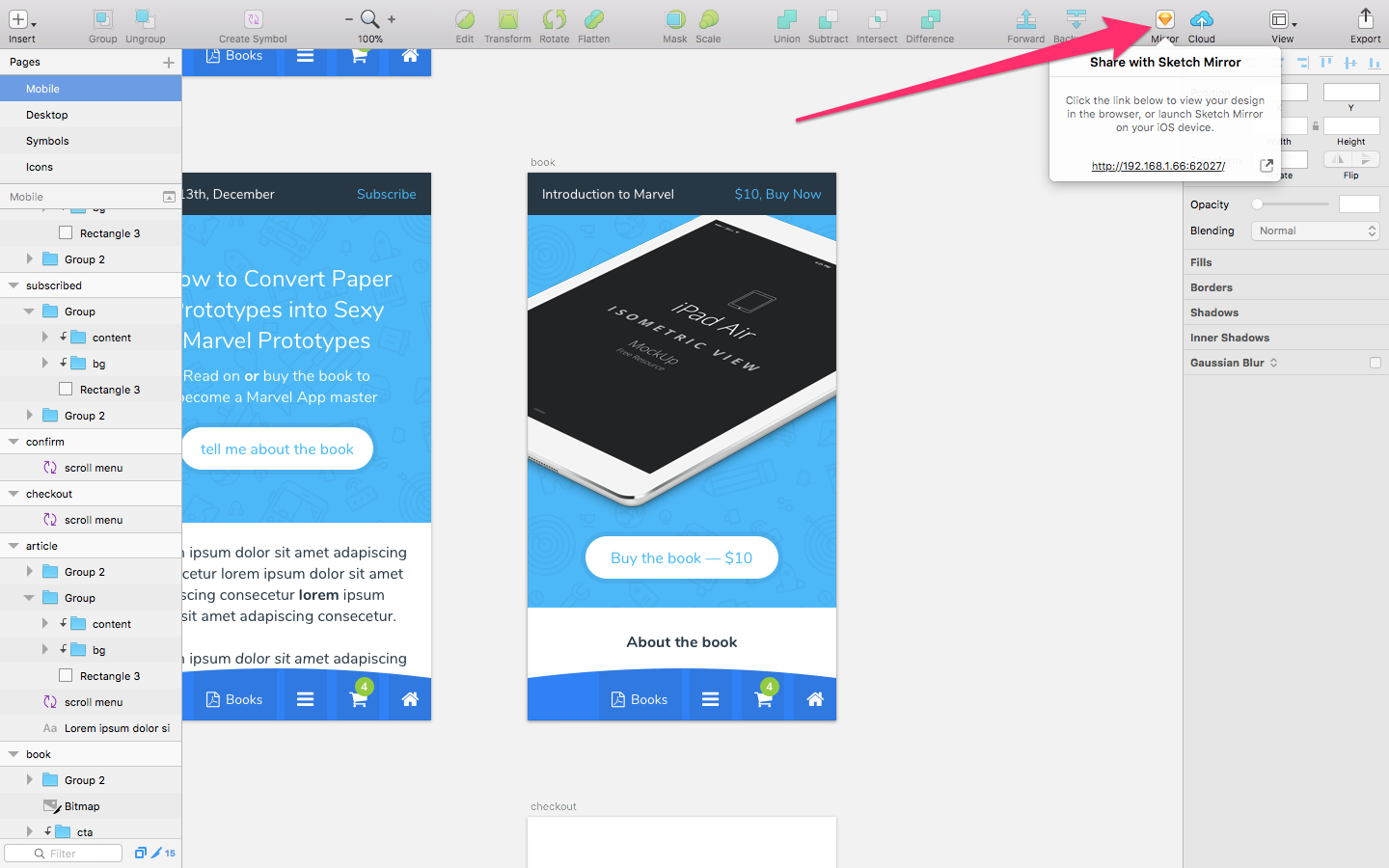
When you're ready, hit the Sketch Mirror icon in the Sketch toolbar.

Right away, Sketch will attempt to locate your device and the first Artboard from the design will appear automatically. If for any reason you're having trouble, consider that you might have some kind of firewall or Wi-Fi security setting that's stopping you from connecting. I find that I sometimes have trouble using Sketch Mirror when using unsecured networks (free Wi-Fi).
Also, ensure that you have the latest version of both Sketch and Sketch Mirror installed. Here is Sketch's own troubleshooting guide for Sketch Mirror, in case you need it. You can also connect to Sketch Mirror via USB if all else fails, although I'd recommend asking your system administrator to consider the solutions listed in this helpful FAQ, as this tells you how to allow access to Sketch Mirror when it's being blocked by an annoying corporate firewall.
Navigating Sketch Mirror
Navigating Sketch Mirror is really easy. Simply swipe through the screens (left/right) in succession, zoom in and out when needed, or pinch close to see an objective view of all the screens at once (this is useful for when you need to find a very specific screen amongst a design that has loads of different Artboards). Just FYI: it's also worth noting that previews scale to the device you're using, so if your Artboard doesn't match the dimensions of your iOS device, your design preview might be out of scale for the device you're testing on.
FAQ
Is there an Android version of Sketch Mirror?
Sadly, no, although you can use Mira or Crystal as an alternative.
Can I connect to multiple devices at once?
Yes, as long as they're all on the same network connection. Assuming your Wi-Fi is optimal enough, you should see all devices update at once when you make a design change.
It's like magic!
Conclusion
Even though you can't create interactive tap targets with Sketch Mirror, it's still a really useful way of testing your iterations on-the-fly. Just make sure that you don't hold your device in a device stand—hold it in your hands so that you can test it reliably. This might be annoying, but it's the only true way to test how your designs actually feel when in the hands of your users.
Closing advice: have a soft mat on your desk, so that you don't scratch or disjoint your device by repeatedly putting it down on the desk/table!


