Content design, technically speaking, is a loose term used to describe any element of a website or app that isn’t a user interface element, however it’s more commonly known as a way to describe how article content (e.g. blogs, help sections, and any other long-formats with lots of images and text) is laid out.
Many companies use a blog to let their users know what’s happening at their company, however many companies also make their blogs inaccessible due to a lack of user experience.
Yes, content design can have a terrible user experience.
Here’s 5 reasons why content design is the most-forgotten area of web and app design, and what we can do to improve it.
1. Start With the Above-the-Fold Content
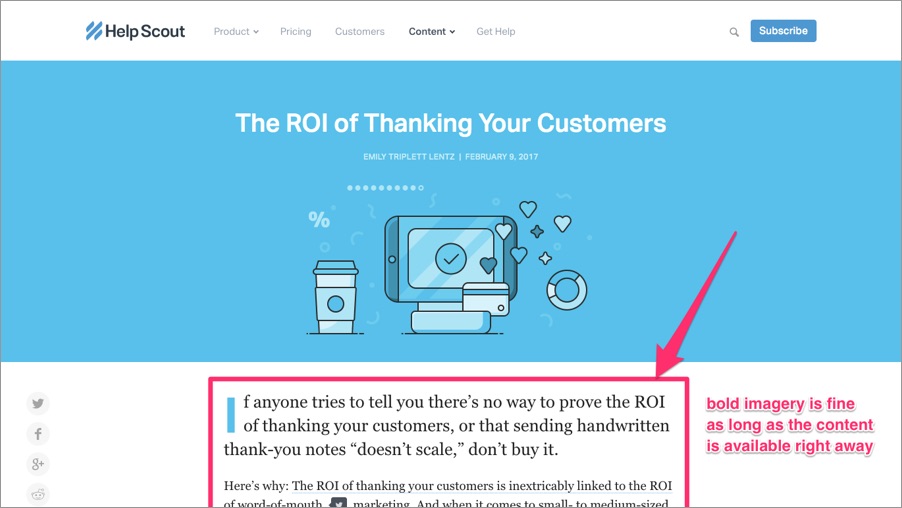
Above-the-fold content is the content that appears on the screen upon loading, whereas below-the-fold content is the content that can only be accessed by scrolling. Because users are lazy, and also easily distracted, articles have a very small window of time where they can entice the user to carry on reading.
So how do we make the most of that time?
Don’t make the article title too large — readers will already know the title from the referrer (e.g. Google search). Even though full-width headers are trendy, it drives the actual content way below-the-fold and forces the reader to have to scroll for the content. Not cool. Give the user what they want!

2. Fine-Tune the Reading Experience
Readability and legibility — this is where typography plays an important role in content design. Great typography is about much more than simply using a font size that’s big enough to read.
Lets take a look.
-
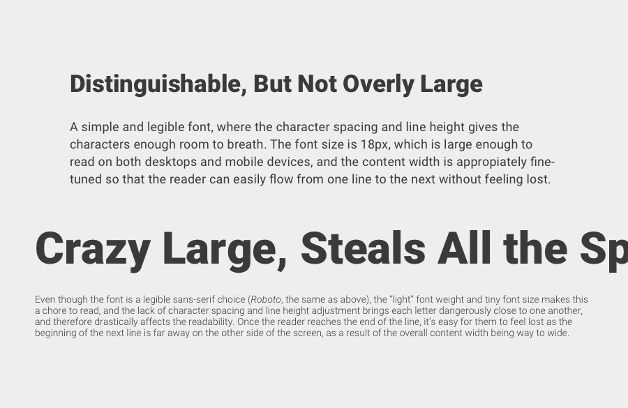
Font family: choose a font with high legibility — legibility is how easy it is to distinguish one letter from another
-
Font size: this should be at least 16px depending on the chosen font family — don’t reduce the font size for mobile devices (if anything you should actually make it bigger)
-
Line height: line height affects readability — readability is how easy it is to read blocks of text, and a slightly increased line height increases the distance between each new line
-
Character spacing: character spacing is the amount of space between each letter and also affects readability — adding a little extra space between characters make text easier to read
-
Content width: when content is spread far and wide across the screen (this tends to happen when the font size is too small), the reader finds it hard to decipher which line is the next line

Most of the time, there is no rule-of-thumb for typography. It depends on the fonts used; the best way to optimise typography is to first tune it to your needs, and then do some user testing (you may have excellent eyesight in comparison to others!).
3. Let the Reader Indulge on Images and Heading
Readers won’t digest content starting from the very first line of the article. Instead, they’ll rapidly scan the webpage and try to summarise the content by reading the headings and looking at the images. Depending on the type of content, sometimes this is fine and the reader will leave feeling satisfied; other times readers will choose to read certain aspects of the article depending on how much the images and headings have enticed them.
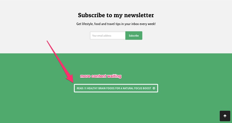
In short, space out the written content with images and headings to help the reader summarise the content more easily. Let them indulge at their own speed, and always have more content waiting (you can display related articles in the sidebar and footer).

4. Put the Reader in Your Pocket
Everybody wants their readers to come back, right? Readers can stay up-to-date with new content by subscribing to RSS feeds and newsletters, or by following on social media, however there is a right and a wrong way to ask users to do that.
Wrong way: it’s never okay to throw a pop-up in the reader’s face — by doing this you’re making a very broad assumption that the reader has a). read your content, b). enjoyed it, and c). wants to read more of it at a later date. Hijacking the reader’s experience is a terrific way to make them hit the back button.
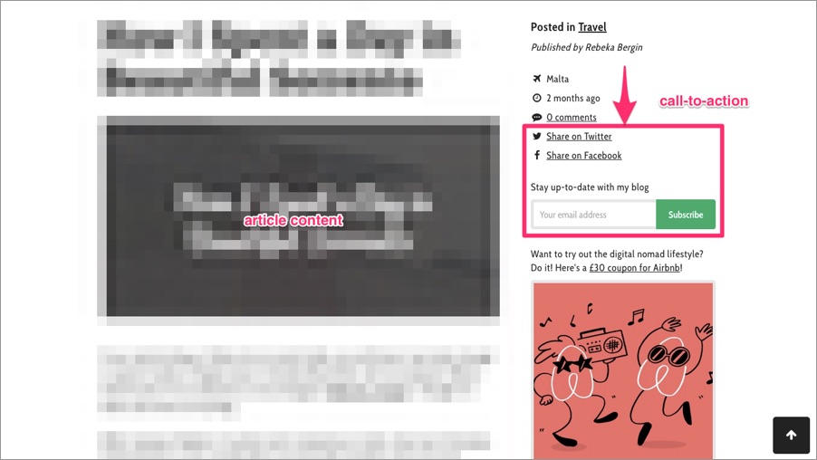
Right way: deliver the content first. Make sure that the call-to-action is reasonably visible (but not in their face — the sidebar or footer is fine) and focus on offering a beautiful experience alongside interesting, engaging, summarised content.

5. Be Human, Show Emotion
When readers want trustworthy information, they don’t look to social media, or to brands, or to celebrities — nope, they look to bloggers. Bloggers are the third most trustworthy (behind only family and friends). Why? Because they’re independent and they show their human side. They write with emotion.
If you want to sell something, don’t use a random article idea to lure them in and then switch the play. Instead, write a valuable, informative tutorial on how to do something using the product, conveying your passion with limited marketing speak.
Tip: write like a human, with emotion. Don’t use illustrations to depict your product, show the actual product and your customers using it. Save the marketing for the splash screen!
If the article has nothing to do with what you’re selling, then include subtle advertising in the footer and leave the content be. Content should never be geared towards an ulterior motive.
Conclusion
Many companies use content marketing to boost sales and brand exposure, but lets be fair, how often do you click on an article and actually read it? Rarely, ever right? Content is often wasted because:
- It was difficult to read without squinting
- It wasn’t immediately visible on the screen
- It seemed like there was way too much text
- It seemed more like a marketing ploy
- You wanted the core facts, but they were hard to discover without reading the entire article, so you didn’t read it
Design content, then write it.


