
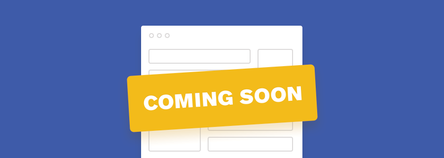
2017 is rapidly becoming the year the of side project. Sadly, though, most on-the-side’s eventually end up abandoned due to a lack of time, not enough interested customers, or worse, both. However, by collecting customers from the very beginning (i.e. pre-launch) we can massively reduce the chances of idea abandonment, and this is why “Coming soon” webpages are becoming so trendy.
Anyone can be an entrepreneur in 2017.
Building up anticipation of your idea, and validating your concept by offering a little teaser, is a terrific way to ensure that not only is your idea worth exploring before you commit serious time to it, but also that you have enough interested customers to give you the confidence to stick with it.
Lets see what makes these “Coming soon” webpages so effective.
Get to the Point
Even if what you’re selling isn’t exactly ready yet, you’re still selling the idea of it, only it won’t cost the customer money, it’ll cost them their email address.
Remember: readers have a very short attention span, especially when it comes to a product that doesn’t even exist yet, so believe me when I say that they’re not interested in your complete sales pitch. Stick to a catchy headline, a bold teaser, and clear call-to-action. If there’s scrollable content you’re doing it wrong!
Create a Clear Call-to-Action
Lets talk more about calls-to-actions (also known as CTA’s).
A call-to-action is a visual way of saying, “Hey, I want you to click here and complete this action”. Getting the user to complete the call-to-action should be your ultimate aim. For starters, it needs to be immediately visible (i.e. the user shouldn’t be forced to go searching for it, especially on a “Coming soon” webpage, which should be relatively basic) and there shouldn’t be any obstacles in the user’s way (i.e. if a user is subscribing to be notified of your launch date, you don’t really need to know their name, cell number or favourite movie.
When designing calls-to-actions you should make sure that they’re quite obvious and easy-to-spot, and that they allow the user to take direct action. If the user is subscribing, as mentioned above, don’t create an additional step where the user has to annoyingly verify their email address — don’t ask too much of the user when you’re not really giving anything in return (yet).
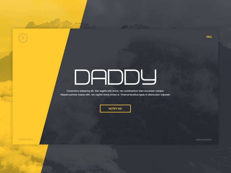
In the example below the designer creates an unnecessary additional step when there is clearly enough space to include a subscribe form.
Whereas in this example, the user learns exactly what the app is about via a combination of brief but bold words and imagery, before they’re able to subscribe to the app that is coming soon.
If you’re interested to learn more about CTA’s, I actually wrote an article about designing them last week, which you might find quite interesting to read.
Create Suspense and Build Anticipation
Media (images and videos) can sometimes speak louder than words, and communicate what you need to say in a shorter space of time (interpreting media requires less brainwork than reading words, and can sometimes be interpreted subconsciously). Media can also be a lot more expressive than words, tapping into the user’s emotions. Because of this capability, you can use images and videos to create suspense, excitement, and build anticipation leading up to your launch.
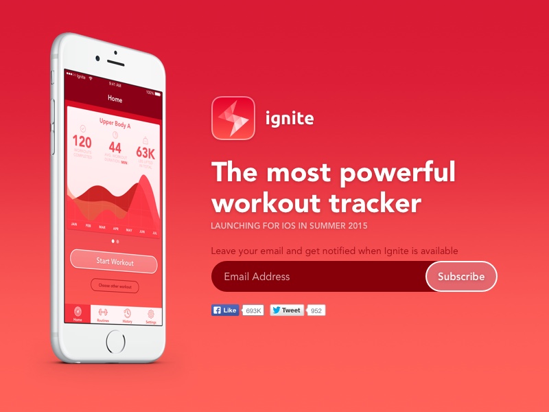
In the example below, the webpage uses bold colours, what content creators call “power” words (literally, they used the word ”powerful”), and a visually appealing screenshot of what’s to come. From the image alone, you can clearly see that it’s a workout tracker. Simple, but very effective.
Appeal to the Audience Emotionally
Lets chat more about tapping into the user's emotions.
In order to appeal to the user emotionally, you must demonstrate a thorough understanding of how the user feels and what the user needs — this is called empathy. In short, you need to show that you understand the user’s problem, and explain why/how your idea is solving it.
You could use a combination of power words and engaging media to do this. By emphasising that you feel their pain or frustration over a certain issue, you can communicate (visually, and/or with words) the value of what you’re selling, making the user far more likely to convert (subscribe, signup for beta access, etc).
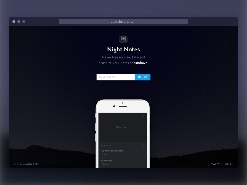
In the example below, the webpage highlights the issue that users encounter (losing ideas) and displays the solution (“Never lose a note”), along with a directly-accessible, clear call-to-action and dark colours that create ambience — the subtle tones combined with the dark, minimal visual aesthetic plays to the users frustration of losing notes, and makes them feel relaxed.
Conclusion
“Coming soon” webpages are nothing new, however, bootstrapping a startup is now easier and more common that it’s ever been. You want to open an online store? We have Shopify for that. You want to start a blog? Try Ghost or WordPress. Video course? Uscreen.
Starting a business is becoming more and more favourable every day, even for those without any technical experience — “Coming soon” webpages are the first and foremost way of attracting attention, and now you know how to create them!