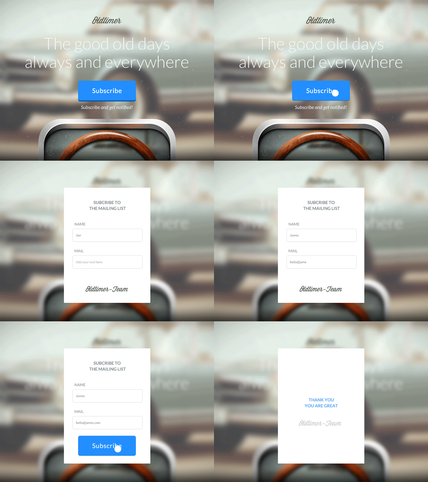
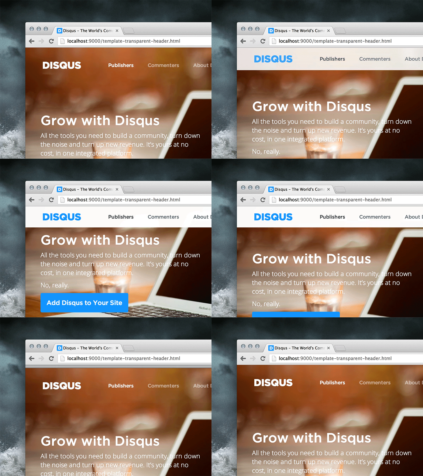
At the end of the day, the overall aim when designing user interfaces is to usher the user towards a call-to-action (also known as a CTA). A call-to-action could be a button that links the user to a signup screen, or adds an item to a shopping cart.
Most websites and mobile apps serve more than a singular purpose. An online store for example will do more then sell things to customers — it might also try to collect subscribers (to sell to future customers). But how do users distinguish between the different types of CTA’s, especially when one is more important than the other? In this case, the “Buy Now” CTA is more important the the “Subscribe to our newsletter” CTA. It’s all about visual hierarchy.
In this article we’ll discuss CTA’s — how to design, reveal and animate them.
Deciding on Link vs. Button
CTA’s can be buttons, or they can simply be text links — but which should you choose? Well, that depends on how important the CTA is. Visual hierarchy plays a significant role in drawing the user’s attention to a specific element on the screen, so you first have to decide where you want the user to look first, then use visual design to draw their eyes to that area of the screen.
Generally speaking, ordinary text links are regarded as less important, whereas buttons are saved for the main CTA’s. When a design has too many text links, or too many buttons, the user feels lost and doesn’t know where to click first. If all the calls-to-action look exactly the same, there’s no pull.
In the example below there are two CTA's, where the user is pulled towards the button CTA first, and the text link (in the top-right corner) second.

So how do we establish visual hierarchy? How do we make a call-to-action more visible? Important CTA’s could have:
- Larger fonts
- Backgrounds (for buttons)
- Floated to the opposite side of the screen
- Bolder font styles (or underlined for text links)
Deciding How to Reveal the CTA
CTA’s that exist on the screen from the moment the screen is loaded are called static CTA’s. Static CTA’s that are immediately visible on the screen are called above-the-fold CTA’s. Since static, above-the-fold CTA’s are immediately visible as soon as a screen is loaded, that makes it higher up in the visual hierarchy (you’d probably use a button for this).
Less important CTA’s should appear below-the-fold, in the sidebar, in the footer of the webpage, or basically anywhere that doesn’t steal too much focus from the main CTA. If you ever find that you have more than one CTA on the screen at any moment in time, that’s when you’d use visual design to highlight which one is more important; which one the user should look at first.
Static calls-to-action aren't the only type of CTA.
Dynamic CTA’s are CTA’s that reveal themselves as the user interacts with the screen (this can be a user-click that leads to a larger CTA, such as a form, which would require a slightly-less-optimal two-step interaction, or a user-scroll, both of which could result in a dropdown bar or modal window).

Modal windows are totally fine for click-based interactions, however when it comes to scroll-based interactions (or reveals that appear after [x] amount of seconds), throwing a modal window in the user’s face can be very annoying — this is why a (small) dropdown reveal is better for scroll-based interactions.

Obtrusive, unsolicited calls-to-action have a risk of forcing the user to click the back button, never to return again!
Deciding How to Animate the CTA Interaction
Animation is vital for designing CTA’s that are:
- Noticeable
- Confirmative
Noticable
Animation shouldn’t be used on text links and buttons to seek attention (this officially crosses the border to “distracting”), although a subtle animation on dynamic CTA’s that reveal themselves on-scroll or after [x] amount of seconds can be useful. Why? Because when something appears on the screen too suddenly, brains struggle to figure out what exactly happened.
Read my article on easings to learn more about the UX of subtle transitions.
Confirmative
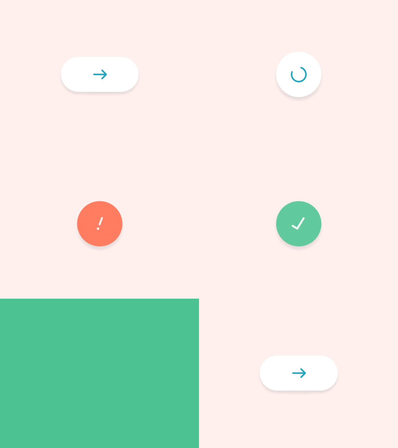
Confirmative animations happen after the fact — this is when a user interacts with a call-to-action and the call-to-action itself animates to confirm that the app has understood the interaction, then visually conveys its response — this clarifies to the user that they have done the right (or wrong) thing.
Imagine a submit button in a subscribe form — it could animate (change background colour, glow, etc) red if the input field doesn’t contain an email address — this highlights the fact that the user has made a mistake — without the animation the user might click the submit button over and over without realising their mistake, and assume that the interface is at fault.

Conclusion
Long story short, CTA’s that are important (to the user) should be perfectly clear (the user shouldn’t have to scan the screen for it), whereas unsolicited requests can still be reasonably obvious, but not distract the user or require them to dismiss the call-to-action if they didn’t ask for it. Doing so may irritate the user so much that they won’t stick around!


