
By harnessing the capabilities of SVGs (Scalable Vector Formats), we can design logos that are responsive (that is, they adapt to different screen sizes in ways more complex than simply being scaled up or down). Some may consider this overkill, but for large companies with a huge focus on branding, having a logo that shines on all devices can be hugely beneficial.
Branding is about much more than visual design. It encompasses all things communication, where colors and style are used to make customers feel a certain way, and messaging is used to make customers think a certain way. Responsive logos are able to accomplish that no matter what device the user has when viewing your website. Even the impressive level of attention-to-detail shows customers the amount of effort you're willing to display to achieve quality.
Logotype vs. Logomark
First, let's decide what a responsive logo actually is. Most brands have both a logotype (a logo made of text, simply described) and a logomark (an identifying mark or symbol with no text). With off-screen media of all sizes, for example, anything from billboard advertising to letterhead design, brands use a range of different logos to suit the situation. That's right, most logos are responsive already, only we don't apply the concept to the web very often!
Here's an example of a logotype (right) and logomark (left) from Pepsi, being used together:
It's not unusual for brands to use either the logotype or logomark, depending on the situation and space available. Sometimes they're used together when the situation allows it.
With that in mind, I'd say that responsive logos in their most basic form can be about switching between a logotype, a logomark, and or using both together. But is that all? One thing's for sure—responsive logos are about much more than making them smaller for mobile devices.
Resize...or Adapt?
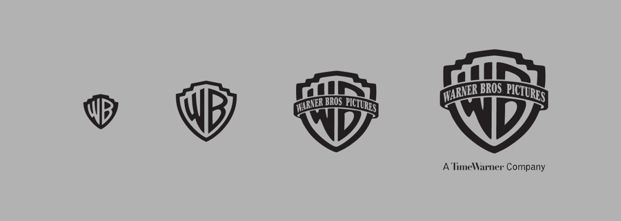
Responsive logo design is about removing the intricate details for smaller devices, leaving behind the style and colors of the logo that we've all come to know and love. If the user doesn't recognize the logo instantly (or doesn't learn/feel new something about the brand if they've never encountered it before), then the logo has failed to accomplish what it set out to do.
Examples:
Let's take a look at some examples. Responsive logos is an exploration of responsive logos by Joe Harrison. Even though the examples are made up, the brands and logos are real.
You'll notice that the smaller details are removed first, leaving behind the brand name, colors and shapes that are recognizable to those that know the brand. As the window is resized (seriously, try it out!), the logo is eventually reduced. Walt Disney, for example, loses its "castle", then the "Walt", then is eventually reduced to their still rather distinguishable "D".
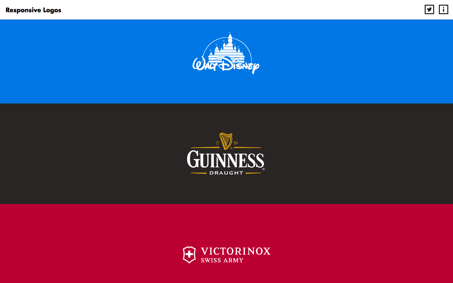
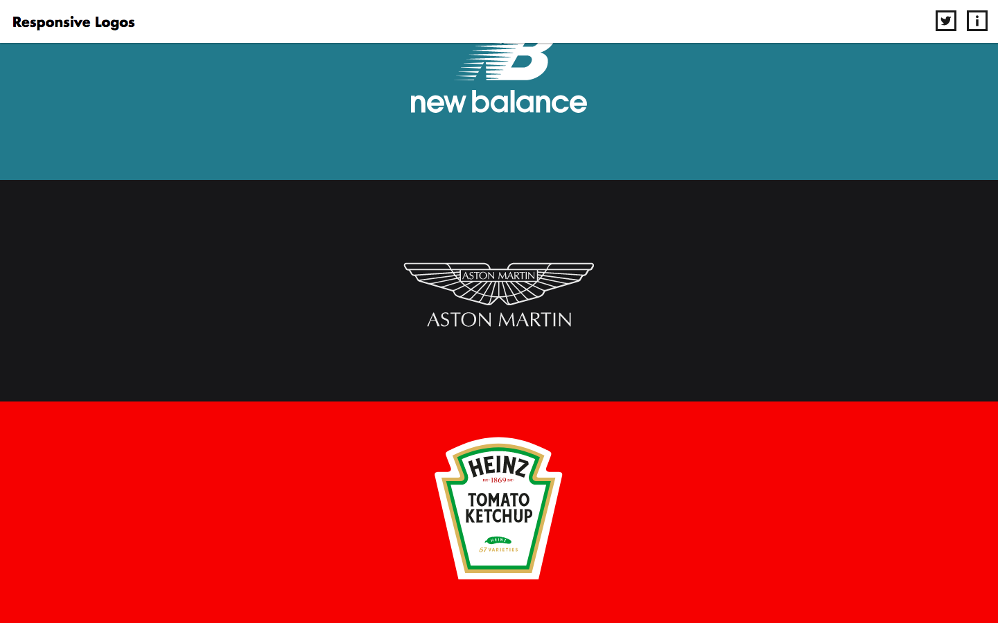
Don't Forget About Color Variants
As mentioned above, logos are used on a variety of different surfaces in the real world. On our screens, logos are used on a variety of background colors too, especially when making the switch from mobile to desktop (or vice-versa). As an example, take the Pepsi logo we looked at earlier. Here's the same logo that uses Pepsi's iconic Pepsi Blue (#002D5F) as a background. Since the logomark also uses a shade of blue, a white border needs to be added to it to establish an appropriate amount of contrast (and the logotype is also switched to white).
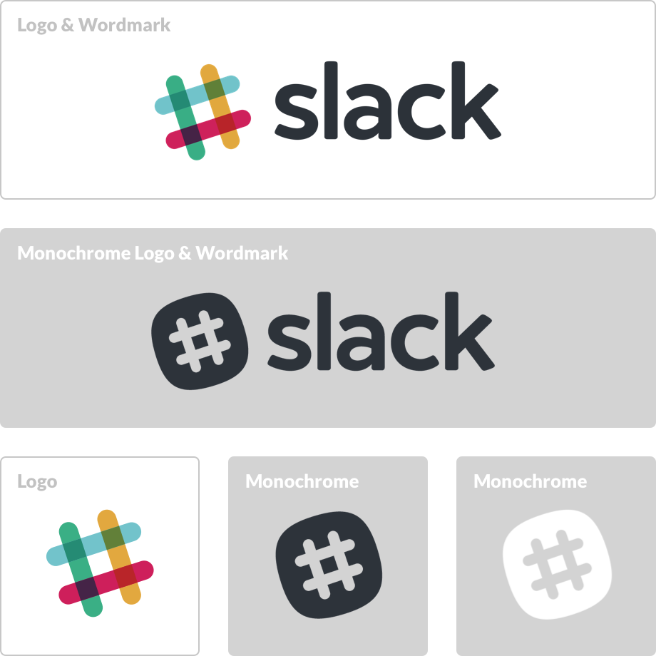
Even though these types of logo variants don't relate to responsive logos specifically, huge shifts in visual design aren't uncommon on mobile websites. In fact, many brands also have a monochrome logo variant at-hand, for situations where the logo needs to be a little more conspicuous, or for when a logo is too brightly colored to work on a colored background.
Here's a brilliant example by Slack:
Conclusion
Logos are often the first thing that new companies inquire about, but they're also the most neglected aspect of design when the brand primarily exists in the digital world. It's important to remember that a responsive logo isn't just an elaborate icon that sits in the top-left corner of a website. It can be used in many different ways. Think outside the box, make them responsive!
Here's a list of situations to use them more creatively:
In the footer, where there's usually more space
In the "about us" section—again, more space
On the homepage, somewhere other than the top-left corner
Oh, also, did you know that SVG can be animated? Just something else to think about! Here's a fantastic walkthrough by CSS legend Chris Coyier, that animates the Wufoo logo in a fun way!