
Destructive actions are actions that can have unfortunate and unintended consequences (e.g., data loss). The best way to handle destructive actions is to add friction (without frustrating users too much), essentially making them harder to complete.
Generally, friction frustrates users and should be avoided. However, there are times when the end justifies the means and a level of friction should be built into the design. Let’s look at some of the most common destructive actions and how to design them with the appropriate amount of friction.
When Friction Isn’t Necessary
Ifthe consequences aren’t too dire; it's best not to add any friction, because the most satisfying user experience is one that makes common tasks quick and easy.
For example: Clearing a search interface should not involve friction as the worst-case consequence of accidental deletion is that the user must retype the query or locate it from within their recent searches.
When to Display a Subtle Warning
Sometimes, only a subtle warning is needed. For example, on more complex search interfaces that use filters, clearing the search input and resetting the filters accidentally is only slightly more destructive and doesn’t necessarily warrant friction either. Instead, displaying a warning cue might be more appropriate (e.g., using red or orange colors).
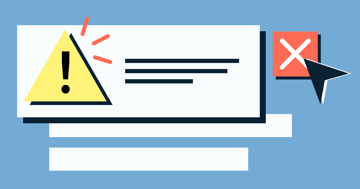
When to Display a Confirmation Dialog
For actions that can be significantly more destructive, consider displaying a warning cue/message before users interact and a confirmation dialog after users interact. The cost of rejecting this approach can cause users to repeat boring and/or time-consuming tasks or lose something that’s difficult to recover (e.g., data or money).
Let’s look at some examples.
Preventing Accidental Subscription Cancellation
If a user were to accidentally cancel a subscription, they would have to resubscribe, which would cost them some time. This can be avoided by including a confirmation dialog that forces users to think about what they’re doing.
Preventing Incorrect Form Submission
A destructive action that designers often forget about (because customer service representatives have to deal with the fallout) is when users intentionally or unintentionally submit the wrong form information.
Users sometimes submit the wrong form information intentionally to avoid sharing data that they believe to be unnecessary (e.g., email address), which can be destructive when in fact the data is necessary (e.g., to receive a digital download).
When designing forms, it’s best to explain why the information is needed (to reduce intentional mistakes) and include a confirmation step where users can review the information before submission (to reduce unintentional mistakes).
Preventing Accidental Deletion
When users delete something, always ask them to confirm their action (even if it can be recovered).
However, for irrecoverable deletions (e.g., user accounts, which sometimes must be deleted completely and instantly for data protection reasons), designers should do more than include a confirmation dialog. Consider asking users to confirm their deletion via an email link too, which you’ll likely want to do as a security measure anyway.
Preventing Accidental Purchase
Businesses rarely offer refunds when, for example, a childaccidentally makes a digital purchase. To combat these types of destructive actions, Apple began the trend of asking users to confirm the account holder’s information as an extra layer of security. Since then, they’ve also implemented family accounts with destructive countermeasures (i.e., approvals and restrictions). These methods tend to be effective against children and it’s worth considering implementing something similar.
Destructive actions can be devastating when they aren’t intended. At times, they can frustrating enough to make users rage quit, so designers should consider adding the appropriate amount of friction to prevent users from making these mistakes.
However, destructive actions are often very rare, situational edge cases, so it can take a lot of user testing to identify them. Use Sympli Handoff to hand off designs to other stakeholders to acquire feedback that user testers (and even the designers themselves) might overlook.