Design to Development: How to Deliver Fantastic Graphics to Developers

What makes web and mobile designers different from any other graphic designer? It is their ability to understand and adapt to an environment where coding and programming is core to every project. In addition to artistic sensibilities, mobile designers need to harness their powers of imagination to create visual elements that work within specified technical parameters to be clear, functional, and interesting.
The process of marrying aesthetic design with the technical coding can be difficult to achieve, therefore, I want to share some effective practices, tips, and tricks to help you deliver fantastic graphics for developers. Once you’ve created a design that accounts for the project’s technical specifications, you can deliver an interface design that is easy to implement.
But first, let’s review some important considerations to have in mind before you actually start designing, keeping in mind, that some of this can be done via Sympli as well (asset naming, etc...):
- **Get to know the pixel universe.** In case you are new to the world of web design, you may be unfamiliar with a space delimited by a viewport. Screens are measured in pixels, not inches or millimeters, and web graphics typically have a fixed resolution of 72 pixels per inch. This standard can vary, however, so I recommend conducting online research to get better acquainted with pixel measurements. Start by **[reading this article](https://www.creativebloq.com/graphic-design/what-is-dpi-image-resolution-71515673)**.
- **Get used to responsive spaces.** Print design operates in fixed spaces. Even when things get “complicated,” at most you’ll only have to create around two different versions of an illustration (poster size and postcard size, vertical and horizontal … and that’s about it). The challenge of web design is on an entirely different level: You have to design versatile interfaces that can automatically adjust to different viewports, resolutions, and orientations.
Think about using an iPad. When you interact with a website, you can turn it around, flip pages, use your fingers to scale up or down, etc. Instead of creating two versions of a design, you need to develop visual elements that account for all these variables to enable optimal viewing in an almost unlimited number of ways.
- **Get better at naming images.** You want to keep your naming conventions short and simple to facilitate better organization and easier file retrieval. Use suffixes and prefixes to eliminate unnecessary words.
For example: Let’s say you have two versions of a website logo. You might name it something like “Logo big version for website.jpg” and “Logo small version for website.jpg.” Instead, try this: “logo-size-001.jpg” for the biggest and “logo-size-002.jpg” for the smallest. Avoid empty spaces by using dashes between words or “camel writing” to connect words with capitalization (“LogoSize001.jpg”).
Try to be consistent with HTML tagging. For heading sizes, HTML uses
<h1>for the biggest font size and<h2>for the smallest. This will help ensure you’re speaking the same language as your developers.
Now let’s explore some specific guidelines for the design process itself:
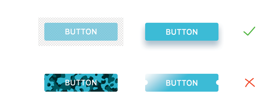
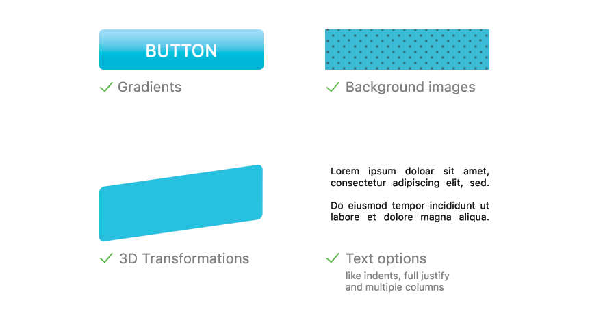
- **Create designs that are easy to code.** Almost all app or web designs use CSS coding. While it can be tempting to use an image for a web button, code-based designs are more efficient; they can be easily resized and reused. If you are unfamiliar with CSS, this visual guide will walk you through the basic buttons that are easy to code.
*Flat, regular fills and strokes:* 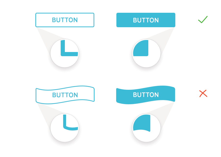Effects—Opacity and Drop Shadow:
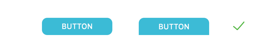
Round corners:
The following advanced design elements can be done solely with code—but they may need additional resources to work properly (more bandwidth, fully updated browsers, etc.).
Other CSS options (that may not always be available in older browsers):
- **Use closed measurements.** Developers need math to properly code your designs. For example, they need to set up the X and Y position of navigation bars, menus and so on. You can make their lives easier—and your partnership more productive—by using rounded numbers when you set up your graphics to simplify their calculations. 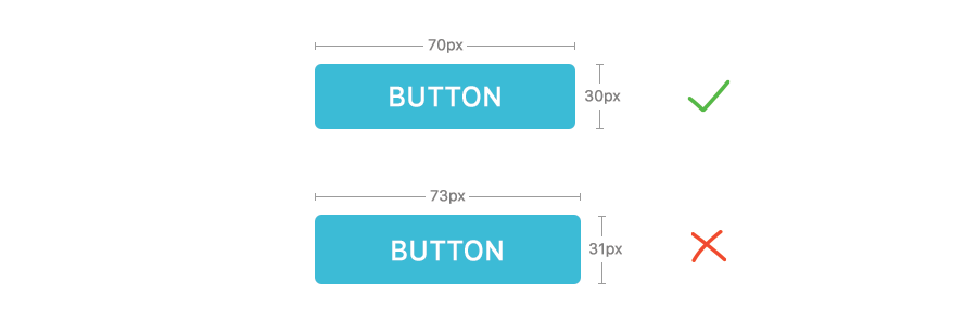
- **Use anti-alias, crispness, sharpness and other definition tools.** Most interface design software tools can help you effectively render borders, corners, and edges of your graphics. Anti-alias is typically good for serif fonts and crispness is often better for sans-serif fonts, but you can experiment to see which works best when you export the assets. Trust whichever tool is more legible for you.
- **Decide on system fonts and web fonts.** As a designer, selecting a font is a crucial part of creating a successful design. Unfortunately you may feel limited when creating a website because you have to rely on system fonts, which are the common fonts (Arial, Verdana, Times) that most computers have pre-installed. These fonts are ideal for long pieces of text (body text, for example).
Fortunately, web designers today can also use web fonts, which can be any font you want to use as long as it can be installed into the server. Here’s a recommended tutorial that will teach you how to install and use web fonts most effectively. As a best practice, do not use more than two web fonts on a single layout since they can reduce performance speed. Use them only for headers and titles.
- **Organize your assets.** Without a comprehensible organizational system, designers and developers will have a greater struggle to collaborate effectively. The common practice is to maintain one unique folder for layout images named “img” or “images.” You can add a “media” folder if your design will use video, audio, or any other media element.
- **Optimize images.** If you must use images that are part of the layout (though, again, it’s more advisable to use code), make sure to use the format that creates the best looking version at its lowest size. The most common formats used for web graphics are .gif, .jpeg, and .png. If you’re not sure when to use each one, here’s a quick guide to get you started:
.JPEG: Best used for photographs or illustrations with a high level of detail (shadows, volume, and lots of colors). Most graphic design tools can help you decide the compression level and quality of the exported image. Generally speaking, a compression of 10 (in a scale of 0-12) will work just fine.
.GIF: Perfect for reducing the final size of an element. Though this format is now considered old, it’s still one of my favorites. Use it for buttons, icons, and other small decorative elements that have to render sharply on the screen. GIFs can only have indexed transparency—so you can “perforate” them without making them transparent. Animated GIFs have also stood the test of time as a means of transmitting quick, effective messages in a novel way.
.PNG: The modern version of the GIF. But unlike their image formatting forebear, PNGs have adjustable levels of opacity so you can see through them. As a result they are slightly larger in size than GIFs, but will render with better quality. Use this format for logos, gradients, schemes, diagrams, etc.
I hope these recommendations can help you expand your skills and develop clear-cut processes for creating web graphics. Once you practice and implement these guidelines, you will be ready to improve your composition sense and style for web.