When we think of improving the user experience, we think of happy users resulting in a boost of conversions (sales, signups, etc). We often forget about the psychological undertones of what we’re trying to accomplish; why does optimal UX result in conversions? What does the user feel about your brand?
Let's take a look at how we can build trust with our users through design.
Visual Consistency
Quite often in my articles, I speak about visual consistency, as it's such an important concept when it comes to designing user experiences, but I rarely mention the effects it has on the user in terms of trust. When a user uses your interface, they learn how it works — they learn what certain colours represent, they learn where things are — this is how visual consistency contributes towards crafting a wonderful user experience.
And what is the result of that? Well, aside from a boost in conversions, the user also learns to trust your website, and ultimately, your brand — the user learns that you (or your company, whichever is relevent in this case):
- Is consistent (= reliable and trustworthy)
- Pays attention to detail
- Puts tremendous thought into the users’ experience
Primacy and Recency
Since design is about making content easy to digest, we often minimise our layouts by summarising our content into rows, columns and lists. But, did you know, users tend to remember the first item in a list more than any other item?
Content marketers call this the primacy effect. A simple rearrangement, not of the layout, but of the content blocks in the layout, can help the user retain that critical scrap of information that’ll make them convert. Naturally, we’ll also remember the last item in a list as well, simply because it’s fresher in our minds.
We call this is called the recency effect. For best results, recap the vital information at the end of your lists, to reiterate what the user is already thinking.

Reiterate and Reassure
Reassuring the user is a tried and tested method of reaffirming them of what they already think about you or your company. With an excellent content writer by your side, you can ensure that you don’t sound like a broken record. Restating your best-written content doesn’t have to be repetitive, it can waiver the users’ concerns and make them feel safer about trusting you and your content/service.
I’m a true believer that content is king, and that you should design around content, not create content around design.
Social Proof
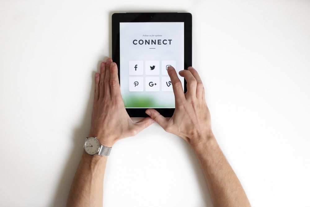
People say that social media is everything these days. I respectfully disagree, however it’s still quite important. Having a high number of followers can be interpreted as approval or validation of what you’re offering; it makes the user think, “Oh, they have a lot of fans, they must be good, let's give them a go!”.
Reviews are certainly useful, but they can be faked, and users know they can be faked. Reviews and testimonials carry less credibility than social acceptance.

Prove Your Authority
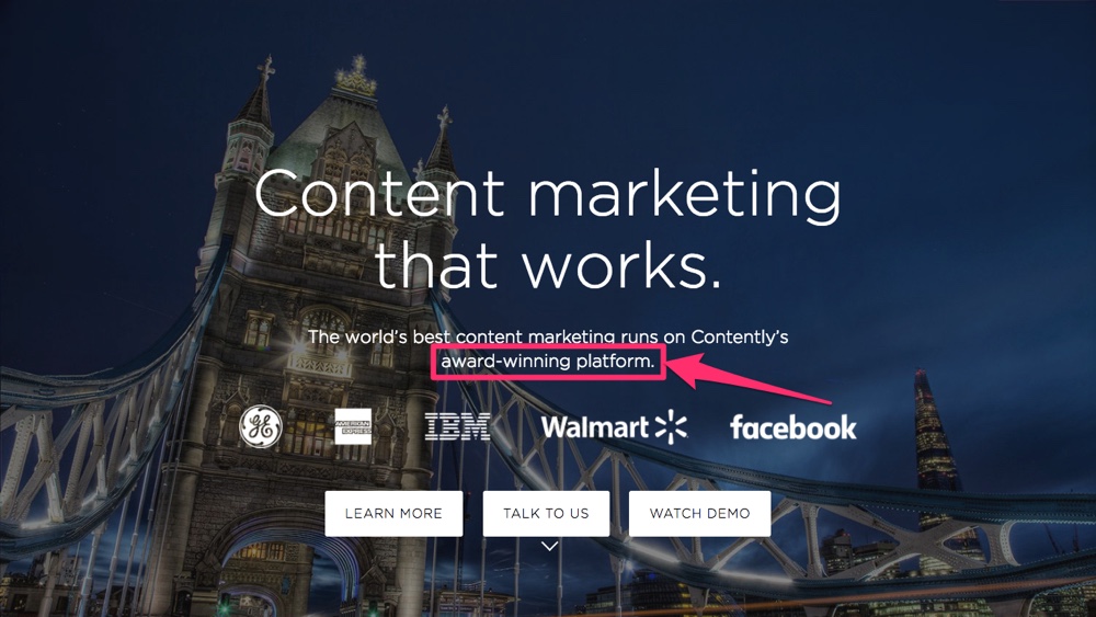
Aside from your social follower count, there are other ways to show your customers that you’re the one leading your industry. Have you (or your company) won awards? Did your Product Manager previously do amazing things at Google? Did your CEO write a bestselling book about something related to what your company does? Speak up if so — those are legitimate achievements!

Steer clear of websites like Awwwards and FWA. Paying for a nomination is not a true achievement, and the only recognition of said achievement is a ribbon that you can stick on your website. Awards like this can reek of desperation — they can hurt your brand rather than boost its credibility. Customer validation, whether through testimonials or follower count, can make you appear more trustworthy. Make sure to include (credible) reviews and follow counts on your website!
Freebies = Goodwill
A legitimate method of approaching animals is to win their trust by giving them food. Now, I’m not comparing users to animals (although we are all essentially animals, with the same core psychology), but the concept does apply here. You offer something for free, the user enjoys it, and then the user begins to trust the authenticity and quality of what you offer. After a while (be patient with them!), the user decides to invest more than their time (i.e. their hard-earned money).
If you don’t abuse that trust (and you really, really shouldn't), you can build it up further over time, resulting in a happy, loyal, lifelong customer.
Conclusion
When a visitor truly understands the value of what you’re offering, price becomes less of a concern. After all, something could be hundreds of dollars but be totally worth it. When a user trusts you, they feel safe, and ultimately, the likelihood of converting into a customer rises. Even up until the very moment the user is about to convert, there is an element of fear. “What if I’ve wasted my money?”, “What if it doesn’t work?”, “What if I never use it?”, “Would I be able to ask for a refund?”.
Be there for your customer. Reassure them that you appreciate their custom as much as they need your service.


