
Money changes everything. People have a completely different attitude towards products when they're not free, compared to when they are free; they become less tolerant when it doesn't work as expected, more likely to become hostile towards a customer service representative, more likely to leave a negative review, and more importantly, trust doesn't come as easily when purchasing it.
When in doubt, users have no trouble flipping the table and shopping elsewhere, and this is why checkout abandonment rates are so high.
Consumers are more likely to leave a bad review on an unsatisfactory purchase than they are to leave a good review on a satisfactory one, and the same concept applies to free items vs. paid items. Consumers are more forgiving when they received the item/service for free, money and value is important to users.
Building trust decreases checkout abandonment rates, and the number of negative reviews and complaints. Let's take a look at three ways that we can turn these statistics in our favour when designing apps and websites.
Exchanges Rates
While many larger e-commerce stores (let's take eBay or Amazon for example) let you pay in almost any currency in the world, some other smaller websites don't. Also, some websites, despite their large size, require a currency conversion regardless (for example, Airbnb, who need to pay the host in their local currency).
And then there's banking systems…like PayPal.
With banking systems especially, exchange rates are not always made clear (by design, no doubt), and I'm sure I don't need to tell you what a bad reputation banks have because of it. Paying more than expected due to a bad exchange rate isn't something the buyer tends to realise at the time of purchase, and while by that time it may be too late, it's unlikely the buyer will want to return.
Airbnb and PayPal both display their exchange rates at the time of conversion.
Seems legit, right?
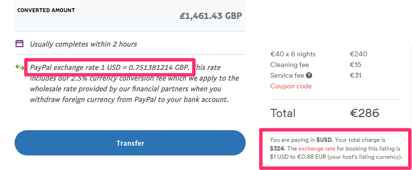
Wrong.
Airbnb offers an exchange rate close-ish to the real mid-market rate, but PayPal does not, and the fact that you'd never know this about PayPal until the dissapointing "Hey, this seems more expensive than I originally thought…" moment, shows that there is something wrong with the user experience here.
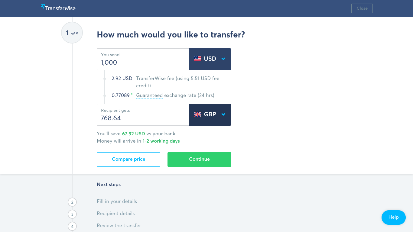
A company called TransferWise was created to rival PayPal, and they're known for not only giving you the real mid-market exchange rate, but explicitly making the exchange rate clear beforehand. You know you're getting the best deal before you transfer — no hidden costs, no unexpected surprises later down the line.
As a designer, why should I care?
Because design is how it works, not how it looks. It's about customer satisfaction. What we're discussing here is ethical design, and when poor design results in a loss for the user, even if it was unintentional, you're losing customers.
Hidden Fees
Hidden fees and costs are another sting that causes distrust among brands that sell online, and unfortunately these sly tricks extend way beyond banking. Many websites also escape penalty by outlining their tricks in their terms and conditions, or by using the old-school last-minute "Oh, by the way" method:
- "By the way, there's a fee…"
- "By the way, we charge [x]% for currency conversion"
- "By the way, you must spend $[x] to qualify for free delivery"
By now, you should be starting to see why so many users abandon their basket at the checkout. What seems like the total amount can quickly rise to something more mere seconds before users hit the "Pay now" button, and while some of these fees may be necessary to conduct a profitable business (I'm totally not judging), the way you design the customer experience drastically alter the way the user feels about said business, and decides whether or not the customer returns.
Building trust with customers extends far beyond the colours you use and the copy you write, it's what a business does and how a business acts that matters the most. Actions speak (much) louder than words. By keeping the user informed at every stage of the checkout, the user doesn't encounter nasty surprises later down the line, and they don't feel like their time has been wasted.
Why Ethical Design = Great UX
Earlier on I mentioned Airbnb, and I talked about them in a positive light. Now, while they do outline their basic fees from the very beginning (cleaning fee, Airbnb fee, security fee, etc), they also neglect to mention a 3% currency conversion fee, which you'd only know about if you read their Terms of Service.
This is where the UX of online purchasing gets very dark.
If you clicked on the link above, I would imagine that you took one look at it and x'd out. It's long and boring, and untrustworthy brands know this. When it comes to money, consumers will cut ties with a company based on one negative aspect, regardless of all the other positive aspects of their customer experience.
Here's what happened when one customer found out about Airbnb's hidden currency conversion charge. If there's any lesson to be learnt here, it's that hidden fees and other shady tactics to nudge users over the finish line are only a short-term solution — how long will it be before somebody builds a company to rival Airbnb, as TransferWise (and many others) have done with PayPal?
Here's a screenshot that depicts how full-transparency and ethical design builds trust; again, using TransferWise as an example. Note, that visual design is used to further emphasise trust (green and blue colours are trustworthy colours).
Full transparency = happy customer = returning customer.
Product Images
"It looked better in the pictures".
An online shopping disaster scenario as old as time (well, as old as the internet at least!). Photoshopped images, the item displayed alongside other non-included items, and lastly, poorly taken shots that lead you to believe that an item is bigger than it actually is, are all terrible ways to mislead a buyer. Value is something that can be tinkered with on the screen, but when the product is in the hands of the buyer, the true reality of the value comes to light. Exaggerated images result in:
- Bad reputation
- Negative reviews
- Non-returning customers
Closing Thoughts
Product images should always represent the item as best as they can, and only by designing customer experiences like this can we build trust with our users. Over time, and by using the power of design (both visual design and customer journey mapping), we can develop healthy, lifelong relationships with our customers.
A transparent checkout results in a happy customer—every time.