In this day and age, where there is so much content to choose from (in our inbox, our newsfeeds, etc), there’s an increased amount of pressure to convert users. Websites need to convert users quickly if we are to play to their short attention spans, and this is why there’s such a huge focus on above-the-fold content.
But is above-the-fold content as important as we think it is?
Actually, no.
Converting users is about much more than designing bold CTA’s, it’s about user psychology — it’s about asking the user at the right time — it’s about building and rewarding trust.
Although you totally shouldn’t forget about how visual design impacts a call-to-action, there is much more to learn about converting users. Lets take a look at how converting users below-the-fold can be even more important than above.
Don’t Interrupt!
It may seem like common sense to create a call-to-action when the user is most captivated (i.e. while reading an article, for example), but in fact, like with many other UX concepts, there is actually a sweet spot. Interrupting the user while they’re taking time out of their busy schedule to show your website some love, is a terrible way to make them hit the “back” button. Instead, wait for the user to finish reading, then calmly insert your call-to-action. Let the user enjoy and trust your content before you try to sell them something at a premium.

Hmmm, a Tempting Offer…
If a user has made it mid-way through the webpage, that means that they’re somewhat invested in what you have to say — they’re engaged. But that doesn’t mean that we have them in our snares yet, and that’s where a technique that I like to call engage-convert-reward comes into it. Your content comes before any "semi-invasive" call-to-action, and as the user is readying themselves to leave the webpage (hopefully, satisfied), you offer them a reward for following/subscribing.

Why is this method so effective?
- First, the user enjoys your content risk-free
- Second, the user converts to gain a reward
- After enjoying the content and their reward (assuming that you didn’t spam them or anything), the user has established a level of trust with you
- Finally, you then convert the subscriber into a customer later
Now compare that to an above-the-fold call-to-action that says “Buy now”, where this CTA is the first thing the user sees. At this stage, you’ve given the user nothing — the likely outcome is that they won’t convert. Instead, you should use this space for interesting, engaging content that will captivate the user.
Which Below-the-Fold Layouts Convert?
Well, there are two main ones.
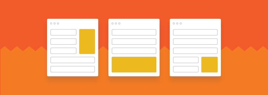
Sidebar CTA
Sidebars have a terrible reputation for showing annoying display ads (particularly with blog layouts). Over the years, users have subconsciously learnt to avoid eye-contact with this area.
Sidebar CTA’s (such as subscribe widgets and text+button CTA’s), despite their reputation, can still work well for webpages that aren’t showing ads in that area. Plus, the user doesn’t have to scroll to the very end of the content to see this CTA.
End-of-Content CTA
After users are finished reading your content, this is a terrific opportunity to convert them with a full-width CTA, or even a modular component of related content (sometimes the user needs more from you before they can convert).
What do these types of layouts have in common? Well, they’re not overly invasive and they can still be quite visible, but most importantly, they give the user a chance to enjoy your content first before you ask for something in return.

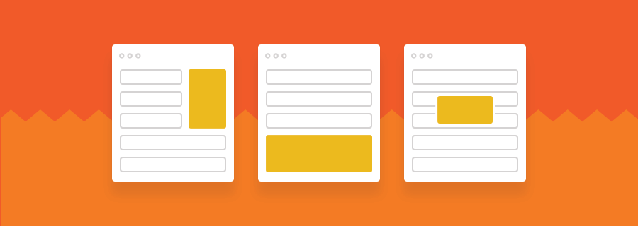
Scroll-Based CTA
Scroll-based CTA’s are those that reveal themselves after the user scrolls a certain distance — the same rules apply — if you’re interrupting the user from accomplishing the goal they’ve set out to make (i.e. abruptly showing a modal while they’re reading), you’re ruining their experience. A subtle dropdown animation fixed to the top of the webpage is much better.
Conclusion
Content is king. If you can offer the best content and CCE (content consumption experience — yes, I made that up), you can build such a level of trust with your users that they will even look forward to seeing what you have to offer. I won’t lie to you, converting users requires a lot of trial-and-error.
By tagging artboards in your Photoshop and Sketch designs, you can use Sympli to handoff multiple variations of the same webpage and discuss them with your teammates. You can then A/B test the variations to see which converts better!


