
Minimal layouts are, by far, my favourite type of layouts — there’s something about the simplicity and cleanliness of them that makes minimal user interfaces a delight to use. But as minimal layouts surged in popularity with the rise of the highly-fashionable “flat design”, many designers forgot that minimalism is much more than a trendy visual aesthetic.
Minimalist design is goal-driven, sometimes even devoid of emotional appeal. It’s about helping the user accomplish something in the quickest and easiest way imaginable, and while a huge aspect of that is about simplifying the interface, many designers choose to minimalise the wrong aspects of the design.
Lets take a look.
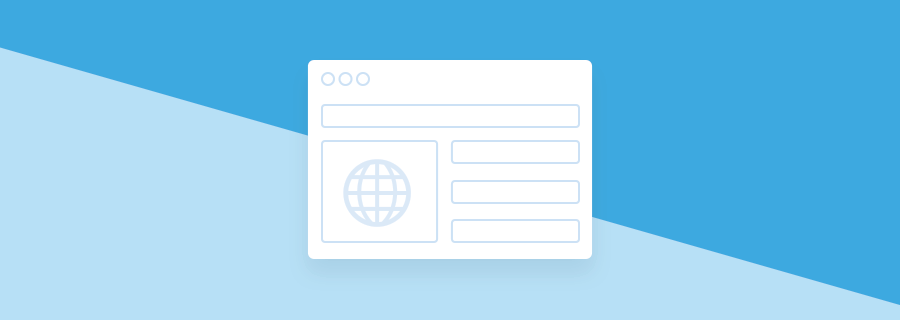
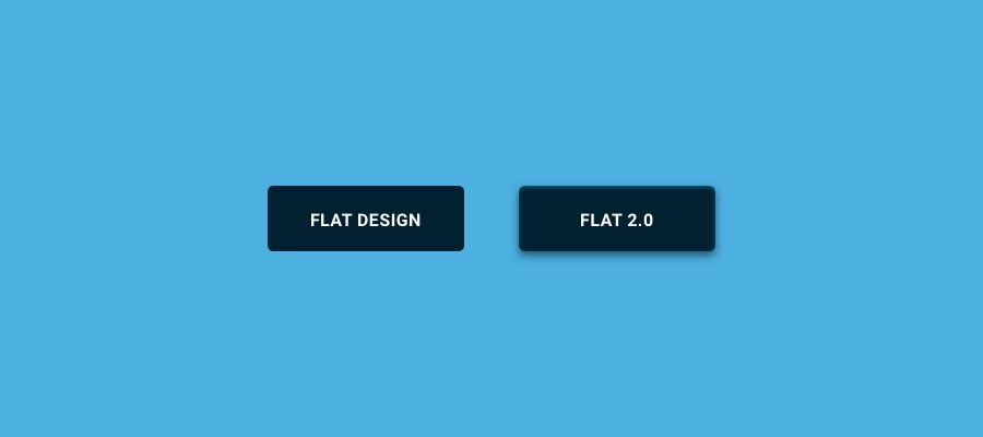
Don’t Go Full-Flat
Flat design lead the way to minimalism in the modern era of interface design, but by removing certain styles (such as shadows on buttons), eliminating that three-dimensional element of the design, we created vagueness, not minimalism. Removing anything unnecessary from the design is a terrific way to simplify an interface, but removing the wrong things will only lead the user to grow frustrating with your interface.
Enter “Flat 2.0”, as they called it. Flat 2.0 is a way of designing minimal visuals without becoming overly-minimal, or ultra-minimal as some describe it. Imagine layouts with a clean, minimalist feel, but where the buttons actually look clickable.
Reduce the Impact of Less-Important Visuals
So if you’re not going full-flat, can you still achieve minimalism? Of course! Most designers go wrong when they assume that flat design = minimalism, but in actuality the best way to achieve it is to reduce the impact of less important visuals. Don’t destroy the user experience by increasing the vagueness of tap targets; instead, reduce the impact of the heavy background image, swap your bold display font for something more readable.
In short: reduce the visual impact of redundant elements.
Find Cleaner Solutions to UX Problems
Minimalism isn’t all about visuals, it’s about simplifying the user experience as well, and you’d be surprised at how much difference can be made by collectively applying reduction in little ways. Does that form really require that many input fields? Does the user really need to signup to achieve their goal? Put yourselves in the shoes of the user, be the user, what would help you navigate from A to B with ease?
Influence Eye-Movement with Shapes
Historically, websites were limited to rectangular shapes. By default, they still are, however modern web technology now allows us to create virtually any shape imaginable, and the subtle art of shaping can influence the user’s eye moment in significant ways. Lets take a “scroll down” instruction/button for instance. We could remove that button by instead shaping the bottom half of the container into a point. It achieves the same thing as a button but it achieves a more minimalist feel.
Conclusion
With the power of creativity by your side, and of course the advancements in modern technology, there are no limits to how you can simplify your interface designs without compromising on crystal-clear clarity, without minimising the most important elements of your design. With a little creativity and empathy for your users, you can become a minimalist aficionado!