
What is a notification and what are they used for?
Notifications are used for alerts, error messages, confirmations, announcements, and acknowledgements. Basically, any type of temporary message you want or need your users to see. The main aim of a notification should be to help users perform a task, they must not interfere or get in the way of users while they are using your product. Notifications are one of the most important aspects of UX design as they provide ‘visibility of system status’, which is one of the Ten Usability Heuristics outlined by Jakob Nielsen.
Notification types
Also known as notification channels, these are the different means and ways of providing a notification or alert to a user. There are a number of questions you will need to answer before deciding what type and styling of notification suit your needs best.
* The type of information being communicated.
* The urgency of the information - whether it needs to be seen immediately.
* Whether user action is required as a result of the information.
Another important aspect of notifications is the tone of voice used. This is often set at a brand level but may require additional thought for things like error messages to ensure they sound just right (and not like you’re telling your users off!) A well-thought-out notification is designed with accessibility and flexibility in mind.
The people using your system and receiving your notifications may be using screen readers or may be using it in a different language. Testing your design with multiple languages with different styles of letters is a good starting point to ensure your design stands up against its real-world application.
There are two main channels of notifications; in-product and external.
In-Product
In-product notifications are notifications contained solely within your application and are not displayed anywhere ‘external’ to your product. In-product notifications are used to convey the status of your system, confirm actions, provide error feedback and give users general updates.
Colour plays a large part in in-product notification design. You can create multiple variations of each notification style using colour to indicate the type and urgency of the notification. Generally, you will use:
- A neutral colour for general system announcements and information (blue or grey is often used here but may differ depending on your brand pallet)
- Red for errors or things you really need your user to read
- Orange or yellow for ‘warning’ style alerts
- Green for happy ‘confirmation’ or good news alerts
One thing to keep in mind is that colours can change meaning depending on what country you are in and may have additional meanings for certain industries. For example, when designing for finance applications red and green are often used specifically to indicate trends in markets and notifications using these colours may be confused to be an alert about a stock rather than a system notification telling them something is broken.
Banner Notifications
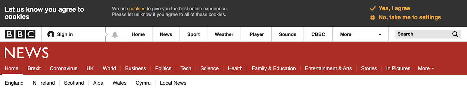
Banner notifications are usually placed at the top of the screen above the main page content. They are full-width notifications that are mainly used to convey ongoing messages. You will likely have come across this style before because they are often used for cookie notifications or system status updates for digital products.
Banner notifications can be designed to persist or to be dismissible. Persisting notifications are most often used to let users know of an ongoing issue like system problems or external issues that may affect them. Dismiss-able banners can be used for notifications you want users to read but that you do not have to remind them of, like update alerts when a new version of your product is released.
Toast Notifications
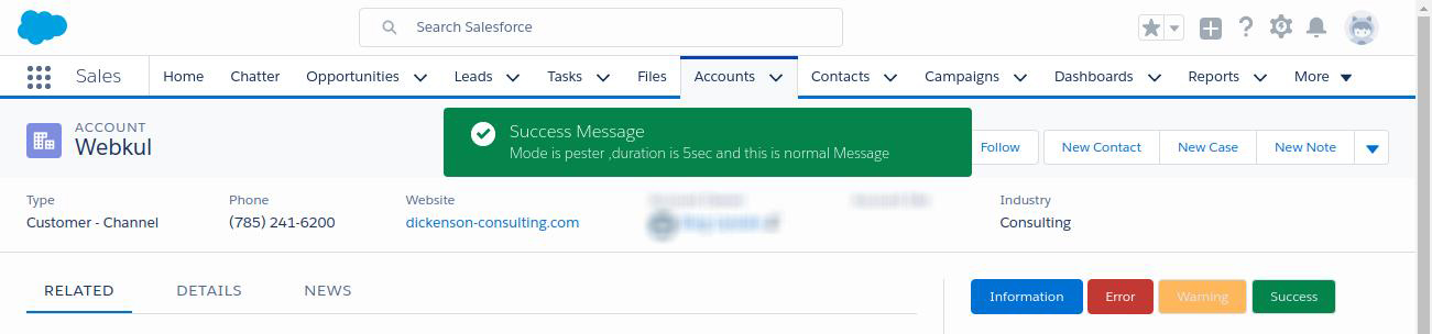
Toast notifications are a style of temporary notification used to alert a user to a status change or new activity. They are called ’toast’ notifications because they pop-up like toast popping from a toaster. Notifications of this style are almost always dismissible and may have a timer to automatically disappear after a few seconds.
Toast notifications are great at letting a user know that an action they have performed has completed and has worked or that there is an error. As they are temporary notifications you want them to be prominent on the page, most often they appear from the top middle or top right of the screen. You can use icons within these to help convey the theme of the notification.
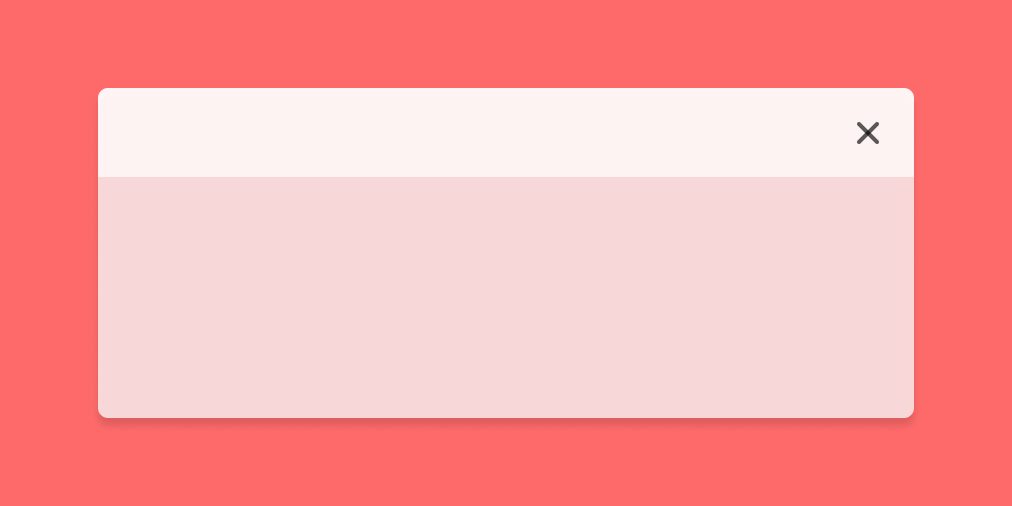
Modals
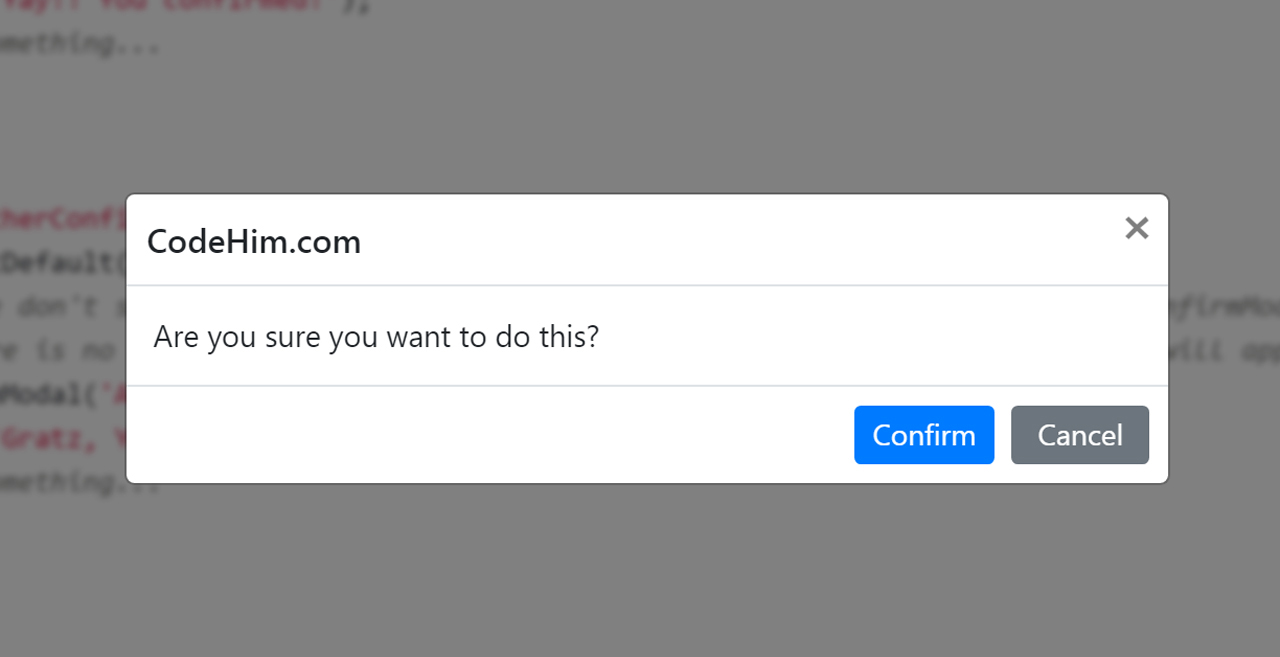
Modals should be used sparingly as alerts as they are the most disruptive to the user experience of your site or product. They are useful for static style notifications that must persist until a user interacts with a button or component within the modal itself and as such are often used for confirmation modals, alerting a user that their progress will be lost if they navigate away from what they are doing without saving their progress.
You will sometimes find these in e-commerce sites being used to prompt the user with an offer or discount when they go to navigate off the screen. However, these should be used sparingly as the user may simply be moving to your navigation to explore more of your site and pop-ups can put people off.
External
External notifications are all notifications sent by your product to your users external to your application. These types of notifications are most often used to let users know of new activity or to alert them to important product updates. If you are utilising external notifications in your system you will want to set up a full notification system with settings, but we’ll get into that in a bit.
There are two main types of external notifications; email and push.
Email notifications can be sent by your company to anyone that has given permission to receive communication from them. Depending on what country your user is in you may have to be aware of rules and regulations such as GDPR and how they affect you before sending these notification types.
Emails are the most flexible of the notification types and can be used for a wide variety of things. You can send alerts that there is activity on a piece of content they are subscribed to, let them know a process has completed, alert them to new site functionality or prompt them to return if they haven’t been to your site in a while. An important thing to remember is you don’t want to overwhelm your user with too many email notifications, this may lead them to stop all email or worse, discontinue using your service altogether.
Emails can be designed in whichever way you wish, but try to be consistent with the styling for email types. Updates all styled one way with errors styled another. Use of colour, imagery and language will be important here to convert the urgency of the action to be taken alongside a main ‘call to action’ within the email to prompt users back to your platform.
Push

Push notifications are the types of notifications sent to your phone or laptop. These are mainly used for applications but some desktop sites use them as well. Gmail and Outlook are two examples that will push a notification to your browser when you receive a new email. Push notifications are most often utilised to get a user to open your application. This can be to check out new content, see a comment someone has left or view an alert.
Push notification styling is often restricted by the operating system or browser your user is using, but the copy and tone of voice can be used alongside icons to ensure the urgency of the notification is still put across well.
Notification systems
A notification system’ is when you have notifications across multiple mediums, such as email, in-app and push notifications. Designing notification systems required an extra level of depth of understanding of the notifications you want to send and the settings surrounding those notifications such as frequency and method.
Notification settings
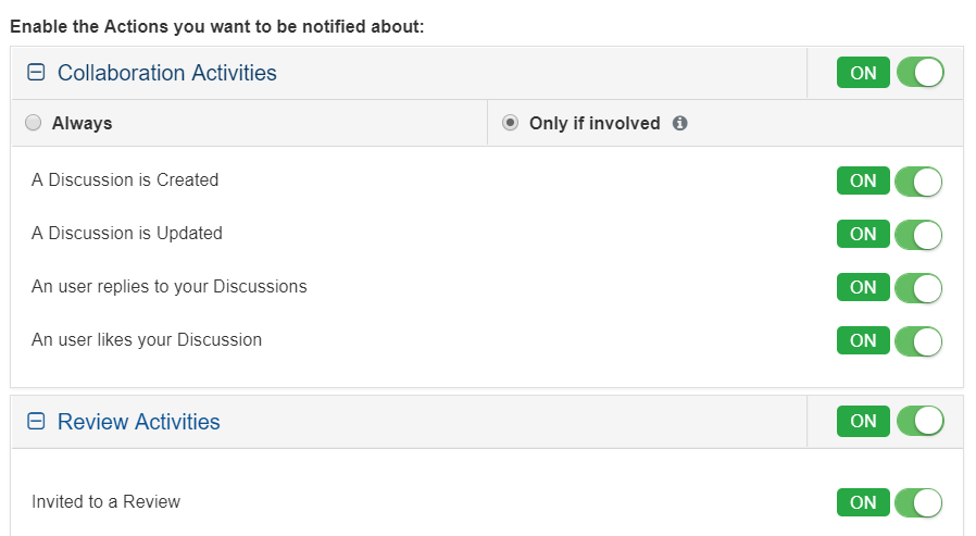
If you plan on having notifications, whether they are in-product only or include push notifications, you’ll want to have notification settings somewhere within your application. This will allow users to decide what type of notifications they want to receive and (depending on your notification types) potentially how often they want to receive them.
A lot of companies use progressive disclosure when it comes to notifications. Only showing the user one set of notification settings depending on what they click on, allowing them to continue to send other types of notifications to attempt to re-engage the user. However, this is considered a ‘dark pattern’. Dark Patterns are tricks used in websites and apps that make you do things that you didn’t mean to, like buying or signing up for something. Using these patterns may seem like a good idea at the time but companies can get in a lot of hot water when they choose to use them.
Allowing users to see all notification settings at once means they can tune the settings to their specific needs. Often this is reducing the total amount of notifications but keeping a few important ones on. By using dark patterns to continue sending notifications you are more likely to push them to turn off all notifications completely.
In summary
Before deciding which notification types you are going to use, you need to understand all the different notifications you want to send your user and how urgent each of these may be. You can then start to tailor your notifications, their style and whether they are in-product or push to each individual circumstance. Notifications are an often overlooked part of the design, tacked on at the end. But they are an integral part of a full product and should be given the attention they deserve.
Sympli creates tools for design collaboration, handoff, and version control. For product teams whose work includes highly sensitive intellectual property and data we have built Sympli Enterprise - check it out, if you're looking for advanced security, control, and support.