

Shadows and blurs are visual techniques that you can use within your design to improve its form or function. Depending on the type you use and how you use it, they can be supporting elements to your design, adding to the interface but not overwhelming the user. Or they can stand out and be the star of the show. This article will outline a few different use cases for shadows and blurs and provide some examples of how they can be used in design.
Shadows
Shadows can be as thin as a line or wide and diffuse as a cloud. They can be dark and diffuse to add depth to your design or white and thin to separate an item visually from sections around it. Generally speaking when you add a shadow to something you have a few ‘settings’ you can play with. There is colour, opacity, spread and blur. You may also have the option of changing the ‘x’ or ‘y’ axis and specifying whether the shadow should be inside or outside the element. Simply tweaking one of these characteristics can change the entire effect a shadow has within a design.
Elements of a shadow
Z-Axis
The z-axis is the third axis in design not top to bottom or left to right but front to back. Using this axis allows you to place items on top of one another, meaning you can make more of the space you have. Generally, you want your shadows to imitate real life as much as possible meaning the higher your element is within the z-axis the wider and more diffuse your shadow should be. You manage this by changing the spread and blur of the shadow.
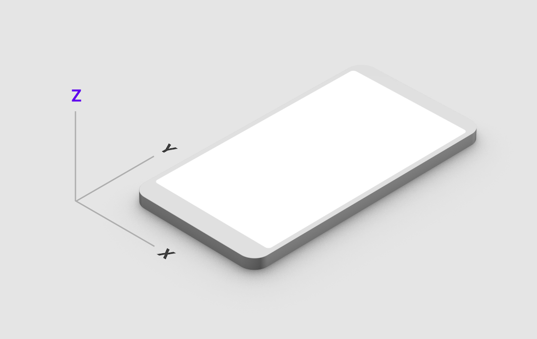
Y and X-Axis
Are the two other axis a shadow can move in. Y moves the shadow up or down the page and X moves it from left to right. To make your designs consistent you will want to pick a direction and stick with it, this will mean all your shadows follow the same light ‘source’ direction.
Spread
The spread of a shadow is the amount by which the shadow expands (or contracts) from the edge of the element it’s applied to. A spread with a plus number (1to infinity) increases outward from the element. A negative spread (-1 to infinity) pulls the spread inward from the edge of an element.
Blur
The blur of a shadow specifies by how much the edge of the shadow is… blurred. A blur of 0 will give you a hard edge, a blur of 10 will blur both out and in from the edge of the shadow 10 pixels and so on. The higher the number the wider and more diffuse the shadow will become.
Different ways to use shadows
To indicate interactivity
The most common use for shadows in user interface design is to create visual cues for users to help them figure out what they can interact with and what they can’t. Our brains try to make sense of what we’re seeing by looking for patterns that match our expectations of the real world. ‘Match between system and the real world is an often-cited heuristic UX Researchers will use when analysing how useable an interface is.
Buttons are a great example of using shadows to indicate interactivity. Often designers will add a shadow to a button on hover, this shown the user that the button is a distinct element ‘detached’ from the background. Raising the element visually from the page it’s on, gives the visual cue that it can be ‘pressed’ down. The shadows we use here should also change when a user interacts with the element to provide feedback that their action has been carried out. The shadow on a button should decrease in size when clicked or tapped to let the user know they have interacted with that specific element. This also matches the real world, when you press a button its height decreases and so the shadow it casts would become smaller.
To create visual depth
Unless you are designing with a flat interface style you will need a way to stack elements on top of one another while ensuring they remain visually distinct from one another. Shadows can help you do this by allowing you to use the z-axis to layer elements. This technique will allow you to show modals that appear ‘above’ the content of the page or open dropdown elements while keeping the list distinctive from other inputs.
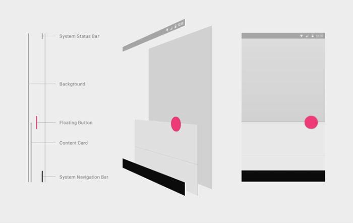
To create a visual hierarchy
Creating visual depth can also be used to indicate a hierarchy of elements. What do you want a user to pay attention to first? That item can be stacked on top of other design elements, using shadows to show each distinct layer, forcing the user to pay attention to items in the order they appear to them. This is more commonly used in mobile applications where you might have a menu appearing over other elements. Adding a shadow can pull that element forward and into the forefront of your users’ attention. This is especially important if you are trying to convey elements like cookie or privacy policies that you need your user to interact with.
Blurs
We have already touched a tiny bit on blurs in the elements of a shadow section but here we’ll go a bit more in-depth into what they are and how you can use them. Blurs are different from shadows in that they can be applied directly to an element rather than from the edge of the element.
Types of blur
There are different types of blurs you can use depending on whether it’s for interface design or for graphic work. We’ll outline the ones you can use in interface design but if you want to read more about blurs you can look up gaussian, motion and radial blur types for extra reading!
Background
A background blur is applied only to the background of an element. Rather than to the element itself. Say you have a square and you have set the background to be an image. If you were to apply a background blur, the image would appear blurred but the edge of the element itself would be sharp as a pin.
Layer
On the other hand, layer blur applies the blur to the entire element. Meaning the background gets blurred but the edges of the element also get blurred. You might use this if you want a background element to blend away so you can focus your users’ attention on something else. Or you might use it as part of a decorative element in a design.
Using blurs
To focus attention
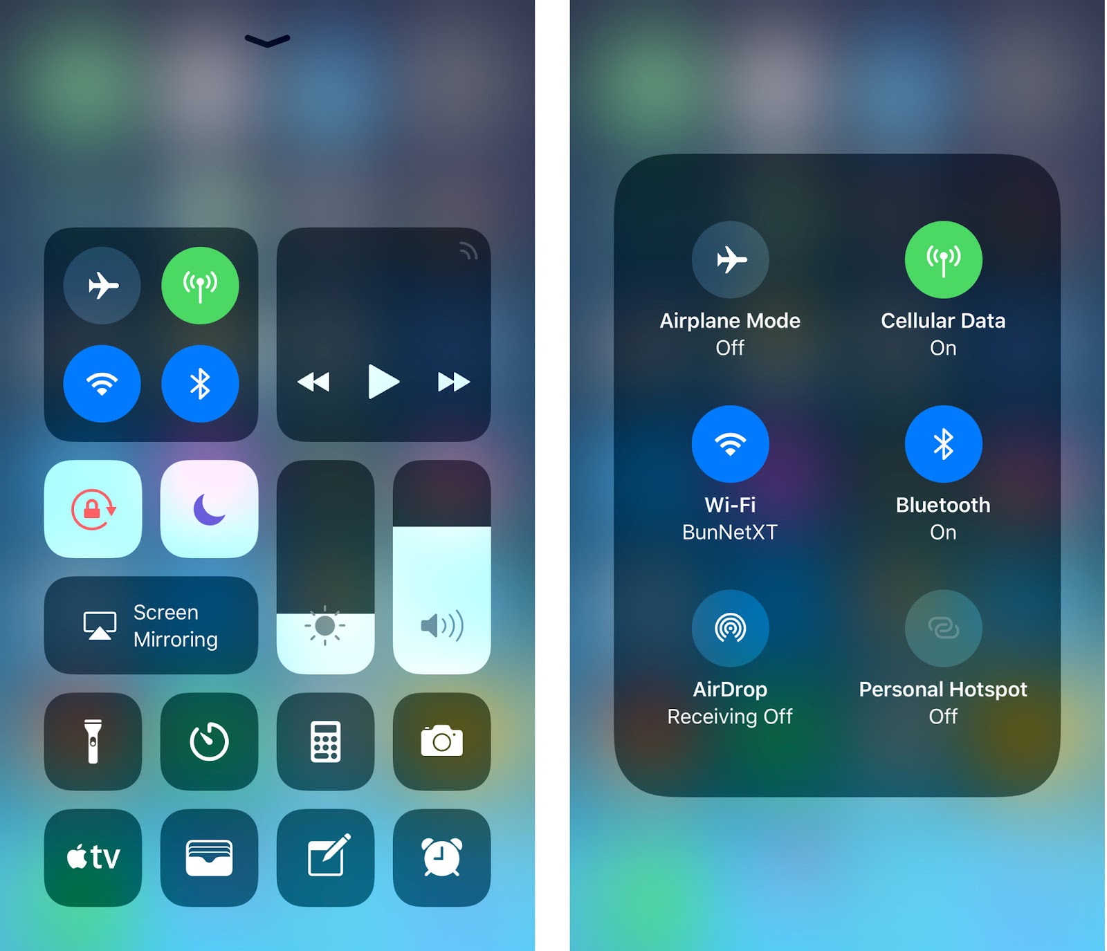
Blurs have a lot of uses but the most common use in interface design is to focus the users’ attention. You will likely have seen it used when modals are opened or when a navigation element is opened on mobile, you can blur the existing background elements to bring the user’s attention to the item they have just opened. If you use an iPhone with an up-to-date operating system you will see this in effect every time you use the control center and open a specific item. The item you have opened is in focus but the background gets blurred.
To increase the legibility of overlaid text
If you are using text over images or video you have two options, a hard background or a blurred background. A hard background can be good for subtitles but a blurred background allows you to keep a visually pleasing aesthetic without compromising on accessibility. You will want to make sure the images you are using behind the blur all follow a similar colour pallet though, as depending on the text you are using, it may not be visible on a blurred dark or light background.
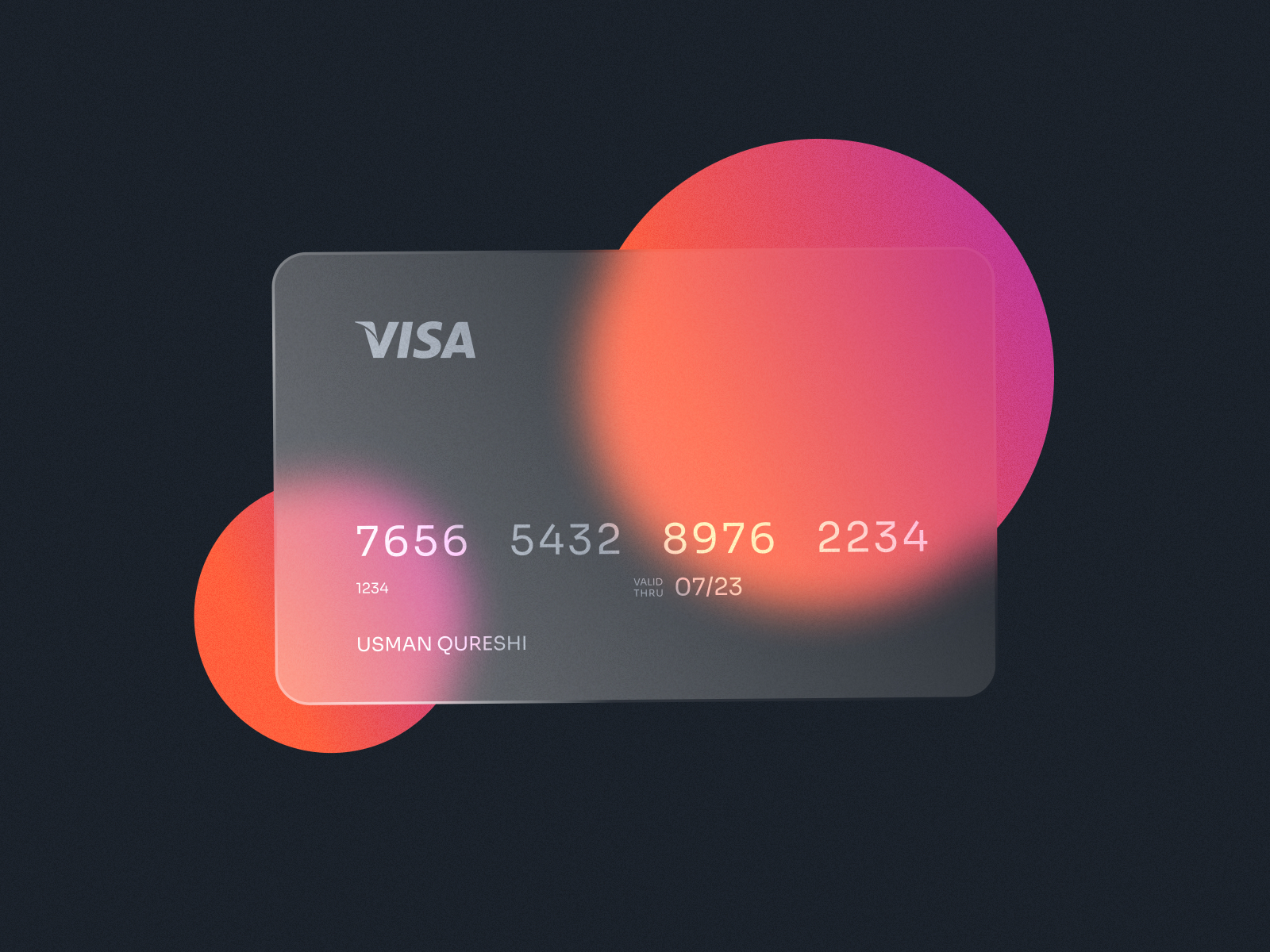
As a decorative effect
Blurs can also be very aesthetically pleasing to look at, and although interface design is about usability, it’s also about making sure the things we create look good. Blurs can be used on background images to bring focus to graphic elements laid on top. This is common in the ‘hero’ section of websites when companies want to use imagery but don’t want it to steal focus. It can also be used to great effect in animations and abstract elements.
Whether you choose to use shadows or blurs in your design, or even both, remember there are so many different ways they can be implemented, try playing around with the settings to see how they affect the feel of your design. Changing a shadow from a thin dark one to a coloured diffuse one can make an interface go from business-like to playful. Adding a blur to the background can help your users focus on an element they have been overlooking. Have fun with it but try to remember the points we’ve outlined above.
Sympli is a Saas company that creates tools for design collaboration, handoff, and version control. With more than 5 years on the market, we had helped thousands of designers and developers work together by providing a single source of truth and reducing back-and-forth communications, resulting in faster delivery.