

“The only important thing about design is how it relates to people.”
—Victor Papanek (1923–1998)
Mobile and responsive design constantly present novel challenges for graphic designers, ones we’ve never experienced before. But that doesn’t mean we can’t learn something from iconic designers of decades or centuries past who never worked with (or even thought about) modern technologies. These creative geniuses understood that graphic design is founded on principles and rules that can adapt to any moment and any context in history.
When I reflect on the Victor Papanek quote above, it helps me remember that design is a medium to connect a user with a machine. In the case of mobile and responsive design, it’s important to engage with the process and get to know the tools that help you collaborate with developers on a project.
The guidance from these luminaries is particularly useful as Adobe users contemplate how to use products like Photoshop and Sympli to bring our designs to life.
“I see graphic design as the organization of information that is semantically correct, syntactically consistent and pragmatically understandable.”
—Massimo Vignelli (1931–2014)
Massimo, who was reputed to have an arrogant and elitist personality, designed the Metro system signals in Washington DC, the city I live in. While he may have been considered abrasive socially, his viewpoint helped him understand a fundamental principle: Design is order.
This perspective remains just as true today, and it is essential to keep it in mind for mobile design. Good design simply cannot be achieved without well-organized content. Make sure you have a finished navigation map to maintain order and organization throughout the design process.
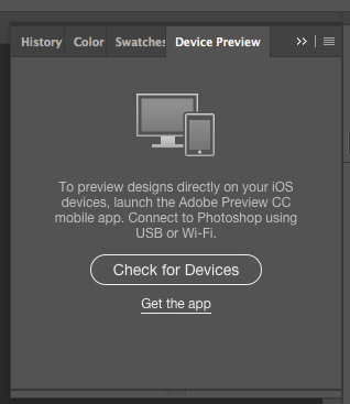
Once you review the content, that’s when you can start drafting for all the screen variations—starting with the smallest version of the app or website. You can quickly draft mockups using Adobe Comp, an app you can get if you are a Creative Cloud member. One additional Photoshop tip: Use the “Device Preview” panel to sync the design draft with your smartphone so you can immediately see how your design looks on a mobile device.
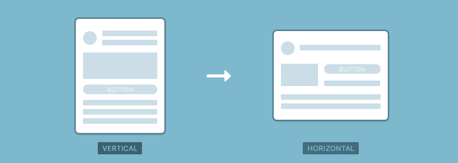
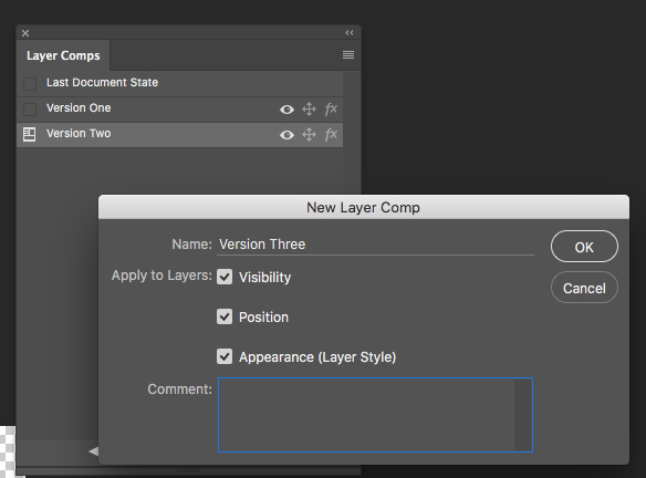
Following Massimo’s advice to maintain order, I recommend using Layer Comps in Photoshop. Found under the window menu, this panel allows you to combine multiple files into one. Having one file will help you make a vertical version, which you can save as another comp to change the orientation and create a horizontal version.
“Digital design is like painting, except the paint never dries.”
—Neville Brody (b.1957.)
This quote perfectly captures responsive design. Always moving, never static, dynamic and versatile—it’s impossible to anticipate all the possible scenarios your design will need to adapt to. Adobe Muse is an intuitive tool that allows you to experiment in a responsive environment so you can see your design in action and make adjustments and corrections.
If you are familiar with InDesign, I strongly recommend using the page tool’s ability to test prototypes with options of liquid design. You can explore some of the other tools to test a design in multifunctional spaces here.
Photoshop does not have any responsive space to test, but you can easily sync its artboards to create a responsive layout using Adobe’s Dreamweaver. To prepare your assets use the layer comps panel to make each different variation of your website. Then choose New Artboard from the Layers panel options, set its dimensions to the new size or orientation, and name each artboard differently, so you can export them as different assets.
Today’s latest tools enable us to adhere more closely than ever to the fundamental principles of design (so long as we understand the principles and know how to use the tools). By heeding the lessons of the designers that came before us, we can build off their visions to create essential, user-friendly mobile and responsive designs for the modern world.