Design handoff is about more than having a safe exchange spot to handover designs, it’s about improving the relationship between designers and developers and establishing better communication. When teams communicate better it improves productivity; it makes teams more excited and it unleashes their shared passion for the project at hand, ultimately resulting in a finer product.
Let's take a look at 5 ways that designers can make their developers fall instantly in love with them!
Keep Your Styles Consistent
More styles means more coding for developers, but they don’t hate it because they’re lazy, they hate it because more styles (or classes as they’re known in CSS code) means more code that has to be read by the browser or device, which in the end results in a slower website or app. Not only that, but the developer has to make sense of all the different styles when inspecting your designs, even if you’re using a design handoff tool like Sympli to help facilitate this.

Photoshop and Sketch both have features that help you keep design elements consistent (Document Colors for saving frequently used colours, Shared Styles and Symbols for saving repeatedly used styles and design components, etc).
If you’re interested to learn more about maintaining visual consistency, read this.
Involve Them the Design Process
At the end of the day, it’s the developer that actually builds the website or app. Even though you’re the designer, the developer knows best when it comes to certain other aspects of the user experience (perceived performance, page loading times, miscellaneous features that will crash the browser).
If you handover your design at regular intervals the developer can weigh-in on the practicality of your design; they can tell you which ideas/features might be difficult to code, or negatively impact the overall performance of the interface.
Plus, asking others for their opinion makes them feel all special and warm inside, and that’s a nice thing to do!

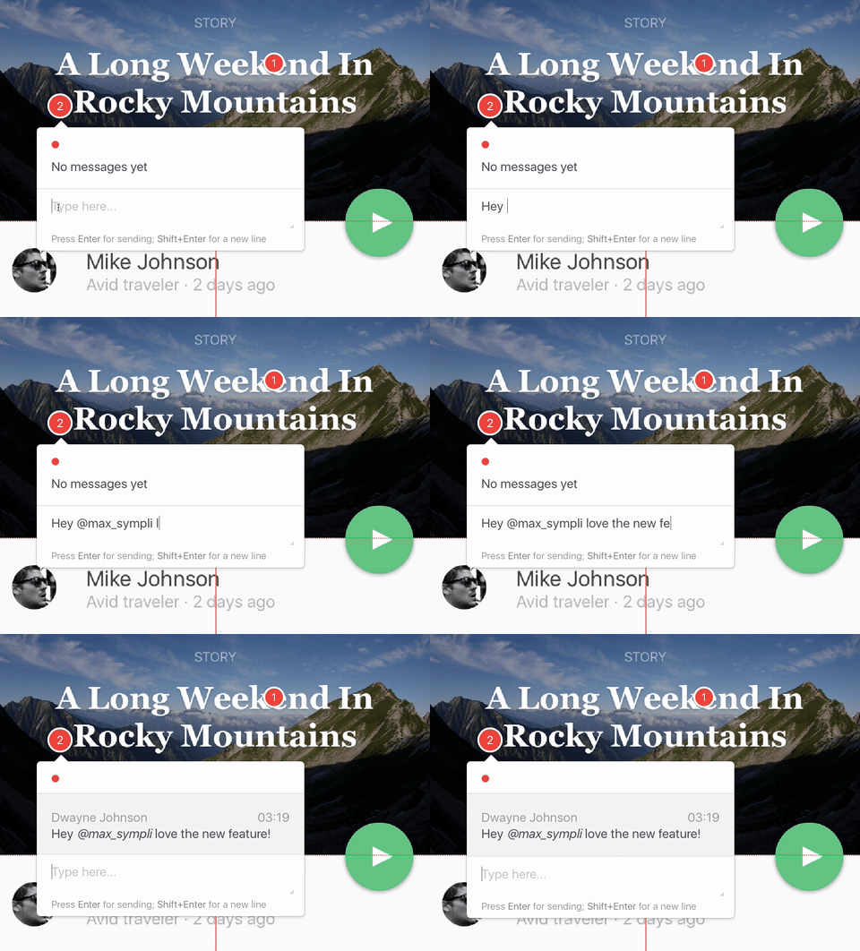
Tip: use the Sympli plugins for Photoshop and Sketch to handoff designs rapidly, and then use the comments and/or Slack features for communication!
Choose Fonts From Google Fonts (for Web Design)
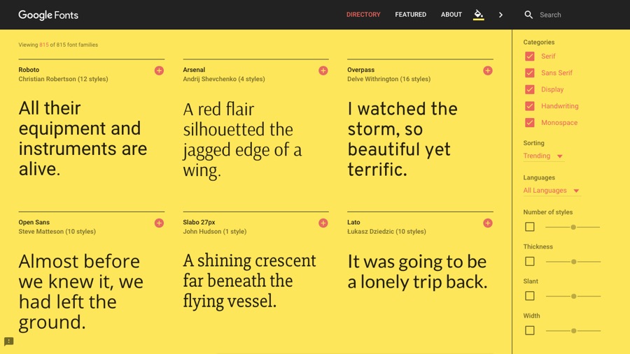
Embedding fonts takes a little bit of work because different browsers support different font file types, and then there’s the hassle of making sure that your web server loads the fonts quickly enough. Google Fonts takes care of all that because it serves fonts using a CDN (Content Delivery Network); it’s probably the largest database of web-suitable fonts, and best of all it’s free to use. It really saves a lot of time for our developers, whom we love so dearly.

You can also serve icons using a CDN like Font Awesome, which not only delivers icons in a scalable SVG format, but allows the developer to style them using CSS code (font-size is used to determine icon size, for instance).
Plus, you won’t have to export a tonne of icons!
Export Image Assets Correctly
Speaking of, exporting image assets can be a bit of a challenge as well. Different handheld devices require image assets to be exported in different resolutions (for example older iPhones were @1x, later iPhones are @2x, and now modern iPhones are required to be @3x). It’s a bit confusing, so this article aims to shed some light on the subject. It’s deadly important that image assets are created and exported at the correct resolution depending on the device and/or browser (and with the correct filenames too).
When in doubt, ask the developer!
Tip: developers can use the Sympli plugins for Xcode and Android Studio to import your design straight into their dev projects! It’s pretty cool.
Optimise Your Image Assets
Optimising image assets is also very important, and this is something that the developer should be able to help you with as well. Since mobile apps load most images at runtime (i.e. they’re embedded into the app and loaded when the app is first opened by the user), native images don’t require optimisation.
But even mobile apps still load images from a web server like websites do, so it’s recommended that you add a layer of image compression (80-95% would be suitable, ask the developer if you’re unsure). Implementing compressed images means that the website or mobile app can load image assets much faster.
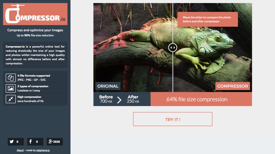
While Photoshop and Sketch will allow you add compression to images, Compressor.io can tell you exactly many kb’s you’re saving while showing you a side-by-side comparison of the image quality. It would take too long to do this with every image, but it’s useful for extra large images.

Developers are pretty picky when it comes to loading times, and rightfully so, because not only do sluggish interfaces negatively affect user experience, but users are likely to hit the back button in a web browser or delete an app if it takes far too long to load. Yes, users are extremely impatient!
It’s best to side with the developers on this, trust me.
Conclusion
Although you shouldn’t need another reason to be considerate of your fellow teammates (especially developers, who traditionally, designers find it hard to see eye-to-eye with), remembering these 5 tips will help you, as a designer, just as much as they help everybody else. Cutting corners to save time only creates speed bumps further down the road, so add a little care with your image exports and some foresight with your design choices.
It’ll help you in the long run, and your developer will love you forever and ever. Developers are our friends, treat them so!


