
What is dark UI?
Dark UI is a term used to refer to an interface that uses mostly dark backgrounds and elements to create a ‘dark’ colour scheme. Dark interfaces can be the only colour theme for a site or app or can be toggled on via customisable settings. Dark UI can help save battery life by reducing the amount of power used to show an interface, it can help reduce eye strain by adjusting to surrounding lighting conditions and can help facilitate the use of devices in dark environments.
When should you use a dark UI?
Dark mode is not a new idea. It has been around for a long time, but only recently have sites and apps started implementing both a dark and light mode for their UI. Back before dark mode was a thing, sites that choose to have a dark UI did so either because their apps and sites were going to be used in dark environments or because they wanted to create a moody dramatic effect. Some examples of sites and apps that utilise an always-on dark mode are; apps to help you sleep, Netflix which is mainly used in the evenings and games where you want to create a moody atmosphere.
Dark UI best practices
There are a few things to keep in mind when creating an interface with a dark colour pallet that differ from interfaces with a light colour pallet.
Avoid using pure black
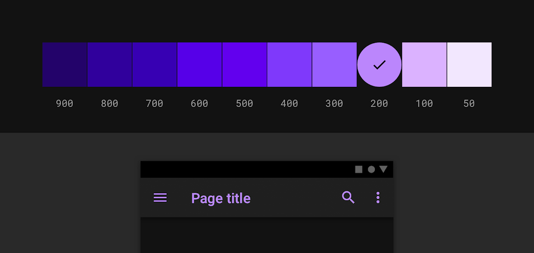
When picking a background colour and a text colour you may immediately go to pure black for your background and pure white for your text colour. However, this has a very harsh contrast and can make text difficult to read and even painful on the eyes after a while. Instead, use a dark grey colour for your background, Googles material design guidelines recommend using the colour #121212. Dark grey allows you to use black for shadows so you can keep a sense of depth and has a reduced contrast between itself and white text which will reduce eye strain.

Use hues of white
When adding emphasis to dark text on a light background we generally use a heavier font-weight or size. However, with dark backgrounds, light text can appear very bold already and using a bold font may look heavy-handed. Instead, consider using a slightly off white for elements that are not active or being interacted with. An example of this would be using a slightly darker shade of white for input text on inputs that aren’t active or don’t have any content, then using a bright white for active inputs or inputs with content. This can help visually differentiate them from one another without adding overly bold text.
Steer clear of over-saturated colours
Colours that are very saturated can look very good on light UI interfaces as they have a good contrast ratio. However, on darker backgrounds highly saturated colours can cause eye strain and often don’t meet accessibility guidelines. Less saturated colours are generally better f=all round in terms of legibility on dark backgrounds. If you have very saturated colours in your brand pallet and want to ensure brand consistency you can use these saturated colours but they should be kept to a minimum throughout and substituted with a less saturated version of those colours when possible.
Adjust your colour pallet where necessary
If you have an existing colour pallet that is used for a light interface and you are now adding a dark interface option you will need to revisit your colour pallet and potentially adjust it specifically for your dark UI. As mentioned above there are some colours that can look great on light UIs but won’t meet accessibility on dark UIs. The first thing you can do is check your existing colours contrast against your proposed background colour. If it meets accessibility requirements then you are good to go, but if it doesn’t meet accessibility consider reducing the saturation.
Use different shades to indicate depth
When creating your interface you shouldn’t feel the need to stick to just one shade of grey for the backgrounds of your elements. In fact, this may be impossible if you use cards, modals or drawers in your designs. Picking a base shade of grey is your starting place, from there you can add a few more tones of grey that gradually increase in brightness. Elements that are elevated above the main background can use these slightly lighter greys to express depth in your designs. The higher the elevation of the element, the lighter grey the background becomes.
Keep your pallet minimal
The purpose of a dark UI is to reduce eye strain by keeping the majority of the items on screen dark. This means that you should try to limit your colour pallet to only a few colours and try to use these colours as highlight and accent colours only. The majority of your screen real estate should be dedicated to dark greys.
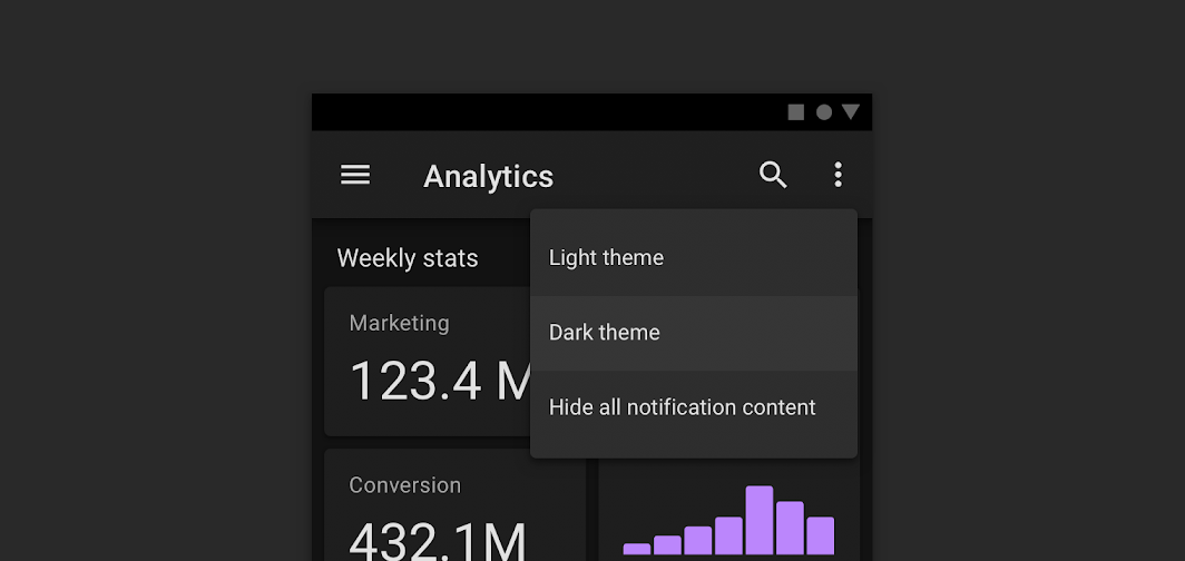
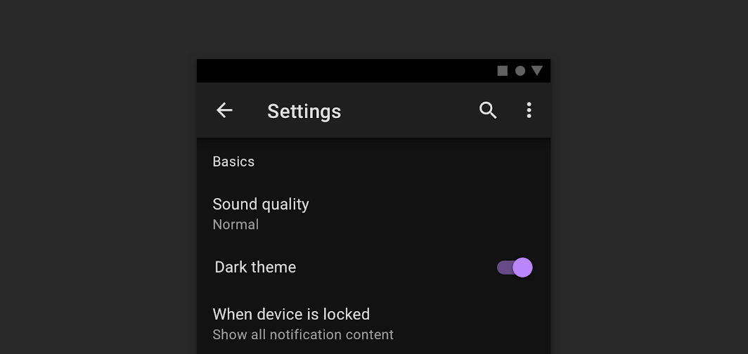
Give users the option to turn it on or off
If you have an application or website with both dark and light UI you should ensure there is a way for the user to control these settings from within your product. This may seem like an obvious one but relying on the users' device settings to change your product from light to dark reduces user control. It could be that they prefer using your site in dark mode all the time and giving them the freedom to choose to do so will greatly improve their happiness while browsing.
Test your design with both light and dark UI
If you have created a design in light mode, tested it and maybe even released it to customers to use, and now you are created the dark mode for that original design, don’t forget to test it. The fact the interface worked well in light mode is no indicator that it will work well in dark mode. Changing colours and contrast can make some items less accessible and this can be easily checked by conducting some usability tests prior to launching your design.
Dark UI in action
Below are some examples of sites that do a good job of implementing a dark UI.
Netflix uses dark UI to emphasise its content and reduce eye strain for people watching in the evenings. It even uses dark UI on its commercial site to add a sense of drama.

Reddit has a dark mode in which users can toggle on and off themselves from a menu. They utilise different greys to add depth to their design and change some colours to more muted tones for dark mode.

Mediums dark UI can be set to match your device settings so that in the evening you aren’t blinded by a bright white screen. Allowing you to read without straining your eyes.
Sympli is a Saas company that creates tools for design collaboration, handoff, and version control. With more than 5 years on the market, we had helped thousands of designers and developers work together by providing a single source of truth and reducing back-and-forth communications, resulting in faster delivery.