
According to the 2021 Design Tools Survey, Figma is the most popular UI design tool. One of the reasons for this is that its style, component and library features are considered to be the best for creating design systems. When paired with Sympli Handoff, designers can hand off and manage their design systems more efficiently, too.
In this tutorial, we’ll show youhow to use Figma’s design system features to ensure that designs are clean, organized and visually consistent. You’ll also learn how to level up your design system even further using Sympli.
Creating Text Styles in Figma
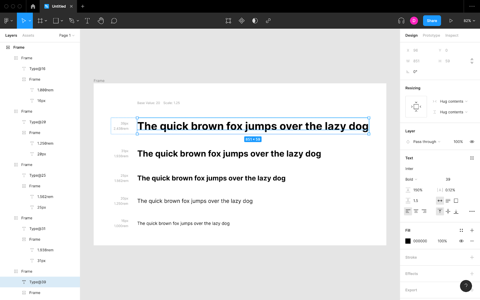
The best way to start a design system is to create a type scale: a systematic set of incremental font sizes that will help to convey visual hierarchy through typography. The most efficient way to accomplish this is with a Figma plugin, such as Typescales. Simply run the plugin (Main menu → Plugins → Typescales), define the type scale settings and then click “Generate.”
If you haven’t created a type scale before, change the “Basesize” setting to 20. Leave the “Scale” setting at 1.25, which is the most common choice. Change the “Line Height” setting to 1.5, which is usually the optimal value and also the minimum value as recommended by the Web Content Accessibility Guidelines (WCAG).
Set “Scale ↑” to 3 (which generates font sizes for 3 heading levels) and “Scale ↓” to 1 (which results in a font size at 16px, the minimum font size as recommended by the WCAG, which can be used for small text as needed). Apply “Round Values” because clients (e.g., web browsers) will do this anyway.

After clicking “Generate” the type scale should appear on the canvas.

Next, define the font family, (font) style and letter spacing for each of the generated text layers from within the “Design” panel on the right side. The letter spacing should be 0.12 times the font size (e.g., 20px × 0.12) in order to meet WCAG accessibility requirements. As for the font family and style, choose wisely to ensure optimal legibility and readability. If any other font variations are required, go ahead and create those too.
Now let’s make these text layers design system-ready. After selecting one of the generated text layers, click the four-dot icon (“Style”) under “Text” in the design panel and then the + icon (“Create style”) to turn it into a “Text Style” that we can reuse in our Figma designs and maintain in our design system. Repeat this step for the other text layers, making sure to name them methodically when asked to. For example:
- “Heading/1”
- “Heading/2”
- “Heading/3”
- “Base (Body)”
- “Small (Minimum)”

Note: “1/2/3” will be organized into a category called “Heading” in order to keep the list of text styles in Figma organized.
Finally, double-click on “Page 1” from within the “Layers” panel on the left and rename it to “Typography” before creating another page called “Colors” by clicking on the + icon.
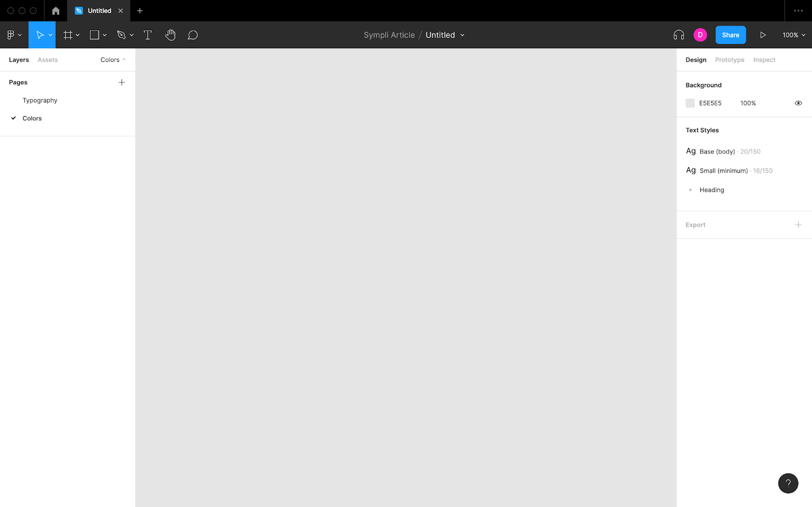
Creating Color Styles in Figma
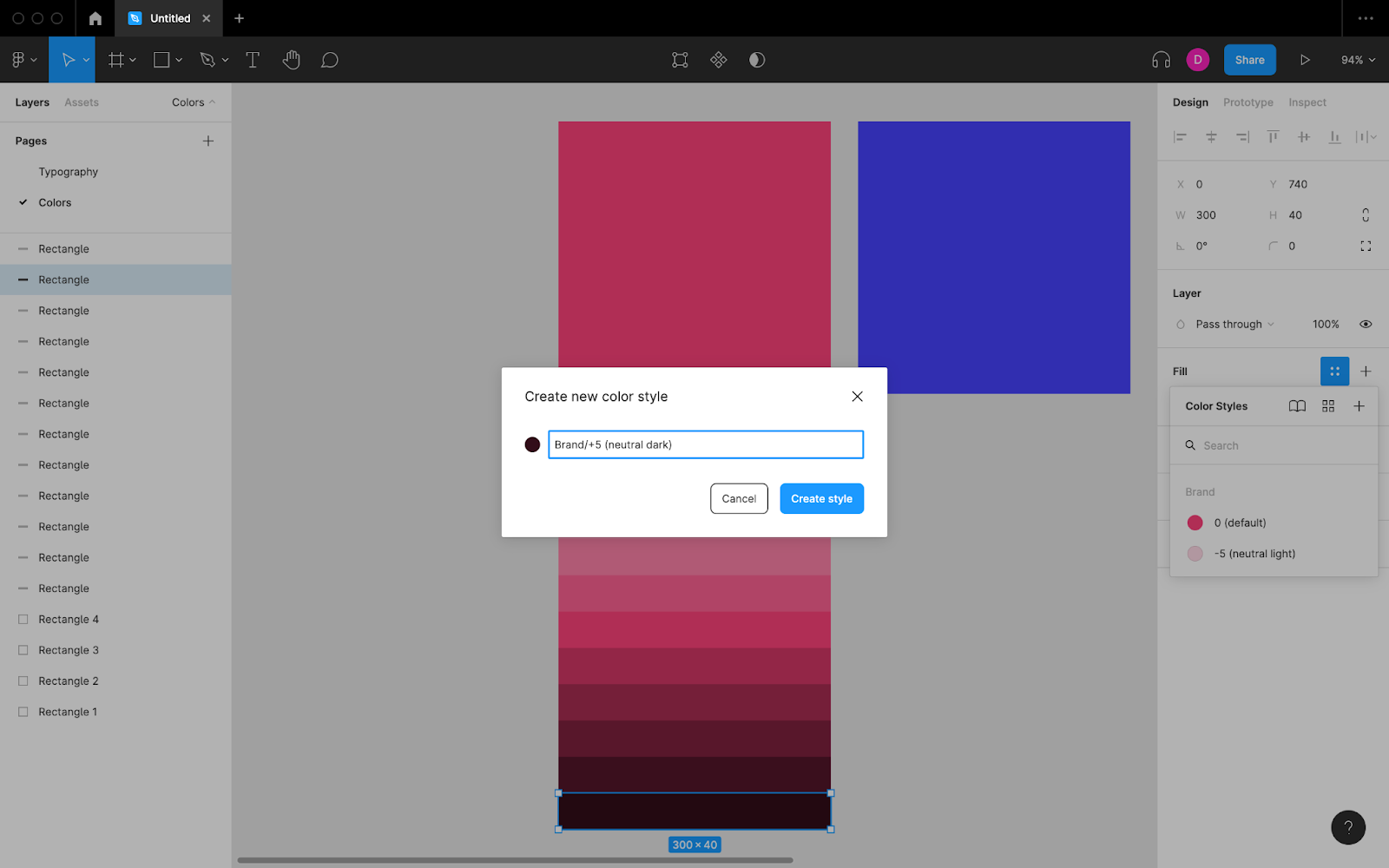
On this new “Colors” page, create a rectangle shape (keyboard shortcut: R) for each design system color and apply its “Fill” using the design panel. Do this for brand colors, alert colors, neutral colors and so on, and organize them how you see fit.
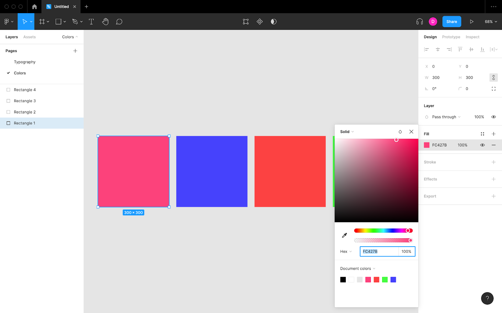
An effective method of creating neutral colors that compliment brand colors is to generate tinted and shaded variations of brand colors. The Tints and Shades Figma plugin, when run, will generate 10 additional colors using any selected layer with a fill applied. An optimal brand color (one that’s not too light or too dark) will result in a white/white-ish color, a black/black-ish color and several tinted and shaded variations that you can use as needed.
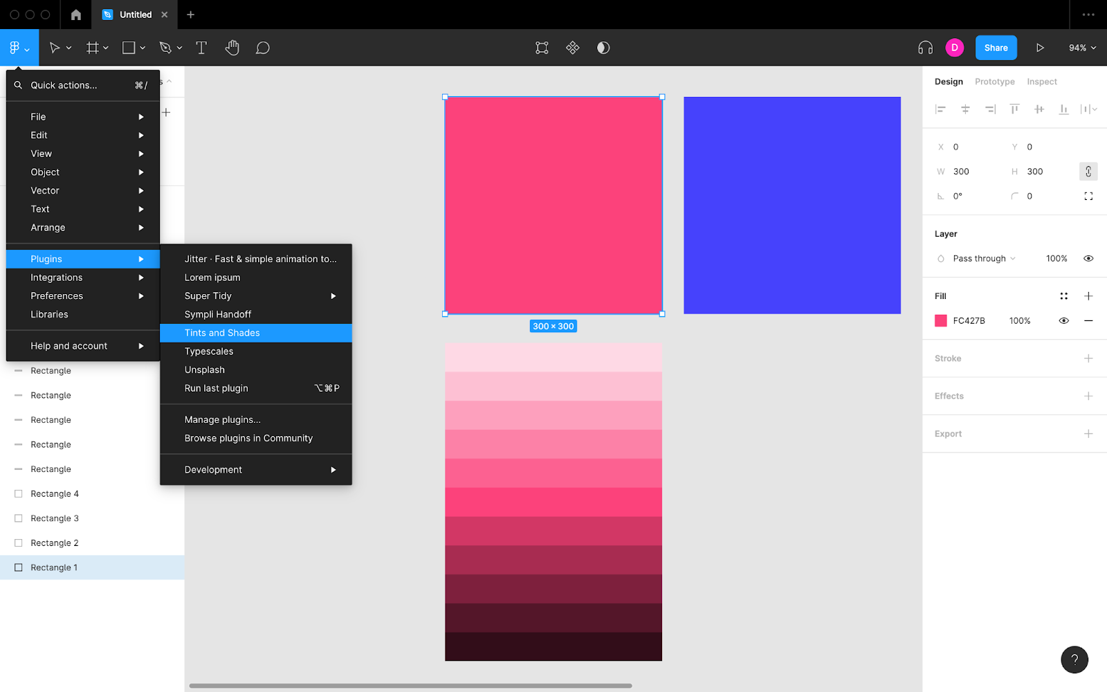
Figma plugins, such as Tints and Shades and the aforementioned Typescales, are fantastic for creating design systems and speeding up the design workflow overall.
Convert the fills into “Color Styles” the same way that you created the text styles.
Creating Components in Figma
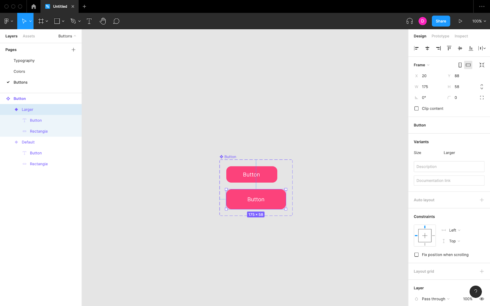
Next, create your reusable design elements (e.g., buttons) and convert them into components (keyboard shortcut: ⌥ Option + ⌘ Command + K for macOS or Ctrl + Alt + K for Windows). Organize different types of components into different pages as you see fit and remember to incorporate your text styles and color styles for visual consistency.
When you need to create slight variations of components, select the component and click “Variants” in the design panel. This is more efficient than creating completely new components. For example, a single button component can contain variants for different colors, sizes and states.
As usual, name them methodically.
Note: converting layers into components can sometimes override Auto Layout settings, so make sure to double check those after creating your components.
Syncing Design System Changes to Sympli
Finally, let’s sync these design system elements to Sympli using the Sympli Handoff plugin.
With Figma being a UI design tool with many real-time collaborators all working at once, it can be difficult for designers to know which design system elements they can use and which are currently being worked on. Sympli, however, offers a true single source of truth where the only changes to track are changes that have been fully approved and synced.
Also, Sympli design systems can store types of design tokens that Figma can’t, such as spacings and sizes.
Using the Sympli Handoff Plugin
You can use the Sympli Handoff plugin from within any open Figma file, including Figma libraries. Just run the plugin, switch to the “Design System” tab, specify any settings, then click “Continue” before choosing a Sympli design system to sync to.
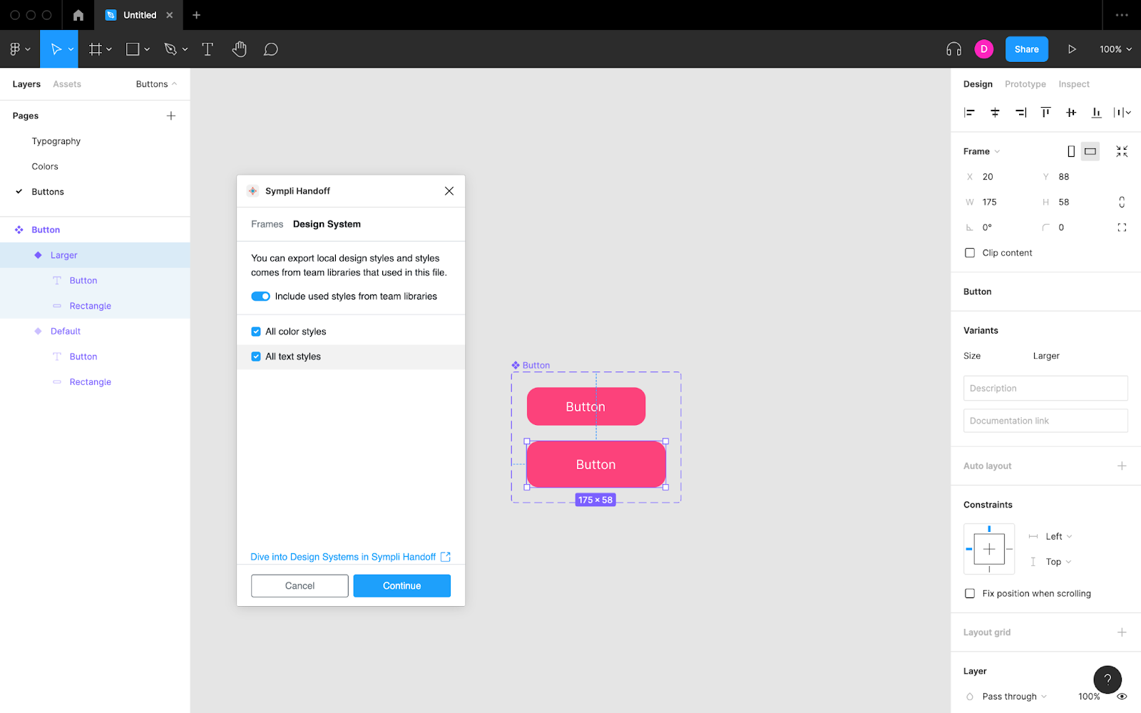
The Sympli Handoff plugin syncs color styles and text styles (but does not affect styles or layout grid styles). It also uploads any fonts used.
Once synced, Sympli translates these into design tokens with pre-generated code for developers. Spacing and size tokens can be created manually from within the Sympli web app. Grid settings and web units (px/rem) can also be defined manually.

Sympli design systems can be shared across multiple Sympli projects for complete consistency. Sympli is continuously improving its design system features. Stay tuned for components support and more.