
As innovation and technology advance, collaborative work and great remote communication develop rapidly. Digital media have proven to be able to maintain proximity versus distances, making coworking, conversational sales, providing feedback or requests for information viable and effective. After several years of developing communication features, the UX/UI design field already has several lessons and good practices that it is important to collect. In the following article, we review the most important communication features.
@Mentions
If you want to get someone's attention in an email or in a comment within a platform, you can write the @ symbol, followed by their name within the message. If you do this, not only will their name be highlighted in the body of the message, but the person will automatically be notified that they have been 'mentioned'. This interaction could change a little if we do this in an email service like Gmail, a social platform like Instagram, or a coworking tool like Slack. But the idea of @mentions keeps the same logic and it’s increasing his popularity.
To design a great mention feature we must take into account:
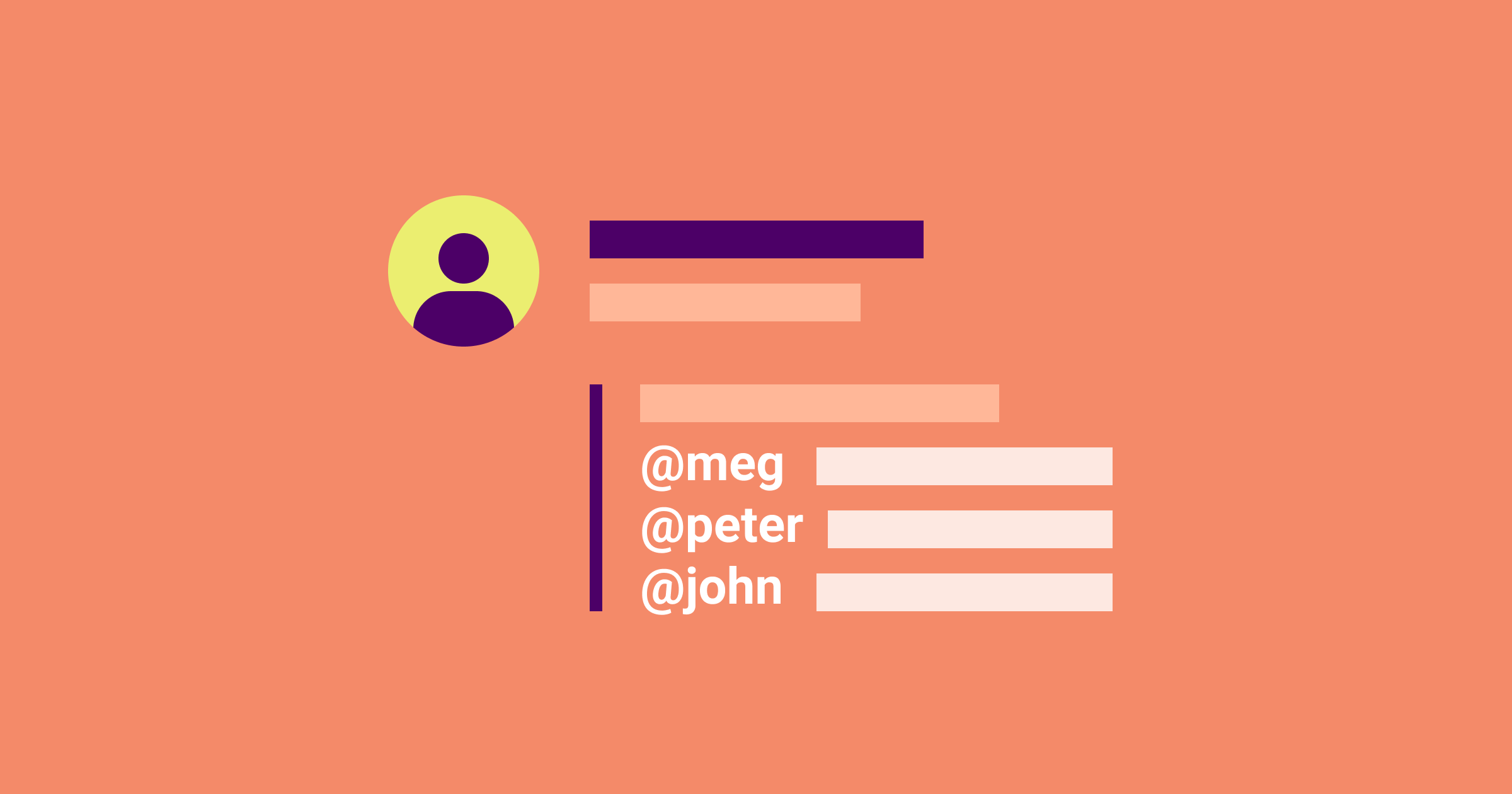
- Make it easier for the user to recognize the person they are looking for by incorporating visual data such as a photo or an avatar. Relying only on the name will be an extra work of recognition for the user.
- Show not only the nickname but also the complete user name, to avoid mistakes and confirm the identities.
- Differentiate the color of the mention “@jhondoe”, from the informative text, to know when the mention is being effective and to know that it has editing properties.
- If there are many users in the list, it should be possible to type the first letters of their real name or username, the pop-up list should only show the matching results.
- It makes it easy for the user to have a section called “mentions” where they can see the old and current mentions.

Gmail uses mentions to notify third parties and copy them in emails. We can see many of the practices mentioned above, like photos, names, mail names, and interaction colors.

Instagram popularized and promoted the use of mentions in a very visual way among its users.

Slack brought mentions to collaborative work where response times and personalized notifications became a central part of the workflow.

Mentions on Facebook allow you to see other user data such as the number of mutual friends or if it is an official page (blue check).
Mentions are an efficient way to notify, work asynchronously, avoid wasting unnecessary time, and have a fluid conversation on a specific topic. The style and micro functions of a mention, however, will depend a lot on the type of product and the objective of the communication.
Comments
A good comment design can go a long way in terms of usability, collaboration, and performance. Taking the time to design a great comment system and comment form can make a big impression on end-users. Subconsciously it implies that everyone's opinion is promoted and it is encouraged to participate in a discussion.
Comments on an interface are literally designed for user interaction, they are a proven way where readers can share their thoughts with others. But not all comments are the same and certain techniques are more favorable than others, let's take a look:
- Focusing on the content of the comment will be something to keep in mind when designing comment systems, check that the font sizes and background contrast are the minimum acceptable for a friendly reading.
- Since the interaction in the comments is an essential part, the conversation threads and quotes between the various authors should be well recognizable.
- Have a simple interaction for reorder comments, whether by publication date or popularity.
- Enable collapse capability for long comments or sub-comments to give users the flexibility of use.
- Emphasize the author of the article if there are comments within a blog.
- Spam prevention when leaving a comment, enabling a captcha or conditioning a login, avoiding non-human comments that end up damaging the experience.
- Support texts in the comment forms (placeholders, tooltips, error states), which will improve the experience when writing the comment.

Facebook comments show through hierarchy, not only the response to a specific comment but also when the comment is from the original author of the content, through an “author” tag and a microphone icon.

In YouTube comments, the sub-comments are compressed by a link (6 replies), so as not to extend the reading experience too much and provide more user flexibility.

Medium on the desktop displays their comments as a screen that pops up from the right. One of its functions is to reorder comments by relevance or date.

LinkedIn comments are also designed to generate conversation threads, value each comment by likes and reorder them by relevance and date.
To design comments that work, we must take advantage of the knowledge that we already have from the years of use of this functionality. After all, comments are one of the first tools to appear on social media and blogs. By studying other interfaces in your market, you will recognize social traits and define the specific needs of your product. Don't forget that the most important thing is the message behind the comment.
Chats
The most popular chat applications (Whatsapp, Messenger, Telegram) do a good job in creating their interfaces and providing great communication. In another scenario, company chats serve as a last resource if the user has not found the information himself, and needs some human help. In both cases, brands consider many interface elements such as buttons, colors, space between elements, branding, and many design and usability decisions with specific objectives. Let's look at some of the most important ones.
- Clear floating chat-button location. Find a contrasting color and a fixed location at the bottom of the screen so that the user can notice its existence while scrolling.
- Enable a dark mode to facilitate night reading. The advantages of dark mode are that it improves visual ergonomics by reducing eye strain, providing comfort for use at night or in dark environments.
- Negative spaces for texts and legible font size, which will be more accessible for the elderly or those with vision difficulties.
- Differentiation between outgoing and incoming messages, that is, being able to recognize my own messages from the responses I receive. This can be done using different colors, shapes, or alignments.
- Land user expectations when talking to a chatbot. That is, show clearly that you are not talking to a real person, to avoid future frustrations.
- Small messages like "the person is writing ..." helps reduce user’s anxiety and give feedback from the system.
- Ease of sharing media files (photos, videos, audios) in the conversation to enrich the conversation and give details if necessary.

The Telegram chat includes a dark mode that respects the minimum color contrasts for a good reading of the messages. As well as the ease of sharing media files.

WhatsApp clearly defines the incoming and outgoing messages by color, position, and shape.

The floating button of the Facebook chat is designed to display a window with the beginning of the conversation, which helps to integrate the conversational experience in a more agile way.

The mobile monkey bot service exposes that it is a virtual assistant and not a real person by its name and avatar, which helps to land user expectations.
The conversation is the way we achieve different goals and build relationships with people. It is fundamentally a collaboration in the most basic sense of the word. A chat design that has the points mentioned in this article will increase the quality of the experience and will facilitate the main objective, which is communication. Designing communication features taking these consolidated references will help to create an empathetic approach with the user, as well as to identify problem areas and determine the solution.
Thanks for reading!