
Chances are, if you’re working on the UI design for a website or a product, you will, at some point, need to consider a loading state. It might be for an image uploader or just a data-heavy page that needs some time to pull itself together. Either way, you’ll need to give your users an indication that something is happening in the background while they wait.
Types of Loading States
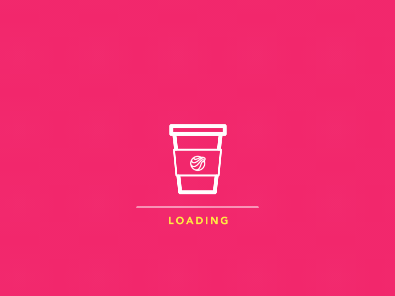
Spinners
Spinners are best used when you aren’t quite sure how long an action is going to take to complete. This could be when waiting for something to buffer or for a user to regain a lost connection. You’ll likely be familiar with the beachball on a Mac or the blue spinner on a Windows machine, displayed when your computer is completing a task. But you can also see spinners on Instagram when you refresh your home feed.

Spinners come in many shapes, sizes and colours and can be customised to be as fun or bland as you want. But where possible, you should include some guidance text alongside the spinner to prompt the user to wait or take action if something goes wrong.
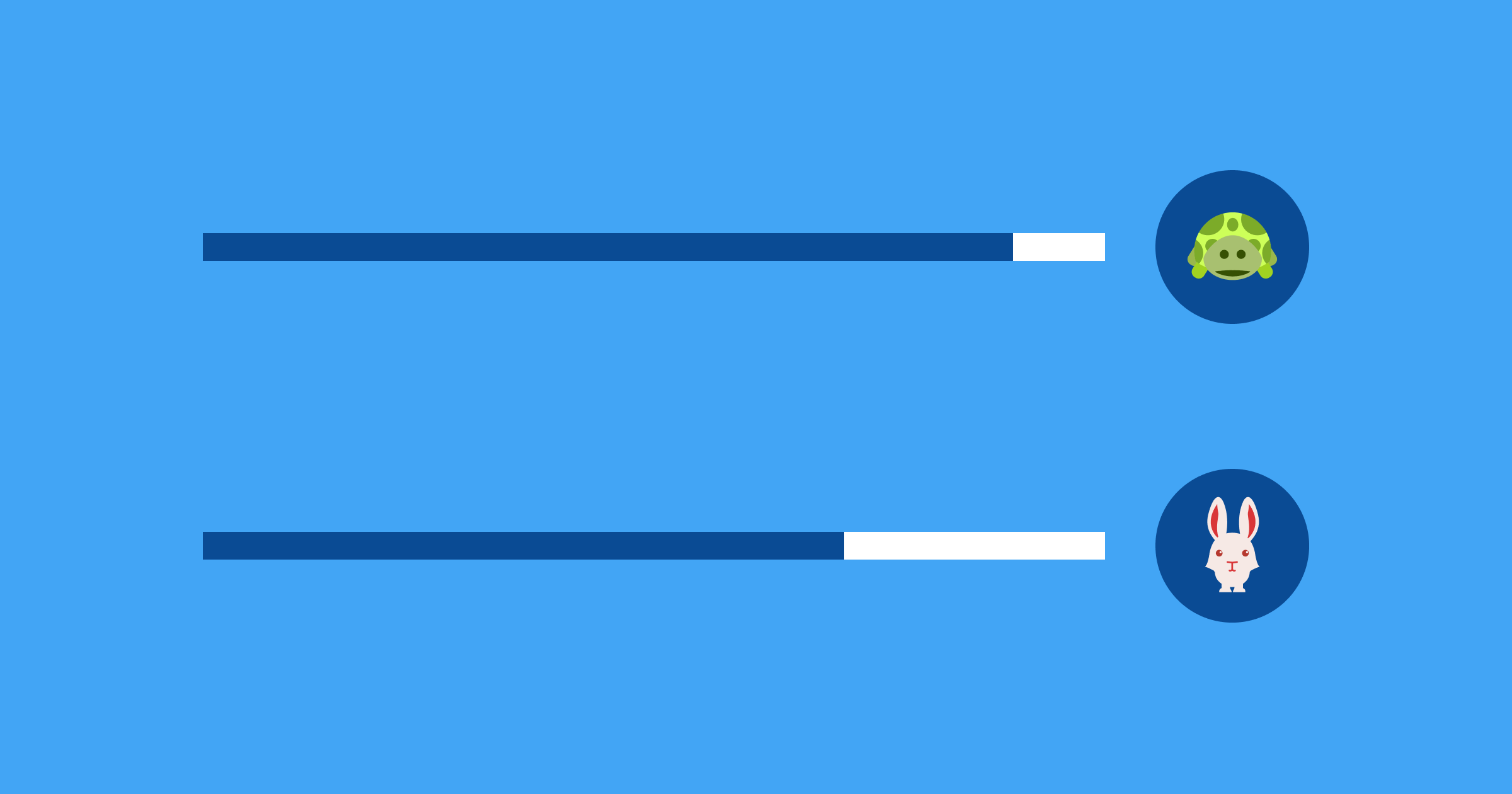
Loading Bars
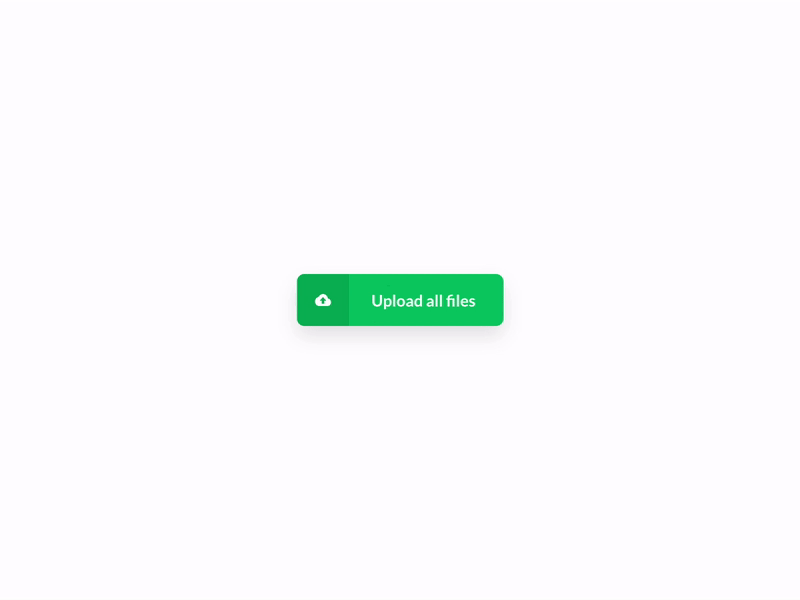
Loading bars are better suited for when you know the progress of an action. These will apply more to components that show the progress of a document uploading or a program installation. They can also be used to show how much of a video or song has buffered in media players.
Loading bars don’t always have to be a straight line: the Google document uploader shows a circular loading indicator, this saves space and allows users to scan down through the progress of their uploading documents.
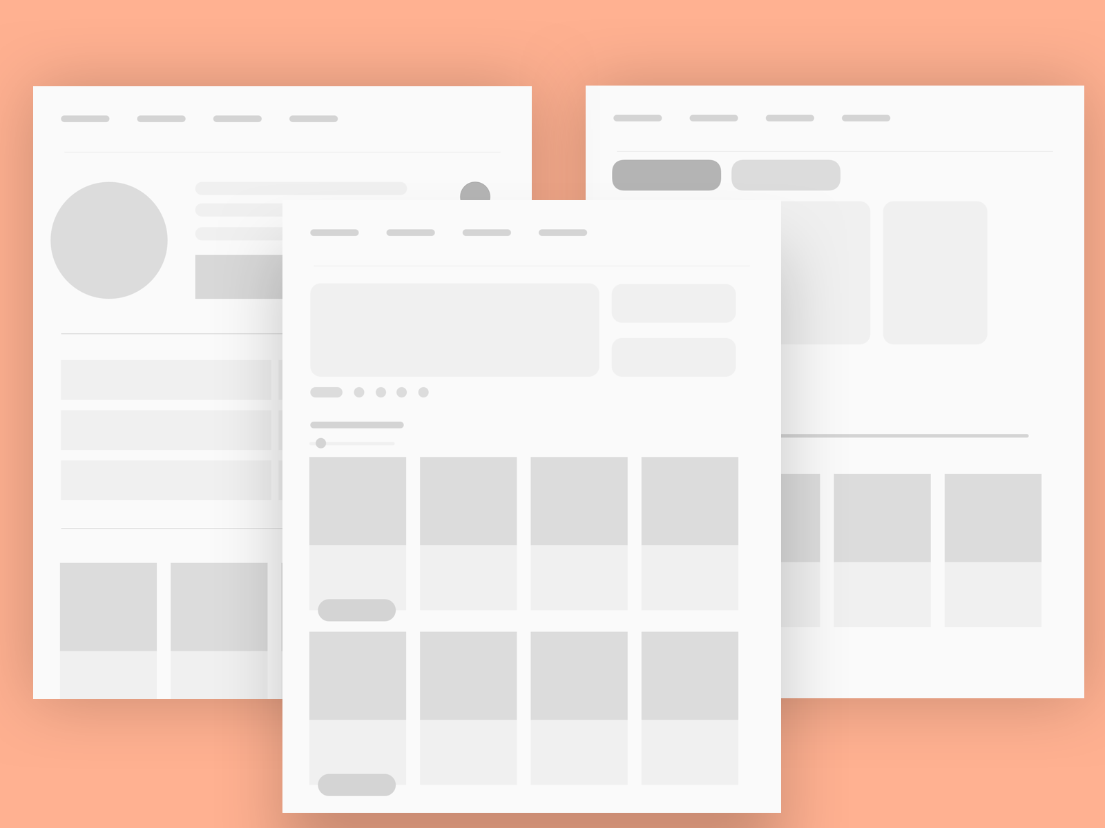
Ghost or Skeleton States
Skeleton (or ghost) states are when you show your user some low fidelity grey boxes on a page for each component that needs to be loaded. In the case where you may have multiple parts of a page loading separately to one another, implementing skeleton loaders can stop the page from jumping around as the page loads but also, it’s visually neater than having multiple spinners on different parts of the page. It can also give the user some guidance on what they should expect to load on the page.
Progressive Loaders
Progressive loaders are slightly different to skeleton states in that they gradually increase the fidelity of images as the page loads. This is particularly useful for image-heavy sites or articles and can actually be used in conjunction with skeleton states to ensure there are no gaping white spaces on pages with large images. If you think a page may be accessed by users connecting via mobile or on a less stable internet connection this may be a good option.
Things to Keep In Mind
If you’re loading a page and something goes wrong, you will need to provide the user with feedback on what they can do to recover from the issue and navigate away from that page.
If you have a loader on a page that might not have content once loaded, remember to add an empty state for that page. You can get really creative with these and can reuse them across pages, you just need to give the user some feedback that nothing has gone wrong, there simply isn’t any content here yet. You can also use this as a call to action for the user to interact with a button or link to carry out a task you want them to complete.
Whatever you choose, the way you present the loader is entirely up to you, and (depending on your brand) you can make it as fun and whimsical as you want it to be. You could even use animations of illustrations in place or loading bars or spinners. UX research has shown us that users have an ever-decreasing attention span so creating a fun interaction design as part of your loading screen could help reduce bounce rates from bored users.
The important thing to remember is that the loaders are there to improve the user experience by giving your users context and feedback about what is happening on-page and to help them recover from errors if something goes wrong.
If you want to get creative and experiment with animating your loaders - check out our article on animation tools for designers.
Sympli is a Saas company that creates tools for design collaboration, handoff, and version control. With more than 5 years on the market, we had helped thousands of designers and developers work together by providing a single source of truth and reducing back-and-forth communications, resulting in faster delivery.