
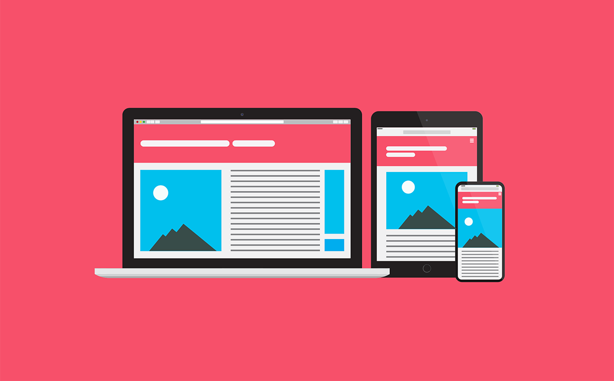
The responsive design consists of responding to the size of the devices (desktop, tablet, smartphone, etc.) from which a website is viewed, adapting the information, its dimensions, and displaying the components in a correct and orderly manner. It is also a mandatory practice for our times, in which technology is diversifying, as well as the ways of accessing the internet.
Origins
It all started with Ethan Marcotte when he introduced the term "Responsive Web Design" and published a book of the same name. In fact, until a few years ago, web pages were designed with fixed screen sizes in mind, and what we now call Responsive Web Design did not even exist before, or at least not in the current way.
In the period where smartphones did not exist, and we just designed for desktop screens, web designers had to constantly update themselves to the latest monitor models, to adapt their designs to new screen sizes, increasingly larger. The diversity of desktop devices leaned towards more or less large screens.
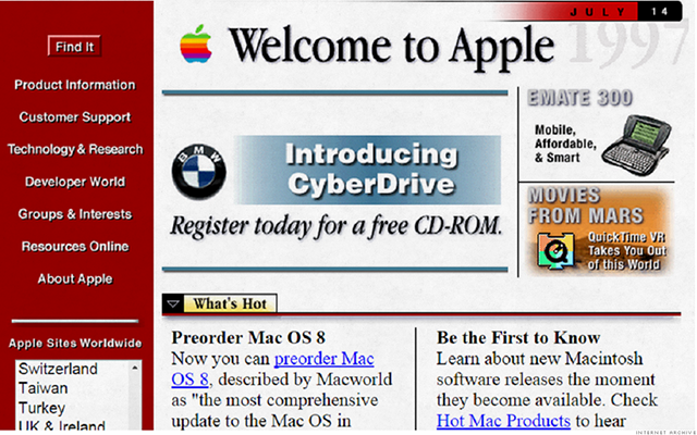
Apple’s website, 20 years ago.
One will probably remember to create a web design 800×600 and another for 1024x768. The work this took was considerable, and actually, this was not long ago.
The ability to create responsiveness using percentages in style sheets (CSS) already existed since those years, but no one yet developed or risked building a single website that adapts to all devices. The problem then was more of a mental conception than of possibilities to develop multi-device websites. The investment of time seemed to be too great for something that might not work.
By 2008, the science of responsive design evolved thanks to the concepts of fluid grids, flexible images, and media queries. This, along with the emergence of smartphones and new digital apps and tools, made many things that previously could only be done on the desktop are now possible on a cell phone. This positioned responsive design as a key factor for the user experience and a ‘must have’ for digital businesses.
The current logic of responsive behavior is the fluidity of content within blocks, which are arranged one on top of the other depending on the device and the type of content.
Benefits of Responsive
If you want to know why having a responsive design is a priority, here are the top three benefits:
1. Improve the user experience
Access to content that is appropriately adapted on any device greatly improves the user experience. A good responsive design also improves readability, increases the time spent on a website, it enhances interaction or, in the case of e-commerce, improves sales. In general, the design and its objectives have a better impact, for the business, and the user.
2. Improve visibility in search engines
Some advantages of the responsive design directly influence the SEO of a website, such as loading speed or dispensing with duplicating content in mobile versions.
In any case, Google recommends that webmasters follow the best practice in the industry using responsive web design, using the same HTML for all devices, and using only CSS media queries so that the content is displayed correctly in each case.
3. Load the site faster
Responsive web design improves site loading speed on different devices. A better loading speed not only improves the user experience but also influences the improvement of web positioning.
Important Considerations
Here are some considerations and good design practices:
- Have a “mobile first” approach from design planning, since it will be easier to adapt the elements from mobile to desktop than vice versa.
- Handling advanced concepts of minimalism will be key to not complicate the screens with unnecessary elements that will later be difficult to place in the different sizes.
- Understand that you will have less control of the design and layout, so we will have to think more about the quality of the components (atomic design) and less about the general composition of each screen.
- Having an approach and good communication with the front-end development area will be important to define in detail the responsive behavior and all that it involves.
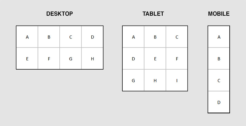
Breakpoints and responsive criteria
A breakpoint is when the content of a website is visually adapted in a certain way to provide a better user experience. For example, when we enter The New Yorker website, we can see all the options in the navigation menu in the header. However, if we access the web from a mobile device, the smaller screen size will make the navigation bar appear at the top left of the screen as a drop-down menu.
Let’s see some good examples and practices:
Youtube
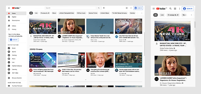
The YouTube main page distributes the thumbnails of the videos in a fluid way on their devices, going from a horizontal reading on the desktop to a vertical reading on mobile. Another important change, and which is defined as a good practice, is to hide the navigation menu in mobile, within what is known as the ‘hamburger button’. Note also that the search in desktop is a complete input, while in mobile it is just an icon that after the tab, will display the input.
Dribbble
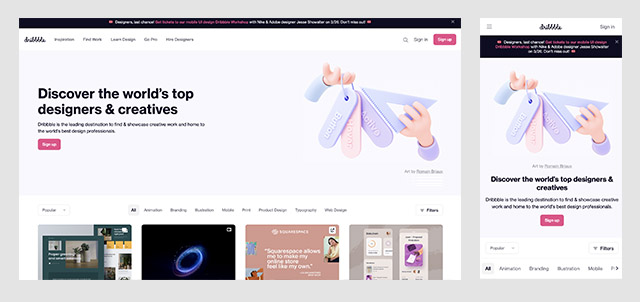
The Dribbble homepage is also a good reference. In this case, the upper black banner varies its position both on desktop and mobile, exchanging its place with the navigation header. This shows that the order of appearance can vary to improve the user experience on each device. Another important change is the text alignment of the main message, being left alignment for desktop, versus a centered alignment for mobile.
Uber
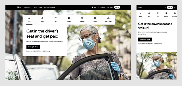
Uber doesn't go unnoticed when it comes to responsive design, their page cleverly shows how you can be flexible and creative with your design to achieve a good layout. Although the adaptation of the header is not very drastic, it is designed to take advantage of all the space available on desktop and mobile. Another interesting change in the mobile is the iconographic menu, which goes to a sliding-type lateral navigation, a very ingenious solution.
Mailchimp
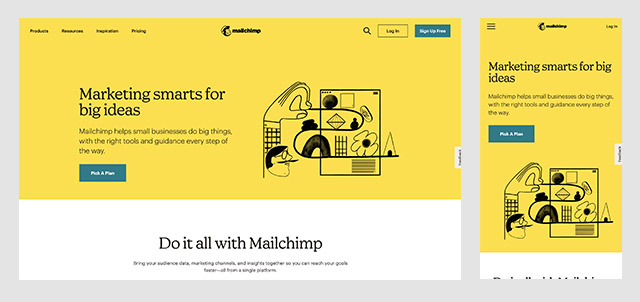
The Mailchimp website is also a reference for understanding correct breakpoints. Their mobile information blocks are placed one on top of the other neatly and with the correct spacing. Several of its buttons and call to actions are hidden in mobile but without taking away their ease of access, making it functional and minimalist at the same time.
Google Maps
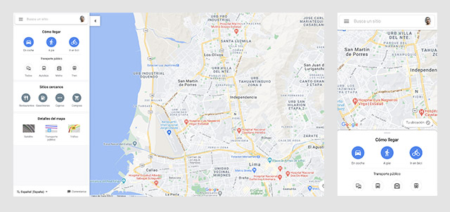
In the case of Google Maps, we can see a very complete desktop version, with a right panel with several options and a large space for maps. In the case of the mobile version, the header is kept at the beginning of the reading but is followed by the map and then by the interaction options. Again, this example shows that the order of the elements can vary from device to device in order to improve the user experience.
Conclusions
Responsive design and mobile devices are already here, and they are going to stay, they are the present. After all, fewer and fewer people are navigating the internet through desktop devices. Although this preference depends on the industry, around 60% of web traffic is on mobile, while 30% comes from desktop. In short, responsive design is not only a solution for this behavior, it is fundamental to capture the attention of the users and give them a great experience.
Sympli is a Saas company that creates tools for design collaboration, handoff, and version control. With more than 5 years on the market, we had helped thousands of designers and developers work together by providing a single source of truth and reducing back-and-forth communications, resulting in faster delivery.