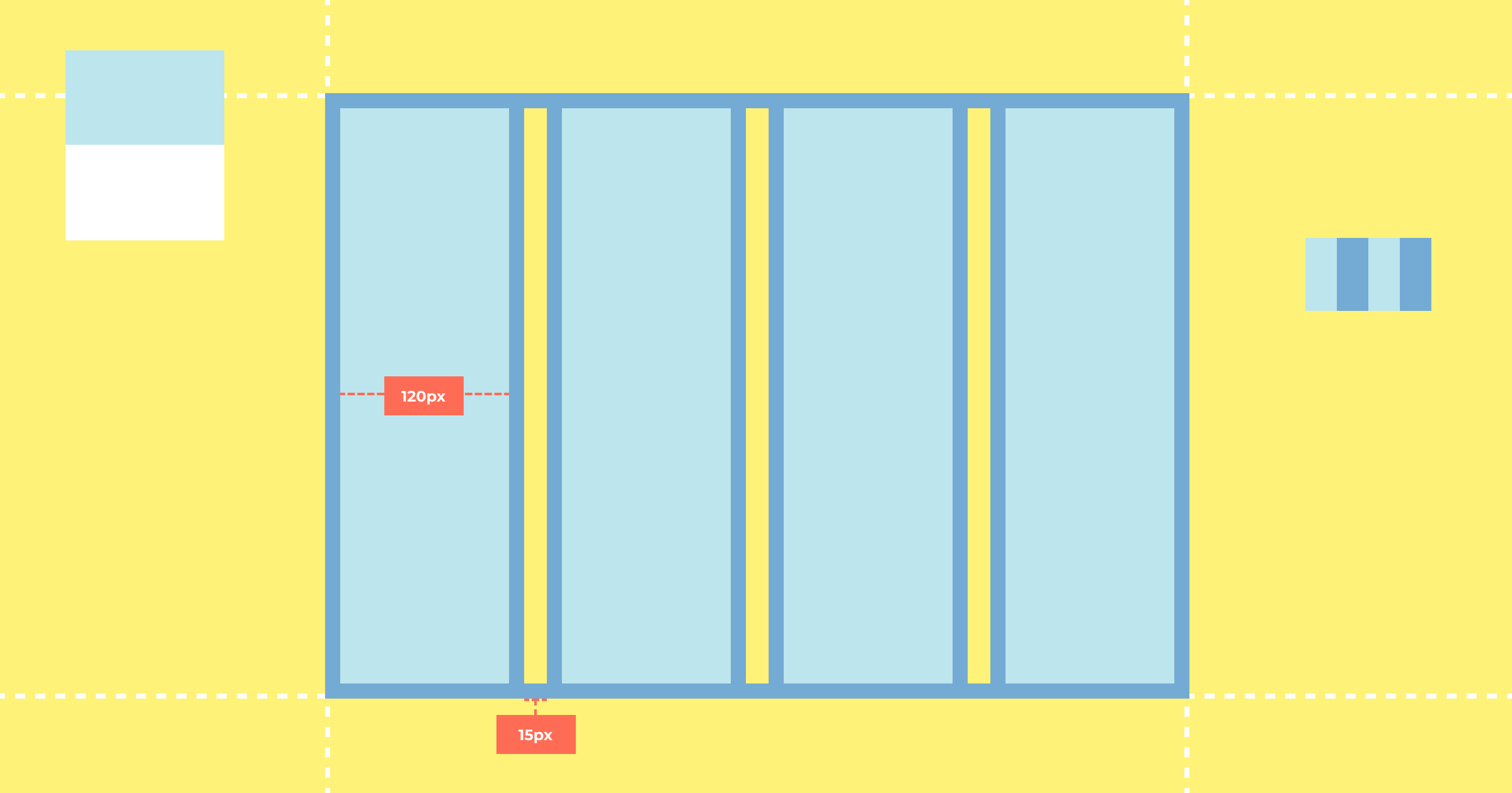
All UI design tools (including Figma, Sketch and Adobe XD) enable designers to apply custom grids (usually called “layout grids”) to artboards/frames. Figma even allows nested frames to have their own grids.
These grids not only help to produce uniform layouts, they also make it easier to code them.
There are many different types of grids but choosing the right one depends on the design itself. Typically, a good grid system results in columns that nest/separate/collapse flexibly, can display various arrangements of content effectively and stack well vertically on smaller screen sizes.
Documenting Grids in Sympli Handoff Design Systems
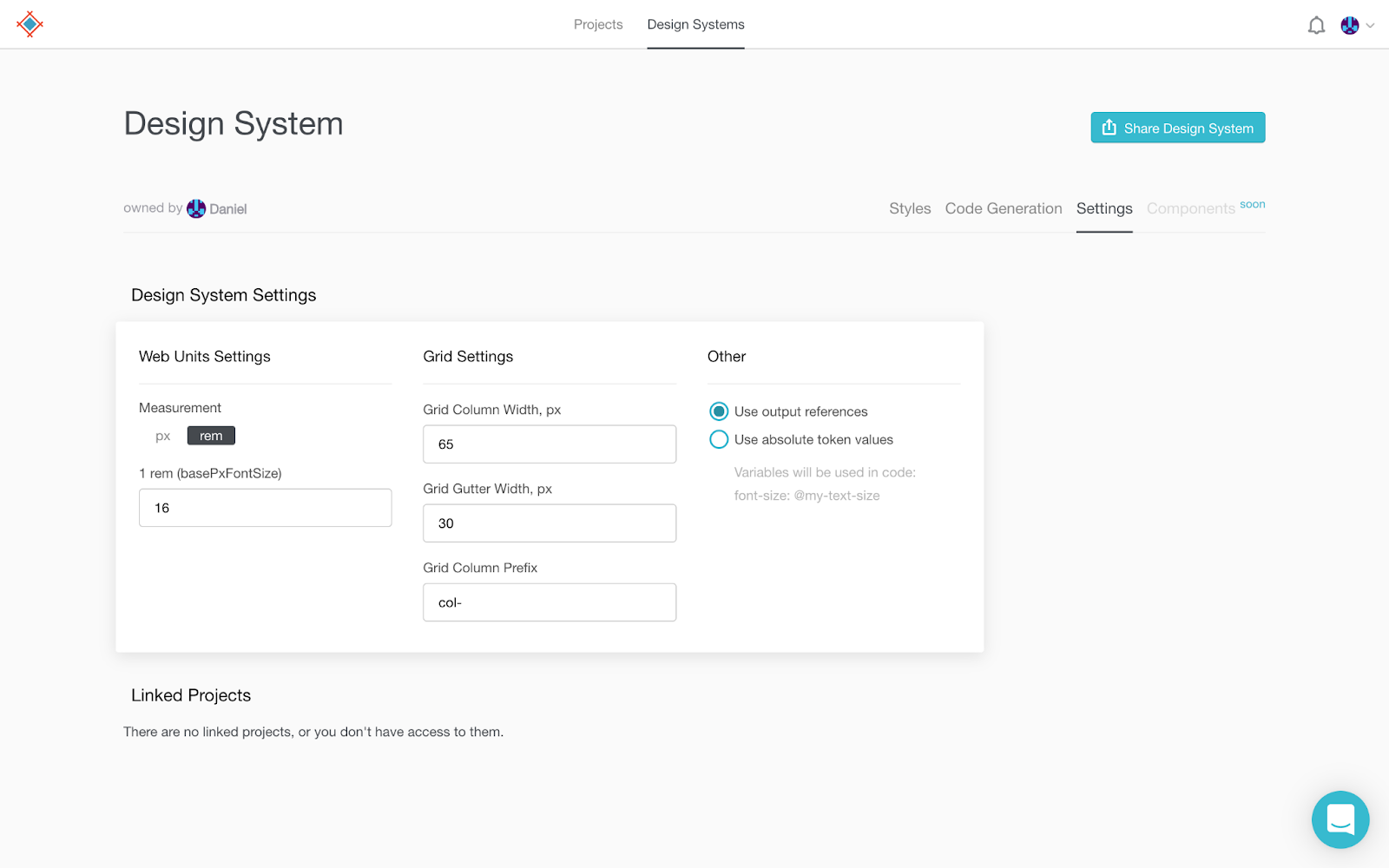
To document your design system’s grid in Sympli Handoff, switch to the “Design Systems” tab, select your design system, then switch to the “Settings” tab. You’ll see three input fields under “Grid Settings” — “Grid Column Width,” “Grid Gutter Width” and “Grid Column Prefix.”

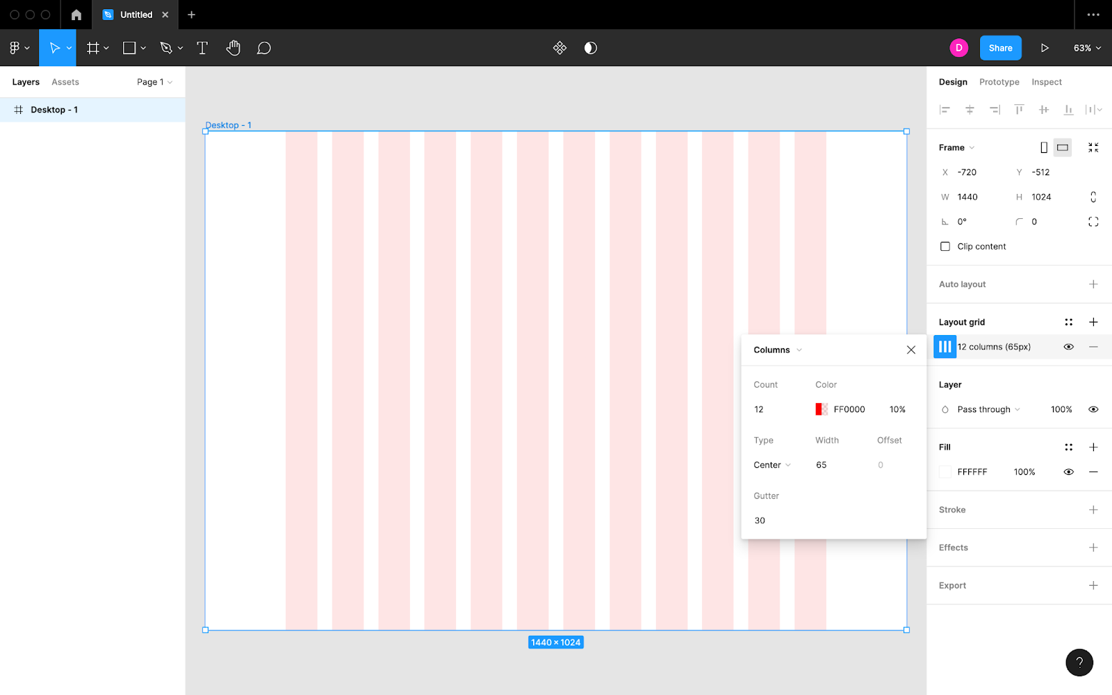
You would have already defined the column width and gutter width in your design file, so the first step is simply a case of retrieving those values. In the screenshot below we’re retrieving the column values from a Figma file:

The column prefix, however, is a Sympli-specific value that decides how any variables or class names are worded when designs are translated to code. This is especially useful for developers that make use of an existing grid system; for example, the class name for a small Bootstrap column is col-sm, where col- is the prefix.
Even if not using a specific grid system, developers may be familiar with and enjoy a particular naming convention and would prefer to set a column prefix to help with naming.
Sympli Handoff Design Systems
Design systems are not only useful for documenting designs clearly for all stakeholders to refer to as needed. They’re also useful for forcing designers to consider design decisions carefully and standardizing design concepts for visual consistency.
Use Sympli Handoff to easily and quickly sync text styles, color styles and fonts from your UI design tool of choice. You can document additional design styles such as spacings, sizes, base font sizes and grid settings manually from within the Sympli app itself.


