Icons by Xinh Studio licensed by Creative Commons (Attribution 3.0 Unported).
———
Branding is half art (visual design) and half science (communication), and represents how a customer/user feels about a company both consciously and subconsciously.
For example, when we think of McDonald's, what comes to mind?
We think tasty, because the colors red and yellow induce feelings of hunger (think: Burger King, KFC and Pizza Hut all use red in their branding), and we think cheap, because customers don't receive table service, they bring their own food to the table, and they clean up after themselves. A customer's only communication with McDonald's is when they order their food, and fast food chains have a terrible reputation for being unfriendly due to underpaid staff.
Your food also comes out on a tray rather than a nice culinary setup.
Every communication and interaction that we have with a brand contributes to our overall feelings towards them as a company. Because the dining experience at McDonald's isn't wonderful in comparison to non-fast food chains, customers that are looking for something cheap may automatically default to McDonald's because they believe it to be cheap.
Even though McDonald's as a corporation has been going strong despite years of backlash, the results of poor branding will eventually start to show in every scenario. For this reason, McDonald's is now trialing table service to improve their image and dining experience.
Let's talk about the basics of branding, the design factors involved, and what we can do to improve branding via the websites and apps that we design.
Visual Design
Let's start with visual design—this type of branding incorporates what the user sees with their eyes, although it affects what the user thinks/feels about a company subconsciously.
Fonts/Typography
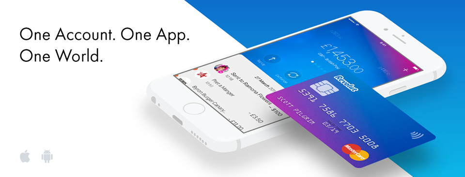
While all fonts should be legible and readable (especially body fonts), they should also reflect the personality of the brand. For example, a financial institution wouldn't use a typeface that's wacky or whimsical, because then they would come across as being silly (and money needs to be taken seriously). That being said, there are many digital banks entering the market now, and they're using sleek sans-serif fonts to illustrate their modern approach to banking.
A huge issue with local high-street banks is that they have poor customer service, high/hidden fees, and terrible exchange rates. A digital bank using bolder colors and modernized fonts is essentially saying, "We're new, we're bolder, we're serious, and we're reinventing banking!".

Revolut's mobile app uses bold colors and typefaces to iterate their modern approach to digital banking
Colors
Colours can mean many different things depending on the culture of the user, and also the context in which they are used. Red, for example, can mean hunger in the West, luck in the East, and error/cancel in UI design. Like all other types of design, UX designers should conduct user research to see where their users are from, also considering whether or not the color choices impact accessibility (i.e. even though red means error, many users are colorblind).

Lucozade uses orange in their original flavor advertising to emphasize energy and vitality
Imagery
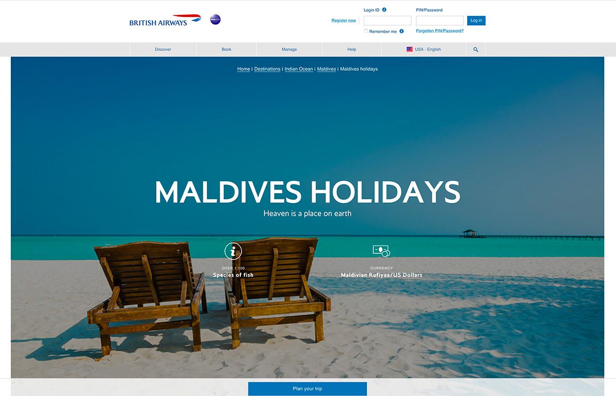
Photography and imagery can tap into the user's emotional core in a way that abstract shapes cannot, and also in a way that text rarely does. Images can convey a user's desire, worry, ambition and so on, for example a beautiful beach on a travel agency's website can:
- Create desire to be at the beach/on holiday
- Arouses ambition to be the holidaymaker on the beach

Branding efforts can include imagery to convey a company's personality. In this case, the company could convey that they are a luxury brand, and this can be used to attract customers of a wealthier demographic. We could also convey freedom, affordability, and whatever else. How a customer remembers a brand will affect their decision to come back at a later date.
Communication
Words can convey personality too (especially when combined with imagery), so the tone of voice that your apps and websites use is also very important.
Copywriting
By words, we primarily mean landing page copy, product descriptions, blog posts, FAQs and so on (less emphasis on UX copy, as there's often less room to be creative). Designers can't be expected to be terrific writers too, but those that do drive themselves to learn more about copywriting will generally design better apps and websites, and the same applies to coding.
First impressions are everything. When you meet someone in real life, they'll consider your appearance (do you look outgoing and modern, or reserved and intelligent?), the way you talk (loud and motivational, or calming and thought-provoking?), and various other things before making a snap judgment about you. It's not fair, but that's how the human brain works.
Customer Support
Although we're bordering both design and business here, customer support is important for of branding, not only because how a business verbally communicates with their customers also contributes to the brand's image, but because customer service can be designed.
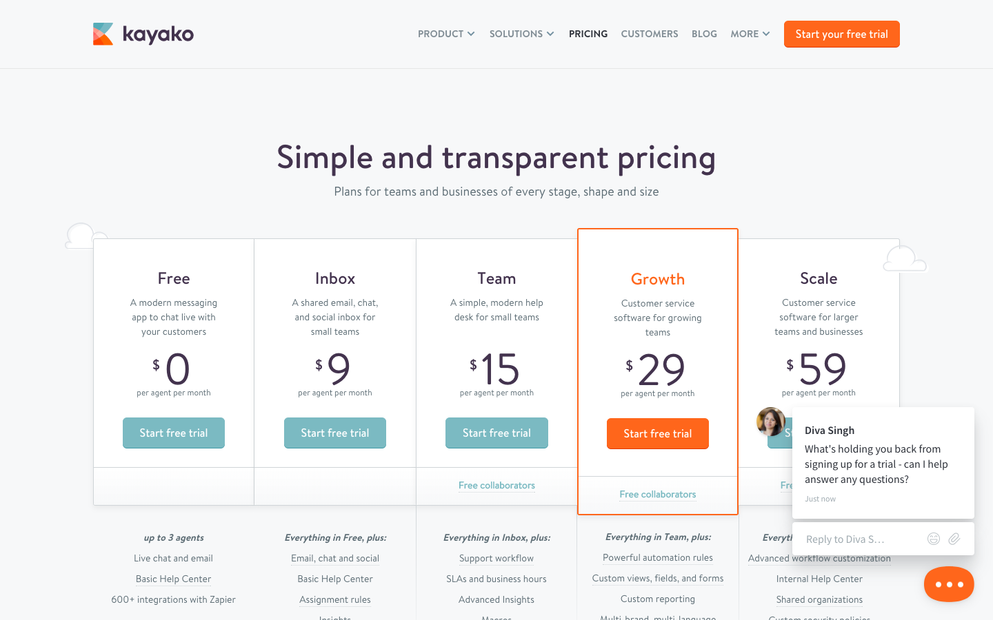
What customer support widgets should be used? Will the widget self-activate at vital steps in the customer journey, for example, the pricing screen or checkout screen? What tone of voice should be used when communicating via live chat? What about social media, how will this be used in the customer journey to aid customers in need of help? Overall, what are the potential problem areas and how can top-notch customer service experience reduce those problems?

Kayako's live chat software helps brands engage with their customers at vital opportunities
Conclusion
Branding isn't necessarily a marketers game, just like how copywriting isn't necessarily the client's responsibility. Designers shouldn't need to be experts in every field, but in general, teams that work together on all fronts build better products that customers return to, so learning at least the fundamentals of branding will make you a better UX designer.
Sympli helps teams to work, communicate and collaborate together with easy design>developer handoff and commenting features. Grab your free trial today!


