
Sidebar navigations are rapidly becoming more popular (especially with SaaS products) thanks to the way that they enable designers to utilize layout space better. On the web in particular, they’re also becoming more popular due to Flexbox and Grid Layout, two modern CSS modules that can be used to develop web layouts more efficiently.
In this article, we’ll take a quick look at four UX tips for designers to keep in mind when designing sidebar navigation components.
1. Be Mindful of Horizontal and Vertical Layout Space
Sidebar navigations are ideal for desktop layouts with excessive horizontal space. However, for desktop layouts where the main content demands all (or most of) the horizontal space, it’s better to forgo a vertical sidebar navigation and use horizontal navigation instead. At least, this is the case for static sidebars that are always visible.
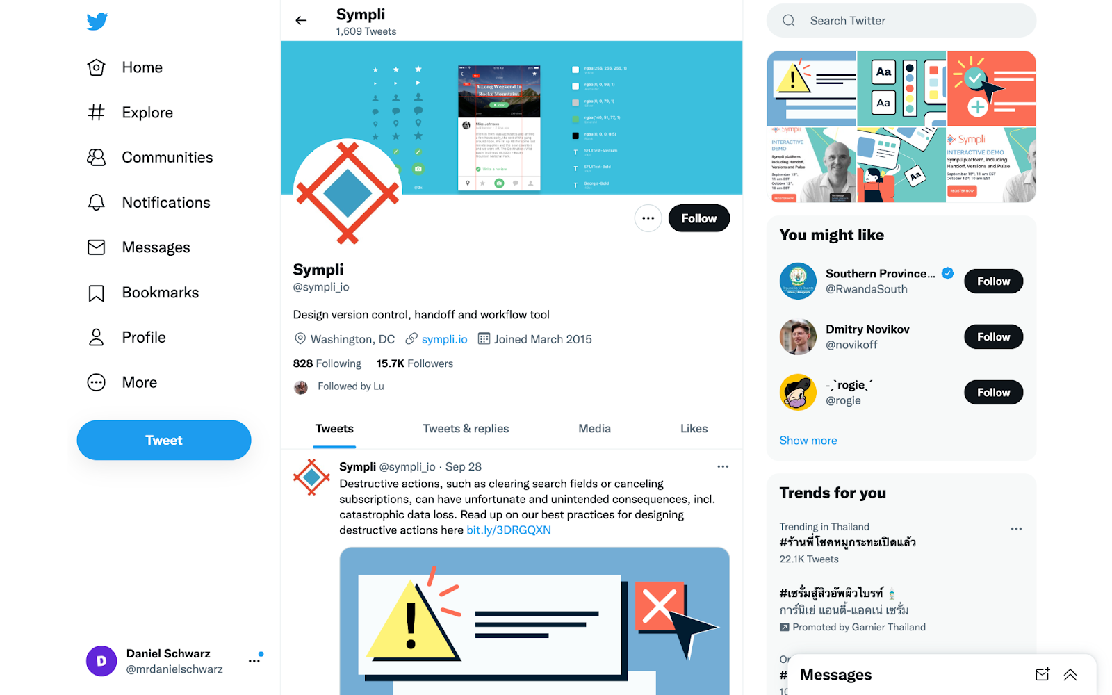
Caption: Twitter’s iconic sidebar navigation
To be able to include a sidebar regardless of how much horizontal space is available, it would have to be an off-canvas sidebar whose visibility would have to be manually toggled on and off by users using a hamburger icon. When visible, this sidebar would simply overlay the main content, making the amount of horizontal space available irrelevant.
However, this approach will cause users to either grow tired of having to repeatedly open and close the navigation, or they’ll never discover most of what’s in the navigation (“out of sight, out of mind” as the saying goes). The only upside to off-canvas content is that, when visible, it can overlay the main content across all screen sizes — it’s a one-size-fits-all approach that works well in terms of responsive design. But since user experience should always come before convenience, you should find yourself designing off-canvas sidebar navigations only as a last resort.
In regards to vertical space, you’ll want to try to make sure that all content in the sidebar is visible above the fold, since users will assume that any content below the fold simply doesn’t exist (or they’ll have to scroll to find it, which is just as frustrating).
2. Consider Using Icons and Accordions
Icons can increase the visual affordance of items in the navigation (i.e., help users to understand what the different tap targets do). For example, search icons can sometimes help users to correctly identify the search functionality faster than the word ”Search.” However, not all icons are as distinctive as the search icon, creating confusion rather than clarity. In addition, using too many icons can make components look bloated, causing cognitive overload. As is the case with many aspects of design, it’s about finding the right balance.
The same can be said for menus. A common pattern for busy sidebar navigations is to categorize navigation items into various menus, labeling each one. However, like with icons, this can increase cognitive load just as much as it can increase clarity, so finding the right balance is critical.
To help with this, consider using collapsible menus (better known as “accordions”). Not only can you use accordions to help moderate initial cognitive load (by having them closed by default), users will also be able to open and close them to optimize space as they see fit. Closed accordions can also be used to conserve vertical space.
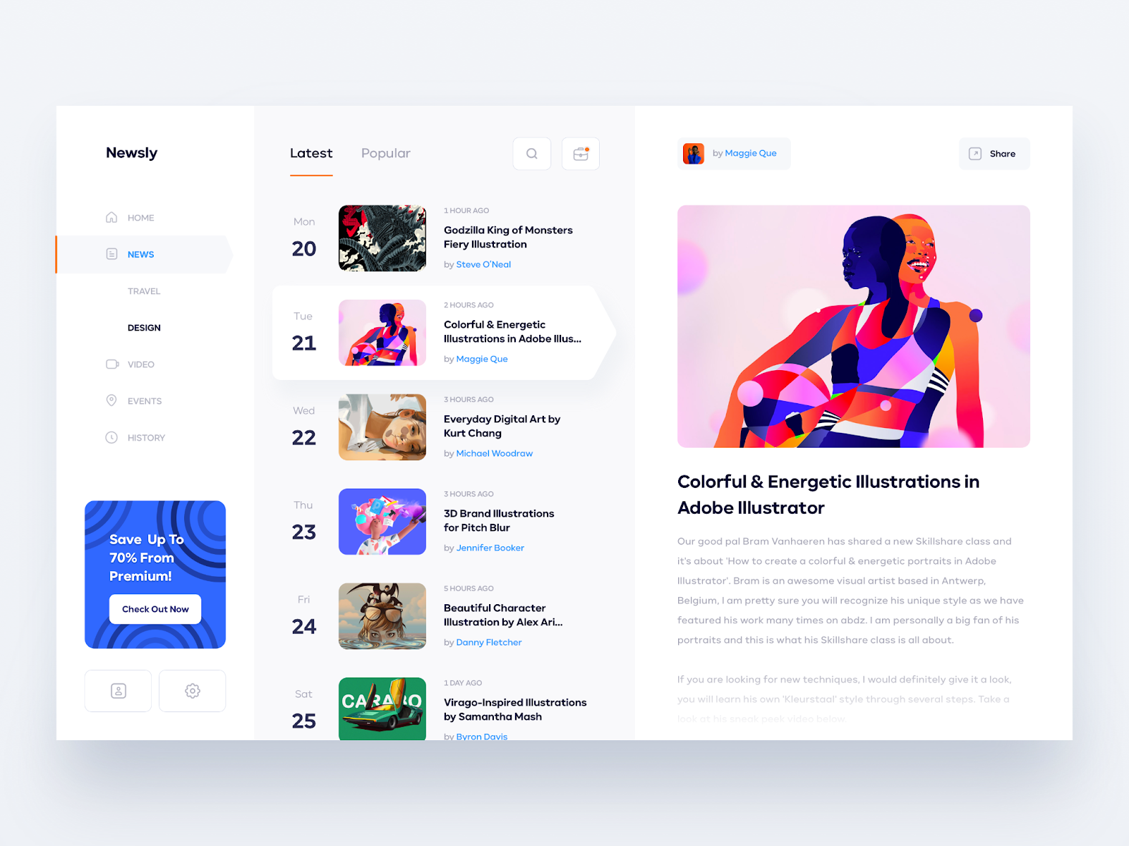
Caption: Sidebar navigation UI with icons and accordions by Dmitriy Kharaberyush
In any case, carry out usability testing to help you make user-informed decisions (specifically, tree testing with real prototypes). If this results in divided feedback, consider including two versions (fancy and minimal) and then letting users toggle between them according to their preference.
3. Implement Search Into the Sidebar Navigation
Search can be a very powerful feature that can provide direct access to pretty much anything that an app or website offers in just a few seconds. Whereas horizontal navigations tend to display search results in a modal or on a new page, you can use sidebar navigations to vertically stack an unlimited number of search results within the component itself, providing a faster and more robust search experience.
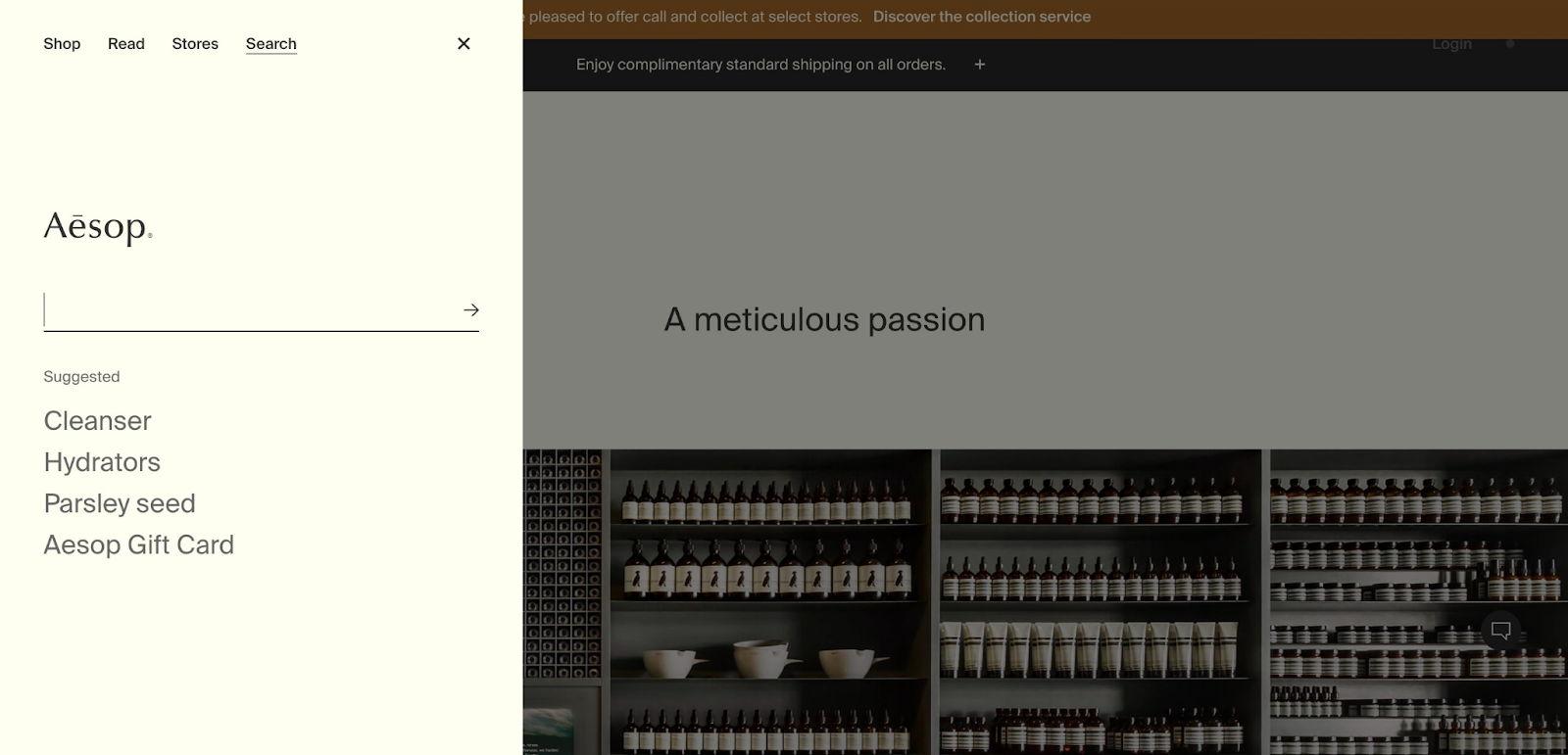
Caption: Sidebar navigation search on the Aesop website
4. Use Sympli Handoff to Get Stakeholder Feedback
As is the case with many features and components, it can be useful to visualize a variety of options and set about getting feedback on them, especially from developers if the component might be programmatically difficult to implement.Use Sympli Handoff to share designs with stakeholders at lightning speed and get contextual feedback that you can use to make critical design decisions.