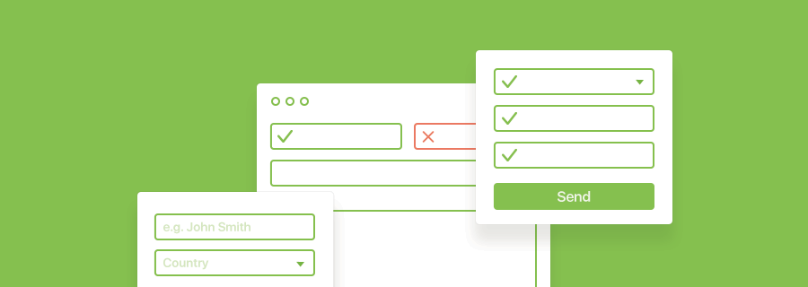
It’s shocking, that even in 2017, the user experience of the average form is way below standard. People still look at forms and think, “No…why”. You can use a minimalist visual aesthetic, reduce the amount of form fields that users have to complete, use infield labels to make forms seem shorter, but how do we actually make them easier and less daunting to use? Lets take a look.
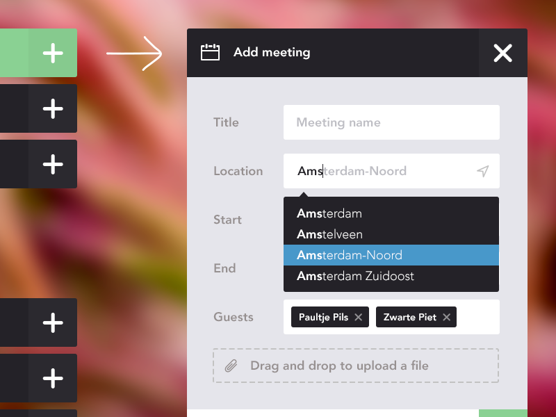
1. Autocomplete or Select Box?
Select boxes — they are the absolute worst. As somebody from the UK, I detest having to select my country in a form. Not only does the long list of countries extend way beyond the screen, select boxes are often in alphabetical order. An additional micro-interaction is also required (scrolling — lots of it).
Fix: swap <select> for <datalist>.
Datalist has the same HTML5 syntax as <select>, only it’s a hidden element. It instead twines with an ordinary <input> field so that the user can type the first (or second, or third) letter of their country and the input field will try to autocomplete it with an <option> from the <datalist>. No scrolling, simply a few letters.
2. First Name/Last Name or Full Name?
Have you ever wondered why some users submit seemingly ridiculous names? It’s because it’s not ridiculous to them. It’s common in Latin American cultures to have two last names (one from each parent), and in Chinese cultures, your family name comes first. Swapping the “First Name” and “Last Name” fields for a singular “Full Name” field is not only easier, but it’s also respectful to your users' cultures.
3. Placeholder or Label?
Placeholders are designed to show an example of an acceptable value that a user can submit in a text field, they shouldn’t be used as a replacement for a <label> tag. What happens when the user begins typing and forgets what the form field was for? It happens, I’m sure it happens to me more frequently, the older I become! It makes sense to eliminate placerholders at first (no labels = minimalism), but in actuality it’s more like no labels = less clarity.
If you want to hit two birds with one stone (total clarity + distraction-less forms, try using infield labels, where the label appears inside the form field. You can read about the science behind it here.
4. Password Rules, Yay or Nay?
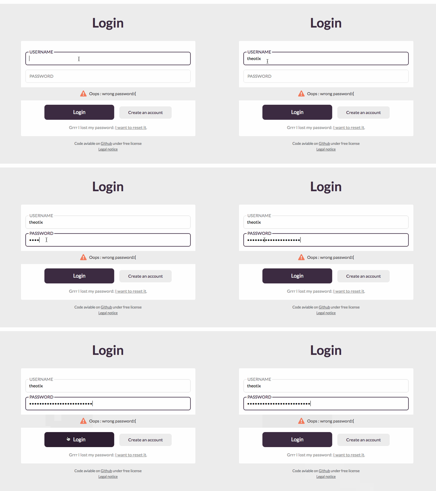
Password rules are for your own benefit and security, but they sure are annoying. Even though using a combination of lowercase letters, uppercase letters, numerical characters and non-alphanumerical characters will certainly keep the small-time hacker away, users like need to feel in control. Tip: make a subtle hint to improve their password by using a password strength checker.
Conclusion
We use forms on a daily basis, even if it’s only the login form for Facebook or some other social media website, but because of the impracticality of some use-cases, many organisations still use paper forms. Banks are notoriously irritating for this, and many tax offices still require additional paper forms even though the main tax return is completed online. Crazy, right?
When we improve the UX of forms (and ultimately their bad reputation), not only will certain organisations see the value of making online forms more accessible, but they’ll be able to save more money and reduce the amount of wasted paper.


