

One of the main weapons of any UI designer to break through in a startup, tech company, or even as a freelancer, is his portfolio. The portfolio works to identify the designer's powerful skills, visual style, and creative ability. This must be like a sample of combined works and performed because of the process selection and exhibition of projects, always trying to communicate the best skills and values in a coherent, synthetic and clear way.
An important aspect will also be the user interface in which you present yourself and your projects. In this article we will see 10 portfolios selected for their great UI.
Note: Not all the selected designers are UX/UI designers, but they have a portfolio that will inspire any design industry.
1. Beta Takaki
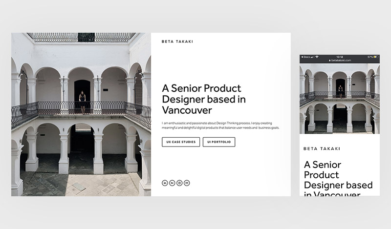
Roberta Tataki is a Senior Product Designer with an interesting minimalist portfolio. Playing with black and white and having only two main 'call to action' clearly focused on the objective of the portfolio. Other interesting design decisions, such as using outline iconography, a clear hierarchy of texts and a photo with a lot of personality, make this UI proposal very attractive.
Important learning
You don't need complex navigation or elements to impress.
Portfolio
2. Ryan Crobinson
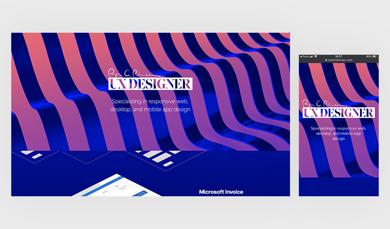
Ryan Crobinson is a UX designer who includes a more daring and dynamic color concept. Through contrast and movement, his portfolio gets to communicate these ideas effectively. While using these types of colors have the challenge of readability, the use of white in typography works very well to balance the visual load. I must say that placing the designer's signature on the first screen also earns innovation points.
Important learning
Don't be afraid of bright colors or complex shapes.
Portfolio
https://www.ryancrobinson.com/
3. Simon Fosters
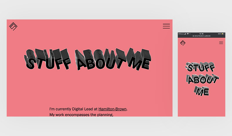
As in the previous portfolio, the designer Simon Fosters also opts for a fun and dynamic proposal. Using a good balance of color, saturated, but without being annoying, the portfolio fulfills to deliver valuable information about the designer as well as transmit part of his personality. Interesting animation in code within the home page and points also for the simplicity of navigation.
Important learning
To avoid a portfolio that looks and feels like many others, don't be afraid to add a bit of your personality to it.
Portfolio
4. Jordan Satta
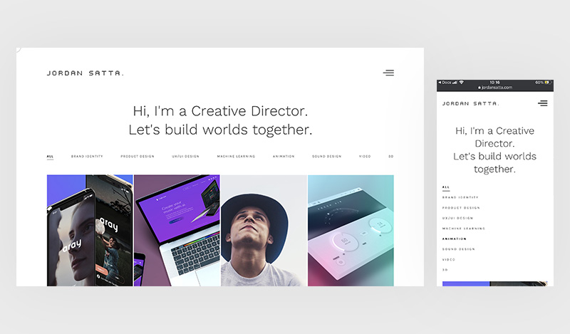
Jordan Sata is a creative director with a clean and elegant portfolio, where he finds an interesting and direct way to show all his skills. It has excellent animated transitions and micro-interactions that play with dark and light modes. The photographic and video content have also been professionally selected which makes the navigation attractive and engaging.
Important learning
To create impact we must not only focus on how it looks, but also how it moves.
Portfolio
5. Craig Reynolds
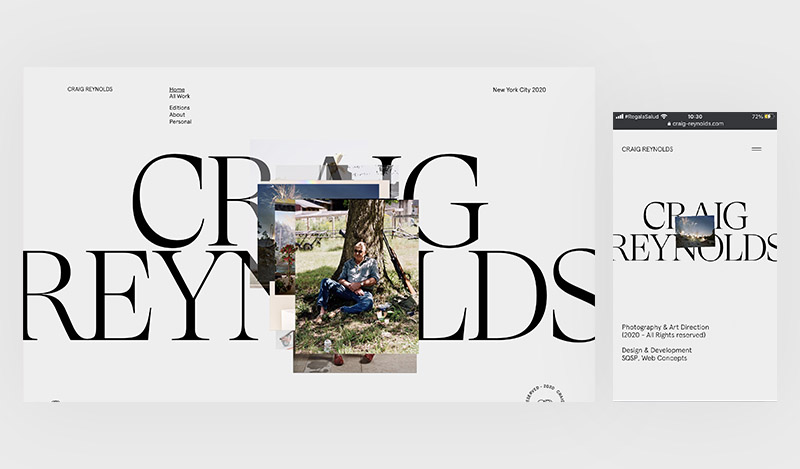
Craig Reynolds is a photographer with a very innovative portfolio. His UI has a great typographic selection as well as an incredible handling of negative space and minimalism. The transitions between projects or screens and his micro-interactions also stand out for his elegance and creativity. Personally, I must highlight the biographical page layout, the minimalist design of the footer and the excellent photographs of the entire website.
Important learning
The use of negative space and the quality of the content are very important.
Portfolio
https://www.craig-reynolds.com/
6. Aleks Grkinic
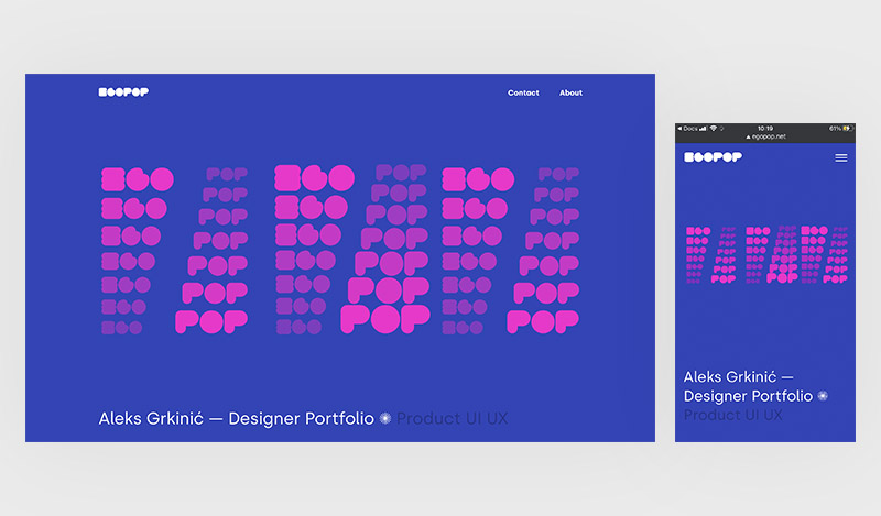
Digital designer Aleks Grkinic exposes his work in a risky interface, using several vivid colors and a diverse palette that harmonize perfectly without losing the legibility of the texts. The projects are attractively graphed and with an interesting layout. If you are trying to include art and color concepts in your portfolio, this is a great reference. Do not forget to visit its mobile version.
Important learning
You can get to transmit the indicated emotions through the use of color
Portfolio
7. Daniel Tsai
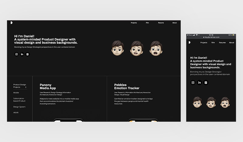
Daniel Tsai is a product designer who uses black and white backgrounds to create dynamism and elegance. The 3D figures balance the minimalism of the interface giving a lot of innovation to the main page. It is also interesting that the responsiveness of the components, which run across the screen, create an immersive experience for the user, taking advantage of negative space and generating a pleasant visual journey.
Important learning
Going to the basic elements of design (color or shape) can make your projects or other content stand out.
Portfolio
https://www.heydanieltsai.com/
8. Gian Marco Magnani
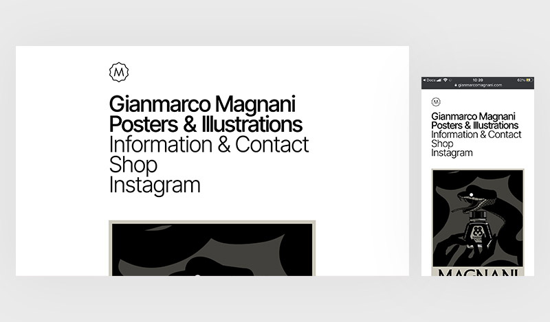
Gianmarco Magnani is an illustrator who has a blog style portfolio. The quality of his illustrative work stands out for the cleanliness and minimalism of his portfolio. This website shows that with a good logo, typography and works, one can have a professional outstanding portfolio. Bonus points for the nice animated illustrations and the biographical page photo.
Important learning
Do not be afraid of simplicity and minimalism, but be exclusive with what you finally choose.
Portfolio
https://www.gianmarcomagnani.com/
9. Banana Design
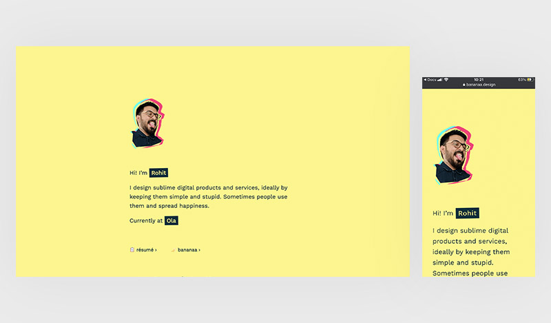
The designer Rohit K Jangir shows an original portfolio proposal based on the concept of a banana. A style with a lot of personality and design, which achieves a good result without compromising important concepts such as legibility, contrast, hierarchy and usability. If I'm going to highlight something, it would be the 90’s GIF animation of the bananas.
Important learning
You can design a portfolio that is quirky and professional at the same time. Just remember the design fundamentals.
Portfolio
10. Jonny Czar
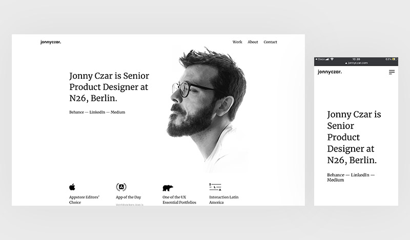
Jonny Csar is a senior product designer with a monochromatic proposal full of elegance. The great iconographic choice and the photography on the main page make the designer the same product selling in a very visual way. The mobile version of the site solves very well the issues of cognitive load and liquid design.
Important learning
It is not a bad idea to emphasize that the final product is us.
Portfolio
UI Recommendations for Portfolios
Although it is clear that there are many possibilities to be unique and stand out for our interface design, we can conclude on certain criteria that will guarantee a quality web portfolio, not only visually but also in terms of usability. Here are five criteria to consider:
Mobile friendly
Statistics show that a user is more likely to browse your portfolio from their smartphone. This implies thinking about mobile design first and applying all the existing usability criteria. Legible text sizes, correct spacing and a responsive design that does not lose the concept.
Good typography
If something must be selected with great criteria, it is typography. Moving towards a modern and minimalist design implies finding a typeface that represents you, since it will be a constant part of all your screens. Do not forget also that you can transmit different emotions between a Serif, a Sans-Serif, or perhaps a Display font.
Micro-interactions
This is very relevant. If you want to stand out and have your portfolio leave a great impression, incorporating micro interactions is a must. Applied correctly it can delight the eye and make the switch between screens more subtle and modern. It will also be important not to over saturate the elements with unnecessary animations.
Simple navigation
Displaying a portfolio does not imply complex navigation, let's take advantage of this to simplify the user's life with a concise and accessible information architecture. This will also allow us to be more creative and innovative in how the user goes from one project to another.
Photographs
Photos do a great job of contrasting the two-dimensionality of an interface design. Other benefits are also adding personality to the website or creating complex visual concepts. It would be important that the photography be professional, to raise the quality of the portfolio and not the opposite.
Thanks for reading!
Sympli is a Saas company that creates tools for design collaboration, handoff, and version control. With more than 5 years on the market, we had helped thousands of designers and developers work together by providing a single source of truth and reducing back-and-forth communications, resulting in faster delivery.