
Historically, graphic design was page-based and, because of this, many still think in terms of stills. Certainly in the realm of print, there is no movement or animation. Even for the first decade of the web, pages mainly went from one to the other as a cut, unloading the first and then loading the second.
In recent years, though, this is changing. Robust platforms combined with the desire to create compelling and engaging user experiences should encourage designers to think not only about how it looks but how it changes. Designers need to think not in the metaphor of pages, but more like movies, with scenes and transitions that flow.
Designers need to think not in the metaphor of pages, but more like movies, with scenes and transitions that flow.
Let’s keep with the theme and imagine this is a movie browsing application. When I select the cover art for the movie in the browsing view, it may carry that image through the transition so that, as a user, I get a visual linkage between the browsing experience and the detail information using the selected item. The transition itself can provide information, maybe it does an inward ‘zoom’ that implies the detail is inside the selection.

Successful Transition Benefits
There is more than visual pizazz at work here. This transition provides specific benefits for the user and can help define and support the user experience, particularly in a complex application:
- The carryover provides a seamless and elegant experience that can cover loading times (both visually and by holding the user’s attention) and directly connects the choice to the result.
- It allows the content to be the interface thus reducing on-screen clutter and utility functions.
- The transition itself creates a relationship between where the user was and where they arrived which helps them develop an internal map of the application’s structure; this, in turn, will reduce the possibility of a user getting ‘lost’ and encourage exploration.
- Motion during transition as well as on the ‘static’ screens keeps the user’s visual system active and focuses attention on the experience.
What it Looks Like
A UX wireframe may map this experience as a set of levels; at each subsequent level the user is presented with more focused information. A simple wireframe may look like this:
In browse, as described earlier, when a cover art item is selected, that image persists on screen as the scene zooms down (and into) the new detail image. The cover art then places itself into the detail screen.
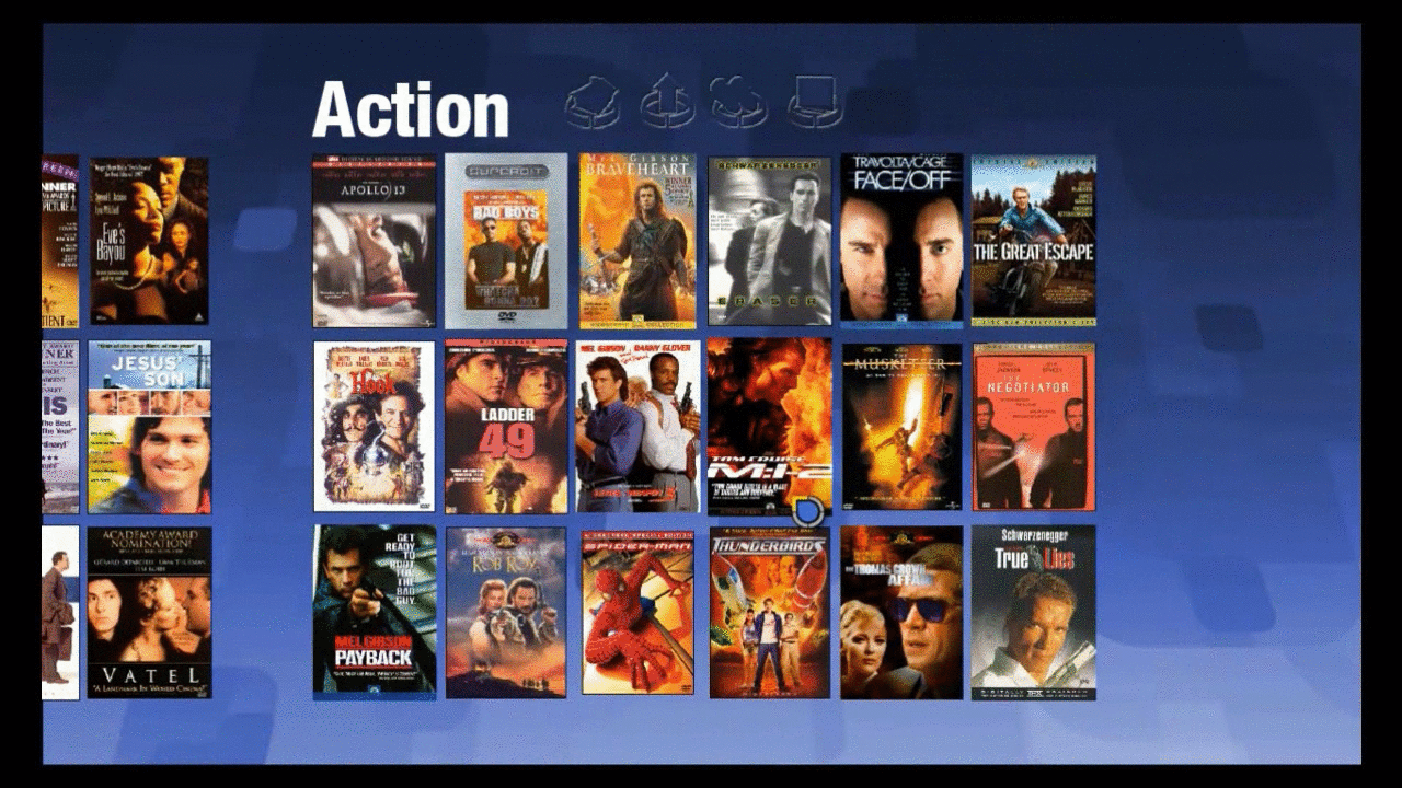
The user gets a visual linkage between the browsing experience and the detail information using the selected item as if following a character through scenes of a movie. The transition itself provides a virtual mapping as it indicates the detail is below the browse and helps the user perceive the virtual map of the content.
Tools that Help Visualize How Designs Move
In film, the process starts similarly with the creation of storyboards. However, there is often an intermediate step known as an “animatic” where the storyboards themselves are roughly animated and the sequence is shown to highlight how the frames of the storyboard move from one to the next.
Application designers have a variety of tools to produce their own animatics that demonstrate and display the more complex interactions in their design and thus have greater input over the final design going forward.
One example would be the use of a tool like Adobe After Effects which would be somewhat familiar to many designers. The result would be a video that is delivered along with the design and assets to show how the transitions are designed to work.
Animated_Design_Sample from Bill Rouady on Vimeo.
If a more interactive version is desired, a designer can turn to web development tools to create HTML/CSS/Javascript mockups. The challenge here is that these tools generally require a bit more hand-coding and development. While not particularly complex, they can be time-consuming and require crafting the assets for the demonstration platform.
Finally, a tool such as Sympli can provide the best of both worlds. The asset creation and delivery process can be easily imported into a tool such as Android Studio. The designer can use the basic functions of the environment to create interactive prototypes that don’t require much coding knowledge. The advantage is not only showing the results on the intended platform, but also being able to provide the developer with the assets and basic function in a form that can be built upon.
Conclusion
As we go forward into a greater level of interaction WITH the content, we should encourage design that adds more interaction IN the content. If nothing else, it will increase user delight and make the application experience more fun and engaging.
So, the next time you design the ‘what,’ pay some extra thought to the ‘how’ and see where it goes.