Minimalism is about eliminating excess and strategically placing the remaining elements. It is based on the particular use of space in which colors are usually neutral and small objects occupy large places. The result can be a simple but powerful design, which is simplified to convey your message. Minimalism can be found in all forms of art, from architecture to graphic design to fashion, and has recently been very beneficial for interface design.
Although minimalism seeks simplicity and reduction to eliminate all symbolic allusions and focus the gaze on more important issues: color, scale, volume or the surrounding space, the selection of what we choose in the work is not a task as simple as we wish, especially when we add the functional aspect. Before exploring its correct use and application in UI design, we will see a bit of its history.
History and Practice
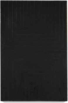
The term “minimal” was early used by Richard Wollheim in 1965 to refer to paintings and other objects with a very high intellectual composition but a low manufacturing content. However, many claim that the Japanese were the first minimalists to create simple but effective architecture, based on the spiritual beliefs of zen Buddhism, dating back to between 1185 and 1333. Minimalism as such reaches its maturity in the decades of the 60s and 70s, as an innovative way to the overloaded styles of the time (pop art) and the communicational saturation within the aesthetic universe.
We could also talk about Dieter Rams, a german industrial designer known for his work and principles that have been an important influence on the minimalist style of Apple's product lines, such as iPods, iPhones, iPads and Macs, as Jony Ive acknowledges, Apple Vice President of Design.
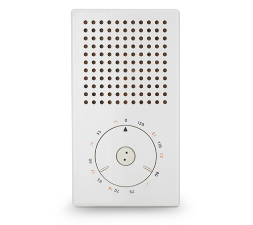
In 1976, Dieter Rams also postulated ten principles of good design where one of them faithfully describes the benefits of minimalism and simplicity:
“Good design is as little design as possible: Less, but better - because it concentrates on the essential aspects, and the products are not burdened with non-essentials. Back to purity, back to simplicity.”
Years later the minimalist architect and industrial designer, Ludwig Mies van de Rohe, used the motto "Less is more" to build his works. The concept of minimalist architecture also consists of stripping all the ornaments until leaving the essential qualities, making the space reach a state of simplicity and cleanliness.
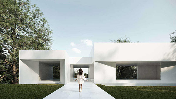
Minimalist architecture reduces everything to what is necessary. For this reason, it is common to see pallets of limited materials, such as concrete and glass. Spacious, light-filled rooms with long straight lines and clean aesthetics are also an essential part of a minimalist interior.
These characteristics also had an interesting adoption in graphic design over the years. We could even say that minimalist graphic design has already acquired its maximum expression this decade, being one of the design trends that has positioned itself the most. The minimalist logos, posters, book covers and advertisements focus on functionality and simplicity, which is why many big brands have adopted it as one of their hallmarks.
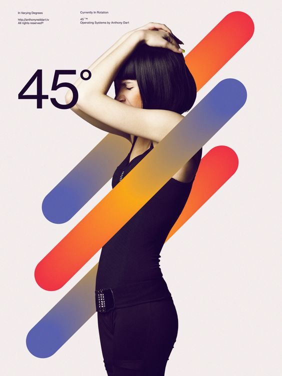
Its appeal depends on the different options of colors and shapes in graphic design and the amount of these that should be used: normally their use is reduced to the minimum expression. Geometric shapes, lines, gradients, white, black and gray and generally vivid but flat gradient colors allow a design to have an impressive impact. Now that we have seen how this trend has influenced many industries, we can delve into more context about its application in interface design.
Minimalism in UI Design
When smartphones appeared, the first approach to visual trends was realism, now known as skeuomorphism. This was an understandable attempt to make the user's transition from the real world to the digital world less painful and more familiar. When more complex functionalities were possible in digital tools and the user felt more confident, we saw the beginning of flat design, which now could be said to have evolved to minimalism.
The minimalist UI design brings a professional and clear impression to users. Plus, it has advantages beyond visual appeal. A minimalist interface loads fast and requires fewer resources and its development can be carried out in less time than a more complex website. The design easily adapts to different screen sizes. Adaptation to mobile devices and loading time are key SEO factors.
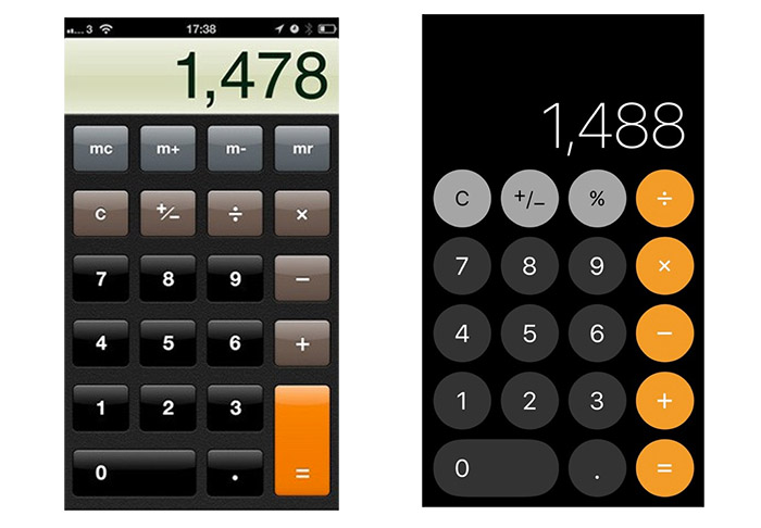
The goal is to make the message clearer by not only eliminating distractions, but also by keeping the focus on what is important. While this involves removing unnecessary elements, a strong focal point must be defined. It is about combining design and functionality in the simplest way possible, using only the necessary elements so that the user can navigate without getting confused, lost, or distracted. All superfluous elements must be eliminated.
If you want to incorporate a minimalist style into your interface design, it will be important to understand these three fundamentals:
Fundament 1: Negative space as a means of highlighting
Negative space is the empty area in a composition. The minimalist design uses negative space as the main resource to highlight the elements and create hierarchy. The more negative space around an element, the more important it will be to the user.
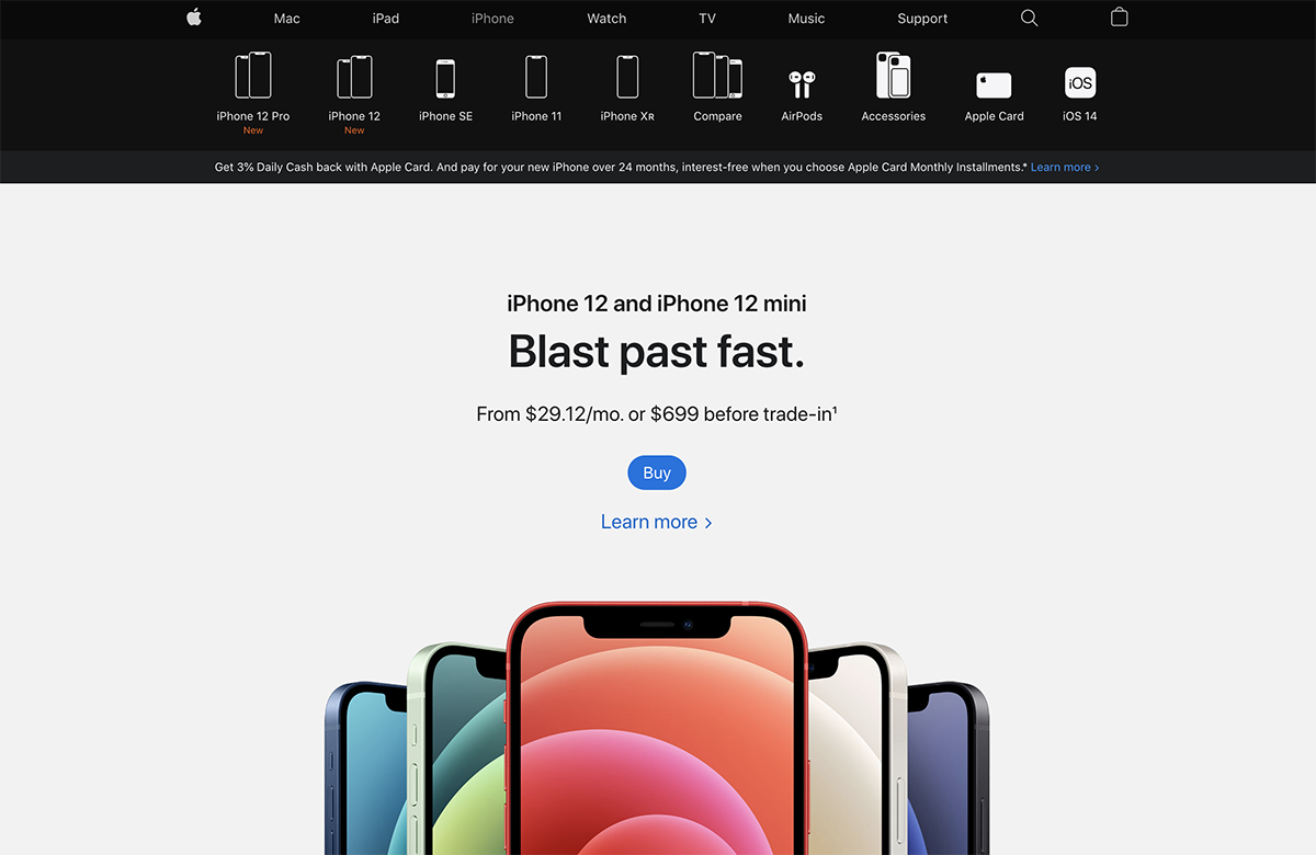
On Apple's website, negative space is used to convey exclusivity in its products. The wide white spacing highlights the smartphones and the main title, in the same way in the black header the same effect is achieved with the synthesized shapes of its other products on a black background.

In the Airbnb app, black negative space is used to clean up the composition and make the visual journey more user-friendly. The spacing between text styles and within the "See dates" button is of equal importance.
Although the negative space is usually white, it is not exclusive since black or any highly saturated color could generate the same effect. Another benefit of separating the elements is a quick assimilation by the user of the content and functionality of the interface.
Fundament 2: Flat design to reduce cognitive load
Contrary to skeuomorphism, flat design gets rid of the three-dimensionality of shapes and their similarity to the real world. It is designing the components in only two dimensions to offer simplicity and readability.
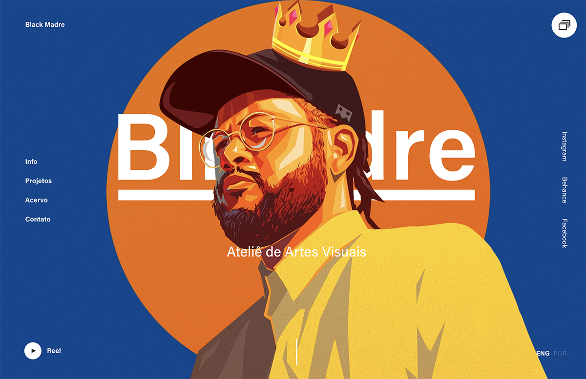
On the Black Madre website, flat design is expressed not only in the background and buttons, but in the same 2D vector illustration, which due to its complexity in certain parts, becomes very attractive.

In the Apple Music app, the iconography and flat buttons harmonize with negative spaces and the well-selected colors. The shadows on the image also improves the readability of the white text.
The flat design reduces the cognitive load making the design more straightforward and minimalist. Although many designs with this trend do not use gradients, this resource can work very well if it is used in a dosed way in specific elements.
Fundament 3: High quality of selected items
An important characteristic of minimalist design is that the few elements that remain in the composition are of a high level in terms of visual design, by this we mean a good typography with an interesting personality, a very well synthesized iconography or professional illustrations and photographs.
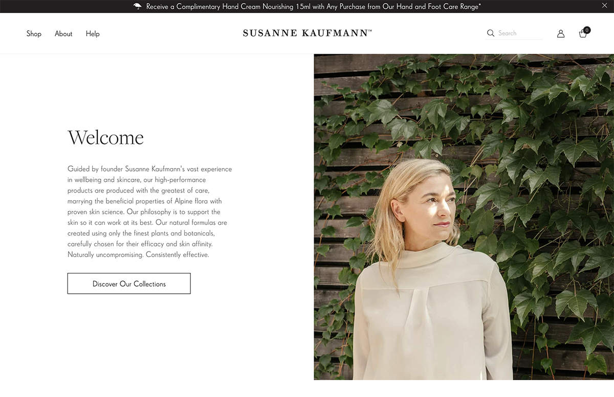
On Susanne Kaufmann's website, the negative space is nicely offset by a very professional photo and a well-selected typeface. The iconography, although it does not come to have such importance in the design, also contributes to having harmony and consistency.

On the Centr nutrition and training app, the photography and quality fonts again elevates the design and allows it to be minimalist in other ways. Interline spacing and letter spacing lend the design legibility and elegance.
We can say that if the elements of a composition have the correct negative space, a flat design, but do not have the attributes of a high-quality design, the effect will no longer be pleasant to be just a simple interface and lacking in appeal or impact.
Conclusions
Minimalism is an attempt to put a bit of order in an overloaded composition. Most people usually have the bias that the minimalist design is only simple because it does not have too many aesthetic resources. On this we must ask ourselves what is the true role of a website or mobile application. The first role is to be functional, to allow us to do something in the best way. In this case, the goal is in the user experience and this is where minimalism has long stood out. Its ease, simplicity and clarity gives us pleasure and a feeling of comfort.
Thanks for reading.
While designers work on reducing the cognitive load of the users with minimalism, we at Sympli work on reducing designers’ cognitive load with organization and workflows. It’s hard to remember what is done in the big design project, by whom and why, so we’ve built Sympli Versions - a version control system to help them. Read more about Sympli Versions.

