
A designer's job doesn’t end when the UI is complete. You must ensure developers have everything they need to implement your designs correctly, and there are a number of things you can do to make this process as seamless as possible.
Design Systems
Creating a design system is one of the best ways to prepare your work for handoff. A design system outlines the styles, principles, guidelines and best practices for implementing your interface. It includes things like buttons, form styling, colour pallets, typography and spacing.
Design systems come in different shapes and sizes, and each team will choose to include different elements in their guide. What you include in yours will be dependent on how tightly you want to control what elements look like and how they are to be implemented. In short, your design system should be your single source of truth. You can read more about design systems in our Quick Start Guide however some important things to include are:
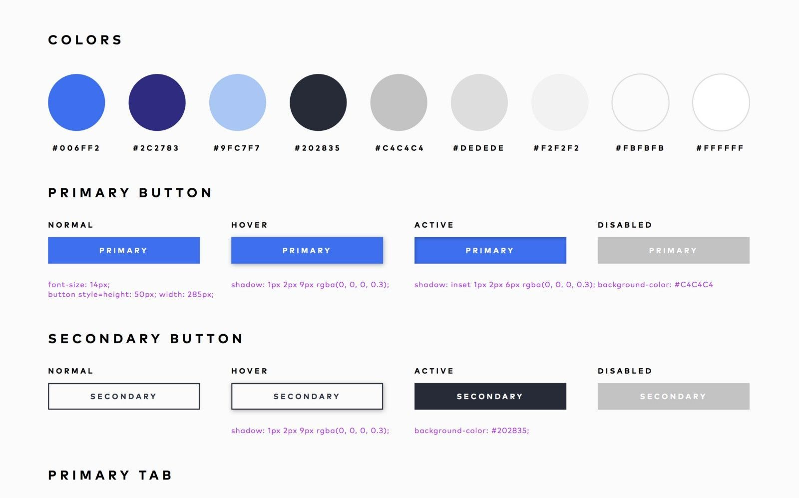
Colour Pallet
The colour pallet for the application including all primary and secondary colours and any supporting greyscale shades you might use throughout as their hex code and potentially named in such a way to be easily implemented as selectors.
Typography
This should outline not only the fonts but the weights and any additional information such as line-height and spacing if they are different to the default for that font.
Buttons
Generally in an interface, you will at some point require buttons (aka CTA’s). You should outline a few variations of these including primary and secondary buttons, as well as their states; default and disabled. You should also consider accessibility affordances and add a ‘focused’ state which can also double as the clicked state. Your design system should also outline the padding and margins for elements such as these.
Form Elements
Form elements are often overlooked or only given a light touch in design systems, however properly designed forms and the guidance around how they should be implemented is complex enough to warrant the creation of books detailing these factors. Improperly implemented forms can lead to frustration or even have disastrous consequences. You should aim to outline at least a few different sizes of textbox along with default, focused, disabled, confirmation and error states along with how form errors should be handled.
Grids and Spacing
Design systems are also an excellent place for documenting what grids to use, breakpoints and any platform-wide spacing principles.
Prototype Documentation
Prototype documentation goes a bit further than a design library. It’s mostly used when working in more complex products but can also be used to outline things like animations, screen states based on permissions or even add notes for the reasoning behind the design choices.
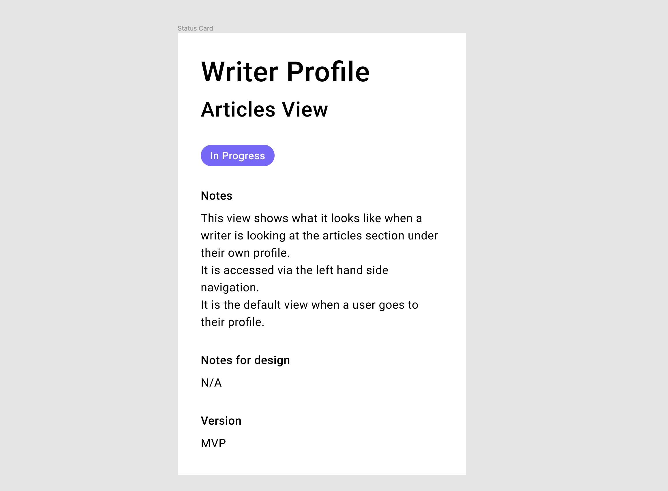
Status Cards
Status cards are a way of highlighting important information for stakeholders and are presented in line with the screens they’re detailing. Usually, in the form of a ‘card’ placed above or at the start of a flow of screens, they outline the basics of the screen and any context required. It can also be used to highlight the ‘status’ of the card such as ‘in-progress’ or ‘in-review’ and which release the designs are for.
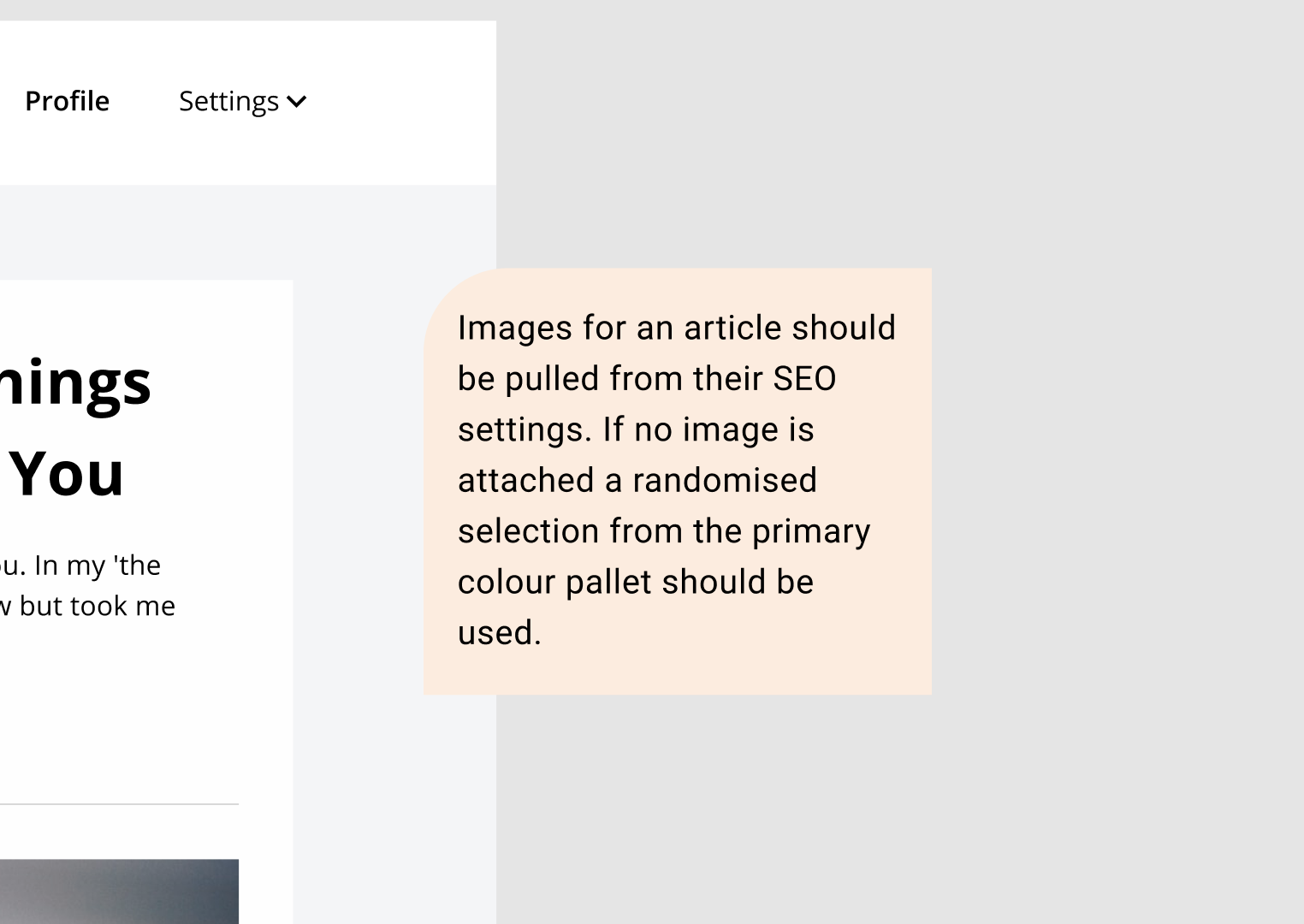
Comments and Annotations
Another way to add context to your designs is to add comments or annotations to them. How you do this will depend on what software you are using to hand over your designs. Nowadays most design products come with inbuilt commenting, however, if this isn’t the case you can use stylized ‘sticky notes’ to add detail to your designs where required.
Exporting Assets
It’s important when exporting assets that you generate all the necessary formats and sizes and that they are easily accessible and shareable among those that require access to them.
Logo and Brand Elements
When it comes to the brand logo and other brand assets you may have already exported these or prepared them for use elsewhere. However if at this point you haven’t already exported them, you’ll want to do that now. Exporting as SVG, with a range of colour options for dark and light backgrounds and potentially at different PNG sizes. If there are supporting brand elements such as illustrations you’ll need to do the same thing for these.
Icons
Depending on what icon pack you are using you may not have to do anything. Font Awesome is a font pack that is actually icons, meaning your icons can simply be ‘called’ by adding their selector name to a line of HTML. If you are using a normal icon pack such as Google material icons or another custom set. You will need to ensure your icons are either exported to be used ahead of time or that they are set up in your design file so that they are export-ready when required. This means making sure they are properly grouped and that their export format is set to SVG.
Imagery
Imagery must be exported in the correct format and at a high enough resolution for its purpose. If the original image is not at a high enough resolution, this cannot be fixed when exporting. It’s best to keep the high-resolution version of images in their own folder, appropriately named, grouped and tagged for easy findability.
Supporting Elements
One thing often overlooked in the design handoff process is supporting elements such as background illustrations or shapes. These must also be prepared for export or exported ahead of time as an SVG or other appropriate formats for their use.
With all items to be exported, it’s easier to do it as you go along, rather than waiting until the screens are finished to export items.
Misc Processes
There are a few other things you can do before handing your designs over to devs that can make the process go a bit smoother.
Walkthroughs
Walking devs through your designs incrementally as you design them can help when it comes to the final handover process. If you have done this, they should already be familiar with the flows and screens and this can reduce the number of questions asked after handover.
Spell Checking Your Design
Something easy to overlook when you are in the midst of a new design is spell checking the content. Though not particularly sexy, checking your designs for spelling mistakes is an easy thing to do with the right tool. Figma and Sketch have several spell check plugins but if all else fails simply ask someone else to read over your designs.
Handoff tools
Something that can be a great timesaver when preparing files for handoff is having a repertoire of tools and plugins that can support the process. Handoff tools can do everything from task automation (such as asset generation) or they can serve as a single source of truth for your design collaboration (the same way development version control tools do). There are several options on the market, and you can try and choose the one that suits your needs most. It's worth trying a few different options out before dedicating yourself to one in particular.
In Conclusion
Every team requires different tools, the ones that suit you will come after some trial and error but hopefully, this list can start you on your way to preparing your designs for handover and make the process as seamless as possible.
Sympli Handoff is a design collaboration and handoff tool, created to reduce back-and-forth communications and deliver faster. Works with Sketch, Figma, Adobe XD and Adobe Photoshop. Integrated with Jira, Azure Boards, Slack, and Microsoft Teams.