
Navigation is one of, if not the most important aspect of any multi-page website, app or digital product. It doesn’t matter how many cool and useful features you have if your users can’t find their way to those features. Poor navigation or ‘way finding’ can be the difference between a great product and an unusable one. So in this article, we outline some of the basic rules of navigation design to help your user interact with your product.
Planning your navigation
Before you create the user interface design for your navigation you need to understand the structure of your site and where each page is going to sit in the hierarchy. This is called your sites IA. You can read more about information architecture and ways of testing your site structure in our article here. Your site IA can greatly influence the layout and the decisions you need to make, so once you have the structure of your site you can start planning out your navigation.
Is your product a mobile app or web app? Is it a website that needs to be responsive and therefore has both mobile and desktop navigation designs? How many items are going to be shown in your navigation? Do you have many sub-navigation items that will need to live in a dropdown or expandable section? Answering these questions can help guide you to a place to start before getting too far into the details of your design.
Navigation best practice
Though you can be creative and innovative with a lot of areas of design. Navigation is one place you might want to stick to some basic rules. After all, you want your users to be able to complete their tasks with ease and not end up frustrated and lost.
Primary and secondary navigation
If you choose to have two navigation elements on the screen you will have one that is called primary navigation and one that is called your secondary navigation. Your primary navigation is the design element that will contain the main pages you want your user to visit or interact with. Secondary navigation can contain supplementary pages such as FAQ’s, blogs or contact pages which are useful but may not be the primary action you want your users to take. (If your site is a portfolio or personal website contact may actually be a page you want to have in your primary navigation).
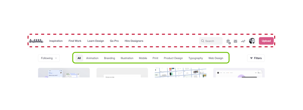
Primary navigation is usually styled to be more prominent on the screen. You can do this by giving your main navigation different background colours, by increasing the font size on your navigation links or by using a different font altogether. Either way, you will want your secondary navigation items to be visible but not stand out in comparison. In the example below we can see the primary navigation circled in dotted red and secondary outlined in solid green.
Sidebars
Sidebar navigations are most often used for web applications or desktop programs. This Is generally because they have more pages, features and functionality that they need to allow users to quickly access. It also provides more real estate if you have navigation elements with long names as you can fit more items stacked on top of one another than if you lay them our side by side.
Sidebar navigation or ‘side navs’ are usually sticky and remain on-screen at all times. Due to their size, they are usually reserved for desktop apps but can be adapted for mobile by adding a way of hiding and showing it. This can also be used on desktop sites to improve screen real estate, a handy way to improve the user experience for people using tablets or smaller laptops.
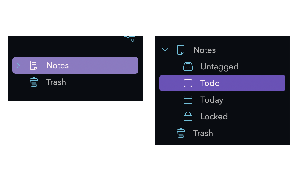
Side navigation is usually differentiated from the main body of a site by using a different background colour. You can see an example of this if you use sites such as Notion or Spotify. If you have a lot of items to display in your navigation you can group related items into an expanding section that users can toggle open and closed. The selected item in the side navigation should be styled differently to show it is the one selected. If the selected item is in an accordion section that is closed, the top-level label or page should show as highlighted to indicate an item within it is selected. How this animates and interacts with the user is up to you to decide as part of the interaction design styles for your wider product.
Header navigation
Header or ‘main’ navigation is the one you will see used on most sites. It’s a bar that sits at the top of the page and usually contains; links, a search input, a call to action of some kind and a logo. This type of navigation is best used when you have only a handful of navigation items or in conjunction with dropdown menus (this is called a multi-level menu and there will be more on this later). Icons can be utilised in this style of navigation to preserve space. Things like notifications can be shown as a bell and profile as an avatar. This doesn’t just preserve space but can add a level of personalisation contributing to a great user experience.
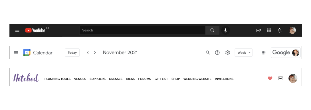
The actions you choose to show and prioritise in this navigation should match with the actions and tasks your users are going to be taking. You can see examples of this below. Youtube’s main navigation is mostly taken up by a search bar, this is because people coming to YouTube are likely looking for a specific song or video or for videos matching a key term they want to search for. Google calendar uses the main navigation for elements to quickly help users get to the date they need and to configure their calendar the way they want. Finally Hitched is a website to help people plan their wedding and discover vendors, so they have prioritised a way to quickly navigate to and filter out results for only the type of vendor you are looking for.
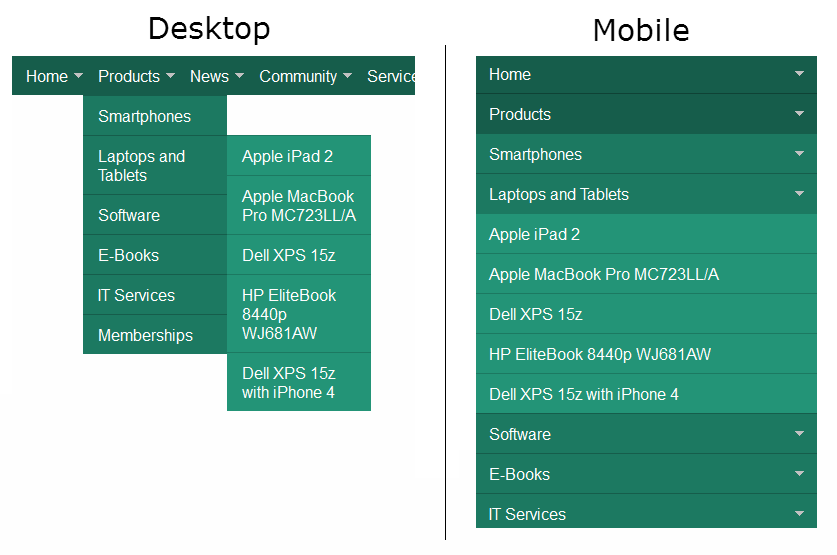
Multi-Level Menus
Multi level menus can be either header navigation or side navigation. Their main feature as you may have guessed from the name is that stye contains more than one level. In header styles, this is commonly displayed via a dropdown section. In side navigations, this could mean either the side panel slides away to reveal a second level or that a second panel expands from the first.
A difficult aspect of multi-level menus is translating them to be more mobile-friendly. And usually, the only way to do this is by turning each nav item that contains a multi-level menu into an expandable section. A downside to this is that if you don’t implement auto-closing of a section when a new one is opened, your navigation height can become very long.
Mobile considerations
Native mobile applications can utilise some out of the box navigation elements that aren’t usually found on mobile versions of desktop sites.
Action Bars
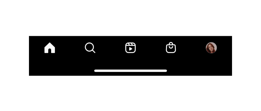
If you own a smartphone you have probably experiences action bars at some point. They are the navigation element that sticks to the bottom of your phone screen. It holds main navigation items such as; home, profile, settings, discover and create.
In the example below you can see Instagrams action bar contains a link to your home feed, search, reels, marketplace and profile. One of the best things about using action bars is their ease of use. Allowing users quick access to the pages they use most or that you want them to use most. And by using familiar icons such as a house icon for home, the learning curve is quite small.
Default OS Elements
If you are creating an application it’s important to remember different devices and operating systems will have different default navigation styles. Some operating systems have ‘buttons’ at the bottom of the user interface to allow users to navigate back or go home. Other mobile operating systems such as iOS utilise a back button at the top of the screen in the header section of the page. This is something you will need to keep in mind when creating mobile application designs.
Supporting navigation elements
Breadcrumbs
Breadcrumbs are used frequently in desktop sites and are particularly useful for e-commerce sites or sites with a complex IA. They are used to help the user understand where they are in the overall site by providing context but also adds a quick way to navigate up and out after clicking deep into your site. Breadcrumbs should generally match your site’s IA structure, if you have a ‘polyhierarchical’ site structure aka you have pages that can be accessed via more than one route you will need to decide which route to show to your users. You can see below, I accessed this page in the Nintendo store via the Pokemon section of the site, however, the breadcrumb lists me as being within games.
Footers
Footers come in many shapes and sizes. The gist of the matter is that they can contain more links to pages within your site than the main navigation because they are hidden at the bottom of the screen out of the way. You can also utilise footers to include things like prompts to sign up for your newsletter or social media links. They can be as large or small as your heart’s desire but if you are including multiple pages in it, the best practice is to group them under a title so it’s easy for users to find what they are looking for. You can check out an example of this at the bottom of Sympli’s website.
Navigation can be daunting especially for complex websites and products. But if you follow these basic guidelines you should be able to create a simple, easy to understand design to help your users find their way around.
Sympli is a Saas company that creates tools for design collaboration, handoff, and version control. With more than 5 years on the market, we had helped thousands of designers and developers work together by providing a single source of truth and reducing back-and-forth communications, resulting in faster delivery.