

As Antoine de Saint-Exupéry says: “Perfection is achieved, not when there is nothing more to add, but when there is nothing left to take away.”
You may be unfortunate enough in your time to work with someone who believes that you must cram as much into your design as possible. That white space is wasted space and that everything should be above the fold. These people are wrong. But before we can explain to them why they’re wrong we have to understand that ourselves.
What is white space?
White space is the empty or negative space between and around components within a design; this could be text, images, cards, buttons, icons, forms, etc. And applies to any type of visual design including UI, web design, and graphic design. When used correctly, white space brings visual clarity and balance to a layout.
Think of white space as a breathing room in your design, if too much content is shown to the user in a small space it can be overwhelming. Introducing white space allows the user to absorb content in neat, bite-sized chunks.
Understanding the terms
Before you start to implement white space in your designs you need to make sure you understand the terminology, so you can accurately tell the person implementing your design to add 8px of padding to the left of an element.
Paddings and Margins
Generally, as designers, we use the term ‘padding’ to mean any space around an element. However, in terms of development, there are actually two different terms depending on what type of ‘padding’ you mean. An element's‘ 'margins’ are the space between its edge and the next element. The ‘padding’ is the internal space between the edge of the element and any internal content.

For example, the space between form inputs and the submit button will be specified using ‘margins’ and the space between the edge of the button and the text on that button will be the ‘padding’. A simple way to remember is: internal padding, external margins.
Alignment
You will likely have heard of the term alignment before, it’s generally used when referring to text which can be left-aligned, centre aligned or right-aligned. But it can also be used to refer to how elements or groups of elements on a page are placed in relation to one another.
Depending on the layout you may want your elements to be left, top, right or bottom aligned. Alignment is used to group items that relate to one another together and to specify where content should sit inside a container.
Content Hierarchy
When you bring these terms together with things like font size and colour it will begin to create a content hierarchy. The content hierarchy should highlight to the user what they should do or concentrate on, within a design. This could be a form or a specific order in which to read through a page. You probably do this already by creating different font sizes and weights for your text elements. An element with a larger or bolder font will stand out more than an element with a smaller or lighter font.
Related Elements
In addition to highlighting areas of focus, white space plays a huge role in the visual organisation of a page.
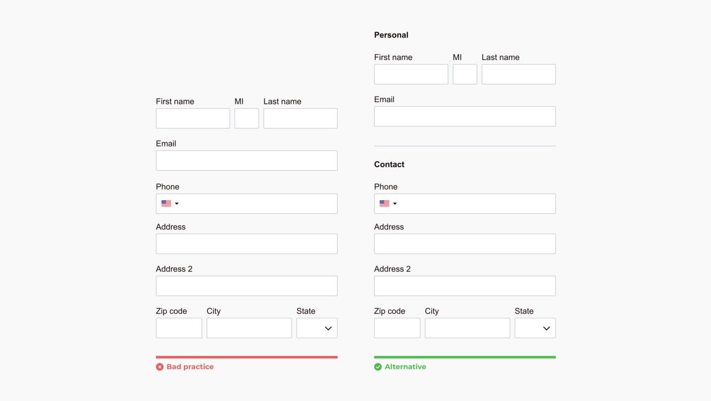
Grouping related content together by using less or more spacing between elements can help guide the user to understand when elements on a page are related. For example when laying out forms related items such as first and last name inputs should be grouped together with less white space between them to show the user visually that they are related. But more space would be added between a name input and, for example, a telephone number input.
The use of spacing on the right-hand example below indicates to the user what inputs are related and allows them to tackle the form in two chunks rather than all at once.
Consistency in your use of white space
A lot of people know about designing to a grid, selecting a number of columns, setting their width and then specifying a gutter width between them, but do you know that there is another way: designing to a set of rules. By this, I mean having set rules for element dimensions, padding and margins across your design. This is known as a ‘soft grid’. For example, a common rule designers use is to specify that all padding/margins should be a multiple of 8. Buttons can have a left/right padding of 16px, Cards a padding of 24px. Each new section on a page may have a bottom margin of 56px etc.
Designing with a preset selection of white space rules like this makes life easier for you as a designer, because you don’t have to think about it, you just set your rules and stick to them. It also makes the life of the person who is developing easier because they can have pre-set padding and margin widths and just pass those in when needed rather than chopping and changing things as they go along.
It also means your designs look and feel consistent, it helps improve visual hierarchy by, for example, specifying that page titles should always have 40px of spacing below them. And that smaller paragraphs or related content have smaller padding. Having a set of rules like this allows for flexibility in your design without compromising on consistency. An 8px increment soft grid also allows most screen sizes to be divisible into it so everything should fit just hunky-dory.
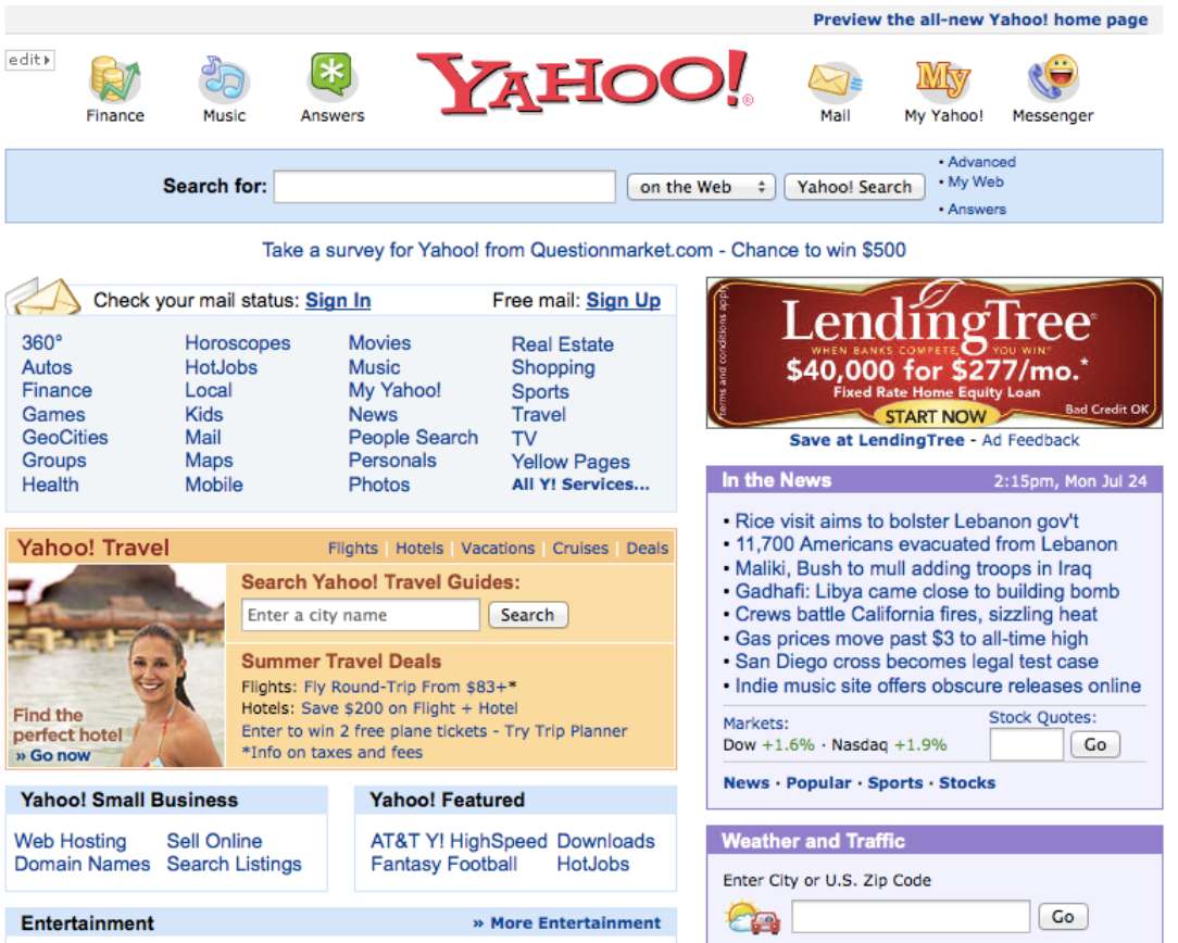
What to say to those that want to go back to ‘90s style interfaces
Less visual noise makes for a better user experience by decreasing cognitive load. Adding space between elements increases the digestibility of content and improves readability. Think of the last time you had to read a really long paragraph without breaks. It can be really intense reading and reading without any hint that there may be an end in sign to the content you’re trying to absorb… It’s not pleasant. That’s what a design with no white space feels like.
There is also the idea that users will not scroll to see all content on the page. This is a myth. Twitter, Facebook and other infinitely scrolling websites prove this every day. So long as you are providing users with useful or interesting content they will continue to scroll.
To summarise, crammed, overfilled websites with a million things above the fold should stay firmly where they belong: in the ’90s. And when in doubt just add more white space…