

A creative process does not always flow as one would wish, and when we talk about websites and mobile applications, where we must also consider innovation, it can become a complex and frustrating challenge. For UI designers, creativity will constantly play an important role, since much of the content and information will be variations of existing products or services that will have to mark their own identity.
In this article, I exemplify a six-step method that I regularly use when designing an interface, “stealing” real references to achieve a high level of quality without losing the aspect of innovation and creativity. Understanding that there is nothing new that has not been designed before we will work on the creative process of a new interface.
The 6 stages of UI creation
There are several books and articles, such as Stealing Like An Artist by Austin Cleon, that explain how the production of new ideas or creations in design are really new combinations of things already created. In other words, nothing is original, but rather a process of intelligently collecting and mixing many sources to produce something new. I have landed this process in six parts: understand, discover, select, mix, forget, improve.
1. Understand: The process begins by understanding the objective of the interface, the industry for which we are designing, and other elements such as the tone of communication and what emotions the brand wants to communicate.
2. Discover: I could describe it as something similar to benchmarking, only focused on UI aspects and not limited to just websites or apps, but to any real, fictional or digital element that can serve as inspiration.
3. Select: After having several references, we take the ones we think will work best for the design (Step 1), usually 3 or 4 references will be enough.
4. Mix: This is the most complex and important step since it involves integrating everything in a harmonious and consistent way. It will apply to detect what works and what does not to iterate on our references and design decisions.
5. Forget: This step should accompany the process until the end, and focus on detaching ourselves from our references and what we already designed in order to constantly make improvements as if we were seeing the design for the first time.
6. Improve: At a certain point, the mix will create something with enough identity that it will not look at all like our references, which will allow us to continue improving the UI design on our own and in a fluid way.
The challenge
To make this creative process more understandable, I will design the website of a fictional project. This exercise was also exemplified in Dan Mall's article, Stealing Your Way to Original Designs, where he explains this process well but reduced it to three steps (I prefer to expand it to six).
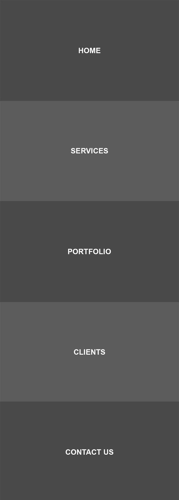
Let's imagine that I have to design a website for a digital agency called The Hexagon, and I have to start from scratch with the design of the website. I have nothing in mind, only a simple architecture of five options: Home, Services, Portfolio, Clients, and Contact. The brand tries to evoke modernity, technology, cleanliness, and professionalism. At the structural level, our page would be something like this:
Once we define the primary structure, I dedicate myself to finding references on the internet, one of the best sources in my opinion for this type of digital agency pages is the CSS Design Awards. On the initial search for references I returned these options:
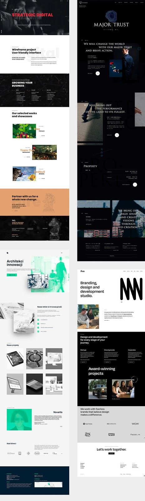
All these references evoke the same style of modernity and innovation that we are looking for and as you will see, they are from the same industry for which I am going to design now. This is not an established rule, as having references from other industries can also enrich our design and incorporate other design trends.
When I look at all the web pages together, I can see that almost all of them have the sections that I need, so the next step will be to take a section from each website to create a different layout. The result is a kind of UI collage.
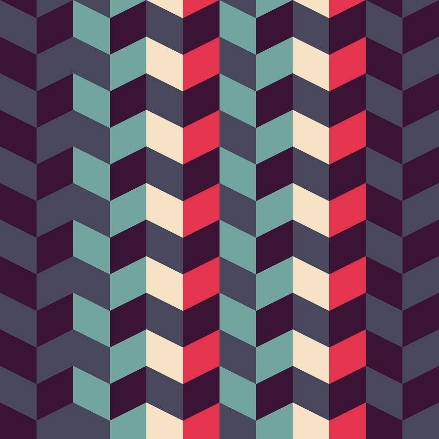
What comes next is the selection of colors. Many times it involves using the brand's colors in an attractive way or, in other cases, proposing new ones. Let's say The Hexagon is the latter case, so I start a search for color patterns to apply to my interface.
After looking at some options, I found this palette that reminds me of some pieces of graphic design in the 60s or 70s, and that I think will make an interesting contrast with the modernity that the web should convey.
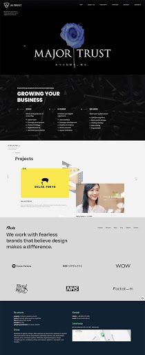
The next step is to land our original proposal by taking these colors and planned structure. Applying these elements and manipulating them a little to generate harmony between them, we could have a result like this:

At this point, nothing is defined, since this step will only facilitate the creation process and decision-making.
Already getting into the details, we go back to our references this time to capture some elements that could contribute to our design. I have selected two sans serif fonts that will work really well and start testing text color combinations that improve readability with my background.
Something very cool about these types of homepages is that the first level always has an attractive element or composition that welcomes you to the web and exemplifies what the brand is. For my proposal, I want to represent a hexagon creatively, that impacts from the beginning and calls the user's curiosity.
Since it is important as a designer to always get out of the UI design scheme, I found a visual idea in the movie Dr. Strange, where the main character constantly traverses to another dimension in a kaleidoscope-like or fragmented mirror effect.
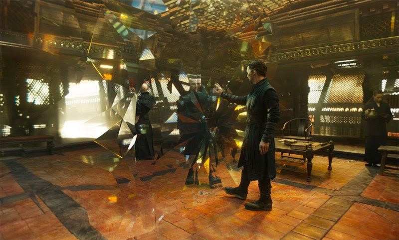
When I saw it, I thought it would be great to integrate something like that with the shape of the logo, to achieve an effect of depth and elegance, while reinforcing the identity of the brand. After doing many iterations and improvements, the result was this:

I add this composition on the first level and place the navigation menu, the logo, a slogan on the hexagon. In the following levels, we can also see text-type content and the size hierarchies that will facilitate the scanning of the information.
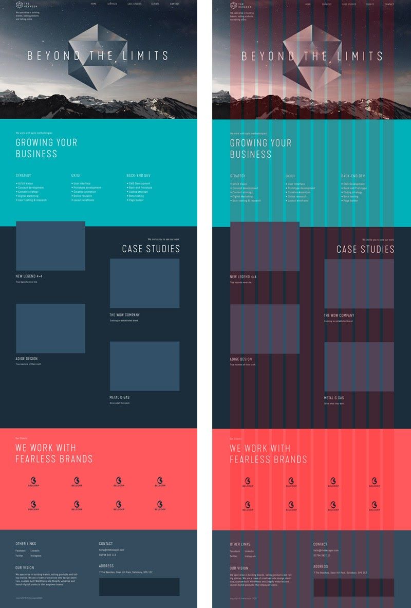
An important factor is to work with a grid, in my case with twelve columns, which will help to distribute the components in an orderly and consistent way (right image). Once having this as a foundation, we can venture to explore improvements based on our criteria or even finding more design trends in our references.
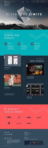
In the following design, we can already see the incorporation of all the information of the website (text, images, and logos) and new elements that help to break the grid to give it more dynamism and asymmetry.
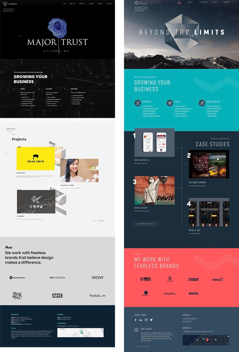
Here I compare the mixed references and the final result:
In the latest version, I made the following changes to the design:
- In the first level, I added certain elements again based on other references, such as a mouse icon to show that the web should be scrolled and also a contrasting line that highlights its location in the navigation menu.
- On the services screen, I incorporated iconographic and certain linear patterns that were based on the hexagon.
- For the portfolio section, I placed reference works and assigned a number to each project to break the grid a bit and again give dynamism to the design. I also added a “see more projects” button.
- On the Clients screen I added sample logos and repeated the linear elements of the services screen for consistency and dynamism.
- Finally, in the footer, I added the social network logos and the agency logo to break up the symmetrical effect of the columns, as well as a dark Google map.
Conclusions
As we have seen, it is possible to create something new using great references, going through the process of understanding, discovering, selecting, mixing, forgetting, and improving. The important thing is to recognize outstanding interfaces and then identify the elements that will contribute to our new composition. Once we have this new mix it will be easier for us to innovate and distance ourselves from our references. As writer James Clear explains:
“The creative process is the act of making new connections between old ideas.”
Thanks for reading.
References:
- Stealing Your Way to Original Designs by Dan Mall
- For a More Creative Brain Follow These 5 Steps by James Clear
- Steal Like An Artist by Austin Kleon