
I remember a time when design terms like wireframing, low-fidelity prototyping and high-fidelity prototyping weren’t as trendy. While style guide has long been an established term, pattern library is a new-ish one, although it’s not really necessary that you remember these terms, it’s more that you understand and correctly implement the processes involved, as opposed to writing them off as a “silly” design trend.
Learning the difference between a wireframe, a lo-fi prototype, a style guide, a pattern library and a hi-fi prototype helps you remember the natural process of designing user interfaces.
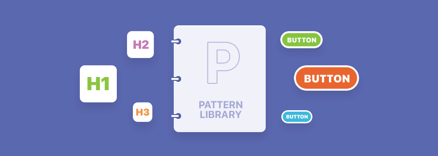
Style Guide vs. Pattern Library?
So what exactly is the difference between a style guide and a pattern library? Well, if you already know that a style guide is a set of style visual cues (text styles, colours, etc), and a low-fidelity prototype is like a wireframe mockup of your layout, then a pattern library is when you take commonly used components from your lo-fi mockup (navigational components, form components, button components, etc) and use your style guide to create high-fidelity mockups of those common components.
In short, it’s not style guide vs. pattern library, it’s style guide, then pattern library. Lets learn more!
Creating the Perfect Style Guide
First, lets clarify the events leading up to the style guide.
- Pen and paper ideas
- Iteration and more ideas
- Low-fidelity prototype (static mockup + user flows)
- Style guide
What Should a Style Guide Include?
Style guides are composed of mainly text styles, fonts and colours, along with the appropriate use-case for each. It’s not uncommon to include branding assets alongside it, for example the logo, which would also contain aspects of the colour styles.
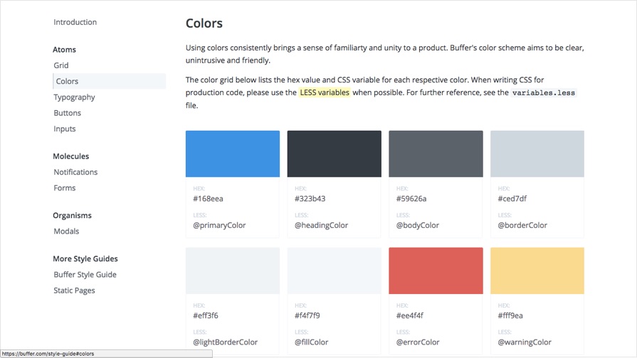
Look at this style guide by Buffer — notice how the colours are carefully displayed in rows and columns, along with their use-case (#323b43 is for headings, #ee4f4f is for errors — this is clearly laid out).
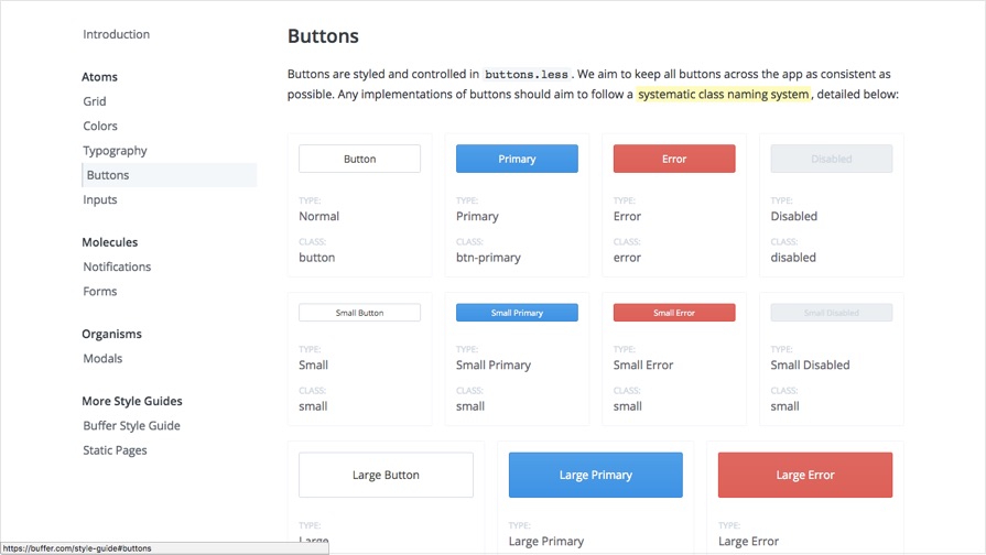
And here’s what buttons look like at Buffer; look being the keyword there. A style guide doesn’t think about design elements in context, the only aim at this stage is to fine-tune the:
- Readability
- Legibility
- Contrast
- Branding
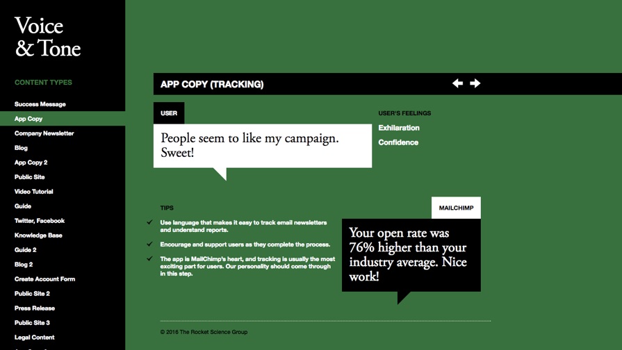
Guides can also include details about voice and tone (i.e. how the content is worded). Is the content formal? Informal? Comedic? Sharp? Aspirational? Branding is about much more than design — you can convey your brand with words too. Have a look at MailChimp’s voice and tone guide.
Creating the Perfect Pattern Library
Pattern libraries are where UI meets UX. You have the styles, now it’s time to build some of the commonly used components, all the while laying those already-defined styles into context.
Identifying Common Design Components
Start by identifying what components will commonly occur throughout your design. Here’s a few examples of design components that might appear on most (or every) screen:
- Menu navigations
- Footers (with links/copyright)
- Form elements (dropdowns, radios, checkboxes, etc)
- Cards (for e-commerce sites/apps or blogs)
- Grids/tables (for sites/apps that display a lot of data)
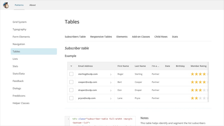
Here's Mailchimps approach to design patterns in tables:
Forming Design Patterns
Great design is about consistency. When you create consistency, users are able to teach themselves how to use your interface; they learn where to look when they want to advance, they learn which colour button helps them cancel an action/return to a previous state. Your users do this by recognising UI patterns.
For example: if a pagination component is floated to the right, do the same with form submit buttons so that users remember where to look when they want to progress. When you help the user move from A to B quickly, you’re creating an exceptional user experience. You can improve the UX in this example even further by using the appropriate colour on the button — this is, the colour consistently associated with “progression” throughout your design, as defined in your styles.
In this U.S. Government example, the designers have laid out clear web standards with templates, complete with actual design files and code samples. Patterns are established throughout these templates, this helps the user become familiar with (for example, since this is a government website) filling out forms. They learn the difference between buttons and links, they understand why a form cannot be submitted and where they need to look to correct it.
A design that uses a different colour for every button in the app/site isn’t establishing any patterns, therefore the user can’t learn how to navigate the interface. If the user interface doesn’t begin to feel familiar to the user, they’re unlikely to return after feeling frustrating with the experience.
Before we wrap this up, take a look at some terrific examples of style guides and pattern libraries from well-known brands:
- Salesforce
- Mailchimp
- Buffer
- US Government
- Starbucks
- Yelp
- A List Apart (Styles)
- A List Apart (Patterns)
- Many more on StyleGuides.io
Conclusion
When you break a design down into steps, the process sounds much less intimidating. It also offers you the opportunity to to slow down, iterate more ideas, and accept feedback at various intervals along the way. Ironically, this actually speeds up your workflow in the long run, because rushing into a design will only result in setbacks later down the line.