
The benefits of a design system are undeniable, if this year you are starting with the creation of your own design system, a little benchmarking will go a long way. In this article, we will look at 8 of the best design systems, their main benefits, peculiarities, and disadvantages.
Giving a bit of context, a design system is a centralized library consisting of a set of general and functional patterns that are interconnected, translated into code, and guided by specific standards, in order to maintain the visual consistency of the digital product and save time.
Having these concepts clear, let's get started.
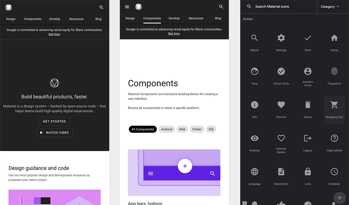
Google (Material Design)
Link: https://material.io/design
Founded in 2014, Material Design by Google is one of the most popular design systems today. Staying firm in its strategy, Google has been implementing Material Design in almost all its products in a consistent and effective way, exploring new components for its libraries and providing a very complete documentation of each one of them. Their exemplary use of atomic design has also served as a guide for thousands of UI designers.
Pros:
- A wide range of great components.
- Detailed design documentation and use cases.
- Clean and minimalist design.
- Styles needed to design in dark mode.
Cons:
- Its popularity in Google products makes the adoption of Material Design take away the product's brand identity.
- If not used cleverly, the design components themselves can result in a boring composition.
- Prioritize visual recognition (familiarity) by Android users.
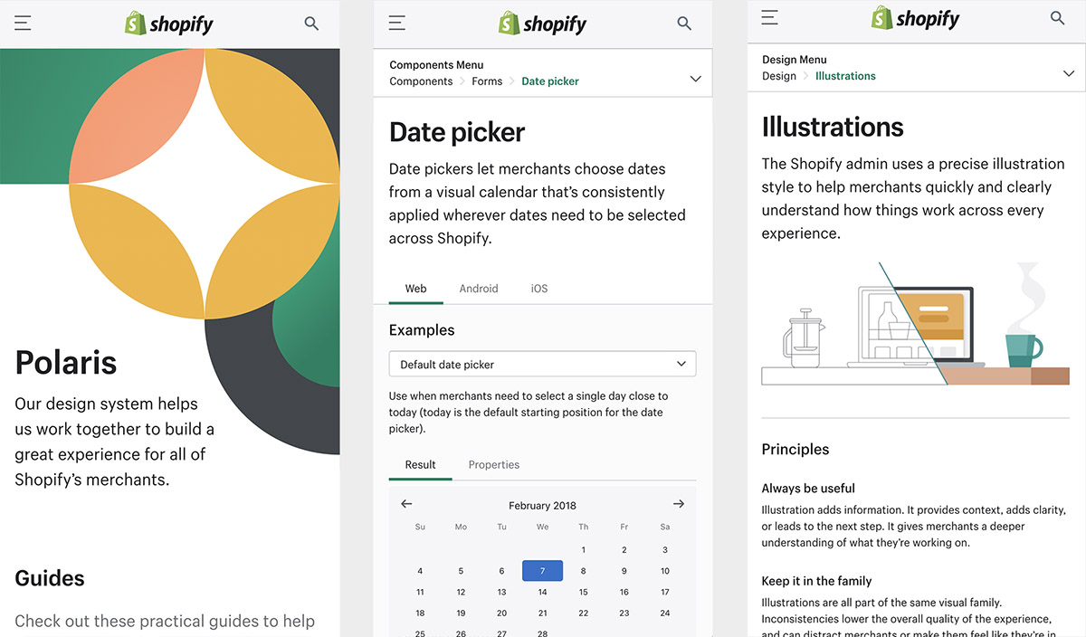
Shopify (Polaris)
Link: https://polaris.shopify.com/
Shopify Polaris was developed a few years ago so that all Shopify merchants could have a great experience and benefit from a consistent design. This design system has guidelines for creating each part of the Shopify experience; from admin screens to product experience and various apps for Shopify. It covers content, components, design, and the style patterns necessary for the creation of an e-commerce product.
Pros:
- Clear and effective components/styles with a nice usability level.
- Good navigation of the site and its information architecture.
- Great library and guidelines for illustrations with good visual quality.
- Great library and guidelines for sounds, which is innovative in current design systems.
Cons:
- Lack of customization or the development of a personal style in the components.
- The documentation in some cases becomes confusing and includes too much text.
- Minimalism is put aside by placing many elements in tight spaces. Some meaningful, others unnecessary.
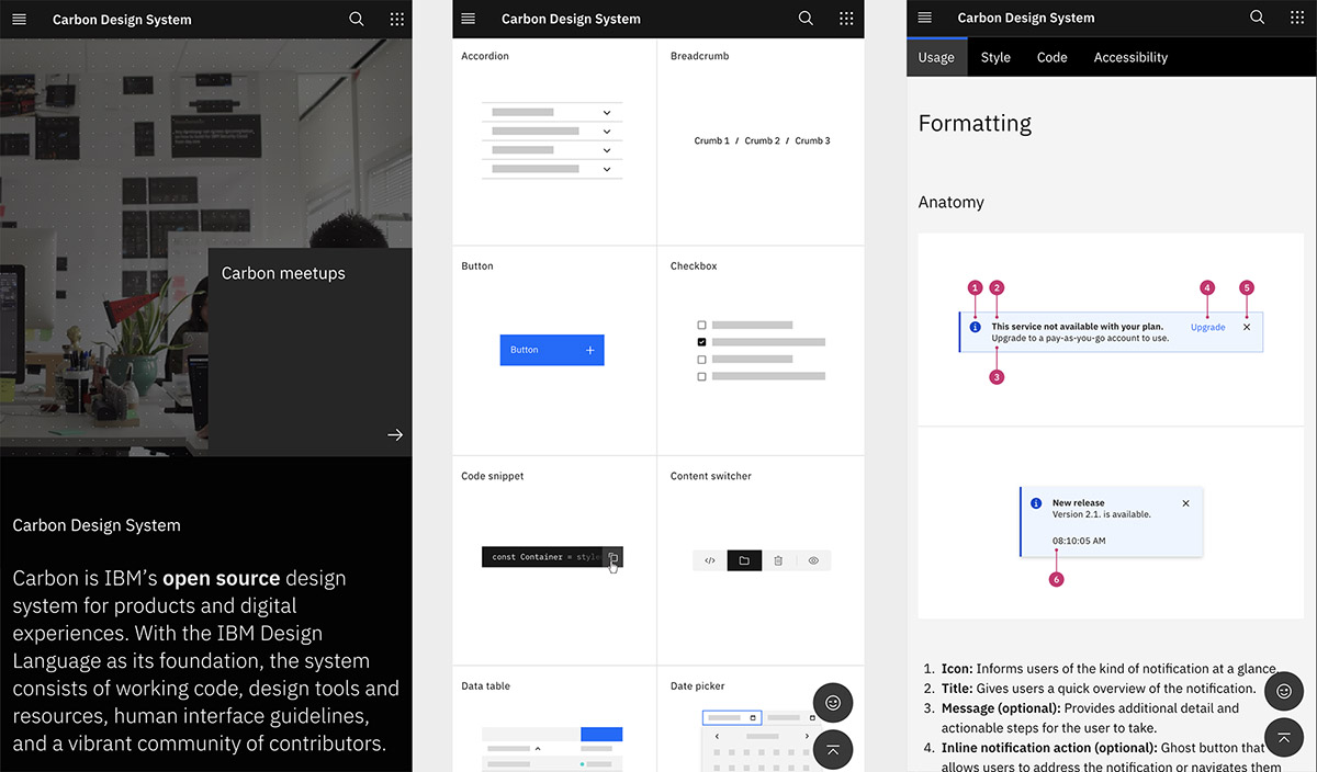
IBM (Carbon)
Link: https://www.carbondesignsystem.com/
The guiding principle of the IBM design system, Carbon, goes beyond documenting the style guidelines and use of brand assets; They also share their philosophy and a gallery full of examples of their design system in action, establishing a shared vocabulary between designer and developer, and providing clear, discoverable guidance around design and development best practices.
Pros:
- Elegant and minimalist without losing functionality.
- It has extensive but orderly documentation.
- Very good examples of use.
- Flawless information architecture.
- Modular and flexible components as shown by their case studies.
Cons:
- It may work better for corporate-type products.
Mailchimp
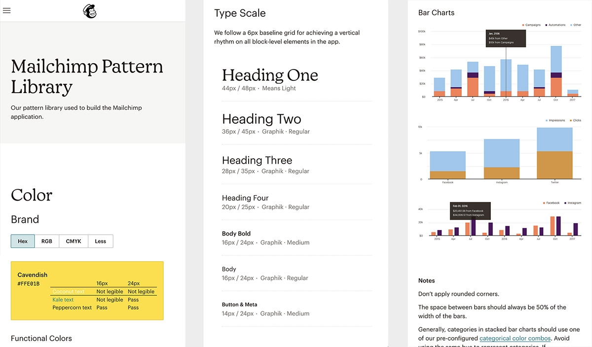
Link: https://ux.mailchimp.com/patterns/color
Mailchimp Pattern Library has very artistic guidelines and is always cited as one of the best examples of a company's voice and tone guide. Its design system is quite complete, and detailed guidelines can be found with many visual examples and explanations that break down the most important concepts. As is evident to many designers, Mailchimp embodies devotion to creative expression and an obsession with quality.
Pros:
- Artistic and modern style, with a lot of emphasis on conveying emotions.
- Great brand tone and voice guidelines.
- A very good library of illustrations that breaks the structured concept of most design systems.
Cons:
- It is for the use of Mailchimp products only.
- Their artistic style may not look good on other types of products or brands.
- Their libraries are very limited and do not cover a large majority of more complex components.
Audi
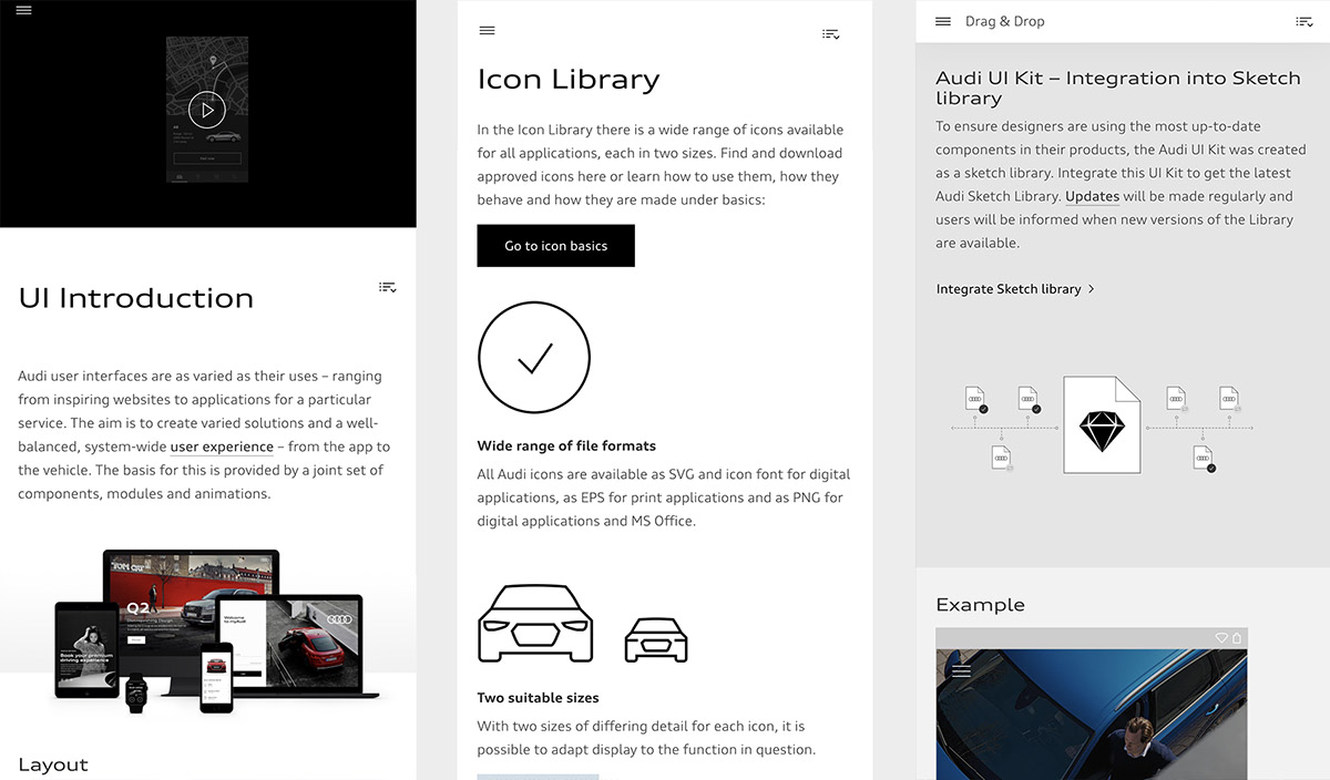
Link: https://www.audi.com/user-interface/introduction.html
Audi UI aimed to create an elegant user experience and a variety of well-balanced solutions, both for its application and for the interface of the brand's vehicles. Its component library is open source and has many inspiring examples. Because it stands out for being cross-platform in the automotive industry, I consider it to be a good reference for any UI designer.
Pros:
- Detailed and explanatory documentation.
- Good balance between own identity and usability.
- Various animations illustrate the behavior of the components.
- Minimalist style.
Cons:
- A not very modern typeface family.
- Lack of consistency in the documentation layouts.
- Confusing sidebar in terms of interaction.
- Certain elements in the documentation layout are not very well designed.
Microsoft (Fluent)
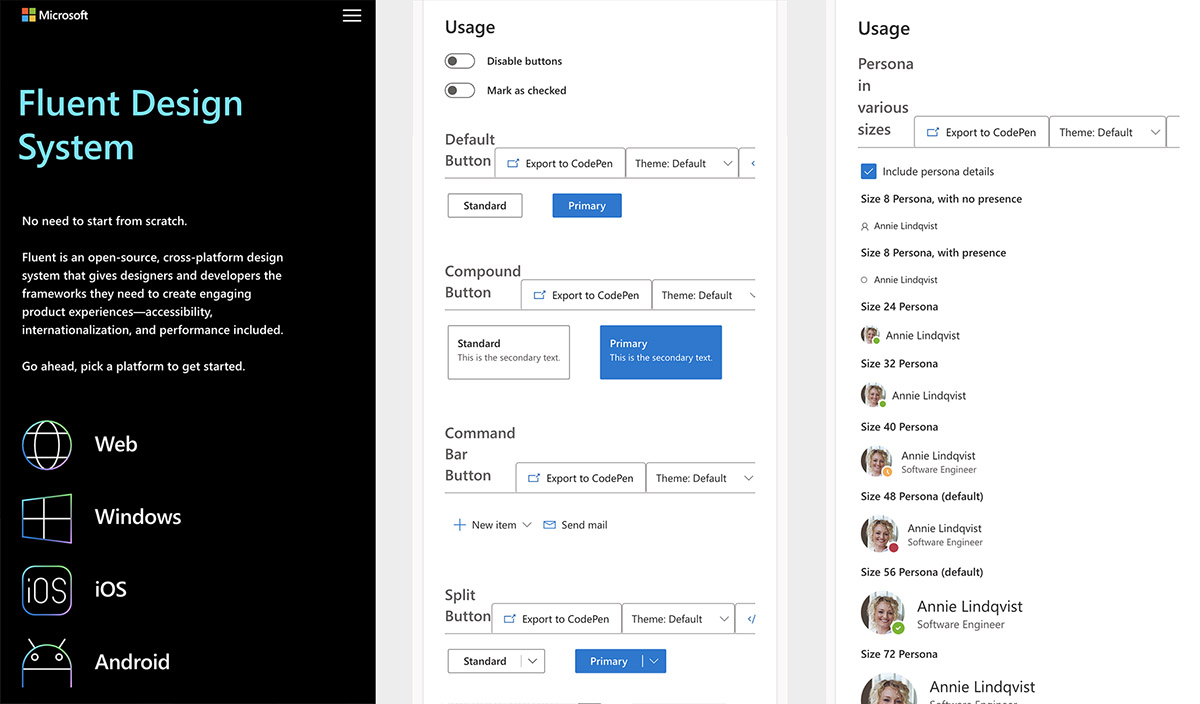
Link: https://www.microsoft.com/design/fluent/#/
The Fluent design system was developed by Microsoft in 2017, achieving in many respects simplicity and consistency through open design systems for all platforms. Microsoft's strategy was to focus on inclusion, bringing together the fundamentals of design and customer needs. It also establishes guidelines for developing applications for Windows, Android, and iOS devices.
Pros:
- It has a very dynamic way of presenting its libraries.
- Various toolkits for Sketch and Figma.
- It addresses a large number of components and casuistry.
- Complete cross-platform documentation.
Cons:
- Lack of consistency in the navigation of the libraries.
- The design is not very clean, sometimes without the necessary negative spaces.
- Some layout distribution problems.
Uber (Base)
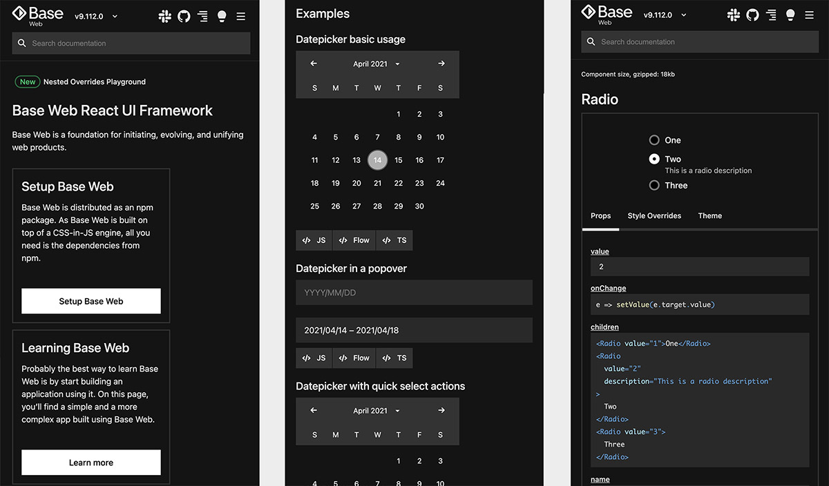
Link: https://baseweb.design/
The Base design system, created by Uber, is another good example of consistency and simplicity while maintaining usability standards and clear communication for designers as well as developers. Its stylized and geometric components cover different types of needs, both in light mode and in dark mode. Other interesting examples such as tables and skeletons are covered in detail in Base.
Pros:
- Minimalist and elegant design.
- Wide variety of components and usage examples.
- Friendly and understandable navigation.
- Dark mode enabled for their entire design system.
Cons:
- You can feel the lack of identity on certain components.
- A lack of spacing complicates navigation.
- It has an overly technical look and feel.
Apple (Human Interface Guidelines)
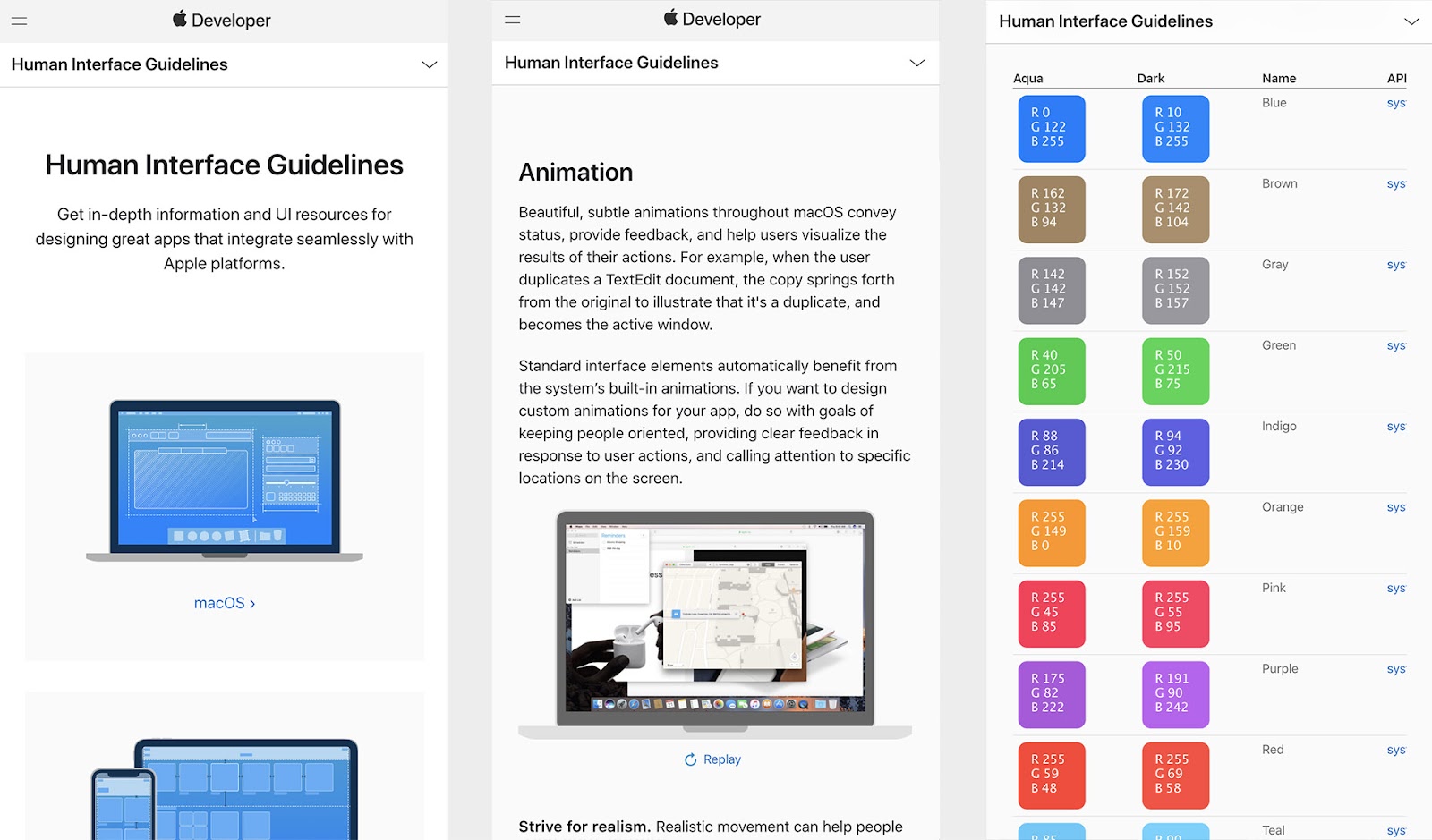
Link: https://developer.apple.com/design/human-interface-guidelines/
Building on the design foundations for the Mac OS X operating system, Apple created design guides to provide a consistent experience across the rest of its products. Human Interface Guidelines, as it is called, is one of the well-known design systems. Human Interface Guidelines are frequently updated and have changed a lot throughout the company's history, adapting to new environments, products, and technologies.
Pros:
- Complete cross-device documentation.
- Good balance between their own identity and usability.
- Detailed guidelines and use cases.
- Clean and minimalist design.
Cons:
- Its guides and components are focused on operating systems.
- Sometimes the documentation becomes very textual.
- It does not allow you to interact directly with the component (just JPG screenshots).
To summarize, we can say that all these design systems help teams work not only agile but also better. The reuse of common elements makes us design faster and have fewer errors, both in interaction and at a visual level, making the final product much more consistent. The use of a design system will also create evolution in the design (product) and the patterns, styles, and usage guidelines - everything supported by the key methodologies that govern good UX and visual design.
Thanks for reading!
Sympli is a Saas company that creates tools for design collaboration, handoff, and version control. With more than 5 years on the market, we had helped thousands of designers and developers work together by providing a single source of truth and reducing back-and-forth communications, resulting in faster delivery.