
Webpages can be printed, but you probably knew that already. You probably don't do it very often, because…well, they're often ugly, too long, or a complete mess. But what you might not have known, is that we can define separate CSS styles using media queries for webpages that translate to a Letter or A4 document.
Websites that sells tickets do this often (think: boarding passes, entrance tickets, proof of purchase, invoices, et cetera), but it's not the norm for everyday content, which is a shame because users do attempt to make content available offline more than you think (i.e. before a flight, as a printable reference, et cetera).
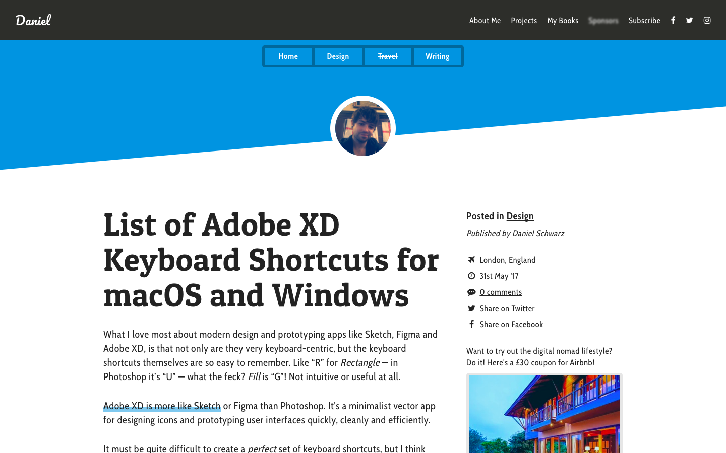
Let's take a quick look at how we can write media queries for printable and exportable content. It's super-easy, it'll only take a minute! We'll use this Adobe XD keyboard shortcut cheatsheet from my blog/website as an example.
Here's what the article looks like on the web:
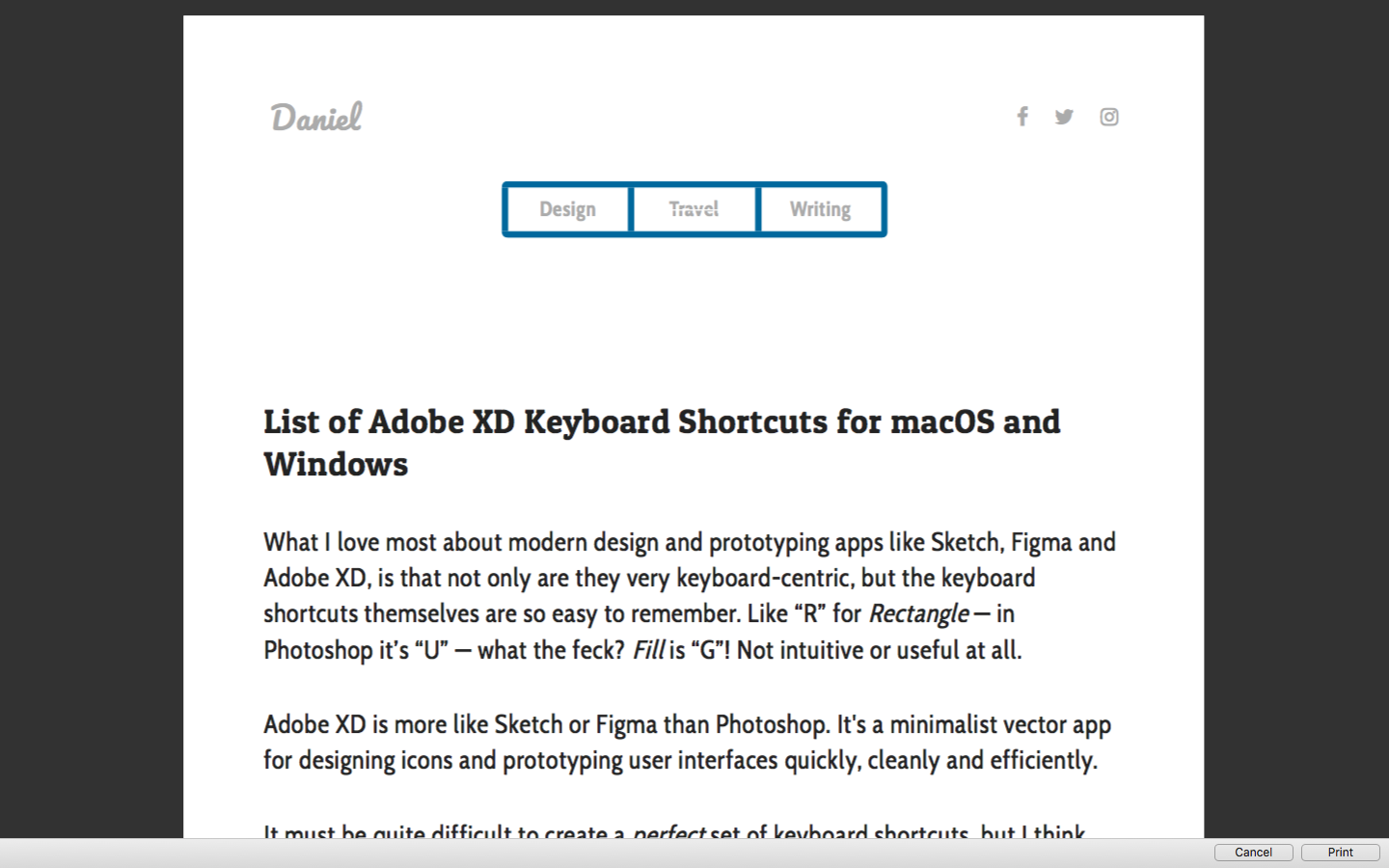
And here's what it looks like as a PDF, before CSS optimization:
FYI: you can print from the web using the keyboard shortcut Ctrl/cmd+P.
Step 1: CSS Media Queries for Print
First of all, we define the media query:
@media print {
    /* styles here */
}
Assuming that this appears at the bottom of your CSS stylesheet, most styles within the media query for print should overwrite anything else that exists with ease.
If not, try using the !important rule.
Step 2: Hiding Redundancy
When downloading webpages as PDF, users don't need:
- UI elements
- Header/footer
- Sidebar content
- Forms and CTAs
- Et cetera
We need to hide those elements using display:none;.
Our code then becomes (as an example):
@media print {
    header, footer, aside, form, … {
        display: none;
    }
}
Our example then looks like this:
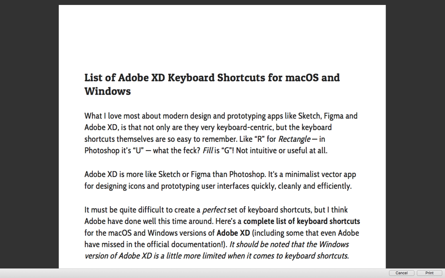
Not bad, but there's some unwanted spacing at the top.
We'll want to "reset" this spacing, which won't necessarily be on the <body> tag. In my case it was a margin: on the <article> element, hence:
@media print {
  header, footer, aside, form, … {
    display: none;
  }
  article {
    width:100%!important;
    padding:0!important;
    margin:0!important;
  }
}
Step 3: Customizing Page Margins
Browsers are actually quite efficient when it comes to redefining page margins and stacking content. That being said, you might want to define your own margins, which is reasonably easy to do. Just remember to use cm instead of px!
Our code then becomes:
@media print {
  header, footer, aside, form, … {
    display: none;
  }
  article {
    width:100%!important;
    padding:0!important;
    margin:0!important;
  }
}
@page {
  margin: 2cm;
}
As you can see from the code example above, margins are defined using the @page at-rule, not by adding margins to the <body> element, since the <body> only exists once and spans the height of all the pages collectively. With this declarative we can even define separate margins for first, last, left and right pages (in the event that said exportable spans more than a singular page), for example:
@page:first {
    margin: 0cm;
}
@page:last {
    margin: 5cm;
}
@page:left {
    margin: 2cm 1.5cm 2cm 2cm;
}
@page:right {
    margin: 2cm 2cm 2cm 1.5cm;
}
Step 4: Handling Links
Links are still clickable in PDFs, but for those users that might want to physically hold the content, we'll need to come up with something more creative. It was Ben Frain that originally enlightened me of this really simple, super-cool trick.
@media print {
  a:after {
    content: "("attr(href)")";
  }
}
What this does, is takes the value of the href attribute and displays it in brackets after the link, like this:
cool trick (https://benfrain.com/create-print-styles-using-css3-media-queries)
———
I'll leave you with this one last scrap of advice: leave something in the printable version that has your name and any copyright information required!
Sympli is a Saas company that creates tools for design collaboration, handoff, and version control. With more than 5 years on the market, we had helped thousands of designers and developers work together by providing a single source of truth and reducing back-and-forth communications, resulting in faster delivery.