
The Basics
Buttons are one of the fundamental components of product design. Without them we would struggle as designers to call attention to the actions your users can take. The styling of those buttons can make or break a product. The $300 Million Button is a testament to that. There are a few best practices in designing your buttons and a few more things you should keep in mind.
Button Types
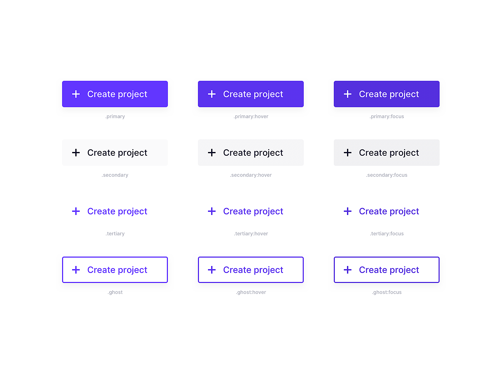
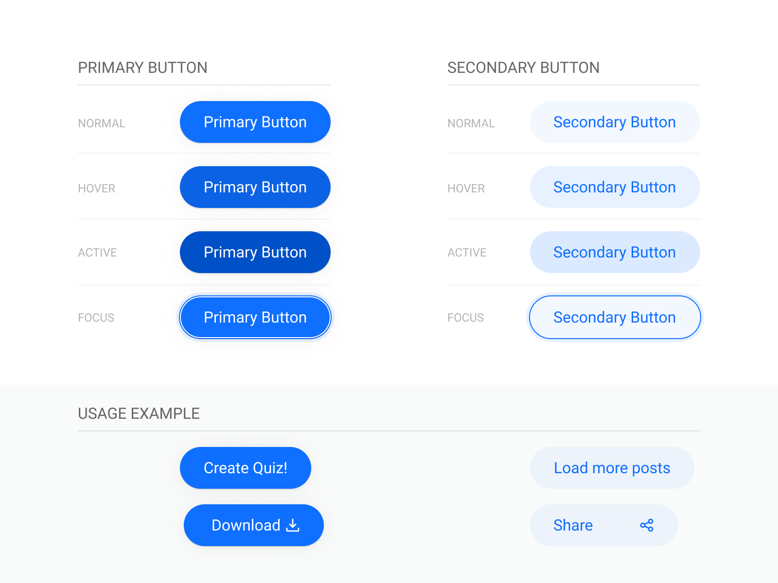
Primary
Primary buttons are used for the main action you want a user to take on a page. Their style will be the boldest to ensure they stand out from the rest of the content shows to users. Because of this primary ‘calls to action’ or “CTA’s” usually have a fill, be it a solid colour fill or gradient the styling is up to you, but you want to ensure it visually stands out on the page.
Secondary
Secondary buttons are used for the second most important action. These are often used if you have multiple actions on a page so need more than one button. Your secondary action should be styled differently from your primary action but may use the same colours. For example, where your primary button might be a filled blue, your secondary action may have an outline of that same blue but no fill. This style of button is also referred to as a ‘ghost’ button
Tertiary
Tertiary buttons are an optional third style for buttons, these are usually used for actions such as ‘cancel’ or ‘close’ actions. They may technically be a button but often they have no background or outline until a user hovers over them, so they simply appear as the label.
Button States
There are a few buttons states that most people know to cover; Default, Hover and disabled there are a few more that are often overlooked, for example; Clicked, Disabled Hover, and Focused.
Default
Your default or ‘active’ state should be the base styling you want your button to take, what the user will see without hovering over the button. It should have a clear ‘call to action’ related to what you want your user to do e.g. save, upload or contact. The label should be accessible on the background colour you choose for your button. Your button activate state styling will be different for each of your button types; primary, secondary and tertiary.
Hover
A button hover state is the change in styling applied to your buttons when a user moves their mouse over them. This change shows users they can click on the button. If you are using shadows in your design you will want to adjust the shadow on hover, if you aren’t using shadows, you will want to change the fill or even animate the button to move to visually indicate to your user that the item is interactive. For mobile, hover states aren’t feasible so your next state will be a ‘clicked’ state.
Clicked
A clicked state is what a button looks like mid-interaction, as a user ‘clicks’ or ‘taps’ on the button. Depending on if your interface is flat in its styling or has visual depth you could add an internal shadow to mimic an actual button being pressed (for non flat design), alternatively you could also add an animation to the fill of the button (if you are using flat design).
Disabled
A disabled buttons’ styling should visually indicate to the user that they cannot interact with that button. There are a few ways you can do this, for example you can reduce the opacity of the button so it blends into the page or you can change the colour to be shades of grey. The main thing is the styling of the button shouldn’t change on hover. A good thing to keep in mind if you do choose to reduce the opacity is that users should still be able to read the label on the button, this can be a tricky thing to manage and thus the option of using greys can be simpler and easier to implement.
Disabled Hover
One thing that you should do with a disabled button is provide the user with system feedback, this is usually in the form of a tooltip that appears on hover. This tooltip should let the user know why the button is disabled, and what they can do (if anything) to enable it. System feedback is an important aspect of your user experience and a way to ensure users aren’t confused by your interface.
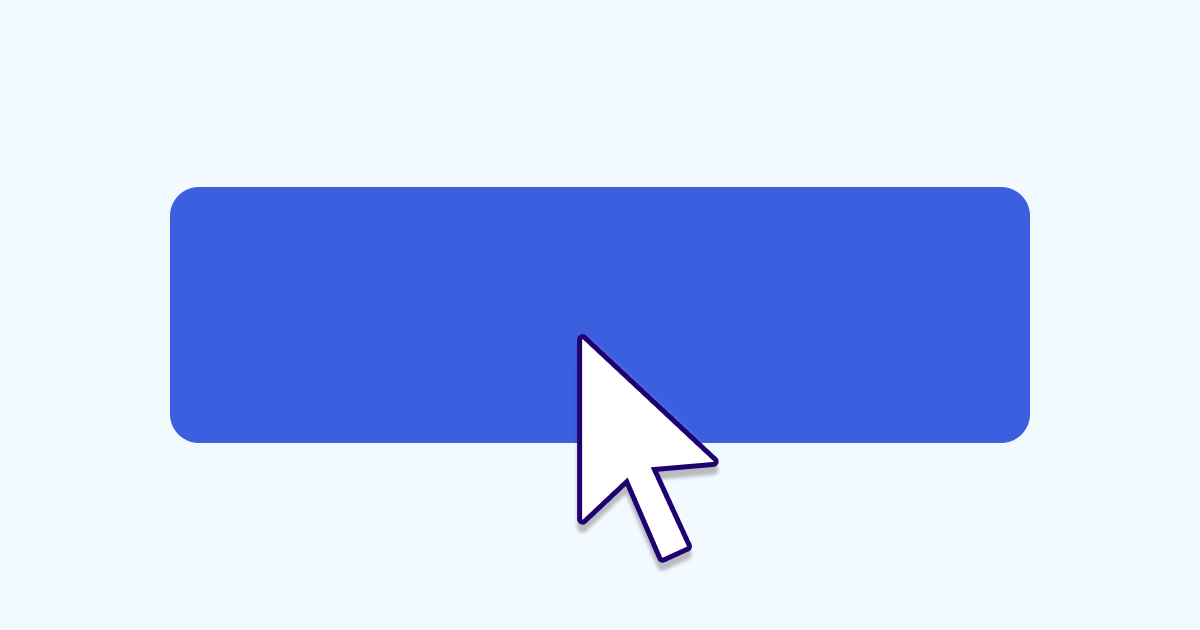
Focused
The final and often overlooked state is the ‘focused’ button styling. Focused is usually different from the styling used for default or hover. You can see how other handle this state by clicking your ‘tab’ button while on a page. You will likely notice elements on the page glowing or their styling changing to highlight it on the page. This shows people who are using a keyboard or screen reader what element they have selected so they know what they are going to interact with if they hit ‘enter’. Adding a focused state can help a lot with accessibility.
Button Labels
Button labels are important, there are a few things you can do to make sure you don’t create awesome buttons with awful labels:
Keep your button labels case consistent.
Case type is how you capitalise your headings and buttons throughout your design and this should be consistent across everything. Unless it has been specified by your brand guidelines it will be up to you to choose the styling here. Title case is where you capitalise all words in the title. It Looks Like This. This can be a bit harder to read but is often used for more formal brands. Sentence case looks like this, where only the first word is capitalised and is easier to read and is a little more friendly in terms of visual tone.
Avoid using long labels.
Keep button labels short and snappy, they should be descriptive but try to stick to 2 or max three words. Long button labels can add a lot of visual noise to your interface and also add cognitive load to the user as they’ll have to read more to understand the buttons action.
Clearly communicate the action.
Make sure the button label clearly communicates the action that will happen when the user clicks on it. This is especially important for ‘destructive’ actions such as deleting something. You shouldn’t leave your user guessing about what will happen if they click a button. If you have ever been confused about which button to press to confirm a deletion of something you know how frustrating this can be if you get it wrong.
Don’t wrap a buttons label.
Part of this is to ensure a clean aesthetic, however wrapping button labels also reduces the legibility of the label.
Things To Note
Below are a few design tips you should keep in mind when creating your button styles:
- Whatever styles you choose, make sure you keep them consistent across the platform. All primary actions should be styled the same, all secondary actions should be styled the same and so on. This is so users know exactly what the main action is on the page the moment they land on it.
- Make sure other components don’t accidentally look like buttons. Though this might seem like an impossibility, components like toggles or tags can accidentally look like buttons if you’re not careful, especially if you are using a flat style of design. You should ensure the styling of these items are visually dissimilar enough that users can differentiate them from one another quickly.
- Decide if and when you want to create icon buttons. Icon buttons can be used when you have a lot of similar actions in a row, for example on a table. Having a lot of buttons one after the other can be overwhelming, in these cases you can use icon buttons in place of full buttons to reduce visual clutter. They are also used a lot in mobile as there’s less screen real estate to use on mobile.
- Keep your basic button styling consistent. Though you can change things like fills and colour across buttons you should generally keep the basics the same. If you use rounded corners on your primary button, your secondary button should have the same rounded corner etc.
- Ensure your buttons have a large enough tap area to work on mobile. When specifying the height of your buttons remember users may still come to your platform via mobile and in these cases you need to make sure the ‘tap’ area of your button is large enough to be easily hit with a thumb or finger. Generally a minimum of 40px is advised for use on mobile.
- Try not to overload your design with buttons. This was mentioned previously but is worth reiterating, try not to have too many buttons on each page. It should be immediately clear to your users what they should be doing, and too many buttons can complicate this.
In Summary
There are a few important things to keep in mind when designing buttons. But the most important aspects are clarity and consistency. Doing these two things will cover off the majority of the points above. And if you’re ever uncertain about what you should do, just try it out. So long as you have analytics tracking set up on your site, you'll be able to launch a button style and see how it performs. If it’s not up to scratch you can always adjust it. Have fun and play around but always keep in mind that your users are trying to get a task done and your styling should help rather than hinder that task.
Sympli is a Saas company that creates tools for design collaboration, handoff, and version control. With more than 5 years on the market, we had helped thousands of designers and developers work together by providing a single source of truth and reducing back-and-forth communications, resulting in faster delivery.